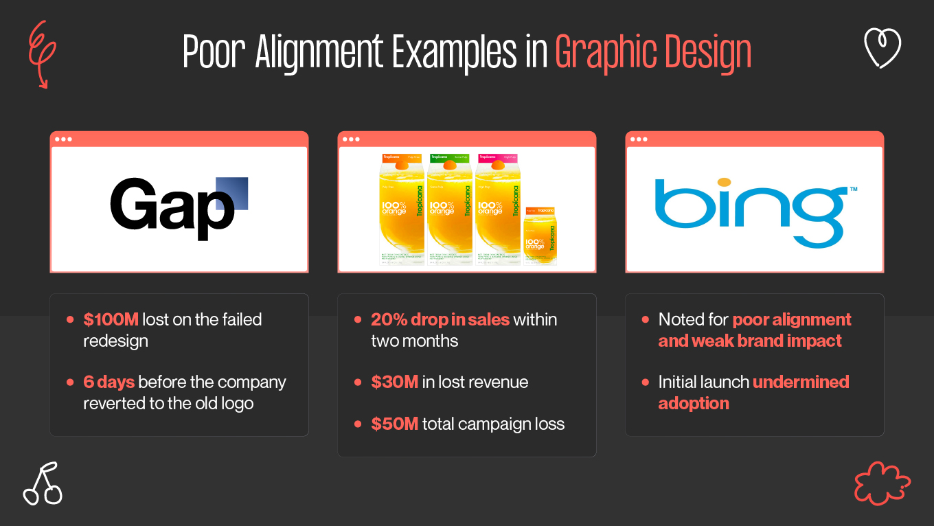
Companies frequently underestimate the impact of inconsistent visuals on their business. Uneven spacing, off-center layouts, and mismatched design elements may seem harmless, but they reveal a larger problem: a lack of attention to detail. Over time, this inconsistency chips away at trust, weakens brand image, and makes messages feel less professional.
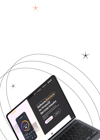
Alignment is what brings design back in line. It organizes content, directs focus, and creates the consistency that strong brands rely on. When used effectively, alignment makes information easier to read, strengthens credibility, and connects every visual touchpoint. The difference is evident in the numbers: companies with a strong design focus, including consistent alignment, achieve 32% higher revenue and 56% greater shareholder returns than their peers.
This article explains how alignment directly contributes to business success by enhancing clarity, fostering improved user experiences, and maintaining visual consistency across all channels.