Dark Mode UX: Benefits, Pitfalls & Implementation

6minutes read
dark mode ux design

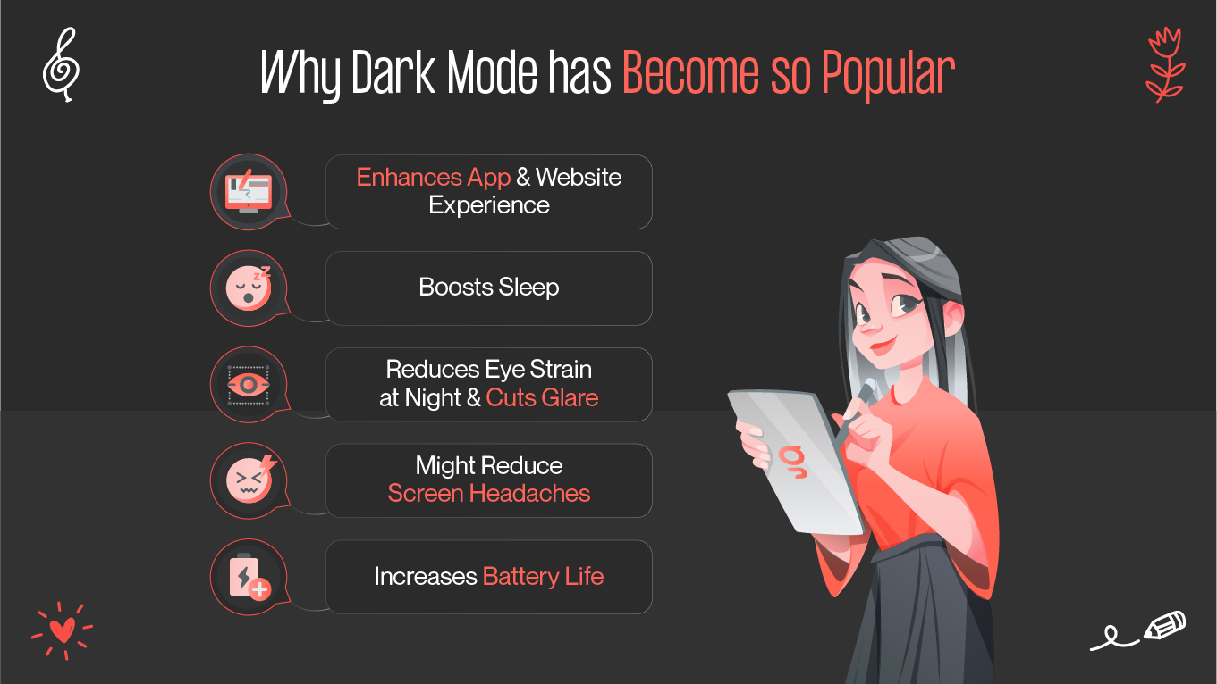
Dark mode has gone from a niche preference to mainstream user experience (UX) feature over the last couple of years. Tech companies have integrated it into their systems, and consumers increasingly expect apps to offer a dark mode option. But why is this aesthetic so fashionable? Is it merely an appearance-driven choice, or does it have more to do with usability and psychological behavior? Let's dive deeper into the nitty-gritty of dark mode UX, from the psychological effects to the technicalities of how it is implemented.

The Psychology of Dark Mode in UI

When we’re exposed to bright screens in low-light environments, especially in the evenings, our bodies interpret that brightness as daylight, which delays melatonin production and potentially affects our sleep.

Dark mode, when done correctly, reduces this disruption. Users are less mentally fatigued when they work with dark interfaces in dark environments. The dark mode is psychologically associated with sophistication and concentration. It's uncluttered, bringing attention to the key bits of information rather than overwhelming the user with a light and color noise. However, it also has emotional depth: dark color schemes can be soothing to some users and distancing to others, depending on the color choices.

Surprisingly, user preference for dark mode sometimes reflects personality. Methodical users seeking extreme concentration may prefer dark interfaces, as they minimize distractions. Casual users, on the other hand, may enjoy light-colored backgrounds as a comfort, reminiscent of the familiarity found in books, documents, and daylight use.

But one significant note remains accurate: dark mode is not always superior. Context and personal preference greatly decide its utility.

why dark mode became so popular
dark mode ux significance

Visual Comfort & Health Considerations

Dark interfaces reduce eye strain by lowering excessive brightness and glare. OLED screens, widely used in today's smartphones, offer an additional benefit: dark mode conserves battery power since pixels in dark areas are turned off, thereby reducing both energy consumption and heat generation.

Dark mode has disadvantages as well. During sunny daylight, reading white text on a black background may lead to halation, where the effect of the white text seems to spread into the black background, making it hard to read and somewhat annoying. Dark mode can also increase cognitive load when the chosen color contrast is inappropriate, requiring users to squint or concentrate more to differentiate between elements.

Therefore, the responsible implementation of dark mode requires an understanding not only of where and how it increases comfort but also where it can cause unintended discomfort.

Designing Dark Mode: Color Schemes & Contrast

It's not as simple as inverting the color scheme. Most of the time, thoughtless inversion produces illegible text, discordant colors, and unusable interfaces. The key to successful dark mode is a thoughtful balance of color, contrast, and tone.

True black (#000000) might seem like an obvious choice as a background, but it can be too harsh and create too harsh a contrast. Designers prefer dark grays (like #121212 or #1E1E1E), which are more comfortable for the eyes but still provide the illusion of darkness.

dark mode color schemes

Contrast is also crucial. Too much contrast between text and background tires out the eyes, but too little contrast makes content unreadable. Dark mode design guidelines recommend a contrast ratio of at least 4.5:1 for standard text, and this is equally relevant to both dark and light themes.

Hues applied to highlights, buttons, and alerts must be treated specially in dark mode. Vibrant colors become even more vibrant against dark colors and may need to be toned down. Warm colors, such as reds and yellows, may appear garish, while cool colors, like blues and greens, tend to look better together.

And don't forget typography: slimmer fonts may be lost against dark colors, and line spacing may need to be adjusted to maintain legibility.

Briefly, getting dark mode right is a standalone creative effort and not just an inverted color scheme.

Managing Light–Dark Toggles & System Settings

Most contemporary operating systems allow users to have built-in dark mode preferences, enabling them to switch their entire environment to dark or light. It is now essential for UX designers and developers to respect such system-level preferences. If the user has already selected dark mode on their device, the application should respect that choice.

light vs dark ux
light and dark toggles

But how about retaining choice for users? The best practice is for apps to store a user's light vs dark UX mode setting locally (or in their account) to ensure session and device consistency. Smart apps also synchronize with daylight hours, toggling modes optionally at sunrise or sunset. It must always be opt-in, however, to respect those who prefer to manually control.

A smart light–dark toggle control increases trust in your product by empowering users to be in control without overwhelming them with excessive options.

Measuring Impact: Metrics & User Feedback

Enabling dark mode doesn't ring the final bell. How do you know it's actually improving the user experience?

User feedback dark mode is your most immediate and best source of truth. App reviews, social mentions, and direct feedback channels will quickly indicate whether your dark mode appeals to or irritates your users. Listen not only to extreme reactions ("I love it!" vs. "I hate it!") but also to thoughtful observations regarding readability, ease of use, and visual fatigue.

On the quantitative side, behavioral analytics can also expose how dark mode affects engagement. Do users spend more time in your app when it is in dark mode? Does user retention increase for those who switch to dark mode? Is the error rate or task length altered when users switch between modes?

Some have even observed that dark mode reduces churn rates, especially from nocturnal users. This, too, is very context-dependent on how the user will be using your app or website.

Ultimately, measuring the impact of the dark mode is an aggregate process that both synthesizes and utilizes qualitative and quantitative metrics, allowing you to refine and perfect the experience over time.

light vs dark ui
light and dark mode ui design

A/B Testing Dark vs Light UI

The goal is to discover when and for whom each mode performs most effectively. For example, dark mode improves reading comprehension at night but worsens during the day. Or that younger readers strongly prefer dark mode, while older readers prefer light mode.

Monitorables are measures of success on tasks, page time, bounce rate, error rate, and even physiological metrics such as eye movement or blink rate (for high-end usability studies).

Keep in mind that users may not always be happy with the performance measures. Users may prefer the look of dark mode more, but perform optimally under light mode. The trade-off between subjective satisfaction and objective effectiveness is the holy grail.

Wrapping Up

Dark mode UX isn't a trend—it's a complex, dynamic user preference with psychological, ergonomic, and design nuance. It's not a one-size-fits-all solution. The best dark mode solutions respect individual differences, environmental factors, and system-level cues.

Ultimately, dark mode isn't simply a switch from white to black. It's about illuminating the right choices for your users, one pixel at a time.

Rate this article

20 ratings
Average: 4.9 out of 5

If you like what we write, we recommend subscribing to our mailing list to always be aware of new publications.