Designing A Better Financial Life Using Your Fintech App UX

12minutes read
fintech-app-ux

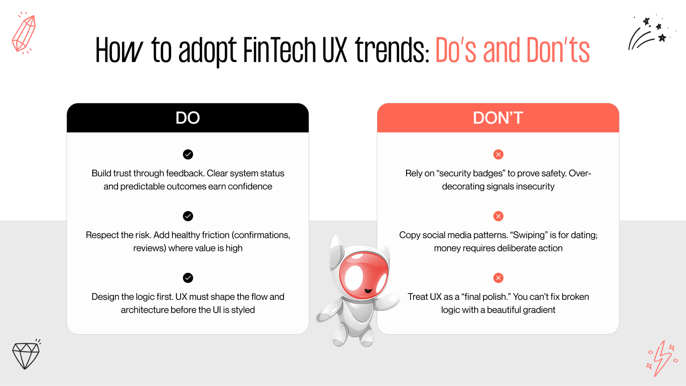
Trust is the true digital currency in fintech app UX. When users share their personal data, ID, and money, they expect security and transparency at each step. If the experience feels unclear or unsafe, they leave before completing registration.

That’s why fintech app design is not optional — it is the foundation of user retention. In this article, we explain how user experience creates trust in financial products, from building smooth KYC flows to reducing onboarding friction and using visuals to communicate reliability.

Trust: The Fintech UX Holy Grail

Financial apps deal with sensitive data and strict compliance. Unlike lifestyle apps, one confusing screen here may result in lost conversions and damaged trust.

Core Trust Builders
Core Trust Builders

Core Trust Builders

  • Visual clarity. Minimalist interfaces with simple navigation.

  • Transparency. Upfront explanation of fees, steps, and terms.

  • Security indicators. Biometric login, two-factor authentication, and padlock icons.

  • Predictable flows. Users always know what comes next and why.

At Gapsy Studio, we believe trust is built through interfaces where uncertainty is eliminated and users remain in control.

UX That Reinforces Financial Safety

Encryption works in the background. What users see are confirmations, progress bars, and clear error states. These UX elements determine whether they feel secure.

Practices that Increase Perceived Safety

Practices that Increase Perceived Safety

  • Transparent confirmations when money is transferred or deposited.
  • Onboarding or transaction progress indicators.
  • Biometric login and 2FA as defaults.
  • Useful error messages: “This picture is blurred, please upload a clearer one.”

“Through our fintech projects, we saw that the more users know what to expect, the less uncertainty they feel — and the higher the activation rate. UX must gradually reduce stress triggers.” — Gapsy Studio

Creating KYC That Won’t Repel Users

KYC UX (Know Your Customer) is mandatory, yet often the biggest drop-off point. Many users leave when asked for documents they don’t expect or face clunky mobile upload tools.

Where KYC Fails

Where KYC Fails
Where KYC Fails
  • Document requests surprise users.

  • No explanation why verification is needed.

  • Upload tools break on mobile devices.

  • No confirmation after submission.

How to Fix It

How to Fix It
How to Fix It
  • Progressive disclosure. Show one step at a time.

  • Friendly microcopy. “We need to verify your identity to keep your account safe.”

  • Interactive uploads. Preview, crop, and auto-validate documents.

  • Mobile-first optimization. Direct camera access without third-party apps.

💡 Want to know more? Read our guide on app design cost and see how UX impacts compliance workflows.

Reducing Friction in Fintech Onboarding

First impressions matter. Poorly designed onboarding is one of the top reasons fintech apps lose users.

Reducing Friction in Fintech Onboarding

Common Friction Points

  • Repeated requests for the same data.
  • Unexpected document requirements.
  • No save-and-continue option.
  • No visible progress.

UX Solutions

  • Smart defaults. Auto-fill known details from device or email.
  • Chunked forms. Break long forms into quick, manageable steps.
  • Contextual tooltips. Explain why sensitive data is required.

Skip & return. Allow postponing of non-critical steps.

Trust Signals in Visual Design

Users judge safety visually before they even read text.

  • Color palette. Blues and greens for stability and growth.
  • Typography. Professional, legible fonts across devices.
  • Microinteractions. Smooth animations that confirm actions.
  • Consistent icons. A shield = safety, a checkmark = success.

Even the smallest inconsistency can raise suspicion in fintech interfaces.

Common UX Friction vs. Solutions

Friction PointUser PerceptionUX Solution

Complicated KYC

“This takes too long”

Progressive disclosure + explanations

No confirmations

“Did my payment go through?”

Visual + textual confirmation

Duplicate data entry

“I’m wasting time”

Autofill and smart defaults

No guidance

“Why is this necessary?”

Tooltips and contextual hints

Measuring Trust in Fintech Apps

Trust is measurable through both behavior and feedback:

Measuring Trust in Fintech Apps
  • Activation rate. Percentage of users who finish onboarding.
  • KYC completion rate. Share of users who pass identity verification.
  • Drop-off points. Where users abandon the flow.
  • Session duration. Longer sessions usually signal greater trust.

User surveys. “Did you feel safe using our app?”

Final Thoughts

Building a secure app is only half the challenge. The real task is building trust across every interaction — from onboarding to transactions.

At Gapsy Studio, we deliver fintech app design that balances compliance, clarity, and user comfort. Our expertise makes identity verification seamless and onboarding a trust-building experience.

👉 Need a partner who knows fintech inside out? Explore our UX/UI design services and create a product your users will trust.

Rate this article

20 ratings
Average: 4.9 out of 5

If you like what we write, we recommend subscribing to our mailing list to always be aware of new publications.

Do you have any questions? We tried to answer most of them!