How to Begin Screen Design: Best Practices and Core Principles

10minutes read
how-to-begin-screen-design

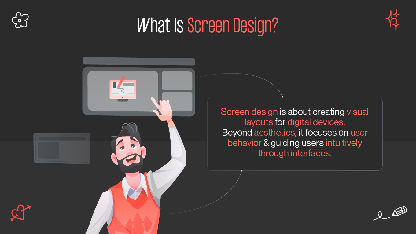
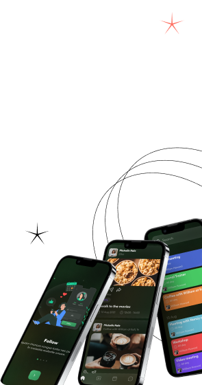
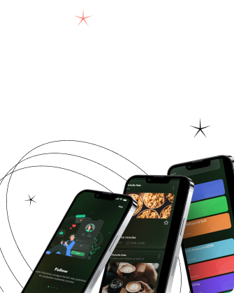
In today's digital world, screens are everywhere—apps, websites, kiosks, wearables, and smart devices. Designing for these screens is not just about making things look pretty. It's about functionality, usability, consistency, and crafting a smooth user journey. That’s the core of screen design—a practice that blends aesthetics with strategy to build engaging digital experiences.

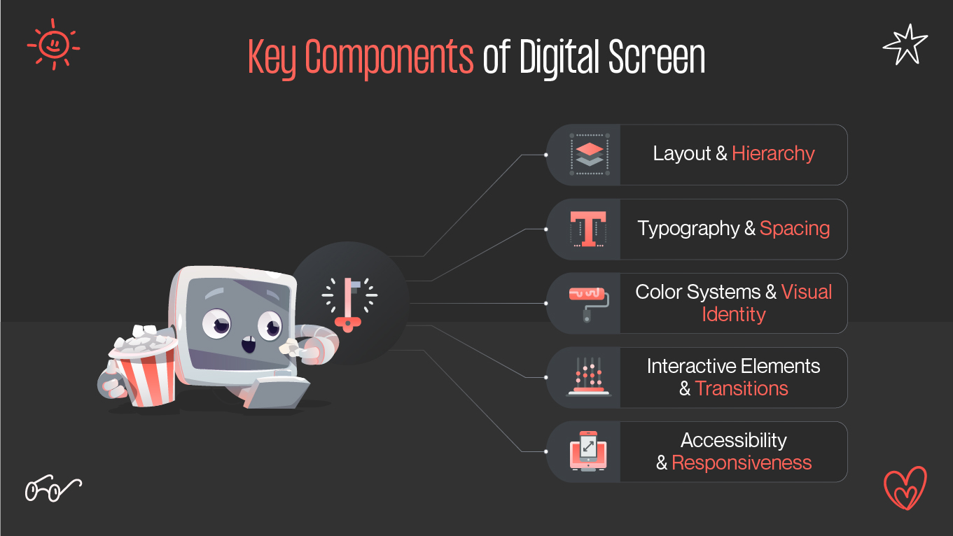
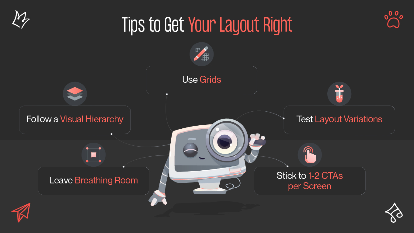
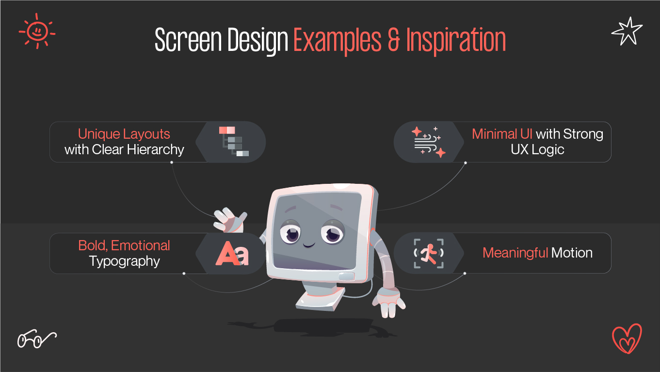
If you’re starting your journey as a screen designer or refining your team’s workflow, this guide breaks down key principles, terminology, tools, and examples to help you design effective, user-centered interfaces.

What Is Screen Design?

What is a screen design?

Screen design is the art and science of creating layouts and visual compositions for digital devices—phones, tablets, computers, and beyond. It encompasses everything users see and interact with, from navigation and buttons to transitions and microinteractions.

While the visual layer is essential, screen design goes beyond aesthetics. It requires understanding user needs, behavioral flows, and device-specific challenges. Ultimately, the goal is to guide users smoothly from point A to point B without confusion.

Key components of digital screen design include:

  • Layout and hierarchy

  • Typography and spacing

  • Color systems and visual identity

  • Interactive elements and transitions

  • Accessibility and responsiveness

Key components of digital screen

A well-thought-out design screen increases usability, retention, and conversions—making it vital for any digital product's success.

From UI Screens to Interactive Screen Design

UI screens (User Interface screens) focus on the visual presentation: buttons, icons, fonts, menus, and visuals. They form the static skeleton of the interface.

Interactive screen design, however, adds life to those elements. It's how your screen responds to actions: clicking, swiping, scrolling, and more. Modern users expect responsive interactions that provide feedback, anticipate needs, and feel intuitive.

Examples of interaction design elements:

  • Button hover animations
  • Smooth screen transitions
  • Drag-and-drop actions
  • Microinteractions (like a heart “popping” when liked)

According to Adobe, 38% of users stop engaging if a website or app is unattractive or non-intuitive—highlighting the importance of seamless interactivity.

Screen Design vs. Screendesign: Key Terminology Explained

You may see both “screen design” and “screendesign” across the web. Though they sound identical, there's a subtle linguistic distinction:

  • “Screen design” is the widely used English term.
  • “Screendesign” is often found in German-speaking regions or in legacy UI documentation.

Both refer to designing digital screens, so feel free to use “screen design” in international, modern UX/UI contexts.

First Steps in Screen Layout Design

The foundation of good screen design lies in the screen layout design—how visual elements are arranged on a page. A poorly organized screen can frustrate users or even cause them to abandon your app or website.

Tips to get your layout right:

Tips to get your layout right
  • Use grids: Align elements with 8pt or 4pt spacing for consistency.
  • Follow a visual hierarchy: Prioritize content using size, color, and positioning.
  • Leave breathing room: Whitespace enhances focus and readability.
  • Stick to 1-2 CTAs per screen: Avoid overwhelming users with choices.
  • Test layout variations: A/B testing helps refine usability.

Pro Tip: Think mobile-first. With over 60% of web traffic coming from mobile, designing for small screens ensures scalability and adaptability.

Wireframes, App Screens Design, and UX Flow

Before diving into visuals, build wireframes—basic black-and-white sketches of your screens. Wireframes define structure, flow, and functionality without distractions.

Wireframing benefits:

  • Aligns stakeholders on layout
  • Helps validate user journeys early
  • Saves time during visual design

Once wireframes are approved, move on to app screens design, where branding and visuals are applied. Focus on consistency across multiple screens such as:

  • Welcome screen
  • Navigation/menu screen
  • Product or content view
  • Checkout or confirmation screens

Every element should contribute to a logical UX flow, ensuring that the user can accomplish tasks efficiently.

Login Screen Design and Onboarding Basics

Your login screen design sets the tone for the user’s journey. If it's clunky or confusing, you risk losing users before they even get started.

Key login screen elements:

  • Minimal input fields: Keep it to email/username + password
  • Remember me & password visibility toggle
  • Secure design elements: Use clear error messages and feedback
  • Alternative sign-ins: Google, Apple, or social media logins

For new users, combine this with a lightweight onboarding experience that introduces app features and encourages first actions. Keep onboarding under 3–5 screens and offer a “skip” option to reduce friction.

Best Practices in UI and UX Screens

Designing UI and UX screens well means balancing usability with visual identity. Users should intuitively understand what to do next at every stage.

Best practices to follow:

  • Stick to 1 action per screen: Simplicity boosts clarity
  • Highlight active states: Use color, size, or animation to show feedback
  • Use standard UI components: Familiarity builds trust
  • Design for accessibility: Contrast, font sizes, alt tags, and screen reader support

Always test your screen flows with real users. Tools like Maze or UsabilityHub can help identify friction points.

Responsive and Mobile Screen Design Essentials

Mobile screen design presents unique challenges: limited space, touch navigation, and varying device sizes. Your screen must adapt and perform on different platforms.

Mobile screen essentials:

  • Touch-friendly targets: Buttons should be 44x44 px minimum
  • Thumb-friendly zones: Place critical actions within reac
  • Hide secondary info: Use collapsible menus and modals
  • Optimize loading times: Compress images and avoid unnecessary animations

Responsive design ensures consistency across devices. Use breakpoints and flexible layouts (Flexbox/Grid) to create fluid screen transitions.

Creating a Consistent Screen Interface Design

Consistency in screen interface design is crucial. It reinforces brand identity and reduces the user’s learning curve.

Maintain consistency by:

  • Using a design system (e.g., Google Material, IBM Carbon)
  • Creating reusable components (buttons, cards, icons
  • Defining global styles for typography and spacing
  • Documenting behavior states (hover, disabled, error)

A consistent interface isn’t just polished—it’s powerful. It builds user trust and drives adoption.

Screen Design Examples and Inspiration

Screen design examples and inspiration

Looking at screen design examples is one of the best ways to spark creativity and learn what works in the real world.

What to look for:

  • Unique layouts with clear hierarchy

  • Bold typography with emotional appeal

  • Minimal UI with strong UX logic

  • Motion that adds meaning, not distraction

Platforms like Dribbble and Behance are full of case studies and concept shots. At Gapsy Studio, we also showcase custom projects where innovative screen design drives user engagement.

Where to Find Templates and Modern UI Screens

Templates are time-savers. They offer professionally built UI kits and layouts that reduce guesswork and help you iterate faster.

Top sources for templates:

  • Figma Community – Free editable templates

  • UI8 – Premium UI kits and wireframes

  • Sketch App Sources – Especially for Mac-based designers

  • Envato Elements – Huge variety for web and mobile

  • Lapa Ninja & Cruip – Landing page inspiration

Using a good template doesn’t mean copying—it’s about kickstarting creativity with a solid foundation.

Tools Every Screen Designer Should Try

A great screen designer needs tools that streamline every stage—from ideation to delivery.

Must-try tools:

  • Figma – Real-time collaboration, component-based design

  • Adobe XD – UX-focused, rapid prototyping

  • Sketch – Clean vector-based UI design for macOS

  • Framer – Great for animated, interactive prototypes

  • Zeplin / Avocode – For handing off designs to dev teams

  • Miro / FigJam – Collaborative brainstorming and flow mapping

Most of these tools offer free trials or community versions—perfect for exploring and mastering your workflow.

Conclusion

Starting with screen design can feel overwhelming, but once you master the principles, tools, and flows, it becomes a rewarding process of creation and problem-solving. Whether you’re designing a login screen or building complex UX screens for a mobile app, focus on clarity, usability, and user needs.

Keep learning from screen design examples, adopt best practices, and stay consistent—and you'll be on your way to designing memorable, user-centric digital experiences.

🚀 Ready to build your product’s interface with precision and creativity? Contact Gapsy Studio or explore our UI/UX design services to bring your vision to life.

Rate this article

20 ratings
Average: 4.9 out of 5

If you like what we write, we recommend subscribing to our mailing list to always be aware of new publications.