What is Responsive Website Design and How it Works

7minutes read
what is responsive web design

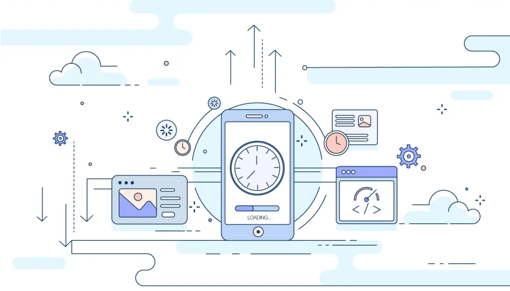
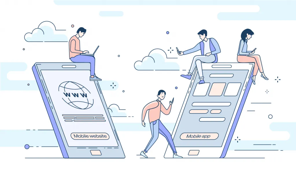
Did you know that 4.4 billion internet users do for 6½ hours each day online? Hours spent on using the Internet are increasing every day. At the same time, the number of various applications and websites that are widely used on multiple gadgets, laptops, and smartphones is also growing. The main question is how to make your website look attractive on all devices no matter what the client is using: a laptop, computer, tablet, or phone?

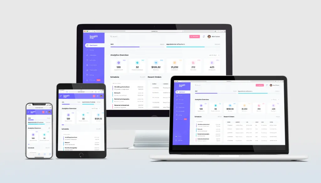
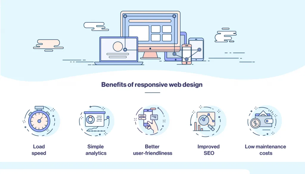
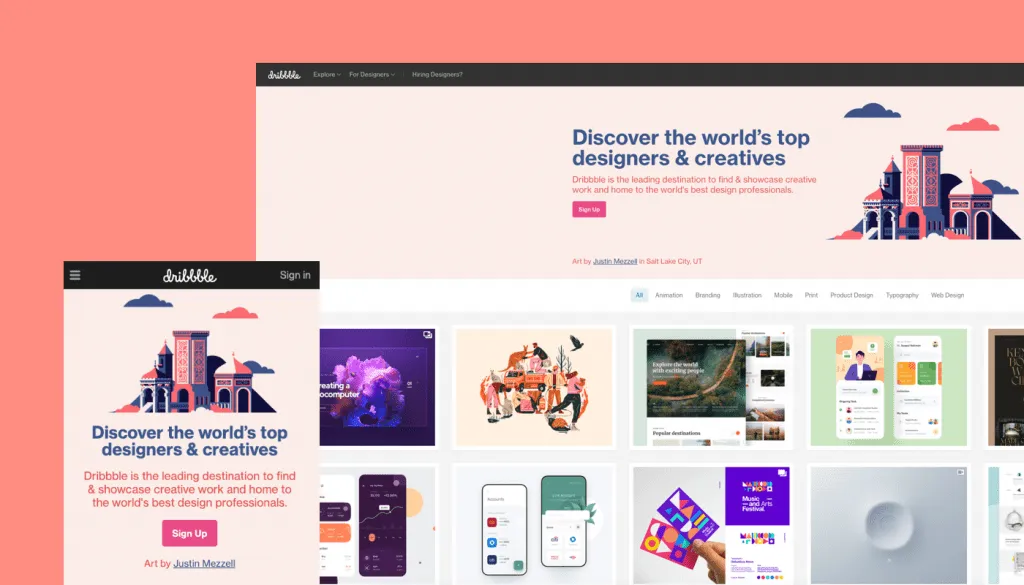
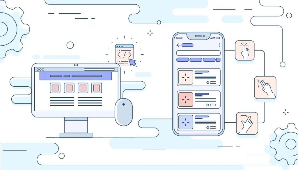
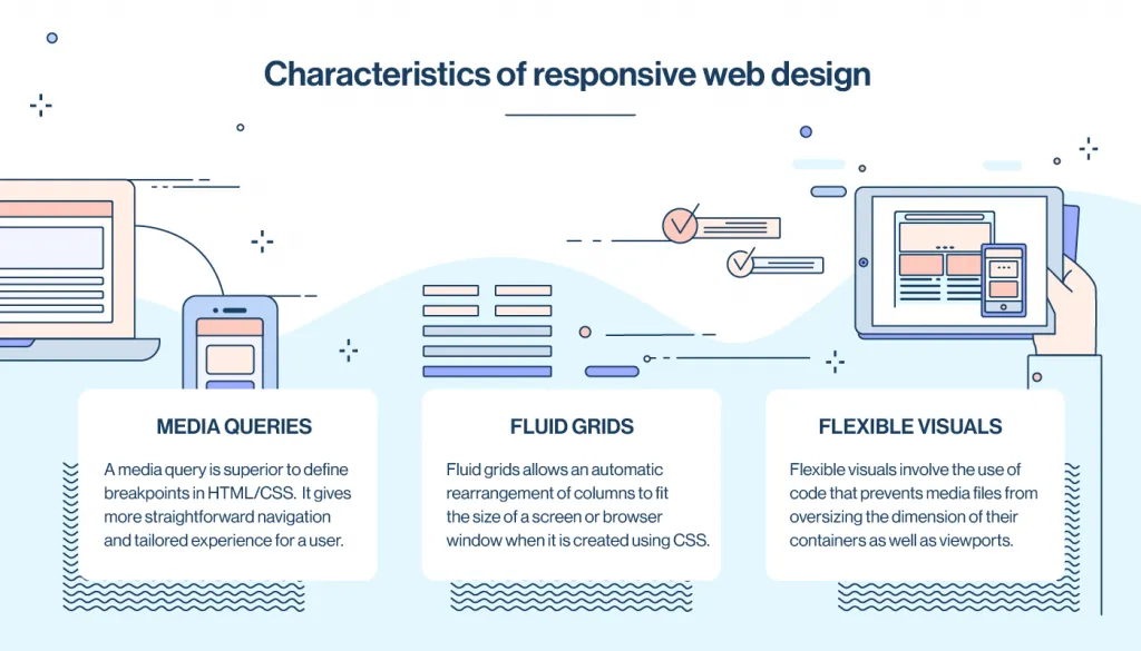
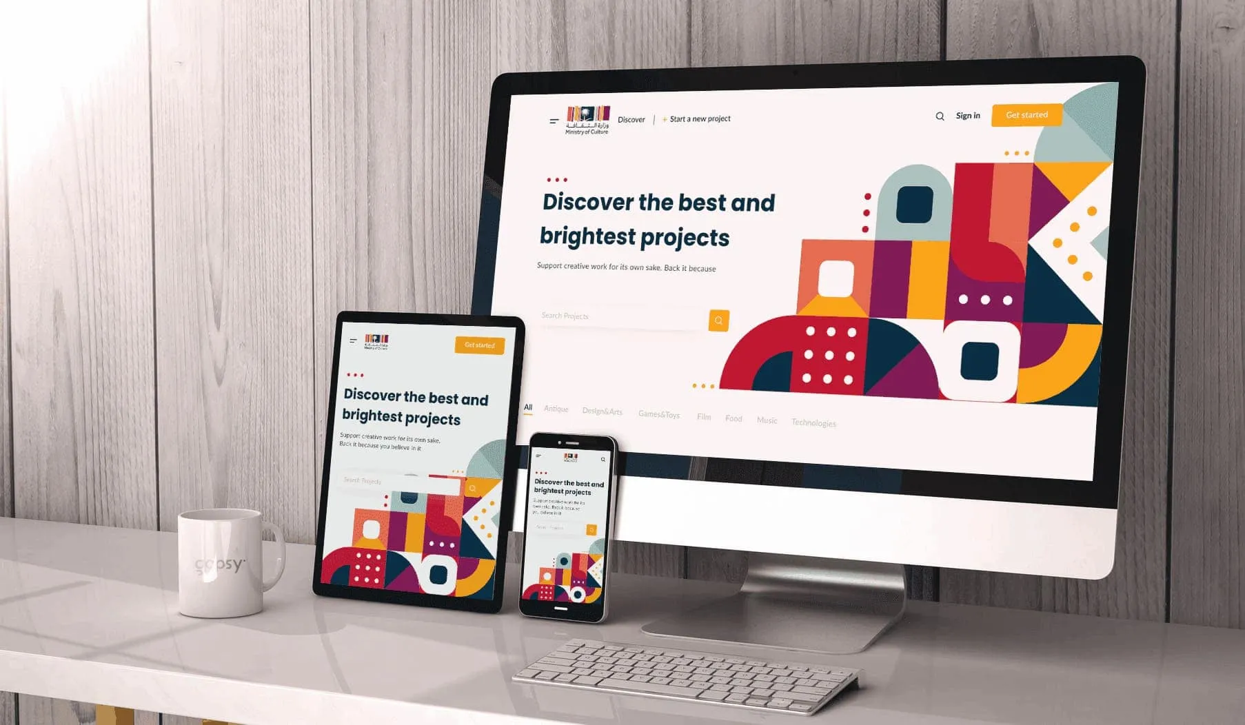
Responsive web design is one of the most important components of Gapsy Studio websites. Below, we will describe what responsive web design is, show you some examples, explain benefits to convince you that responsive design is essential to modern design.

what is responsive website design
examples of responsive web design on different devices

What does responsive mean in web design?

Responsive web design is an approach to creating web interfaces that “respond” to a user’s device to adjust a web app or website to any device, windows, or screen sizes.

Unlike traditional design approaches that rely on pixels, responsive design uses fluid grids that are measured in percentages. Likewise, responsive pages automatically adapt and fit in any screen size of various devices. They also use flexible, or so-called “fluid,” images that change not only their size and orientation but also shape when needed.

Why is responsive web design important?

The number of smartphone users worldwide today surpasses three billion. It is forecasted to grow further by several hundred million in the next few years. It means that just creating a website is no longer enough. More and more people are performing online activities through their smartphones. That’s why it is essential to create designs that can look good on their devices, and a responsive approach is the best solution here.

Make sure your web app or website UI/UX design looks perfectly on a computer, laptop, tablet, or smartwatch ‒ any device that your users may use, so you don’t spoil their impression of your website.

Benefits of responsive web design

One of the frequently asked questions is, “why responsive web design should be used?” Responsive web design comes with loads of benefits. One of these benefits of responsive web design is the websites’ load speed and absence of content distortion, which eliminates any need for manual content resize. Other benefits are listed below:

  • Low maintenance costs. Compared to adaptive design, where many sheets are created for different screens, responding to design is cheaper.
  • Simple analytics. Responsive web design simplifies the process of collecting analytical data on site users and sources of traffic.
  • Improved SEO. Google ranks mobile-friendly sites higher than those that do not have mobile optimization.
  • Better user-friendliness. Responsive web design helps users to benefit by making it easier to continue viewing content without Internet connection as long as the content is within the HTML web app.
responsive web design benefits
benefits of responsive web design

However, responsive web design has not only advantages but also disadvantages as well. One of the main disadvantages of responsive design is that not every site looks pretty on every device despite fitting in.

Another problem that may arise while creating a responsive web design is a case when there is a need to offer different content to different users according to their devices.

How responsive web design works

Despite some complications, a lot of website owners see more advantages of responsive web design than drawbacks. Unlike adaptive web design, where numerous layouts are created for different screen sizes, responsive design allows a single layout to adapt to different screens without compromising functionality and aesthetics.

Let’s look at examples of responsive design to better understand how it works.

Responsive web design examples

To clearly understand how responsive web design works, you can go to any website from your computer and then open it on a mobile device. You will immediately see the difference in web design. You will also notice how pages change their layouts to match your device.

One of the most notable responsive website design examples is the Dribbble website that showcases one of the hallmarks of responsive web design with a lot of features. For instance, it has a flexible grid that consists of five columns on laptop or desktop computers and two columns on a mobile phone. Another example is the Slack’s website, which flexible grid easily adapts to all screen sizes and shapes. For instance, on desktop, customer’s logos are displayed in a three-column layout, but on a mobile, it is presented in a single column layout.

responsive web design examples
good examples of responsive web design

Responsive web design challenges

What kind of challenges can a designer face while creating one website for different devices?

Here are the responsive web design challenges a designer has to tackle:

1) Touch screen vs. mouse

Creating designs for mobile devices also involves mouse and touch screen comparison. On a computer, we usually have a mouse to navigate and select items. In turn, on the screen of a smartphone device or a tablet, we use our fingers to manipulate elements. A web designer should always consider all these aspects and understand that something that can be easily clicked with a mouse will be challenging to use on a touch screen.

responsive web design problems example
responsive web design challenges example

2) Graphics and load speed

There may also be a problem with heavy graphic design elements and load speed. On mobile devices, It may be advisable to display fewer graphics, so that your site does not load on smartphones too long.

responsive web design issues example
example of responsive web design challenges

3) “Mobile versions” and apps

If you have more mobile users than those who use the desktop, then you need to consider the option of creating not responsive design but a mobile application design instead.

example of responsive web design challenges
responsive web design issues example

Main characteristics of responsive web design

Responsive web design features have such three aspects:

  1. Media queries
  2. Flexible visuals
  3. Fluid grids

These features come together to form the three technical ingredients for responsive web design.

1. MEDIA QUERIES: A media query is superior to define breakpoints in HTML/CSS. It gives more straightforward navigation and tailored experience for a user. Media queries permit the use of condition checks by developers to alter web designs based on a user’s device.

2. FLUID GRIDS: Fluid grids allows an automatic rearrangement of columns to fit the size of a screen or browser window when it is created using CSS. This allows a website or web app to maintain a consistent look and feel across multiple devices.

3. FLEXIBLE VISUALS: flexible visuals involve the use of code that prevents media files from oversizing the dimension of their containers as well as viewports. This is achieved when a flexible container resizes itself automatically, adjusting the visuals within it.

what is responsive web design
what does responsive mean in web design

Final thoughts

To sum up, all mentioned above, we can see that the increasing rate of Internet traffic from a variety of devices has necessitated the use of responsive web design.

If you dream about an appealing and modern website that looks great on all types of devices, whether it be a computer, laptop, tablet or phone, you can contact the team of our professional designers at Gapsy Studio, and they will be happy to help you realize your dream 🙂

To have a closer look at our works, visit our project and concept pages.

Rate this article

20 ratings
Average: 4.9 out of 5

If you like what we write, we recommend subscribing to our mailing list to always be aware of new publications.

Do you have any questions? We tried to answer most of them!