Accessible Typography: How to Choose Fonts for Web & Mobile

12minutes read
accessible-typography-web

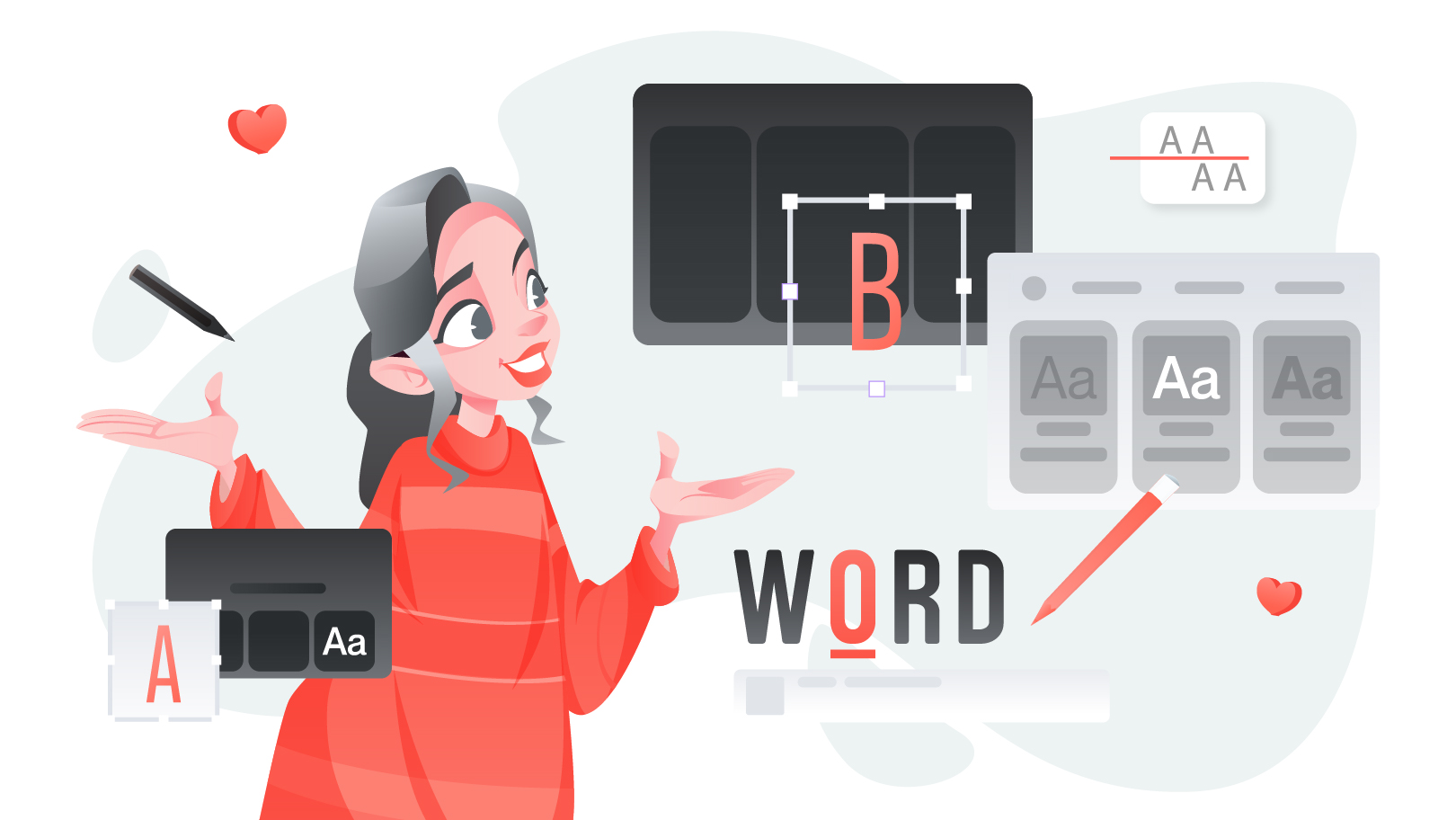
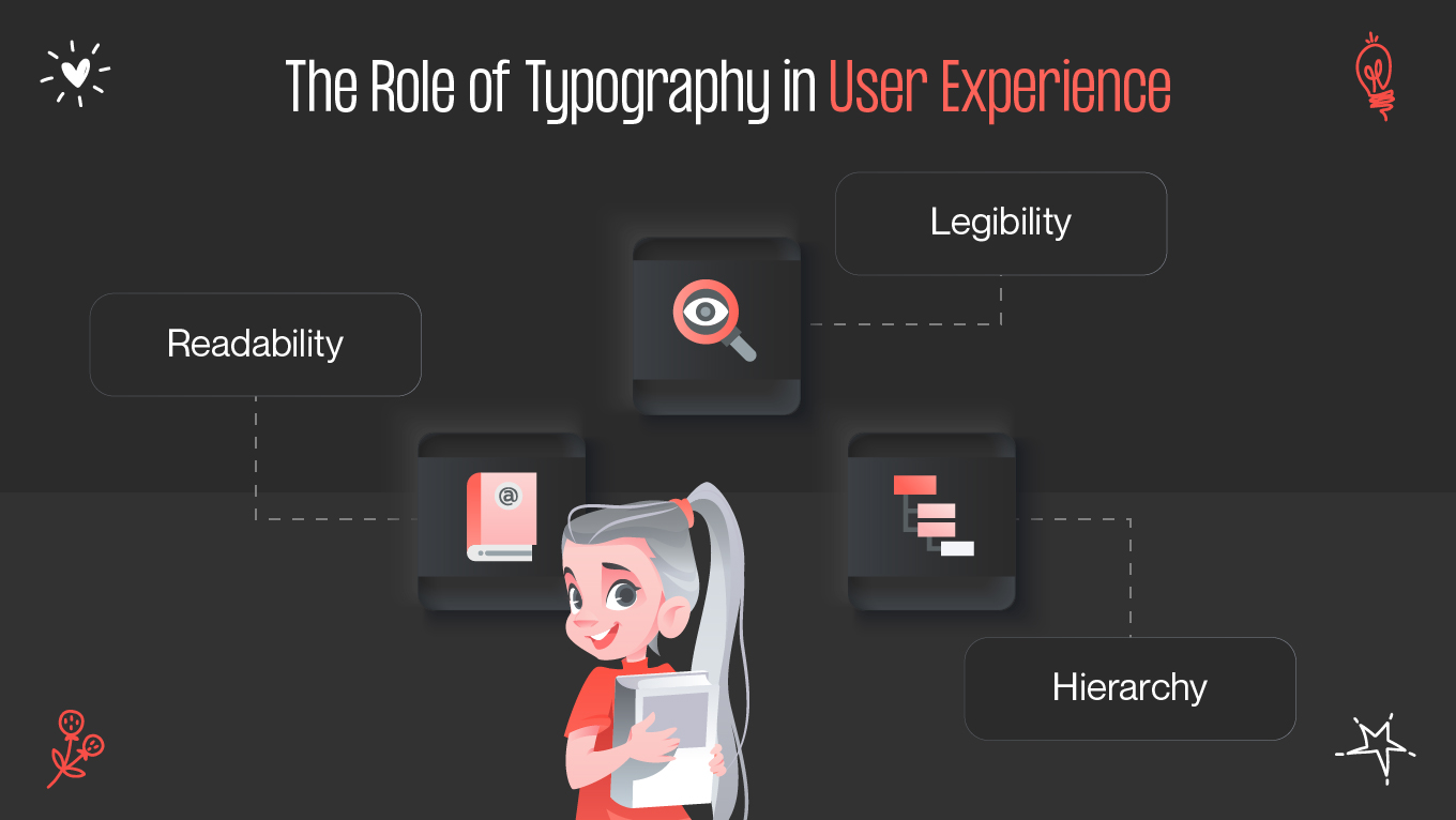
Typography does far more than shape visual appeal — it directly impacts usability and inclusivity. When crafted with accessibility in mind, typography ensures that every visitor, regardless of ability, can read and interact with your digital product comfortably. Let’s explore how to create accessible web typography that enhances legibility and user experience across both web and mobile platforms.

Why Typography Matters for Accessibility

Typography serves as the bridge between visual design and comprehension. Inaccessible type can alienate users with visual impairments, dyslexia, or cognitive differences, leading to poor engagement and higher bounce rates.

The role of typography in user experience

  • Readability: The ease with which users can recognize words and sentences.
  • Legibility: The clarity of individual letterforms — the foundation of accessible reading.
  • Hierarchy: Good typography establishes a clear visual order, guiding users through the interface intuitively.

Accessible typography goes beyond aesthetics — it’s about ensuring everyone, regardless of visual ability or device type, can comfortably navigate your website or mobile app.

Key Accessibility Typography Rules

Crafting accessible text involves a combination of design sensitivity and adherence to web accessibility standards like WCAG (Web Content Accessibility Guidelines). Below are essential rules to follow:

1. Choose legible fonts for accessibility

The most important step is selecting legible fonts accessibility best practices recommend. Sans-serif fonts (like Arial, Roboto, or Open Sans) are typically clearer on screens than ornate serif styles. Avoid overly decorative or condensed fonts that reduce character clarity.

Tip: Test font performance under different lighting conditions and screen resolutions to ensure consistent readability.

2. Prioritize sufficient contrast ratios

Contrast between text and background must meet WCAG standards — at least 4.5:1 for normal text and 3:1 for large text. Proper contrast ratios help users with low vision or color blindness differentiate text without strain.

3. Optimize font size and scaling

Responsive and flexible typography should adapt to different devices. Implement font scaling using relative units like em or rem instead of fixed pixels, allowing users to zoom in or out without breaking the layout.

4. Use adequate line spacing and length

  • Line spacing: at least 1.5x the font size.

  • Line length: between 45–75 characters per line.
    This balance reduces cognitive load and eye fatigue, improving reading flow for all users.

5. Consider variable fonts

Modern variable fonts allow multiple weights and styles within a single file. This not only improves performance but also supports user customization — a crucial aspect of accessibility. For instance, users can adjust contrast, weight, or width to suit their vision needs.

6. Maintain responsive typography

Typography should adjust fluidly across screen sizes. Responsive design ensures that text remains readable whether it’s viewed on a 27-inch monitor or a smartphone screen. Techniques like CSS clamp functions and viewport-based units (vw, vh) can help create dynamic font systems.

Tools & Techniques

To build accessible typography effectively, designers can leverage various tools to test and refine text accessibility:

1. Contrast checkers

  • WebAIM Contrast Checker: Verifies color contrast compliance with WCAG standards.
  • Contrast Ratio by Lea Verou: A quick browser-based color contrast tool.

2. Font pairing and legibility testers

  • Accessible Font Pairings: Helps select font combinations that maintain clarity and readability.
  • TypeScale: Useful for defining modular scales that ensure consistent hierarchy.

3. Browser and OS-level accessibility features

Test how your typography behaves with real assistive technologies:

  • Zoom and text enlargement on iOS and Android.
  • Screen readers like VoiceOver or NVDA.
  • High contrast modes and dark themes.

4. Use style guides and design systems

Integrating accessibility into your design system ensures consistency across pages. A clear typography guideline with predefined sizes, weights, and contrasts reduces errors and streamlines collaboration.

Examples from Real Projects

At Gapsy Studio, accessible typography is a core component of our UI/UX design services. Here are a few practical examples from real projects:

1. Oasis Water — luxury meets clarity

For this premium water brand, we implemented large, clean sans-serif typefaces with generous spacing to enhance legibility while preserving the elegant tone. The result: a visual hierarchy that balances sophistication with accessibility.

2. CyprusBed — hospitality across devices

In the CyprusBed hotel booking platform, the typography was optimized for mobile-first interaction. Using relative units and font scaling, text remains readable without zooming — ensuring seamless booking experiences for all users.

3. Adsellr — data-heavy UI made readable

Adsellr’s analytical dashboard demanded clarity in complex data tables. We used high-contrast color palettes, responsive variable fonts, and modular scales to maintain readability even under reduced screen brightness.

4. Internal design system for fintech client

For a fintech platform, we built a custom type system supporting dynamic resizing and accessible contrast ratios. This ensured users could comfortably read transactional details regardless of lighting conditions or device orientation.

The Future of Accessible Typography

As technology evolves, accessibility will increasingly intertwine with personalization. Adaptive systems will use AI and machine learning to automatically adjust typography based on user preferences and device capabilities.

However, the foundation remains the same — accessible web typography begins with empathy. Designers who prioritize inclusion not only meet compliance standards but also create digital experiences that truly connect with people.

Conclusion

Choosing accessible typography is a blend of aesthetics, usability, and ethics. Every decision — from font size to contrast — impacts how users perceive and interact with your content.

Remember:

Aesthetic and minimalist design focuses on presenting only the essential information clearly and visually pleasingly. Unnecessary elements or content that do not contribute to the user's goal should be eliminated. A clean and uncluttered interface helps users focus on the task and reduces cognitive overload.

By integrating accessibility at the heart of typography, you build designs that are not only beautiful but meaningful — accessible to everyone, everywhere.

Ready to make your product more inclusive?
Explore our UI/UX design services and let’s craft digital experiences that speak to every user.

Rate this article

20 ratings
Average: 4.9 out of 5

If you like what we write, we recommend subscribing to our mailing list to always be aware of new publications.

Do you have any questions? We tried to answer most of them!