Design Trends to Watch: Brutalism, Anti-Design & Beyond

6minutes read
anti design trends

We've selected the best brutalist web design 2025 examples to highlight its appearance in web design, which is imaginative, experimental, and distinctive. This post will examine the definition of this trend, its origins, and resources for brutalist web design. Lastly, we'll examine some pointers for implementing brutalism into your personal web UX/UI design process.

Trends Overview

Over the last few years, some designers have begun to take notice of and adopt brutalist online design. Like most design trends, it was first mostly restricted to avant-garde design spaces, such as digital agency websites, art museum websites, and designer portfolios.

There are two different styles within the generally accepted definition of web brutalism:

  • The idea of brutalism is derived from an older architectural trend.
  • Often called brutalism, antidesign has distinct objectives and is conveyed in a different way.

Some designers are promoting the incorporation of both principles into goods. It's important to pause and think about the origins of these styles, their motivations, and their implications for user experience.

Bold font, straightforward layouts, and a stark, functional vibe are all highlighted in this design. Publications such as RAW magazine provide examples [1]. They provide a welcome change from slick and formulaic looks. They give brands the chance to differentiate themselves and engage with consumers looking for something new.

anti-design trends
anti-design trends

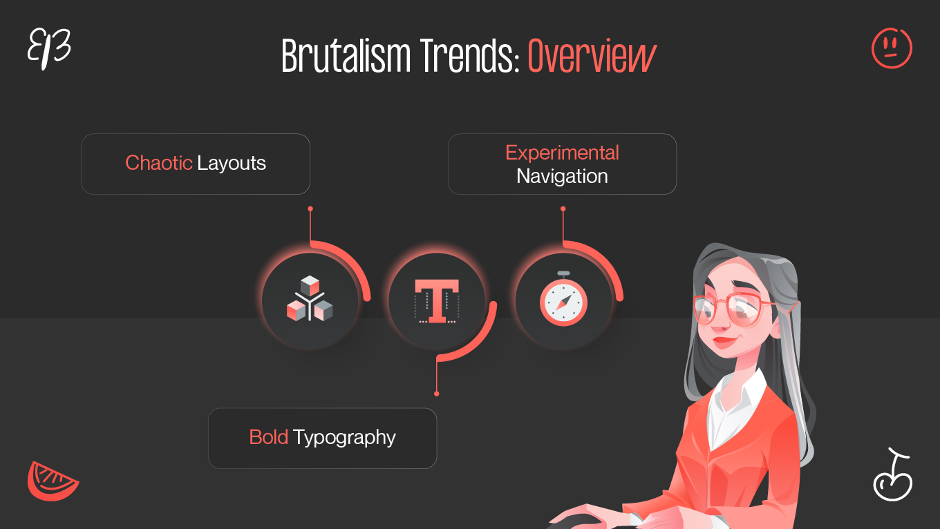
Visual Inspiration: Chaotic Layouts

By purposefully violating design guidelines, clashing colors, disorganized layouts, and unconventional navigation systems, chaotic layouts go even farther. This defiant approach is an exaggerated attempt to create distinctive, eye-catching websites that set themselves apart from the competition. ​

Even though these styles may be highly visible from the outside, designers should utilize them sparingly in order to achieve a great user experience. When used carefully, anti-design and micro-brutalism can convey brand identity and interact with users in novel and surprising ways.

Bold Typography: Making Statements

“Originally an architectural movement, brutalism is frequently characterized as a 
manifestation of socialist principles. Brutalist structures do not employ ornamentation 
for no reason; rather, they seek to reveal their actual purpose from the exterior [2].” 

A key component of brutalist UI design is bold typography. Large, striking, and attention-grabbing typefaces are frequently used in it. Strong geometric designs and thick, chunky fonts are frequently used. Subtlety is not an option here; the font is stark and unpolished, perfectly complementing the brutalist style.

Experimental Navigation: Breaking the Mold

Any website must have navigation since it acts as a guide for people to explore its features and information. Conventional navigation menus have a hierarchical structure with distinct labels for categories and subcategories and are frequently found at the top or side of a webpage. 

Experimental navigation seeks to defy convention in order to produce a more memorable and engaging user experience, even though this strategy is generally acknowledged and understood. The following are some advantages of non-traditional navigation design:

Brand identity and distinction

Your website can separate itself from the competition by implementing experimental site navigation. You have the chance to develop a distinctive visual identity that complements your brand and draws in customers by defying convention.

Enhanced user engagement

Unusual positioning, moving features, and hidden menus are examples of experimental navigation strategies that can pique users' interest and motivate them to continue exploring. It can create a sense of excitement and involvement by making the navigation procedure seem more like an adventure.

Memorable user experience

Visitors are frequently left with a lasting impression by websites that use experimental navigation. Users are more likely to remember your website and come back for more visits if you provide a fresh and surprising engagement.

Showcase innovation

If your website showcases a state-of-the-art good or service, experimental navigation can be a powerful tool for communicating innovation. It shows your willingness to push boundaries and harmonizes your design with the forward-thinking attitude of your brand.


When “Rules Don’t Apply”: Anti-Design in Action

Understanding the traits of anti-design, a rebellious and provocative design movement, is crucial to appreciating this distinctive methodology. Next, we'll talk about the traits of anti-design and how you might use them in your design work.

anti-design traits
anti-design characteristics

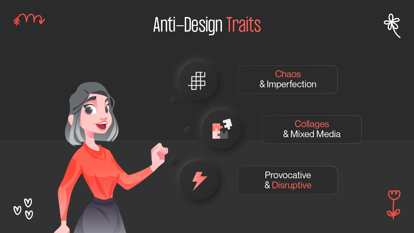
Chaos and Imperfection

Random elements, asymmetrical layouts, and unusual color combinations are all part of anti-design, which also embraces chaos and imperfection. It subverts the conventional notions of harmony and balance to produce compositions that are both visually arresting and surprising.

Collages and Mixed Media

Using collages and mixed media is a typical approach in this style. To produce original visual compositions, it could entail fusing different elements like text, textures, graphics, and images. This method makes anti-design even more chaotic and exploratory.

Provocative and Disruptive

Provocation and disruption are two of this strategy's main goals. It frequently includes daring and contentious features that subvert social norms and promote discussion. It can be an effective vehicle for social criticism, bringing significant topics to light and igniting debates.

UX Implications: Fusing Chaos and Clarity

Limit it to visual design in order to capitalize on the brutalist approach. Don't sacrifice your interface design, visual hierarchy, or navigation for the sake of novelty. And for the sake of your company metrics, stay away from antidesign like the plague and stick to pure brutalism.

making anti-design work

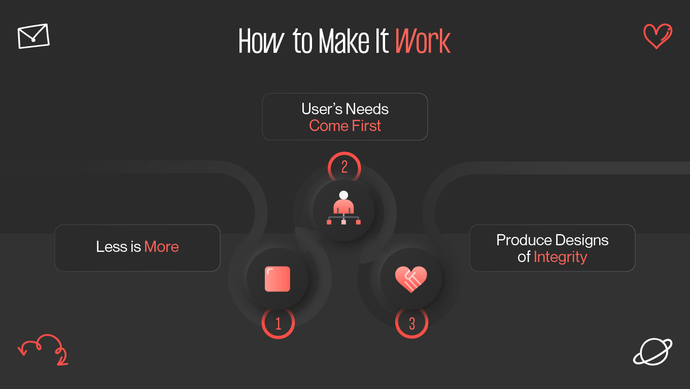
1. Less is More

Brashalism shares minimalism's appreciation of simplicity and the maxim "less is more." However, brutalist design goes beyond elimination, while minimalist design typically strikes a balance between beauty and simplicity. Although a white background is not required for every brutalist website, you will frequently find fewer graphics, color schemes, and other visuals.

2. The user’s needs come first

The goal of brutalism in architecture was to create useful structures with the least amount of money and effort.

Similar to this, brutalist websites frequently prioritize functionality over looks, either completely or partially.

3. Strive to produce designs of integrity

The creation of well-considered, comprehensive structures that were intended to satisfy certain fundamental demands was one of the Brutalist movement's greatest assets. Not only did they address the fundamentals, such as heating, sewerage, and plumbing, but they also designed blocks to promote community by creating common areas both inside and outside the building.

Final Thoughts: Embracing the Future of Design

Advances in user interactions, including adding voice commands or haptic feedback for increased engagement, may also be part of the future of brutalism and anti-design. A brutalist smartphone app, for example, might use voice-activated controls to provide a genuinely futuristic and immersive experience. Designers may push the limits of user interfaces by coming up with creative ways to incorporate virtual reality (VR) or augmented reality (AR) into interfaces.

References

  1. https://brutalistwebsites.com/raw/
  2. https://www.diva-portal.org/smash/get/diva2:1304924/FULLTEXT01.pdf

Rate this article

20 ratings
Average: 4.9 out of 5

If you like what we write, we recommend subscribing to our mailing list to always be aware of new publications.

Do you have any questions? We tried to answer most of them!