How to Choose the Right Color System for Your Brand

11minutes read
color-for-your-brand

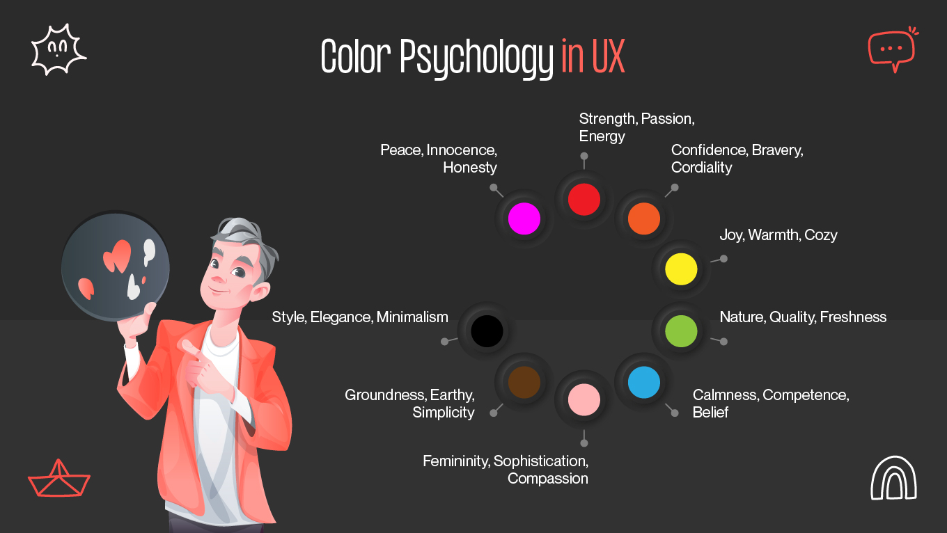
When it comes to consumer decision-making, color can be very important. Customers initially use brand colors to choose whether or not they want to interact with and learn more about your brand, even if they are unaware of the nature of your goods.

Selecting the appropriate brand colors is essential to establishing your identity and making a statement, regardless of whether you're a creative professional or an entrepreneur managing your own branding. When used effectively, your colors can serve as a visual shorthand for your identity, values, and unique selling points.

This post will teach you how to pick brand colors and create a palette that is unmistakably you, feels new, and is strategic. We'll walk you through every stage of the process, from innovative examples and practical advice to color psychology in branding.

Why Color Consistency Matters

Reliability and professionalism are fostered by consistency. A corporation can convey that it is well-organized, reliable, and trustworthy by using the same brand colors across its website, social media accounts, packaging, and advertising. Certain personality traits and brand features can be reaffirmed with a consistent color scheme. For example, a brand that wants to be young and active might choose vivid colors, whereas a luxury brand might use subdued, elegant hues.

Why Color Consistency Matters

Color recognition and memory are innate in our brains. Consistent brand colors make it easier for customers to remember your company, even if they can't remember the name or emblem. Long-term brand loyalty may benefit from this improved memory recall. To reinforce brand identification and provide a unified, recognizable experience, color constancy must be maintained across all media, digital and print.

The Psychology of Color

The study of how brand colors influence attitudes and actions is known as color psychology. The study of brand color theory enables us to comprehend color and make effective use of it in branding and marketing, from its meanings and symbolism to its effects on consumers. In a sense, each brand color has a backstory, and it is this backstory that has the power to influence your customers' attitudes and perceptions.

The well-known brand color examples listed below have done a fantastic job creating a brand that is instantly recognizable just by its hue. You may create a color scheme that is instantly recognizable and adored by researching the brand image you wish to project and improving your knowledge of color.

Being able to communicate effectively with your design team is crucial for brand managers and leaders. Do some study and learn the fundamentals if you are unfamiliar with all the terminology used in relation to brand colors.

Throughout the brand color choosing process, you can improve accuracy and efficiency by using the right language. As you create your color scheme, train your staff to express any ideas or opinions they may have.

Alternatively, a corporation that is open to everyone is represented by rainbow branding. The spirit of diversity can be effectively captured by employing a multicolor approach.

Instagram's color scheme and logo, for instance, combine ten distinct hues. It comes in a variety of hues, including red, orange, yellow, and various shades of blue and purple. Together, these hues represent Instagram's love of ambition, trust, creativity, and friendliness.

Building a Color System

Building a Color System

Material design is pre-configured with a baseline theme that is ready to use right out of the box. This comprises the standard hues for:

  • Colors, primary and secondary
  • Primary and secondary color variations
  • Other UI colors, including typography, iconography, surfaces, backdrops, and mistakes.

You can alter each of these hues to suit your app.

The baseline material brand color system is shown in the material color scheme diagram.

Primary color

The color that appears most frequently on the displays and other elements of your application is called a main color. You can create a color using your primary color.

Dark and light primary elements

You can use bright or dark variations of your primary colors to create contrast between UI elements, such as a top app bar from a system bar. Additionally, these can be used to differentiate components, such as the icon of a floating action button from its circular container.

Secondary color

Using a secondary color gives you additional options for highlighting and setting your product apart. Although it is optional, using a secondary color to provide emphasis should be done carefully.

You can also highlight elements with your primary color if you don't have a secondary color.

Secondary colors work best for:

  • Action buttons that float
  • Selection tools, such as switches and sliders
  • Selecting text and highlighting it with progress bars
  • Titles and links

Your secondary color might have both light and dark variations, just like your primary color. Your primary color, secondary color, and the dark and light versions of any color can all be used in a color theme.

Alternative colors

Alternative colors, which are colors used as substitutes for the primary and secondary colors of your brand (they are extra colors to your theme), are supported by the brand color system. Various UI sections can be identified by using various colors.

The following apps work better with alternative colors:

  • Those with light and dark themes
  • Applications with many sections and themes
  • Applications included in a product suite

Since it might be difficult to integrate other colors with preexisting color schemes, they should be used with caution.

Tokens and Variables

When building a scalable brand color system, design tokens and variables act as the connective tissue between design and code. They translate abstract visual choices (e.g., primary hues, surface contrast, or semantic states) into reusable, machine-readable values that ensure consistency across platforms and themes.

For instance, instead of hardcoding a hex value like #6200EE in multiple components, define it as a token such as color-primary. This token can then be referenced across your design system, ensuring that when your brand color evolves, a single update propagates globally.

Tokens can represent not only color but also relationships between colors. When integrated into variable-based systems like CSS Custom Properties (--color-primary) or platform tokens in design tools, they enable dynamic theming, responsive palettes, and dark/light mode adaptation without redundant effort.

Accessible colors

Light or dark variations of your primary and secondary colors might be used for your background to guarantee an accessible background behind light or dark text. These hues can also be applied to text that stands out against dark and bright backgrounds

Examples of Scalable Color Systems

Scalable adaptive color design are built to handle complexity, from brand evolution to multi-platform deployment, without breaking consistency. In practice, this means establishing color hierarchies and relationships that can adapt to different products, devices, and contexts.

For example, Google’s Material Design color system defines semantic roles such as primary, surface, on-surface, and error, each with tonal variants that automatically adjust based on light or dark themes. 

Atlassian’s design system uses a token-driven architecture, where color decisions cascade through a hierarchy, global, theme, and component-level, ensuring that changes in one layer don’t disrupt another.

Atlassian Color System

Shopify Polaris uses color tokens to maintain brand identity while supporting theme customization for different merchants. The result is a modular color structure that scales gracefully across UI states, accessibility requirements, and new feature rollouts.

Responsive Theming

Responsive theming extends beyond layout responsiveness; it’s about adapting color, contrast, and visual emphasis dynamically based on user context. A responsive theme can shift its palette depending on system settings (like dark mode), environmental conditions (such as ambient light), or user preferences (like high-contrast or reduced motion modes).

For instance, a dashboard might use a cool, subdued palette in bright daylight to reduce glare but transition to richer tones in darker environments for better legibility. Advanced implementations use CSS environment variables or color tokens linked to media queries to achieve this adaptive behavior.

Final Thoughts

A strong brand color system connects brand identity with usability, ensuring your digital products remain consistent, accessible, and emotionally resonant. As technology evolves, so must your design strategy. From token-based architectures to responsive theming, brands that embrace modularity and adaptability will stay recognizable and relevant, no matter how fast design trends shift.

At Gapsy Studio, we don’t just pick colors. We engineer complete design systems that reflect your brand’s personality, support accessibility, and scale across platforms. Whether you’re crafting a startup identity or evolving an enterprise-level design language, our team uses cutting-edge UX practices to build adaptive color design that work, functionally and technically

Rate this article

20 ratings
Average: 4.9 out of 5

If you like what we write, we recommend subscribing to our mailing list to always be aware of new publications.