The Role of Color Psychology in UI Design

8minutes read
The Role of Color Psychology in UI Design

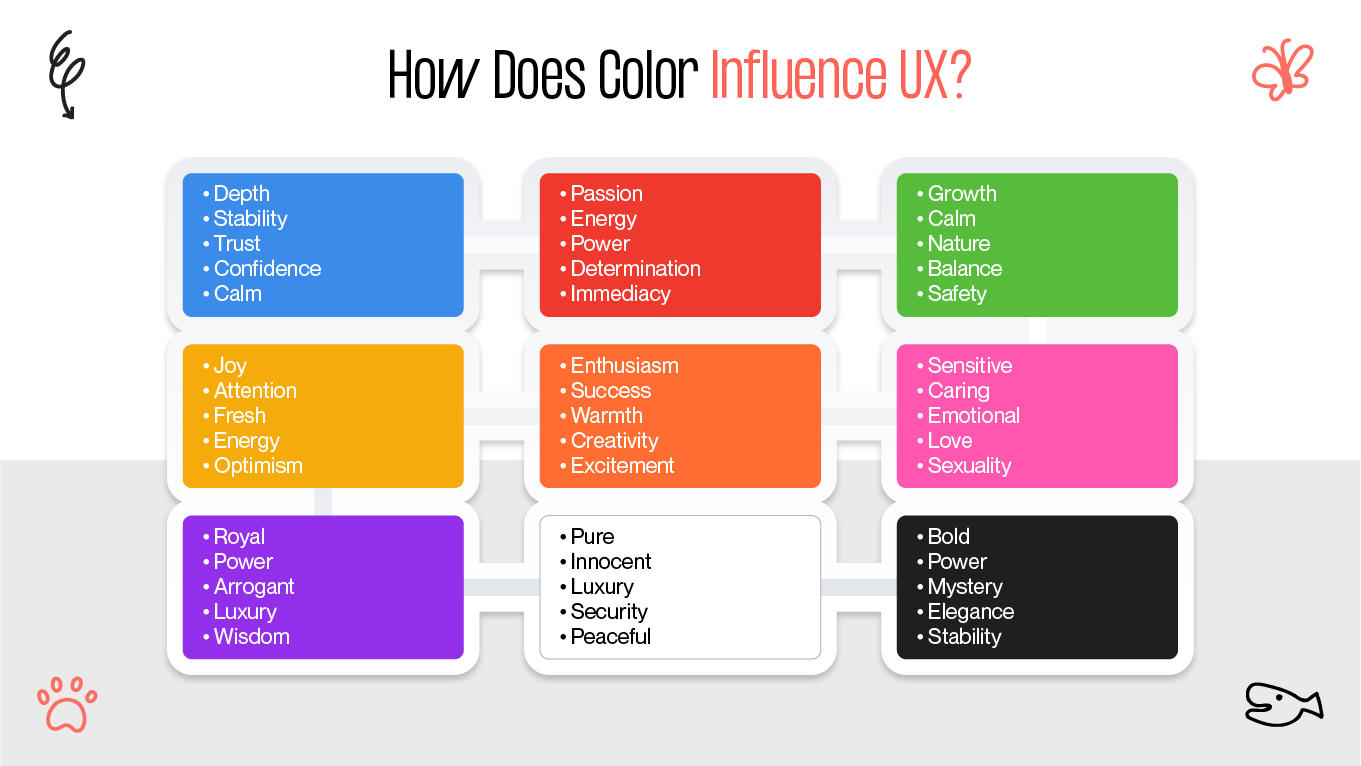
Color is a powerful tool that influences behavior, evokes emotions, and shapes user perception; it is more than simply a visual element. Particularly in the context of visual design and user interface (UI), research indicates that colors influence decision-making, create first impressions, and determine users' feelings about an interface.

Brands employ color psychology UI carefully to establish the mood, communicate their personality, and guide consumers through their journey because they understand this.Thus, as designers, you would frequently encounter inquiries such as —

  • Does this blue feel cold, or does it inspire trust?
  • Will users be overwhelmed by this red button or will it draw attention?

Don't worry, we'll go over everything in this post as we examine the complex science of color psychology and how to use it to your advantage in 2025.

How Does Color Influence UX?

In UI design, color psychology takes into account how users feel, interact, and engage with your product in addition to aesthetics. Actually, a number of studies show that people view blue tones as authoritative and reliable, indicating that color serves as a cognitive trust cue on websites [1].

When designing the product interface, selecting a color or combination of colors requires knowledge of how particular hues elicit particular feelings and actions.

We'll look at important ideas that help us comprehend color psychology UI design in order to gain a better understanding of this.

colors in ui design psychology
color psychology

How colors affect human emotions and behavior

Many brands carefully choose their color schemes to reinforce their identity because certain colors have been scientifically shown to evoke particular emotions. Colors have the ability to evoke particular associations and feelings and are inherently connected to emotions.

For example:

“Red was linked to strong feelings, both good and bad, ranging from passion and 
love to rage and fury. Light and saturated hues are linked to positive emotions, whilst 
darker hues are linked to negative emotions. Colors are great means of expressing 
feelings.” [2]

Colors therefore affect how users view and use your interface.

This table illustrates how each of the primary colors influences a specific emotion.

Color

Associations

Use Cases

Examples

Blue

Trust, calmness, dependability

Common in finance, healthcare, and tech to promote reliability and security

PayPal, Facebook, IBM

Red

Passion, urgency, energy

Often used in sales, CTAs, and food branding to grab attention and evoke excitement

Netflix, Coca-Cola, YouTube

Green

Growth, nature, harmony

Frequently seen in eco-friendly, health, and finance brands to promote balance and well-being

Whole Foods, Spotify, Starbucks

Yellow

Optimism, warmth, creativity

Used by brands targeting youth or aiming to appear playful and innovative

McDonald’s, Snapchat, IKEA

Black

Sophistication, elegance, power

Popular in luxury branding, fashion, and minimalist design

Chanel, Nike, Apple

Orange

Confidence, enthusiasm, friendliness

Common in entertainment, retail, and casual tech to feel accessible and energetic

Fanta, SoundCloud, Amazon

Purple

Imagination, luxury, spirituality

Often chosen by beauty and wellness brands to convey uniqueness and creativity

Cadbury, Twitch, Hallmark


Best Practices of Applying Color Psychology

Digital product color selection is a dynamic process that blends data-driven decision-making with creativity. By tracking important metrics like engagement and conversion rates, color psychology UI A/B testing enables you to compare various color schemes objectively.

Remember that color selection is an iterative process. Don't be scared to make minor changes based on your results and consider seasonal fluctuations to keep your design up to date.

Combining these tactics with a willingness to adapt will ensure that your color choices in the ever-changing digital world will be advantageous to users and your brand identity.

applying color psychology in ui
how to apply color psychology in ui design?

Comprehending color theory

It's essential to comprehend fundamental color theory design before choosing colors. This information offers a strong basis for designing color schemes that work well together:

  • Analogous: Colors that are next to each other on the color wheel, like blue, blue-green, and green, give off a cohesive appearance.
  • Complementary: Colors that are opposite each other on the color wheel, like orange and blue, provide striking contrast and visual impact.
  • Triadic: A bright, well-balanced scheme is produced by three colors that are equally spaced on the color wheel (red, yellow, and blue, for example).
  • Monochromatic: A single color in various tones and shades produces a unified, elegant appearance.

Four color harmony schemes are depicted in color wheel diagrams.

Choosing your color scheme

Start by choosing:

  • Primary color: It should evoke the desired feelings and be consistent with your brand identity. Red for enthusiasm (Netflix) or blue for trust (Facebook) are two examples.
  • Secondary colors: one or two hues that enhance your design and go well with your primary color.

Accent colors are ideal for call-to-action buttons and emphasizing crucial information because they contrast with your primary and secondary colors.

Expert advice: Limit your palette to no more than three to five colors to maintain visual harmony and avoid overwhelming consumers.

Using color theory to achieve equilibrium

Utilize a color theory design to produce designs that are appealing and well-balanced:

  • The 60-30-10 rule states that you should use your primary color for 60% of the design, your secondary color for 30%, and your accent color for 10%.

Recall that hues arouse feelings. For example, green can stand for nature or growth, whereas purple is frequently associated with luxury.

Maintaining uniformity across platforms

Create a thorough brand identity guide that consists of:

  • The color palette consists of primary, secondary, and accent colors and the hex codes that correspond to them.
  • Usage instructions where and how to use each color.

Examples: Use colors appropriately and inappropriately in a variety of contexts.

Make certain that every team follows this guide and that it is applied uniformly across all platforms, including your website, mobile app, social media accounts, and marketing collateral.

Using color tools to refine

Make your color selections more precise by using these resources:

  • Adobe Color: Provides harmony rules and a color wheel for creating and experimenting with color schemes.
  • Coolers: Produce color schemes and let you lock and modify colors.
  • Colorhunt: Offers carefully chosen color schemes for ideas.
  • Paletton: Offers previews of example websites together with a sophisticated color scheme creator.
  • Stark: Simulates color vision deficiencies and validates contrast in design tools.
  • WebAIM Contrast Checker: Checks that background and text color combinations adhere to WCAG guidelines.

With the help of these powerful tools, you can confidently and sensibly pick colors, ensuring that your designs are not only aesthetically beautiful but also useful and approachable.

Color Considerations: Accessibility and Inclusivity

Use colors consistently throughout the product if they have specific meanings in your interface (for example, red for mistakes or green for success). Users with partial color vision can create trustworthy mental models of your interface thanks to this consistency.

“Every concept in a design system must convey a meaning, i.e., what something is 
and why it matters. … Teams have to decide on terms, names, and other things. and 
definitions (a documented, collective understanding of what things are).” [3]

color contrast
accessible vs inaccessible color contrast

The basis of accessible color usage is contrast. Clear guidelines are provided by the Web Content Accessibility Guidelines (WCAG):

  • The WCAG AA standard requires a minimum contrast ratio of 3:1 for large text and 4.5:1 for normal text.
  • The enhanced contrast ratio of 7:1 for regular text and 4.5:1 for large text is the WCAG AAA standard.

Aiming for AAA offers a better experience for more users, including those with low vision or viewing screens in bright environments, whereas AA compliance creates a baseline. Our goal is to consistently meet double-A standards and, if feasible, triple-A standards.

However, statistics only provide a portion of the picture. Contrast problems that calculations overlook are discovered through testing on various devices and under various lighting conditions. In low light or glare, human contrast sensitivity dramatically declines. Older and younger participants performed significantly differently in studies with different luminance levels and glare stimuli, demonstrating that measured lab contrast ratios are not a reliable indicator of user experience in different environments. [4].

We employ this idea in a methodical manner. Error states include an icon, explicit text, and red coloring. In addition to color coding, charts also show patterns. Both color shifts and structural alterations are used in selection states. There are several ways to comprehend because of this redundancy.

Our UI/UX design services are based on research, accessibility contrasts, and real-world testing to make sure your interface speaks clearly to every user, in every situation. We can assist you if you're looking to create digital products that are inclusive, accessible, and visually consistent.

Summary

Color is a language your interface speaks before any words are read; it's much more than just decoration. Your color selections subtly affect how people feel, behave, and recall your brand, for example, using blue to inspire trust or red to compel action. For this reason, deliberate, research-based color design is not a choice, it is a necessity.

You can get past guesswork by knowing the psychology of color. Your color choices become effective instruments for emotional impact, clarity, and usability when combined with user testing, accessibility guidelines, and consistent design systems. Creating inclusive, visually meaningful experiences is now a differentiator in today's cutthroat digital environment, not just a nice-to-have.

References

  1. Hall, R., & Hanna, P. (2004). Color matters: Color as a trustworthiness cue in websites. Retrieved from https://www.researchgate.net/publication/233605112_Color_Matters_Color_as_Trustworthiness_Cue_in_Web_Sites
  2. Elliot, A. J., & Maier, M. A. (2025, January 15). Consistent color-emotion correspondences across 128 years. Psychology Today. https://www.psychologytoday.com/us/blog/color-psychology/202501/consistent-color-emotion-correspondences-across-128-years
  3. Adobe. (n.d.). Designing design systems: A framework for names, terms, and definitions. Adobe Design. https://adobe.design/stories/design-for-scale/designing-design-systems-a-framework-for-names-terms-and-definitions
  4. He, Y., & MacLeod, D. I. A. (2006). Contrast sensitivity under different lighting and glare conditions. Vision Research, 46(17), 2897–2905. https://pubmed.ncbi.nlm.nih.gov/16699441/

Rate this article

20 ratings
Average: 4.9 out of 5

If you like what we write, we recommend subscribing to our mailing list to always be aware of new publications.

Do you have any questions? We tried to answer most of them!