Why Cross-Platform UX Design Matters

6minutes read
cross-platform ux design

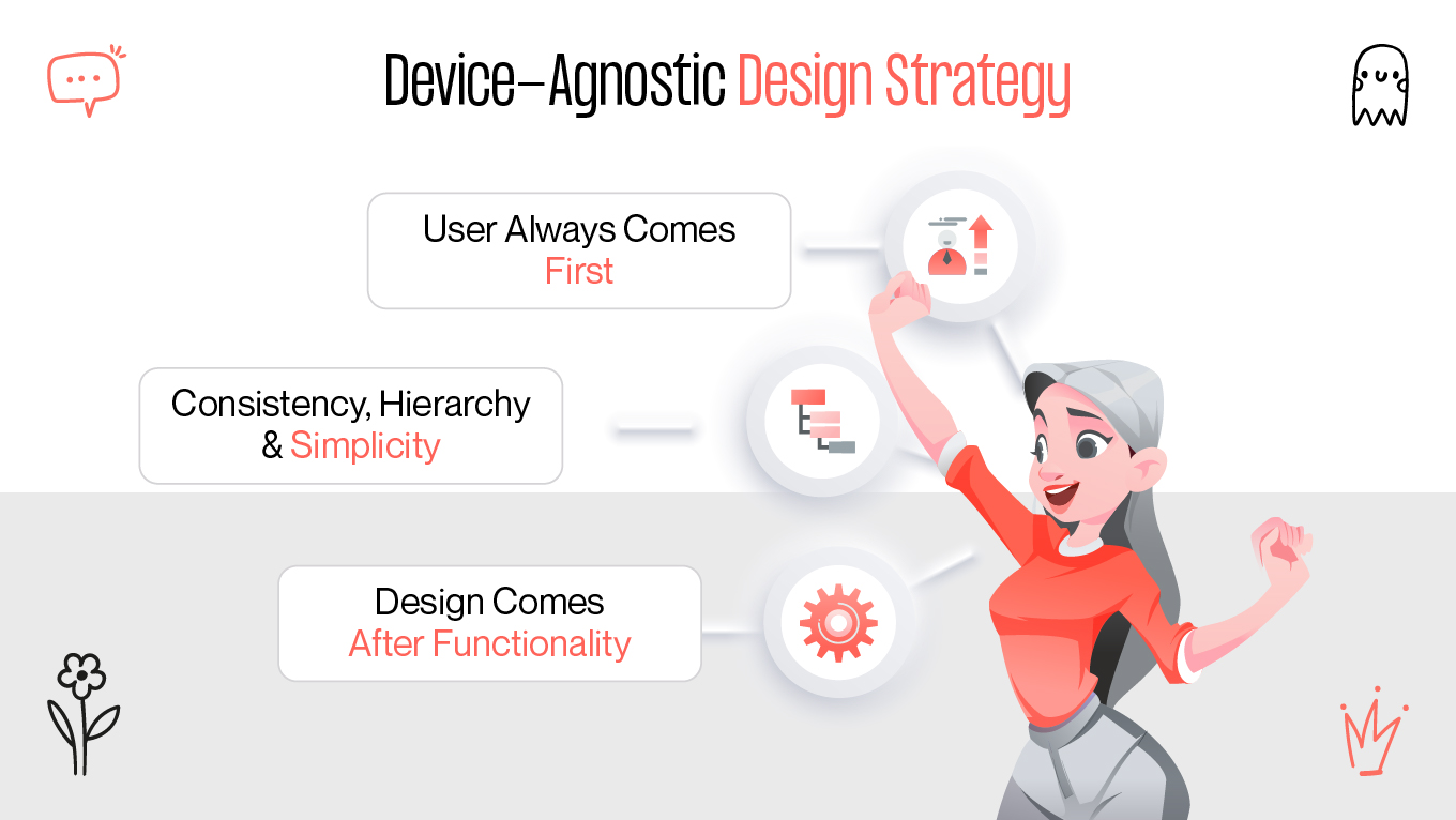
The user experience (UX) is influenced by every interaction consumers have with your brand and product. For example, the landing page that introduces visitors to your product or service, the onboarding and signup process, and every feature or component inside your product all have an impact on UX and how people perceive your brand.

The user experience frequently dictates whether customers churn, convert from free to premium, and stay on the site. Cross-platform UX design is a concept that applies to all teams and roles in an organization, but it is especially important for product teams.

Creating a Device-Agnostic Design Strategy

Device-agnostic design is a method that takes into account the dynamic nature of the web and user behavior; it is comparable to responsive design and progressive enhancement, and it can contain elements of both. You design for the lowest common denominators and improve your ideas where you can, instead of creating content for a certain device, resolution, browser, or even connection speed. The following are the fundamental ideas:

device-agnostic ux strategy
device-agnostic design principles


The user always comes first

"The user comes first" is the most important premise in UX design. Although it might seem apparent, it's important to bring up given the numerous internal goals and responsive behavior that product teams must deal with.

Consistency, hierarchy, and simplicity

Users can quickly and easily find what they're searching for and accomplish their goals with simple, hierarchical, and consistent UX design. To bring consumers where they want to go, your product should, whenever possible, use the simplest actions, the simplest copy, and the simplest design.

Design comes after functionality.

Product function comes before product design, which is another distinction between UI and UX: UI is concerned with how your product looks, but UX is concerned with how it works.

From this point on, you should concentrate on the construction bricks instead of the pages. creating modular design sets that enable the construction of multiple models. You must be aware of what you are building and what each model will require and look like. Although bespoke elements are occasionally required, you want to be able to reuse as many pieces as you can and avoid having too many of them.

Personalization in Cross-Platform UX

The who, why, what, and how of product use should all be taken into account as a UX designer. The "why" refers to the reasons why users choose to adopt a product, whether they have to do with a task they want to complete or with values and opinions they connect with using and owning the product. The "what" talks about a product's functionality, or what users can accomplish with it. Last but not least, the how connects to the design of functioning in a way that is both aesthetically pleasing and accessible [1].

personalization in cross-platform ux principles
personalization ux key strategies

Research

This initial phase is crucial to establishing your objectives and selecting the platforms you wish to invest in, so don't be afraid to invest some time in it. You probably don't need your app to be widely available. Understanding your target audience and the devices they prefer will help you concentrate your efforts on creating a cross-platform experience that has a greater impact.

To do this, consider your target audience and pose pertinent queries, such as:

  • "How many people could use more than one platform or device daily?"
  • "Is location a factor in platform selection?"
  • "Which platforms offer your product the biggest potential user base and market share?"

You may save time and money by conducting user research and gaining insightful knowledge.

Consistency

For the best user experience, your cross-platform application must have a uniform interface. People will find it easier to navigate and use the product efficiently if it is represented with consistent UI and interaction design, performance, and features [2]. This crucial element lowers learning curves and fosters a sense of continuity, which eventually increases user loyalty and engagement.

To attain the proper consistency, designers must strike a balance with native layouts and patterns.

Prioritization

Information architecture prioritization describes how you arrange layouts and content to satisfy user needs. Users using desktop computers and smart TVs have greater screen real estate, but content on smaller screens needs to be organized and prioritized. Designers must incorporate UI space-saving patterns like expandable cards, dropdown menus, FABs, hamburger menus, and adaptive navigation.

To improve familiarity, however, make an effort to arrange and structure the content consistently for personalization.

Prototyping Tips for Seamless Cross-Device Experiences

A version of your product with enough features to enable testing and feedback from your initial users is called a prototype, or minimum viable product (MVP). Although the prototype usually doesn't resemble the final product, it gives an idea of how it will function.

prototyping for cross-platform ux

Low-fidelity prototypes are crude and simplified versions of the product that emphasize the essential features and layout. Low-fidelity prototypes, despite their lack of visual fidelity, may be made quickly and cheaply, enabling designers to test out several design ideas and quickly iterate in response to feedback. Before spending time and money on higher-fidelity iterations, they are especially helpful in the early phases of the design process for idea validation and obtaining preliminary user input.

High-fidelity prototypes, which frequently closely resemble the finished product, provide a comprehensive and well-designed depiction of a product's functionality and user interface. They offer a thorough sneak peek at the user experience by combining lifelike graphics, interactivity, and animations. Because they provide a clear picture of the eventual product's appearance and feel, these prototypes are useful for stakeholder presentations, user testing, and developer handoff.

Teams can efficiently adjust to shifting user needs and market circumstances thanks to this iterative methodology, which promotes flexibility and agility.

Final Thoughts: Making Cross-Platform UX Work for Your Users

It takes a methodical approach to cross-platform UX design that strikes a balance between platform-specific optimization and consistency. Early friction point identification is made possible by incorporating analytics-driven insights and iterative testing, which enables UX strategies to dynamically adjust to user context and behavior.

At Gapsy Studio, we combine interactive innovation, technical scalability, and design supported by research to produce experiences that function consistently across platforms. Follow up with us to learn more about practical tactics and cross-platform UX best practices and how they may improve the user experience of your product.

References

  1. https://www.interaction-design.org/literature/topics/ux-design?srsltid=AfmBOoqOpTQaTaAEmnhkvSsw24IesxDMyhnRq3UNCg7d-n9m3RNATsrk 
  2. https://www.researchgate.net/publication/313895940_Cross-platform_user_experience 

Rate this article

20 ratings
Average: 4.9 out of 5

If you like what we write, we recommend subscribing to our mailing list to always be aware of new publications.

Do you have any questions? We tried to answer most of them!