Dark Mode Design Challenges & How to Overcome Them

7minutes read
dark mode challenges

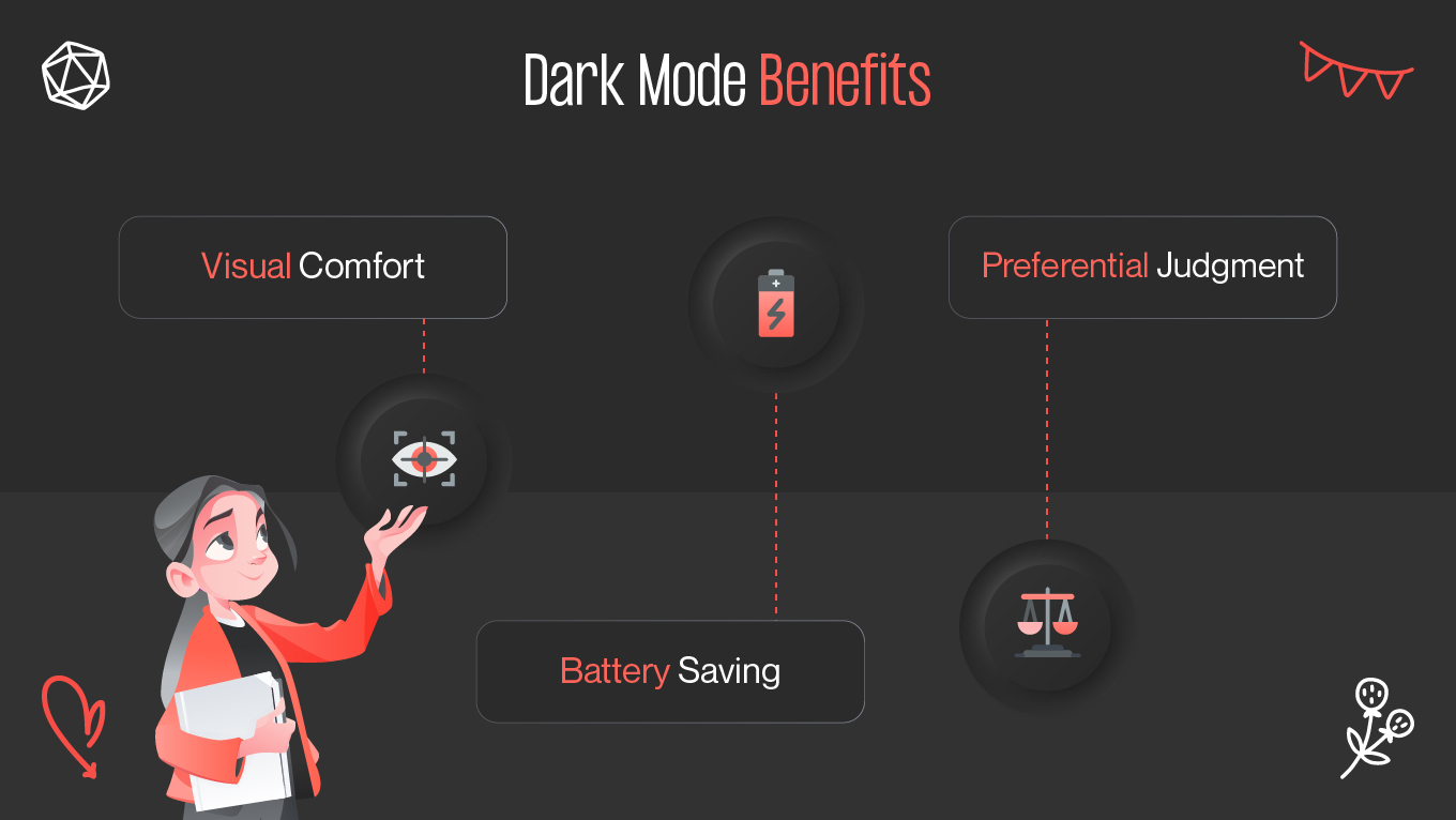
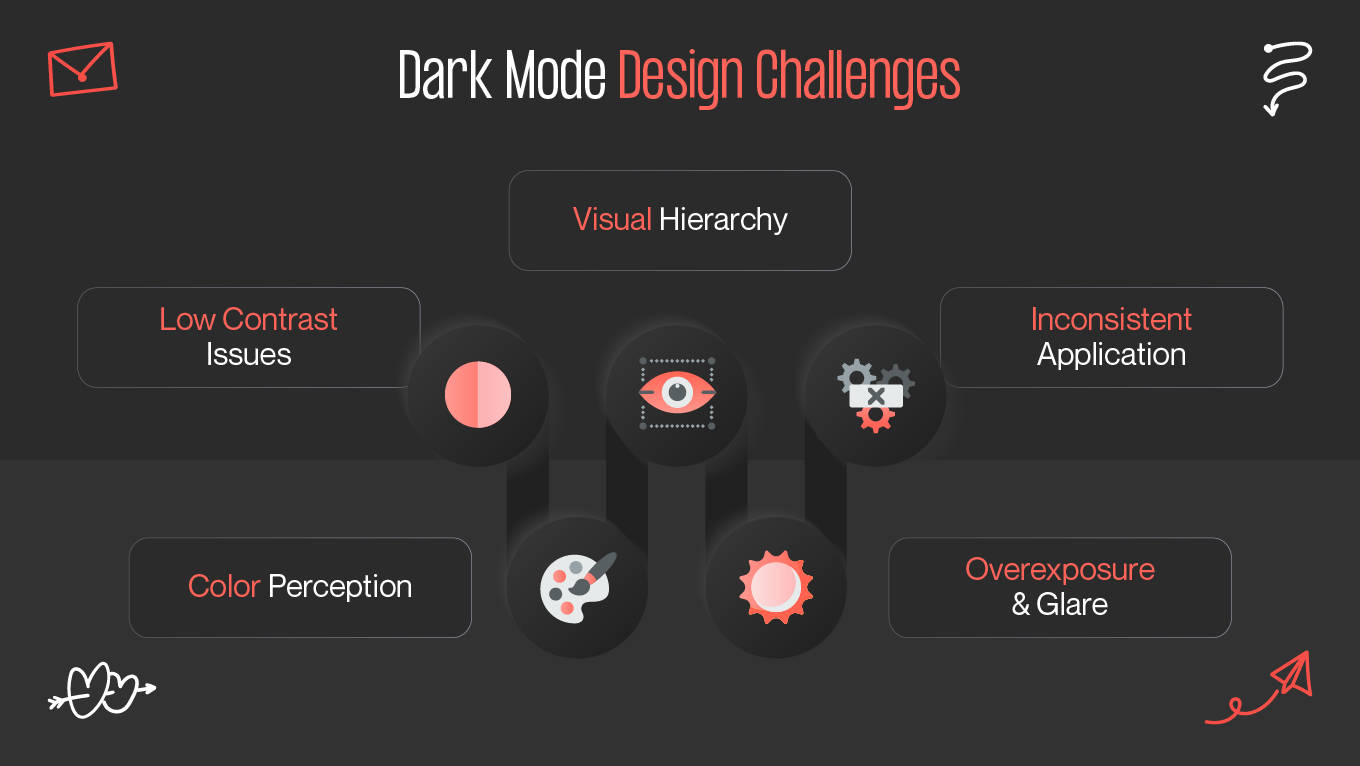
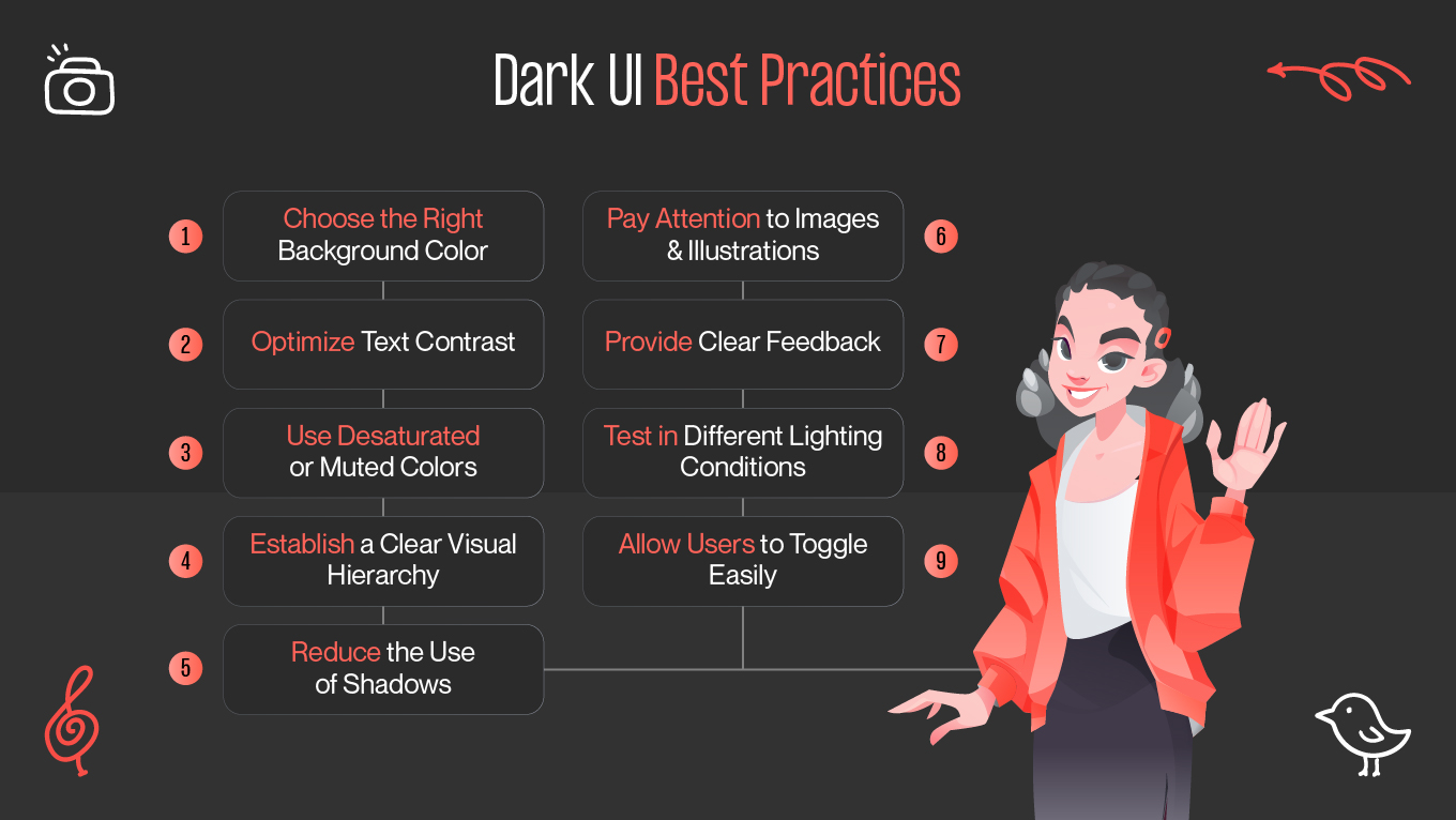
One of the most well-liked UI design trends nowadays is dark mode, which provides a visually appealing substitute for the conventional light-themed interface. Users are starting to expect branding in dark mode as a normal feature since most operating systems, apps, and websites now offer it. But it's not as easy as switching colors from light to dark when designing for dark mode. To guarantee usability, readability, and a visually pleasing experience, careful design considerations are necessary.

We'll discuss the dark mode design challenges in this blog and offer best practices for making functional, approachable dark mode user interfaces.

The Rise of Dark Mode

Dark mode, sometimes referred to as "night mode," is a display setting in which the text is light, usually white or light gray, and the background is dark, usually black or dark gray. The classic light mode, which shows dark text on a light background, is reversed here.

Users favor dark mode for a number of reasons:

  • Visual Comfort: Dark mode is more aesthetically pleasing, especially in dimly lit areas. It lessens eye strain by lowering the amount of bright light that screens generate, particularly at night.
  • Battery Saving: Dark mode can help extend the life of batteries on smartphones with OLED screens. Dark mode saves power since OLED screens switch off pixels to show black.
  • Preferential Judgment: A lot of users just like how branding in dark mode looks. It may provide websites and apps a slick, contemporary, and businesslike appearance.

Dark mode is expected by 2025 and is no longer a feature. This design trend is obviously here to stay, as evidenced by Google's Material Design standards and Apple's system-wide dark mode.

Common Design Challenges

It offers a distinct set of dark mode design challenges in spite of its advantages. Dark mode can cause eye strain, poor reading, and usability problems if it is not well designed. The following are some of the main obstacles that designers encounter:

Low Contrast Issues

Making sure that the text and background elements contrast properly is one of the biggest issues in dark mode design. Although light-on-dark lettering can appear crisp, too little contrast makes it hard to read and can cause eye strain. On the other hand, an excessively high contrast (such as pure white writing on a pure black backdrop) may produce a jarring visual experience.

The challenge is to strike the ideal mix between readability and contrast without making people uncomfortable.

Color Perception

On dark backgrounds, colors behave differently than on light ones. On a dark background, bright colors can become overpowering and startling, while muted hues can look washed out or hard to tell apart.

The challenge is to modify the color scheme for dark mode without sacrificing visual appeal or brand identification.

Visual Hierarchy

Using bright colors, gradients, and shadows in light mode aids in creating a distinct visual hierarchy. These methods don't usually work well in dark mode, either. For instance, shadows are less noticeable on dark backgrounds, which makes it more difficult to distinguish elements and add depth.

The challenge is to differentiate elements and provide a clear visual hierarchy in dark mode without using conventional design signals like shadows.

Overexposure and Glare

Overexposure can result from bright items on a dark background, producing a blinding impact that detracts from the user experience. This is particularly prevalent when huge text, buttons, or icons are very bright in dark mode.

The challenge is to reduce glare while keeping key user interface elements visually clear.

Inconsistent Application

Because dark mode isn't applied consistently throughout the interface, many branding in dark mode end in failure. A fragmented experience may result when just portions of an application or website are created in dark mode but other pieces maintain their light mode characteristics.

The challenge is to make sure that dark mode is implemented consistently throughout the user interface, including in the text, backdrops, controls, and icons.

Best Practices for Dark UI

Designers must adhere to dark UI best practices that guarantee readability, usability, and visual harmony in order to overcome the difficulties presented by dark mode. The following are essential rules for creating dark mode interfaces that work:

Choose the Right Background Color

For a dark mode background, pure black (#000000) would seem like the natural choice, but it's typically too harsh. Choose dark grays (like #121212 or #181818) instead. These deeper hues are more aesthetically pleasing and offer superior contrast with text and user interface components.

To lessen glare and eye strain, use a very dark gray for the background rather than complete black.

Optimize Text Contrast

Pure white (#FFFFFF) should not be used for text in dark mode since it can produce too much contrast and strain the eyes. Instead, to lessen the contrast without compromising legibility, use lighter grayscale (such as #E0E0E0 or #B0B0B0).

The Web Content Accessibility Guidelines (WCAG) propose that body text have a contrast ratio of 4.5:1 to 7:1.

Use Desaturated or Muted Colors

Avoid using fully saturated colors because they tend to appear more strong on dark backgrounds. Choose subdued or subdued hues of your primary color scheme instead. This method makes sure buttons and links stand out while maintaining a softer, more balanced appearance in dark mode.

To prevent producing an overpowering or startling visual experience, test your color selections in dark mode and modify their saturation.

Establish a Clear Visual Hierarchy

Consider employing different techniques to provide a visual hierarchy and depth because shadows are less effective in dark mode. Darker hues should be used for background items and lighter or brighter colors for foreground elements. Separating layers of content can also be aided with gradients, delicate borders, and contrasting colors.

To show hierarchy, use different brightness levels. For example, make the main buttons lighter and the secondary items darker.

Reduce the Use of Shadows

Shadows aid in indicating layering and elevation in light mode. However, in dark mode, shadows could be hardly perceptible against the dark backdrop. Consider employing delicate highlights, glows, or border contrasts to convey depth rather than depending solely on shadows.

If shadows are required, utilize low opacity, extremely soft, delicate shadows to prevent harshness in dark mode.

Pay Attention to Images and Illustrations

It can be challenging to use images and artwork in dark mode, particularly if they were created for light backdrops. Images in dark mode may lose detail or exhibit color aberrations. Make sure your photos are compatible with both settings, or if necessary, make assets specifically for the dark mode.

Make sure logos and icons are visible and contrasted against dark backgrounds by using transparent PNGs for images.

Provide Clear Feedback for Interactive Elements

Buttons, links, and other interactive elements must be noticeable in dark mode without being too bright. To indicate interaction, use distinct states (such as hover, focus, and active) and take into account color, opacity, or little animations.

To draw attention to interactive features, use brighter hues or delicate illuminating effects, but make sure they aren't overpowering or overwhelming.

Test in Different Lighting Conditions

Although it can be used during the day, dark mode is frequently utilized in low light conditions. You can make sure your dark mode design functions successfully in a variety of situations by testing it in different lighting settings. A design that looks fantastic in a dark space, for example, could appear too gloomy in a bright setting.

To guarantee a seamless and comfortable experience overall, test your dark mode design in both light and dark settings.

Allow Users to Toggle Easily Between Modes

Users should be able to switch between bright and dark modes with ease if dark mode is implemented successfully. This allows users to customize their experience according to their comfort level and surroundings. Ensure that the toggle can be easily located and accessed from anywhere in the program.

When feasible, sync dark mode with system preferences so that users can switch between modes automatically according to their device's settings.

Final Thoughts

Dark mode is a chance to enhance the user experience, particularly in dimly lit areas. However, contrast, color behavior, and visual hierarchy must all be carefully considered when creating an effective dark mode. Designers may produce aesthetically pleasing and intuitive dark mode interfaces by following dark UI best practices and testing designs in a variety of scenarios.

Dark mode presents particular difficulties, but it also has the ability to boost user involvement and enjoyment. In addition to satisfying user preferences, offering a well-designed dark mode improves accessibility, lessens eye strain, and may even prolong battery life on OLED devices. In the end, a well-considered dark mode design makes the digital experience more welcoming and cozy for every user.

Rate this article

20 ratings
Average: 4.9 out of 5

If you like what we write, we recommend subscribing to our mailing list to always be aware of new publications.