Insights into Dark UX Practices: What to Watch For

7minutes read
dark ux practices

Ever stumbled upon a website that somehow trapped you into buying something you didn’t want, or worse, signing up for a subscription you didn’t even notice? Welcome to the shadowy world of dark patterns UX—strategies deliberately designed to trick users into doing things they might not want to do. 

While UX design usually focuses on improving user experiences, dark UX practices have a more sinister intent. So, what is a dark pattern? Gapsy pulls back the curtain and reveals the tricks some platforms use, how they work, and what you should watch for.

How do Dark Patterns Work?

Before we dive into the different types of dark patterns, let's start with a key question: Whats a dark pattern, and how do these sneaky tricks actually work? Dark patterns take advantage of human psychology—our habits, impulses, and assumptions. By using familiar visual cues, misleading wording, or deceptive layouts, dark patterns can manipulate users into making decisions that benefit the company but not necessarily the individual. These practices often hide in plain sight, camouflaged as seemingly harmless design features.

how do dark patterns ux work
dark ux principles definition

Ever clicked a big, shiny button, only to realize it wasn't what you thought? Or did you find an option to opt out of something buried in the fine print? These small, seemingly insignificant tweaks work because our brains take shortcuts to avoid cognitive overload. While you might feel a twinge of unease after realizing you’ve been tricked, dark patterns are designed to make it just easy enough for you to comply.

Types of Dark Patterns

Dark UX comes in various forms, each sneakier than the last. Let’s break down some of the most notorious offenders so that you can identify them before falling victim to their traps. Here are some dark patterns examples:

Deceptive Interfaces

Imagine browsing an online store for new sneakers. You see a “limited-time offer” banner, complete with a countdown timer ticking away the minutes until this once-in-a-lifetime sale expires. Your heart races—should you buy now before it's too late? You panic, click “buy now,” and proceed to checkout without a second thought. But was the timer real? Probably not. 

Deceptive interfaces, or bait-and-switch patterns, rely on false urgency or misleading visuals to push users toward quick, often ill-informed decisions. These dark patterns in UX prey on your fear of missing out, making you believe that if you don’t act immediately, you’ll lose out on a great deal. Here is bait and switch dark pattern example:

deceptive interfaces dark pattern
deceptive interface example

Forced Actions

This tactic is all about forcing users into making unnecessary commitments—often involving personal data—before they even know whether the service is worth it. What’s worse, forced actions can also include making you agree to terms and conditions that you don’t fully understand or clicking through a labyrinth of unnecessary steps just to proceed. 

Ever noticed how some apps require permissions for things like accessing your contacts or location, even though those features have nothing to do with the app’s core function? That’s forced action in its sneakiest form, making you give up privacy in exchange for access you didn’t realize came with a hidden cost. It turns an eager user into a captive participant, often locking you into decisions you weren’t ready to make.

Hidden Costs

Hidden costs are UI dark patterns designed to exploit the fact that by the time you’ve reached the checkout, you’re already emotionally and mentally invested in the purchase. After spending so much time researching and choosing products, abandoning the cart now seems like a waste. This tactic banks on the fact that, once users are so deep in the buying process, they’ll feel compelled to just "go with it," even if they feel deceived. 

hidden costs dark pattern
hidden costs example

Some companies may even add extras to your order by default—like warranties or subscriptions—and you’ll have to carefully uncheck these options to avoid paying for services you didn’t want in the first place. Hidden costs can also appear after you’ve entered your payment information, pushing you past the point of no return and leaving you feeling trapped and cheated.

Disguised Ads

Disguised ads are one of the dark pattern examples that are deliberately designed to blend in with the surrounding content, making it difficult to distinguish what’s genuine from what’s paid promotion. This can include “related content” sections that are actually ads, buttons that appear to be part of the website navigation but lead to third-party sites, or even misleading headlines that trick users into thinking they’re about to read more content.

disguised ads dark pattern ux
disguised ad example

These sneaky ads create a frustrating experience where users feel tricked into engaging with promotional material when looking for relevant information. The goal is to make users click without realizing they’re being advertised, hoping that curiosity will override annoyance. After all, if the user has already clicked, they’re more likely to stay on the page, even if they feel slightly duped.

Roach Motel

Picture this: signing up for an online service is a breeze—just a few clicks and you’re in! But when are you trying to cancel the subscription? It’s a labyrinth. This roach motel tactic makes it easy to get in but nearly impossible to get out. 

Companies often hide cancellation options deep within layers of menus, requiring multiple steps and, in some cases, even making users call customer service to unsubscribe. They’re hoping that by making it harder, you’ll just give up and keep paying.

Forced Continuity

Have you ever signed up for a free trial and forgotten to cancel it before the trial period ended, only to be charged? That’s forced continuity at play. Users are automatically billed after a trial period, and companies often make it difficult to cancel or remind you too late. The automatic billing takes advantage of your forgetfulness, binding you to a service you no longer want or need.

Canceling can only be done via phone, after waiting on hold for hours. The company hopes users either won’t notice the charges or will be too lazy or frustrated to go through the cancellation process—leaving the company to profit from your forgetfulness quietly.

Confirmshaming

"Are you sure you want to leave and miss out on this amazing deal?" These guilt-inducing tactics are called confirmshaming—using emotionally manipulative language to make you feel bad about declining an offer or opting out of service. By framing the alternative as something foolish, companies make you second-guess your decision and try to manipulate your emotions into compliance.

confirmshaming dark ux pattern
confirmshaming example

You might have been perfectly content with your decision before, but after seeing the guilt-laden prompt, you start to feel like you’re making a bad choice, which can lead you to click "okay" just to avoid feeling bad. This tactic preys on emotional vulnerability and subtly pressures users into doing things they wouldn’t normally agree to.

Trick Questions

When filling out an online form, have you ever encountered unnecessarily confusing questions? Maybe an opt-out checkbox for marketing emails was worded in a tricky way: "Uncheck this box if you don’t want to receive future promotions."

They rely on the idea that users skim text rather than reading it in detail, which allows companies to sneak in permissions for things like spammy email marketing or data sharing. What seems like a simple yes-or-no question is a cleverly disguised trap aimed at tricking users into giving up more than they realize.

Negative Consequences of Dark Patterns

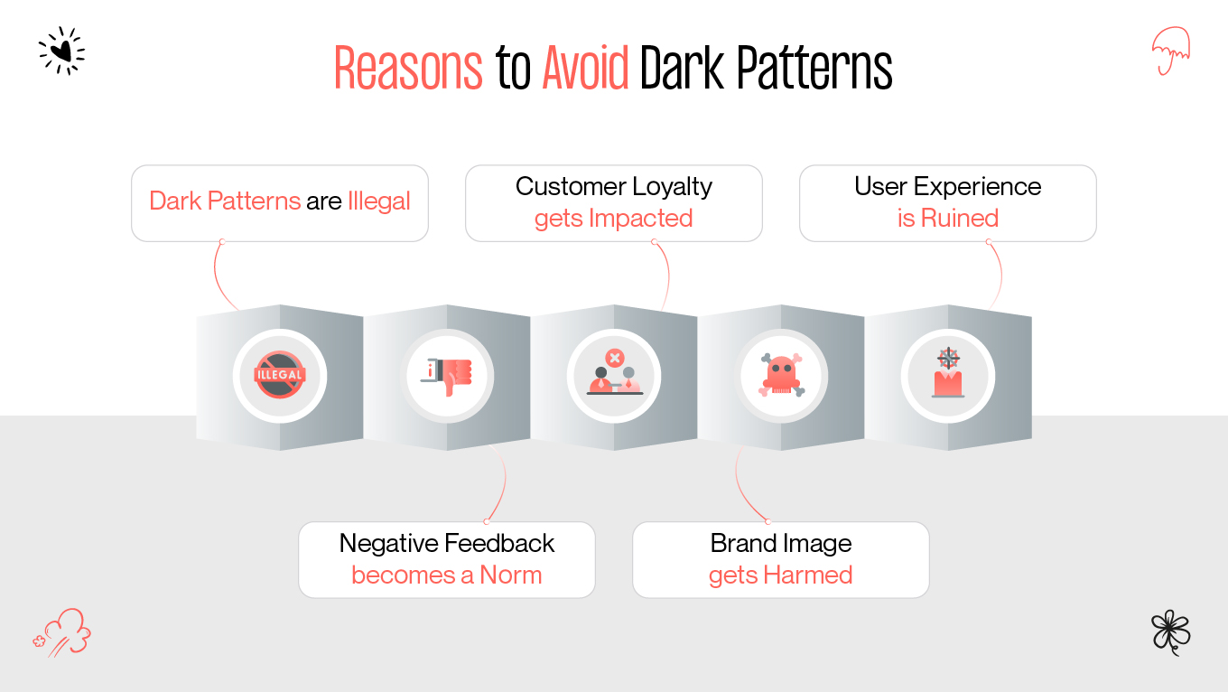
If dark patterns didn’t come with consequences, they wouldn’t be a problem. Unfortunately, the effects can be far-reaching and deeply problematic for users and businesses. Dark UX practices erode trust between users and platforms, which can lead to:

  • User frustration and loss of loyalty. Once users catch on to deceptive practices, they’re likely to abandon the service or brand entirely.
  • Legal implications. Some dark patterns design are borderline illegal. The European Union’s GDPR, for instance, cracks down on manipulative consent forms and cookie agreements.
  • Brand reputation damage. Negative word-of-mouth travels fast. One bad experience can easily lead to viral complaints on social media, tarnishing a company’s image.
reasons to avoid dark patterns
why to avoid dark ux principles?

In the long run, any short-term gains from dark patterns can be outweighed by the long-term damage they cause to a company’s credibility.

Ethics and Responsibility

At the heart of this debate lies a moral dilemma: Should businesses prioritize profits over user trust? It’s tempting for companies to use dark UX strategies to drive conversions or increase user engagement. The question becomes even more critical as users grow increasingly savvy about their digital rights and are quicker to call out unfair or unethical behavior.

Role of UX Designers

Designers hold significant power when it comes to shaping the user experience. That’s why it’s crucial for designers to not only be aware of dark patterns but to resist their use actively.

As a UX designer, your role isn’t just to create an intuitive, seamless experience—it’s also about ensuring ethical design choices. Designers must recognize the fine line between persuasive design and manipulative tactics, opting to craft experiences that prioritize user well-being over corporate profit.

How to Avoid Using Dark Patterns

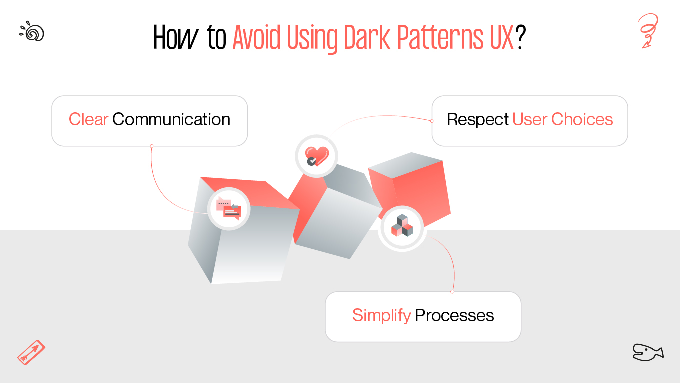
The best way to avoid a dark pattern is by fostering transparency and trust. Here are some key practices for designing ethically sound user experiences:

how to avoid dark patterns ux?
how to avoid dark ux principles?
  • Clear communication. Always be upfront about costs, commitments, and outcomes. Make sure users understand what they’re signing up for.
  • Simplify processes. If users want to cancel a subscription, make the process as easy as signing up. Avoid trapping them in frustrating loops.
  • Respect user choices. Give users control over their data and preferences without guilting them into decisions. Provide straightforward opt-out options and avoid emotional manipulation.

By adhering to these principles, designers can avoid falling into the trap of dark patterns and instead build lasting, trustworthy relationships with users.

Conclusion

Dark UX patterns may seem like clever tricks to boost engagement and revenue, but their negative impact on user trust and satisfaction can’t be ignored. Whether it’s deceptive interfaces, forced continuity, or hidden costs, these tactics prioritize short-term gains at the expense of long-term relationships.

As users become more aware of dark patterns, businesses and designers face a pivotal decision: continue down the path of manipulation or embrace ethical, user-centered design that values transparency and trust. The choice is clear for those who care about their users. Gapsy Studio will help you build your users' trust. Our experienced team crafts unique designs to meet the target audience's needs. Check our portfolio and contact us today to collaborate!

Rate this article

20 ratings
Average: 4.9 out of 5

If you like what we write, we recommend subscribing to our mailing list to always be aware of new publications.

Do you have any questions? We tried to answer most of them!