Designing for Accessibility: How to Build Inclusive Interfaces

10minutes read
design-for-accessibility

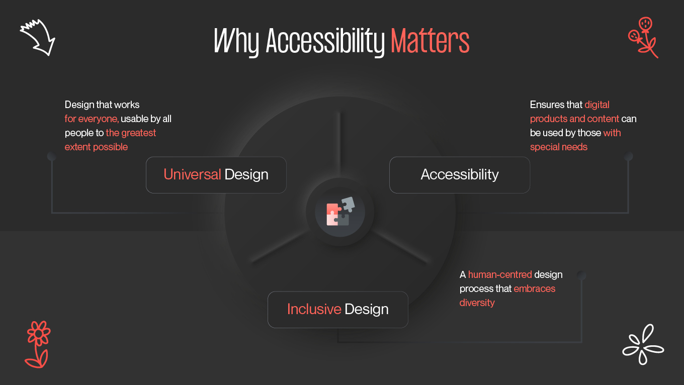
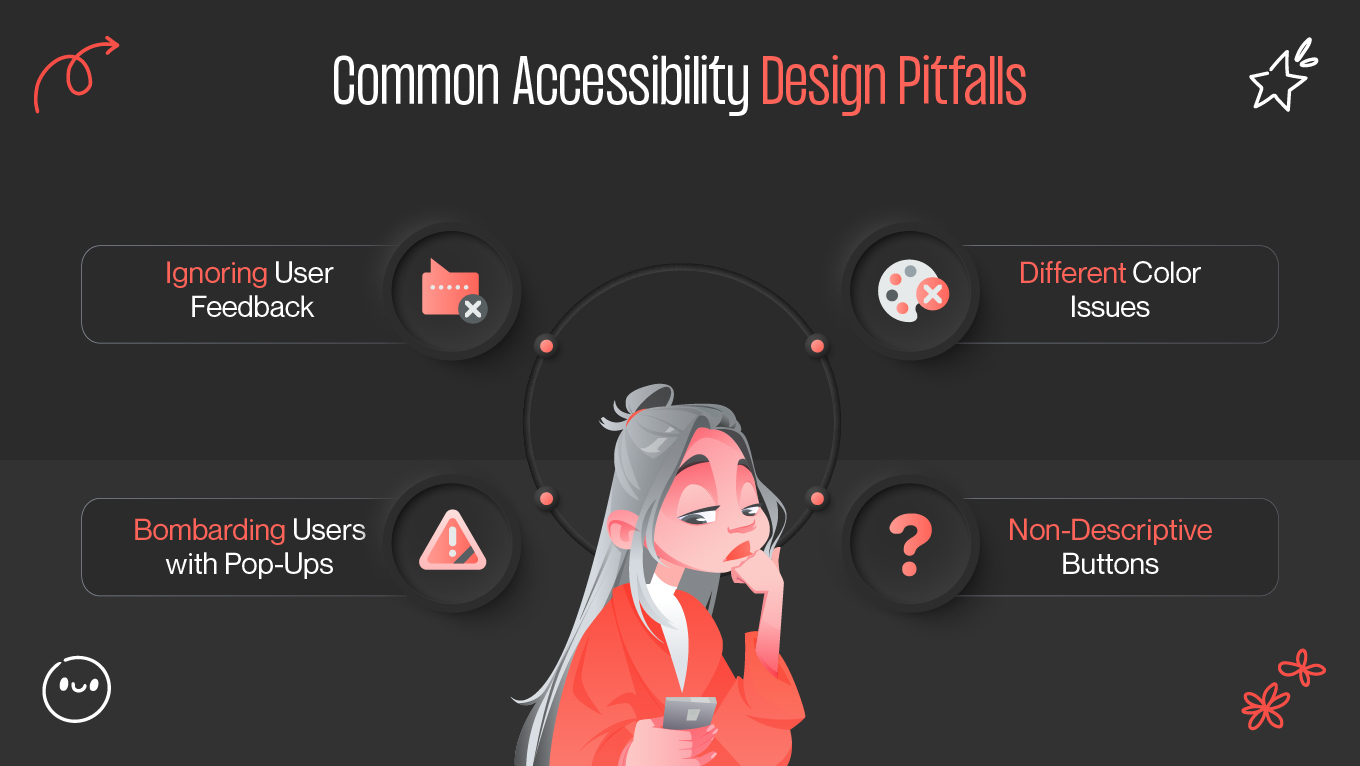
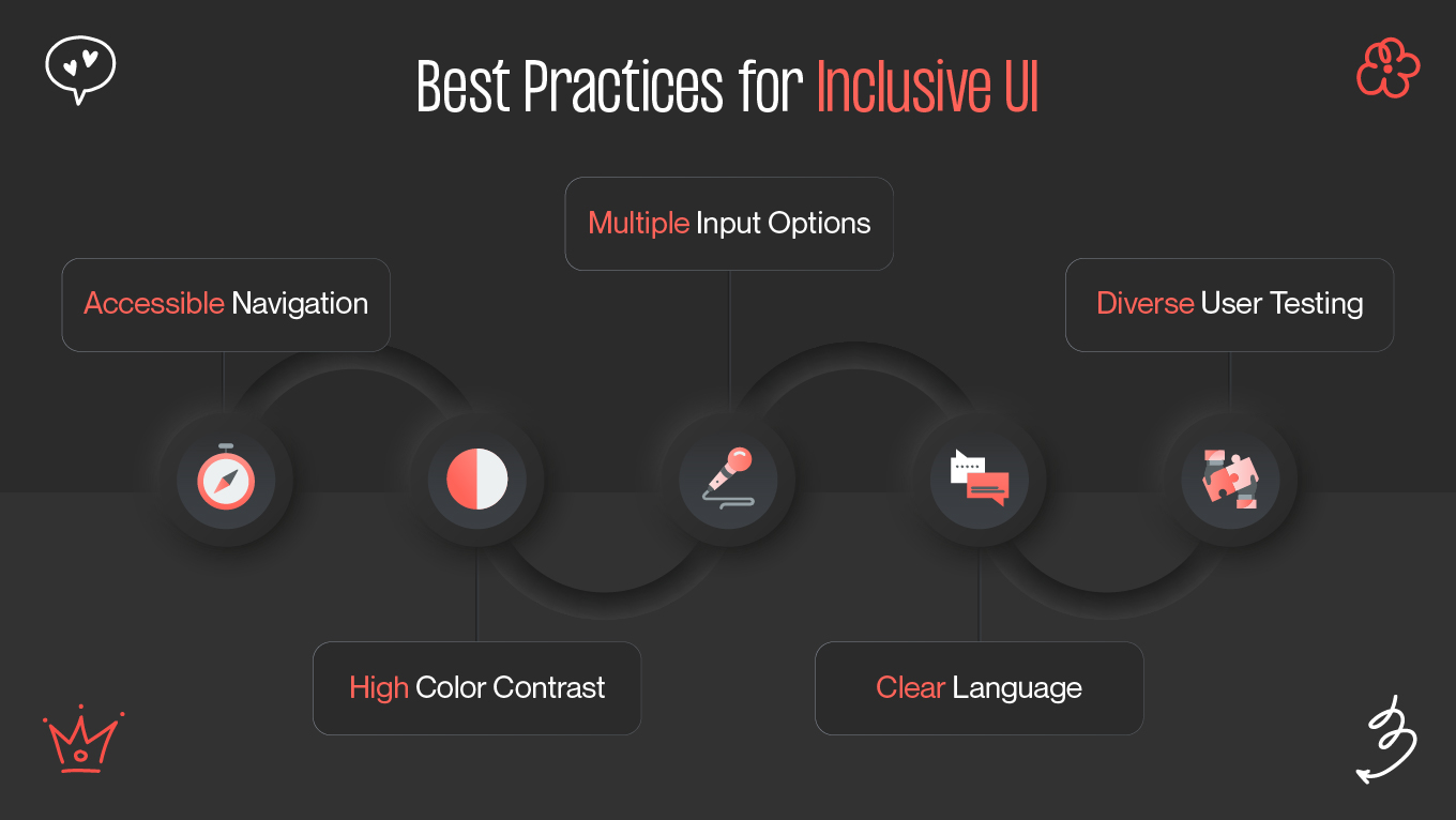
In today's interconnected world, it is essential to be inclusive while creating user interfaces (UI) and user experiences (UX)! The main objective is to create programs that are entertaining for all users, irrespective of their demands or identities. When your program has an inclusive UI/UX design, anyone can use and enjoy it without any problems or unfair treatment.

Therefore, this post will discuss the importance of inclusivity in UI/UX design as well as how to develop an application that respects all of its users. Let's begin, then!

Why Accessibility Matters

Why Accessibility Matters
Caption

A broader range of people, including those with visual, auditory, cognitive, or movement disabilities, can use items with accessible design. Moreover, everyone's experience is frequently enhanced by accessible designs. Enhancements to usability for users in a variety of situations (e.g., in bright sunshine, noisy environments, or on small screens) include features that aid individuals with disabilities, such as larger font, stronger contrast, and easier navigation.

Video subtitles, for instance, are helpful for those with hearing impairments as well as for those who might not want to listen to audio in a quiet environment or when multitasking. Solutions that benefit a wider audience are frequently the result of designing for accessibility. However, inclusive design takes into account the varied demands, backgrounds, and experiences of people in addition to accessibility.

Legal and Ethical Reasons

Ignoring accessibility can have major legal repercussions. Laws in many nations mandate that digital products adhere to accessibility guidelines. For example, the Americans with impairments Act (ADA) in the United States requires that digital services and websites be accessible to individuals with impairments. In a similar vein, websites and apps in the public sector are required to adhere to the Web Accessibility Directive (WAD) of the European Union.

When UX designers neglect accessibility, their businesses run the danger of being sued, fined, or having their reputations harmed. Following accessibility guidelines such as the Web Content Accessibility Guidelines (WCAG) is essential to preventing these problems.

Common Accessibility Pitfalls

Technologies and standards for accessibility are always changing. Maintaining accessibility requires keeping up to date and being prepared to modify designs in response to user input and emerging trends.

Common obstacles that might make digital experiences unsuitable for some people include inadequate spacing, bad font, and a failure to account for color blindness when designing for accessibility. To guarantee usability, input from a wide range of consumers must be taken into account.

The ability of a user to interact with a product can be greatly impacted by accidental barriers, which may not be immediately apparent but can be found through thorough user testing. Observe:

  • Typefaces should be readable and clear.
  • Make sure to provide enough room between touch targets.
  • Add to color cues by using textures or patterns.

By utilizing inclusive design principles from the outset, innovative interaction design makes the experience easier for individuals with disabilities. Designers can promote continuous progress by making a commitment to lifelong learning and maintaining an open line of communication with the accessibility community.

Ignoring user feedback

Common Accessibility Design Pitfalls

Everything you do should be focused on your user. Avoid making the mistake of believing that you are your user or, worse, that you know more than your user.

To bridge the knowledge gap about consumer needs, it is critical to consider their input carefully.

Prioritize customers throughout the whole product design and optimization process to keep your product user-centered. Consider how you may improve your product to offer a smooth resolution to user issues.

In order to establish a regular cycle of listening to your users and improving your product in response, be proactive in gathering feedback with UX surveys throughout the lifecycle of your product.

Bombarding users with pop-ups

Receiving a barrage of pop-ups as soon as a person lands on your homepage is the best way to drive them away. Before they've even begun their product or web trip, customers have to deal with shutting down or navigating away from a number of pop-up windows instead of getting the information they desire.

While not all pop-ups are terrible, be wary of those that are difficult to close and those that are badly positioned and constructed.

Think about when and how many pop-ups to include when designing a UX-friendly pop-up. It's preferable to limit it to one per page and make sure it doesn't take up the entire screen, which would disrupt the user experience. Additionally, your pop-ups should be placed appropriately, be easy to close with a few clicks, and be simple to handle.

Different Color Issues

Another area where designs frequently fail is color contrast. Users with visual impairments may find content unintelligible if there is little contrast between the text and the background. To create an accessible design experience, color contrast ratios must be in accordance with WCAG requirements.

In order to make material readable for individuals with visual impairments or in varied lighting circumstances, it entails making sure that alt text and images have enough contrast with their backgrounds. A minimum contrast ratio of 4.5:1 for regular text and 3:1 for large text is specified by the guideline. In order to reach people with color blindness or low vision, designers should experiment with and modify color combinations to match these ratios.

Non-descriptive Buttons

When buttons lack meaningful context, users relying on assistive technologies like screen readers receive no information about what the action will actually do. For example, if multiple “Learn More” buttons appear on a page without distinction, users have no way to determine which product, topic, or section each refers to.

From a UX perspective, vague button labels disrupt flow and increase cognitive load, forcing users to guess the outcome of their actions. A well-designed button communicates intent immediately. Instead of generic alt text, designers should use action-oriented, context-rich labels. These labels improve clarity for all users, reduce uncertainty, and enhance task completion rates.

Best Practices for Inclusive UI

Best Practices for Inclusive UI

Content accessibility for people with disabilities, low vision, or assistive technology use should be taken into account. Neurodiversity encompasses several facets of disability. For example, the way you arrange your inclusive UI design may make it difficult for people on the autistic spectrum to identify certain aspects.

It's also critical to question presumptions about users and recognize the potential differences in their experiences. Is design practice, for instance, exclusively focused on American users? It's critical to address issues like these in the early stages of design and development.

Age, gender identity, ethnicity, language, culture, geography, religion, and socioeconomic status are a few examples of these kinds of inquiries. For instance, "How does language affect users' comprehension and usage of the product?" Knowing the solution enables you, as a UX designer, to develop solutions that are customized to meet the needs of a wide variety of people.

You will have addressed a wide range of pain issues in your design, which will benefit all users. Creating inclusive UI design gives users a sense of inclusion across a wide range of user groups.

Keyboard Accessibility

All interactive components of a digital interface, including buttons, menus, links, and form inputs, must be completely functional with just a keyboard in order to be considered keyboard navigation accessible. For users who depend on assistive technology or are unable to operate a mouse because of mobility problems, this is very important.

Developers must guarantee a sensible tab sequence in inclusive UI design that adheres to the interface's functional and visual flow. To help visitors understand where they are on the page, each element should have visual focus states (such as an outline or highlight) when selected. Standard keyboard buttons like Tab, Enter, Space, and Arrow keys must also be able to navigate features like dropdowns, modals, and sliders.

ARIA Labels

Semantic descriptions provided by ARIA (Accessible Rich Internet Applications) labels aid screen readers and other assistive technology in accurately interpreting and announcing interface elements. They are particularly useful when there is a shortage of informative language in a visual element, such as an icon button or dynamic widget.

For instance, a search icon could be obvious to the eye yet unclear to a screen reader in terms of meaning. Designers ensure that users who use assistive software hear a meaningful description of the control by using an aria-label="Search". Similar to this, screen readers can explain what's happening in real time as users interact with items thanks to ARIA roles and characteristics (such as aria-expanded, aria-checked, or aria-hidden), which transmit dynamic states.

When ARIA labels are used appropriately, they create parity in understanding and interaction between assistance interpretation and visual design. When used carefully, ARIA enhances rather than replaces semantic HTML, making the user experience more visible, perceptible, and inclusive.

Final Thoughts

Accessibility enhances creativity rather than stifles it. Designers create products that adjust to the diversity of the real world when they use inclusive principles, clear structure, descriptive labels, strong contrast, and assistive-friendly navigation. For all users, not just those with disabilities, these enhancements result in faster, more seamless, and more intuitive experiences.

Great design, in our opinion at Gapsy Studio, is only truly great when it is available to all. Our team creates meaningful, user-friendly, and egalitarian interfaces by fusing creativity with inclusive UX principles. Get in touch with Gapsy Studio right now to find out how accessibility-driven design can improve engagement, strengthen your brand, and create enduring trust.

Rate this article

20 ratings
Average: 4.9 out of 5

If you like what we write, we recommend subscribing to our mailing list to always be aware of new publications.