Design Systems in UX: Why and How to Build One

6minutes read
design systems in ux

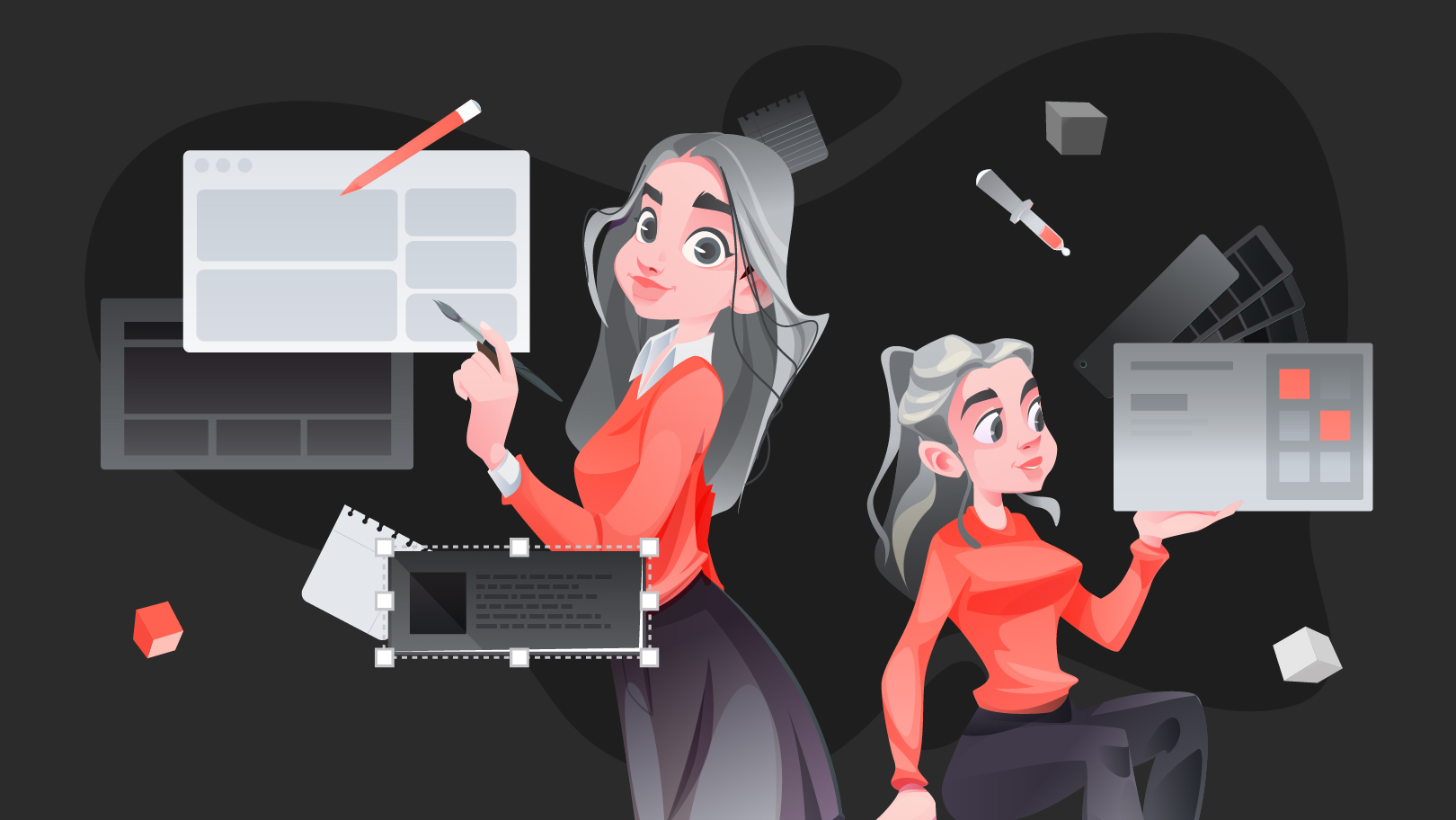
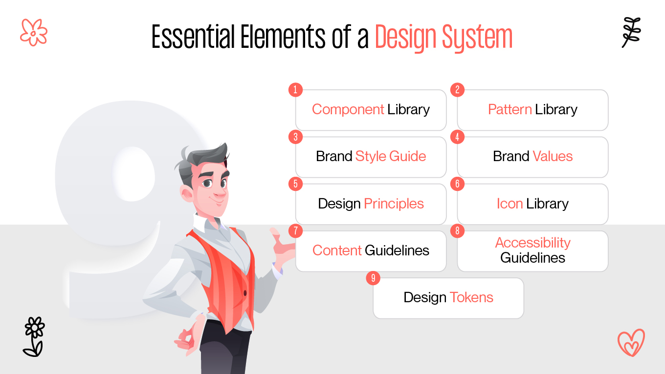
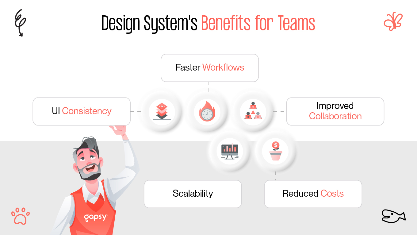
Creating a visually appealing product becomes just part of the challenge. The real difficulty lies in maintaining consistency, scalability, and smooth teamwork across different groups. How designers achieve that and make it work? That’s where a UX design system becomes important. According to the statistics, design system brings 34% efficiency boost [1].

What is a Design System?

A design system is much more than a style guide or a collection of reusable buttons. Think of it as the DNA of your digital product, a set of principles, guidelines, and reusable assets that make sure everything your team builds feels cohesive and user-friendly.

elements of a design system
design system features

It includes:

  • Component libraries: Pre-built UI elements like buttons, inputs, modals, and navigation menus.
  • Design tokens: The smallest building blocks (colors, spacing, typography rules, shadows, radii) that control your product’s look and feel.
  • Documentation: Guidelines that explain how and why components should be used.
  • Philosophy and principles: A guiding star for decision-making, ensuring designs reflect the brand’s voice and vision.

Without it, every designer and developer ends up reinventing the wheel. With it, teams create consistent, scalable experiences that users recognize instantly.

Aspect

Design System

Style Guide

Component Library

Scope

Tokens, components, rules, docs

Colors, fonts, logos

Reusable UI elements

Goal

UI consistency & scalability

Brand consistency

Faster development

Users

Designers & developers

Marketing & design

Developers & designers


Benefits for Teams

Why put in the effort to build a design system? It requires time, planning, and collaboration among teams. However, the rewards are significant. Let’s look at some of the major benefits.

design system benefits for teams
why implementing a design system?

UI Consistency

Have you ever noticed how some apps just feel right? Every interaction, from clicking a button to scrolling, flows smoothly. That’s UI consistency at work. With a design system, users aren’t distracted by mismatched fonts or misaligned buttons; instead, they enjoy a seamless experience.

Faster Workflows

Imagine instead of creating a new modal from scratch, a designer simply pulls it from the Figma system library, while developers add the matching coded component. No endless back-and-forth emails or redesigning the same button multiple times.

Result? A massive boost in speed for both design and development.

Improved Collaboration

Designers, developers, and product managers often speak different “languages.” A design system serves as a translator. With shared documentation, design tokens, and component libraries, everyone knows exactly what to use, when to use it, and how.

Scalability

As your product expands, so does its complexity. Without a system, adding new features means patching them onto existing ones until everything feels cumbersome. A design system ensures every new addition fits neatly into place.

Reduced Costs

Fewer design inconsistencies lead to fewer user complaints and fewer fixes later on. It’s simple: consistency saves time, and time saves money.

In short, design systems are essential. They’re a vital strategy for modern digital products.

Building Blocks

What makes up a UX design system? Think of it like a pyramid: from the smallest design tokens at the base to high-level design principles at the top. Each layer plays a crucial role.

Design Tokens

Design tokens are the basic elements of your product’s design language. Companies like Headspace have seen 20%–30% time savings on straightforward tasks and up to 50% on complex projects through their use of tokens and variables [2]. They’re the smallest, indivisible values, such as brand colors, typography scales, and spacing units.

  • Color tokens: Primary, secondary, error, success states.
  • Typography tokens: Font sizes, line heights, weights.
  • Spacing tokens: Margins and paddings in consistent increments.

For example, instead of using “#FF5733” throughout codebases, you define it as “color-primary”. Now, if the brand color changes, you update it once and see it affect the entire product.

Components

Next up are component libraries. These are reusable, pre-built UI blocks like:

component libraries elements
what to include in a component library?
  • Buttons
  • Input fields
  • Dropdown menus
  • Modals
  • Navigation bars

The beauty of this approach is reusability. Once a component is designed and tested, it’s used everywhere, ensuring reliability and speed.

Patterns

Patterns are groups of components that work together. Think of sign-up forms, dashboards, or navigation flows. They go beyond visuals and also define interaction logic.

Guidelines and Principles

Even with components and tokens, teams need rules of engagement. Guidelines explain when to use certain components, accessibility standards, and brand tone.

For example:

  • Use primary buttons for main actions.
  • Use secondary buttons for supporting actions.
  • Always follow WCAG standards for accessibility.

Documentation

A design system without documentation is like a library without a catalog. Designers and developers need clear resources to know:

  • How to apply tokens.
  • When to use a specific component.
  • Why the system works the way it does.

Platforms like Notion integrate well with Figma to provide living documentation.

Tools and Tips

Building a design system doesn’t happen overnight. It takes the right tools, attitude, and processes. Let’s look at the essentials.

tools for building a design systems
building a design system ux

Tools for Building a Design System

Figma system libraries

  • Create design tokens.
  • Build reusable components.
  • Share across teams.
  • Collaborate in real-time.

Storybook

  • A playground for developers to test components in isolation.
  • Ensures the coded components match the design.

Design Token Managers

  • Tools like Style Dictionary or Tokens Studio keep tokens synced between design and code.

Documentation Platforms

  • Zeroheight, Notion, or Confluence.
  • Serve as a single source of truth.

Tips for Building a Successful UX Design System

  • Start small: Don’t attempt to design every component at once. Begin with the basics: buttons, typography, and colors.
  • Involve developers early: A design system isn’t just for designers. Developers must implement, test, and maintain it.
  • Prioritize accessibility: Build inclusivity into your tokens and components from the start.
  • Keep it flexible: A design system should evolve. Review regularly and update it as the product grows.
  • Promote adoption: A system no one uses is ineffective. Educate your team, hold workshops, and make adoption easy.

Explore Gapsy Studio’s UI/UX design services.

Design Systems Examples

Sometimes the best way to grasp a concept is by looking at real-world success stories. Let’s see how leading companies use design systems to scale.

Google’s Material Design

Perhaps the most well-known example, Material Design is a complete UX design system. It includes design tokens (colors, typography), components (cards, buttons), and guidelines (motion, accessibility) within one of the most widely adopted systems globally.

IBM’s Carbon Design System

IBM faced the challenge of uniting hundreds of products under one brand. The Carbon Design System achieved consistency across platforms while allowing flexibility for specific use cases. Its strength lies in thorough documentation and components designed with accessibility in mind.

Atlassian’s Design System

Known for Jira and Trello, Atlassian’s design system emphasizes patterns and guidelines for collaboration-focused tools. It shows how a well-crafted system boosts team productivity while preserving brand identity.

Shopify’s Polaris

Shopify’s Polaris is tailored for merchants. It covers not just UI but also content guidelines, tone of voice, and interaction principles. This comprehensive approach illustrates how design systems go beyond visuals.

Airbnb’s Design Language System (DLS)

Airbnb created a design system to unify its global platform. Their DLS balances flexibility with strict rules to ensure brand trust while accommodating different markets.

These examples prove one thing: design systems aren’t optional. They form the foundation of modern digital products.

Conclusion

In the changing landscape of product design, UI consistency and scalability are essential. A UX design system gives teams the structure, clarity, and efficiency to deliver smooth user experiences.

Whether you’re using Figma, managing design tokens, or building strong component libraries, remember: the goal isn’t just to make things visually appealing. It’s to make them usable, scalable, and trustworthy.

If you’re just getting started, begin small. Define your colors, typography, and a few core components. From there, grow your system gradually. Before long, you’ll wonder how your team functioned without it.

References

  1. Design system 104: Making metrics matter from https://www.figma.com/blog/design-systems-104-making-metrics-matter/
  2. Building a design system that breathes with Headspace from https://www.figma.com/blog/building-a-design-system-that-breathes-with-headspace/

Rate this article

20 ratings
Average: 4.9 out of 5

If you like what we write, we recommend subscribing to our mailing list to always be aware of new publications.

Do you have any questions? We tried to answer most of them!