Designing for Dark Mode: Tips, Pitfalls & Best Practices

7minutes read
designing for dark mode

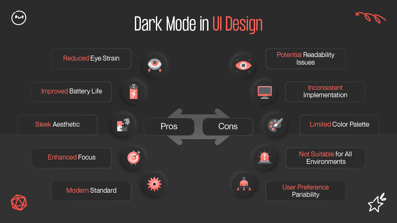
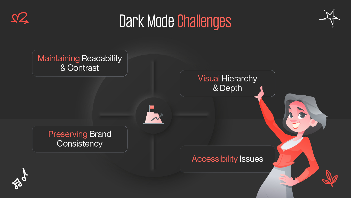
The dark mode allure has taken digital platforms by storm — from productivity apps to social media, it's everywhere. What began as a straightforward aesthetic preference has turned into a vital element of user interface (UI) design. Users now anticipate the ability to switch between light and dark, and designers have to keep up. However, designing a visually harmonious, accessible, and brand-aligned dark mode is more complicated than it appears.

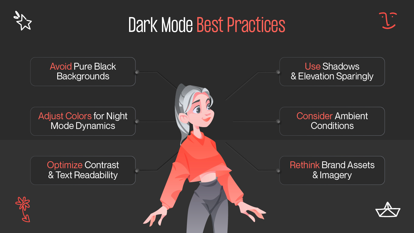
Let's dive into why dark mode is important, the design challenges that are commonly faced, dark mode best practices to achieve a smooth experience, and some real-life examples that nailed it.

Why Dark Mode Matters

Dark mode is more than a preference — it's a shift in how individuals interact with digital products. This design trend reverses the traditional light background to darker hues, prioritizing contrast and readability, and providing an entirely different atmosphere.

Dark mode is comfort and focus for the majority of users. Staring at bright displays for a long time exhausts the eyes, especially in dim environments. A dark interface, when implemented correctly, reduces glare, reduces eye fatigue, and is more natural for use at night. The so-called night mode dynamics kick in here — it tracks users' routines, offering a visually more gentle interface at night.

Aspect

Light Mode

Dark Mode

Visual Tone

Bright, open, and energetic

Sleek, focused, and immersive

Eye Comfort

Ideal for daytime and bright environments

Better for low-light or nighttime use

Contrast Strategy

Dark text on light backgrounds

Light text on dark backgrounds

Emotional Impact

Feels airy and friendly

Feels modern and sophisticated

Brand Adaptation

Uses full-color palettes easily

Requires recalibration of colors for balance

Battery Usage (OLED screens)

Consumes more power

Saves energy with darker pixels

Dark mode, though, is not just about ergonomics. It influences perception, mood, and even brand reputation. A well-crafted dark theme can make a product look sleek, modern, and professional. It can enhance a brand's visual identity, emphasizing sophistication and innovation. For instance, creative apps like Adobe Photoshop or Figma are more immersive in dark mode, with users focusing on their work, not the interface.

Additionally, dark mode supports battery life on OLED screens. Since fewer pixels are required for darker power, users of mobile devices experience extended battery life. A minor but valuable improvement that equates to user delight and app retention. 

In short, dark mode matters because it speaks to the intersection of comfort, performance, and aesthetics — a triumvirate that today's users devour. 

Dark Mode Design Challenges

While the benefits are clear, dark mode UI/UX design isn't as simple as inverting colors. It's about rethinking the entire visual hierarchy, contrast levels, and brand consistency. The following are the most common issues designers face.

Maintaining Readability and Contrast

Contrast management is the greatest challenge. If the contrast is too high, it will cause eye strain; if it's too low, text will be illegible. Finding the right balance is essential. The dark background itself should not be black, as it will create harsh edges and fatigue the eyes. Designers like to use almost-black values like #121212 to keep images soft and gentle on the eyes.

On the other hand, text color should be light enough to offer readability without being too harsh. Pure white on black can be blinding. Designers opt for soft off-white or grayish hues for a more pleasant experience.

Preserving Brand Consistency

A dark mode redesign can too easily distort a brand's identity. Vibrant colors from a light theme can adopt a neon-like quality or be eye-searingly jarring when directly applied to a dark background. Color saturation and tone must be modified to keep the brand as recognizable while also being in harmony with the new scheme.

For example, a vibrant blue can be perfect on a light interface but turn electric or jarring in dark mode. Designers have to redesign color themes sometimes without altering the emotional personality of the brand. It's this delicate balance that makes users still feel "at home" in dark mode or makes it feel like an entirely different product.

Visual Hierarchy and Depth

Light mode uses shadows and highlights naturally. In dark mode, these need to be handled differently. Shadows on dark backgrounds lose their depth, and highlights can be overly dominant. Establishing a sense of visual hierarchy requires subtle layering — using lighter grays, gradients, or elevation through blurred shadows instead of sharp contrasts.

Designers also face the challenge of separating elements that would otherwise blend into one another. Input fields, buttons, and cards get lost in the background if not dealt with accordingly.

Accessibility Issues

Dark mode can create accessibility problems in case contrast ratios have not been properly tested. Users with visual impairments can struggle with reading text when there is low contrast. It is not just a matter of aesthetics — accessibility ensures inclusivity. Designers should test their UI with WCAG contrast guidelines to ensure that all the elements are perceivable and comfortable to use.

Best Practices

How to design dark mode UI? It is a task of precision, empathy, and thoughtful experimentation. The following are dark mode principles that can guide you in creating a balanced, readable, and visually pleasing experience.

Avoid Pure Black Backgrounds

While pure black (#000000) might be the immediate consideration, it's rarely the best viewing experience. Dark greys like #121212 or #1E1E1E provide more depth and are less strenuous on the eyes. They also sit well on different types of screens and under different lighting conditions.

Adjust Colors for Night Mode Dynamics

Color palettes behave differently with dark backgrounds. Vibrant colors get more saturated, while muted colors can get washed out. Adjusting saturation, brightness, and hue ensures brand color harmony and consistency.

In terms of night mode dynamics, emotional perception is something to keep in mind. Cool tones create calmness and focus, while warm tones are comforting. The goal is to preserve your brand's emotional tone without overwhelming the user's senses.

Optimize Contrast and Text Readability

Deep contrast is the basis of any dark mode interface. Use subtle differences between text, icons, and background elements. For body text, aim for 15:1 contrast with the background at a minimum. For larger headings, you can tone it down a notch to achieve a softer, more harmonious look.

Use color for emphasis sparingly as well. Let typography and composition communicate hierarchy rather than relying on color to provide cues.

Use Shadows and Elevation Sparingly

Shadows should be understated in dark mode. Utilize lighter colors or gentle gradients, instead of traditional dark shadows, to create depth. Alternatively, use faint glows or highlights to delineate interactive elements like buttons or cards.

Elevation should also be natural, not forced. Abrupt shadows can destroy the immersive quality of dark mode, making the interface look artificial.

Consider Ambient Conditions

Users interact with dark mode across various contexts. It is ideal for dark settings but may be compromised by bright daylight. Provide users with the option to switch themes manually or automatically based on system settings.

Dynamic color adaptation — adjusting the intensity of dark colors relative to ambient light — can further enhance the user experience.

Rethink Brand Assets and Imagery

Not all visuals translate well to dark mode. Images that have light backgrounds can clash, and logos can disappear. Create separate image versions with pleasing contrast and readability. Use transparent assets judiciously and let them integrate naturally with both themes.

Case Examples

YouTube

YouTube dark mode is a textbook example of thoughtful implementation. The background isn't pitch black but rather a gentle dark gray, offering easy contrast with thumbnails and white text. The accent red is faithful to YouTube's branding while also seeming elegant against the darker background. It brings attention to video content without visual noise.

Slack

Slack's dark mode follows a brand-consistent route. Its signature purple and green adapt nicely, maintaining the friendly yet professional atmosphere. It rebalanced accent colors to avoid jarring neon effects, with comfort during long hours of use as the priority. This move illustrates the imperative of tone moderation when translating bright palettes to dark mode.

Apple macOS and iOS

Apple set a new benchmark for system-wide dark mode. Their use of soft gradients, subtle shadows, and restrained color hierarchy creates depth and clarity. Apple also does night mode dynamics intelligently, with the option for users to switch automatically on local time or ambient light. It feels natural — not a theme, but part of the system design itself.

These are just a few examples, but they prove the point: good dark mode design is the outcome of intentional decisions — not color inversion. Each platform tailored its palette, contrast, and tone while preserving its fundamental character.

Conclusion

Dark mode design is both an art and a science. It is not about darkening things but about harmony, comfort, and continuity. Designers must balance contrast, maintain brand consistency, and adapt to night mode dynamics without sacrificing accessibility or emotional tone.

When executed properly, dark mode is more than a trend — it's a bridge between usability and aesthetic sophistication. As users continue to demand flexible experiences, mastering dark mode design will remain a key skill for any UI designer.

Rate this article

20 ratings
Average: 4.9 out of 5

If you like what we write, we recommend subscribing to our mailing list to always be aware of new publications.

Do you have any questions? We tried to answer most of them!