The Masterclass in Conversational UI Design: Best Practices, Frameworks, and 2026 Trends

13minutes read
conversational ui design

Software still makes users think like machines by requiring them to memorize navigation paths, interpret abstract icons, and struggle with rigid forms. Conversational UI changes this approach. Instead of making users adjust, these interfaces teach technology to grasp how people really speak, think, and make decisions.

When a system understands intent, it evolves from a tool that users handle into a partner that helps them solve problems. For decision-makers, this change is not just a philosophical idea. Removing friction from conversations shortens the path to value, boosts completion rates, and directly affects revenue. At Gapsy Studio, we view conversation as the most effective bridge between a user's needs and a brand's solution.

This guide goes deeper than basic definitions. We will explore what is conversational UI, the mechanics behind its simplicity, from foundational CUI principles to the rise of agentic AI in 2026. We aim to provide a practical roadmap for designing interfaces that understand users.

Key Takeaways

  • Conversational UI shifts complexity from users to technology, reducing friction and increasing completion rates.
  • Intent-based design and context awareness are essential for scalable, intelligent conversational systems.
  • Multimodal and agentic interfaces are becoming the new standard for complex user workflows.
  • Trust, transparency, and graceful failure handling define successful conversational experiences.
  • Strategically designing CUI can shorten the path to value and directly impact business metrics.

Our Case Study: Designing an AI Life Assistant

To illustrate how a conversational UI design framework connects into a product, let’s examine a recent concept from our lab: AI Life Assistant.

It was built as a “smart support” system for daily productivity and mental wellness. Instead of relying on rigid menus and static flows, we aimed to create an interface that offers a more fluid, conversational way to interact with technology. Here is how we applied the core principles of conversational UI design to solve user friction.

Visualizing the Heartbeat of the AI

In Voice User Interface (VUI) design, silence is the enemy. When a user speaks, they need immediate, visceral confirmation that the system is listening.

Instead of a static microphone icon, our interface utilizes a dynamic purple orb and pulsing blue waveform. This animation serves as the AI's "heartbeat." It reacts in real-time to voice input, providing a continuous feedback loop. This reduces cognitive load: the user doesn't need to read a status text; they feel the connection, much like making eye contact during a human conversation.

Fluid Multimodal Handoffs

Real life is rarely purely text or voice. A user might start a request while driving (voice) and refine the details while walking into a meeting (text).

To support this, we designed smooth, non-destructive transitions between modalities. A task created by voice (like “Schedule a client meeting”) instantly appears as a Task Card in the chat. From there, it can be edited via touch or text without breaking context. Voice, typing, and UI actions all live in a single timeline, so the conversation stays continuous no matter how the user interacts.

Contextual Empathy and Data Visualization

A standard chatbot waits for a prompt. An intelligent agent anticipates the need.

In this concept, we replaced the classic app dashboard with a personalized “Morning Briefing” experience. Here, conversational UI mobile activity data, such as workout trends or meditation streaks, appears directly in the conversational flow, turning raw metrics into meaningful context. When a user updates their schedule, the system doesn’t just execute the change; it confirms it in natural language, reinforcing the feeling of collaboration rather than automation.

Have a conversational product idea in mind? Let’s explore it together — contact us today.

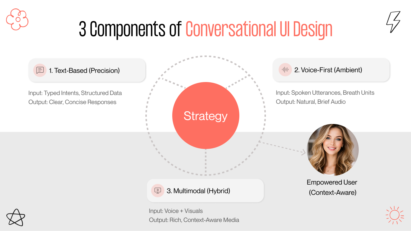
The Conversational UI Design Framework: A 3-Pillar Approach

A strong conversational UI framework is a spectrum of modes that adapt to real-world context. Drivers navigating traffic, juggling groceries, or approving a mortgage on their commute each need a fundamentally different interface experience.

That’s why designers need to move beyond the “one-bot-fits-all” mindset. The goal is not to build one perfect chatbot, but to orchestrate the right interaction channel for the right moment.

Pillar 1: Text-Based Interfaces

Text remains the most reliable channel for complex, sensitive, or data-heavy tasks. While voice can be faster for input, text is better for reviewing details, ensuring accuracy, and maintaining privacy. It’s the safest option for situations where mistakes aren’t acceptable, such as confirming appointments, checking financial information, or resolving billing issues in a loud environment.

The dominance of text lies in its asynchronous nature. It eliminates the social pressure of a real-time voice call, allowing users to multitask and respond at their own pace. This efficiency is why 52% of users cite faster resolution as the primary benefit of chatbots. But a great text interface is about guiding.

But a strong text interface goes beyond just a simple input field. Open-ended typing can feel overwhelming; the blinking cursor effect is real. The best conversational UIs combine typing with structured elements like quick-reply buttons, carousels, and date pickers, all directly in the chat. This hybrid approach reduces cognitive effort, prevents misunderstandings, and guides users toward successful outcomes without making the interaction feel scripted.

Pillar 2: Voice-First Interfaces

Voice is the interface of the physical world. It removes the glass barrier entirely, making technology accessible to users who are occupied, visually impaired, or simply moving through space. With voice commands now driving mobile searches for nearly 128.4 million Americans, VUI (Voice User Interface) has graduated from a novelty feature to a critical utility for the "hands-busy, eyes-free" context.

However, designing for voice requires a completely different mindset. Spoken information is linear and fleeting. Users can’t skim, scroll, or re-read what they missed. If a system talks too much, attention drops quickly.

That’s why effective VUI design focuses on short, natural speech segments and intentional pauses, which linguists call “breath units.” By structuring responses in digestible chunks and ending with clear prompts (like “I found three options. Do you want the fastest or the cheapest?”), the system feels more conversational and keeps the user in control, rather than overwhelming them with a long speech.

Pillar 3: Multimodal Interfaces

Multimodal interaction becomes the default expectation for complex tasks. These systems combine the immediacy of voice with the clarity of visual information, fixing the weaknesses of each mode.

Consider the user experience of booking a flight. A user might ask, "Show me flights to Tokyo under $1000."  Voice is the most efficient way to ask, but listening to ten flight options to process the answer is overwhelming. A multimodal system allows users to express their intent verbally and then view the results visually.

This blend of spoken input and visual output creates a much stronger experience. Users can easily switch between speaking, scanning, and tapping without disruption or losing context. By leveraging devices such as smart displays, tablets, or in-car dashboards, this approach combines the conversational ease of CUI with the density of a Graphical User Interface (GUI). It’s a smarter way to make important decisions.

5 Conversational UI Best Practices

Plenty of designers confuse “conversational” with “chatty.” They overload bots with jokes and overly casual tone, hoping to mimic friendship. But in service-driven experiences, users are looking for outcomes.

Strong conversational UI/UX design requires minimizing the distance between a problem and its resolution. That means shifting focus from surface-level empathy to interaction psychology and system intelligence. Below are five strategic principles that move beyond generic conversational UI design best practices and into scalable, product-level design.

1. Intent Mapping > Keyword Matching

Early chatbots acted like rigid librarians. If a user typed, “I can’t get in,” the system didn’t respond because it was looking for the keyword “password.”

Modern conversational systems focus on intent rather than specific wording. Natural Language Understanding (NLU) models have shifted the focus from what is said to why it is said.

For instance, a message like “Where is my order?” in all caps shouldn’t only start a tracking process. The system should recognize frustration and either escalate the request to a human agent or move it up in the queue. Designing with intent in mind means addressing the actual goal, not just responding to a set phrase.

2. The "Rule of Three"

In visual interfaces, users can view 10 options simultaneously. In conversation, attention is one thing at a time and easily lost.

Showing too many choices at once causes “choice paralysis” and slows down interactions. The Rule of Three helps keep conversations on track. Never offer more than three options in a single turn:

  • Bad“I can help with billing, shipping, returns, technical support, account settings, or subscriptions.”

  • Good“Are you asking about shipping, billing, or something else?”

Breaking down information in this manner helps users keep moving rather than pausing.

3. The Transparency Mandate

There is an “uncanny valley” in conversational text. When bots try too hard to sound human ("Oopsie! I made a boo-boo!"), they often come off as fake or condescending.

Trust grows from clarity. 72% of customers demand to know upfront if they are interacting with AI, and pretending otherwise damages credibility. The best conversational systems use a clear “persona” that matches the brand. This “persona” is friendly, yet obviously artificial.

A bot that openly acknowledges its limitations, like saying “I’m still learning,” feels more trustworthy than one that pretends to be human but struggles with basic logic. Being transparent also sets realistic expectations, reducing frustration when automation reaches its limits.

4. Context Retention

Nothing kills a conversation faster than having to repeat yourself. 35% of consumers prefer AI specifically to avoid the repetition typical of legacy support lines.

A strategic conversational system remembers context, including user state, session data, previous actions, and history. If a user is logged in and viewing return items, the bot should use that context rather than asking general questions (i.e., "Do you have a question about the item you returned on Tuesday?")

Passing metadata from the product interface into the conversation changes the bot from a generic assistant to a guide that understands the situation.

5. The "Graceful Fail" Protocol

No AI system is perfect. Failure is inevitable. The experience design around that failure determines user retention.

A generic message, “I didn’t understand that,” leads to a dead end in conversation. A graceful failure provides an exit path and preserves user choice.

  • Generic: “Sorry, I don’t understand.”

  • Strategic: “I’m having trouble with that request. Would you like to rephrase it, or should I connect you to a human specialist?”

The goal is to never trap users in an error loop. Always offer a next step, a handoff, or an alternative path.

Curious how conversational UI could reduce friction in your product? Let’s discuss all the details together.

Essential Conversational UI Design Patterns

If the "strategy" is the brain, design patterns are the muscle memory. These are the reusable interaction models that users intuitively understand. When deviating from these established norms, you risk confusing the user; when applying them correctly, the interface feels invisible.

Here are the essential conversational UI patterns that form the backbone of a resilient conversational interface.

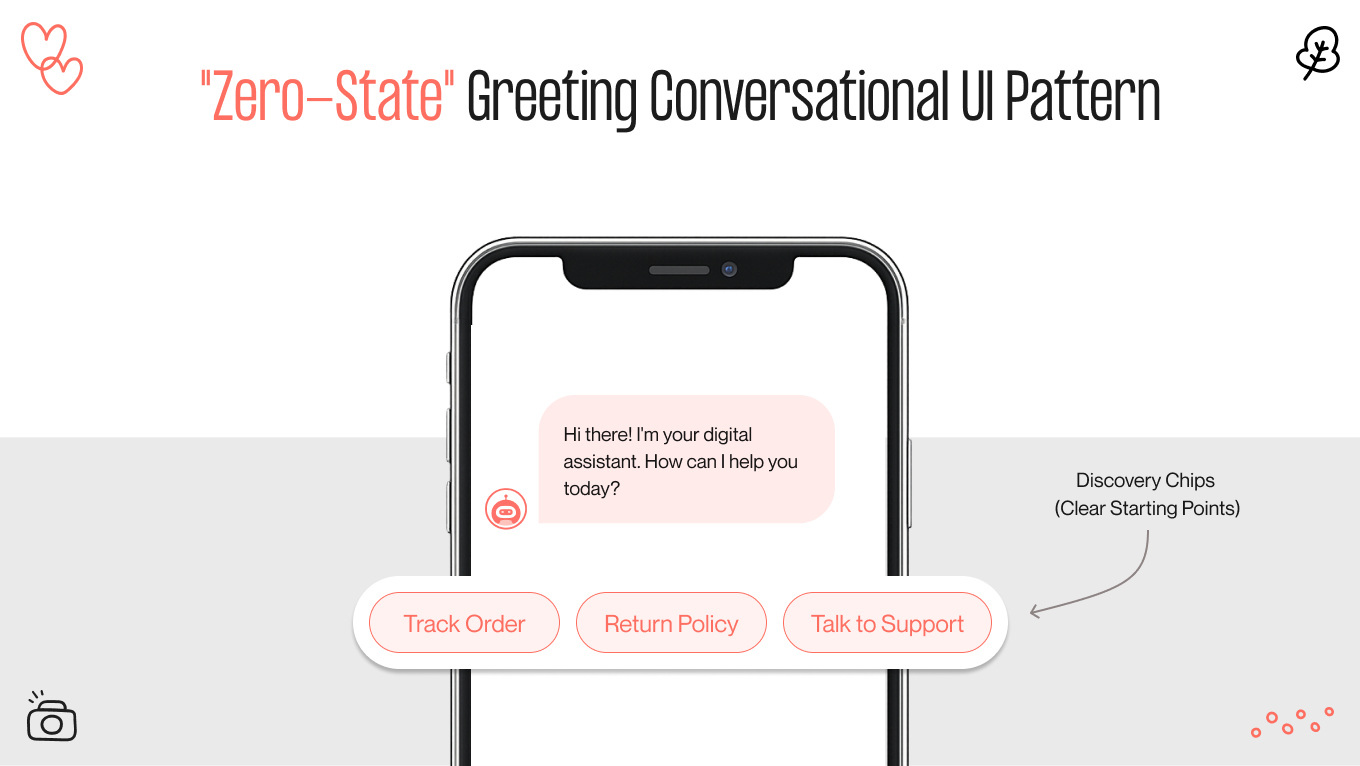
The "Zero-State" Greeting

An empty chat window creates uncertainty, leaving users wondering what the system can do.

The Pattern: Don’t start with a blank screen or a vague “Hello.” Instead, use a friendly greeting along with discovery chips. These are clickable prompts that highlight the bot’s main features, such as “Track Order,” “Return Policy,” and “Talk to Support.”

This approach sets clear expectations right away, showing what the bot can do and helping avoid irrelevant questions. Most importantly, it makes it easier for users to engage for the first time — they simply need to tap.

Disambiguation Menus

Natural language is naturally ambiguous. A request like “Book a table for Saturday” has multiple unresolved variables: which Saturday, what time, and how many people.

The Pattern: Instead of making guesses, the system highlights ambiguity through a structured clarification interface. A disambiguation card might say, “I found two Saturdays available. Which one do you want?”

This changes potential failure into a collaborative clarification step. Users remain engaged, and the system prevents costly misunderstandings without needing to retype.

Typing Indicators

In a face-to-face conversation, you can see when someone is thinking. In a chat, silence looks like a broken connection.

The Pattern: Use animated three bouncing dots to signal processing.

Timing is critical. If a response appears instantly (0.1s), it feels robotic and dismissive. If it takes too long (>3s), the user abandons it. A programmed delay of 1–1.5 seconds, accompanied by the animation, mimics human cognitive processing time, making the interaction feel more organic and "thoughtful."

Rich Input Controls

Free-text input is flexible but unreliable for structured data. Typing a date (e.g., "Jan 12th, 2026") is error-prone. Is it MM/DD or DD/MM? 

The Pattern: Replace the keyboard with context-specific UI components, such as date pickers, sliders, dropdowns, and color swatches, when structured input is needed. 

The hybrid conversation approach and a graphical user interface improve data accuracy, reduce user effort, and increase completion rates. It’s an important pattern for critical tasks such as bookings, payments, and scheduling.

Explicit vs. Implicit Confirmation

Not all actions deserve the same level of friction. Over-confirming slows users down. Under-confirming can lead to serious mistakes.

  • Implicit (low risk): Play music, show the weather, open content; just do it.

  • Explicit (high risk): Money transfers, deletions, irreversible changes; always require a clear confirmation step, such as a modal, Yes/No buttons, or biometric authentication.

This creates intentional speed bumps only where the consequences matter.

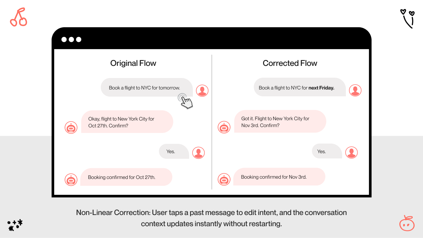
Non-Linear Correction

Human thinking is rarely straightforward. Users may notice mistakes after going through several steps.

The Pattern: Allow editing of previous inputs without restarting the flow. Summary cards or interactive message bubbles should be tappable and editable. For example, users should be able to change the flight date without having to restart the booking process.

It reflects real cognitive behavior and significantly reduces abandonment in complex workflows.

Looking for a strategic partner to design conversational experiences? Gapsy Studio is ready to work together.

How to Build and Audit Conversational UI Designs

Building a traditional app is like constructing a building. You design the structure, define the pathways, and guide users through a fixed environment.

Designing conversational UI apps is more like improvisational jazz. You set the tempo and provide the instruments, but the user shapes the melody. When you force a rigid script, the interaction falls apart because real people rarely follow scripts.

At Gapsy Studio, we design for uncertainty. Below is our 4-phase cycle for creating conversational systems that remain functional, coherent, and helpful, even when users act unpredictably.

Phase 1: The "Screenplay"

Most teams jump straight into flowcharts. We begin with dialogue. 

Before any UI or code, we write conversational scripts that reflect real human interactions. This shows how a support agent would talk to a stressed, distracted, or impatient user. 

We map:

  • The “happy path”: When everything goes as expected. 

  • The “edge cases”: When users change their minds, provide incomplete information, or interrupt the flow.

If these “screenplays” sound awkward in conversation, it will feel robotic in the interface. This phase helps define tone, boundaries, fallback logic, and persona before design artifacts make final decisions.

Phase 2: Prototyping

How do you test a conversational AI UI before it exists? You fake it.

In early-stage testing, a designer manually responds to user inputs in real time, acting as the bot. This approach uncovers real-world language patterns, misconceptions, and emotional cues before engineering starts.

It often shows the vocabulary gap, which is the difference between what designers expect users to say and what they say. For example, customers rarely say “Book a flight.” Instead, they say, “I need to get to London tomorrow.”

Identifying these gaps early prevents costly rework and leads to more natural intent models.

Phase 3: The Hybrid Build

Once the logic is validated, it’s time to build an interface. This is where our team integrates the multimodal elements discussed earlier. We map the conversation to the visual UI:

  • Question: "What date?" → UI Response: Trigger Calendar Picker.

  • Question: "Which flight?" → UI Response: Display Carousel Card.

We treat the text input as the "Command Line" and the screen as the "Dashboard."

Phase 4: The Friction Audit

Launch is not the finish line. It’s the start of real validation.

Beyond basic completion rates, we look at behavioral friction and emotional signals. Our audit framework includes:

  • Fallback frequency: How often does the system fail to understand? (Target: <5%)

  • Language drift: Does the user become shorter, more direct, or more aggressive over time?

  • Repetition loops: Are users asked to confirm the same data multiple times?

  • Drop-off points: Where do users abandon the conversation entirely?

A conversational interface is only successful if it works better than traditional navigation. If users need more steps to complete a task in chat than on a website, the design hasn't reduced friction. It has added it.

Let’s partner up to create an engaging conversational UI for your product — we’re just one click away.

2026 Trends in Conversational UI: From Reactive Chatbots to Agentic AI

The age of the static FAQ bot is coming to an end. Those early "digital librarians" that simply provided links are being replaced by something much more powerful: agentic AI. These systems can take action on the user’s behalf. Let’s see how these trends show off.

The "Glass Box" Design

The biggest barrier to adopting agentic AI is psychological. Users don’t fear automation; they fear invisible automation.

If a user says, “Book me a flight to London under $600,” and the system silently processes the request before replying “Booked,” the experience feels reckless. What airport? What seat? Refundable or not? The lack of visibility creates anxiety instead of delight.

Glass Box conversational UI design guidelines tackle this issue by showing the agent’s reasoning in real time. Instead of a generic loading spinner, the user interface displays intermediate steps like a live checklist:

  • “Scanning schedules for LHR and LGW…”

  • “Filtering for <$600…”

  • “Checking seat availability…”

  • “Found 3 options.”

By visualizing the decision-making process, the interface builds trust. It shows that the AI evaluates and acts based on this analysis. 

The Polite Interruption

Proactive AI has a dark side: it can become intrusive. Constant pop-ups, chat bubbles, and unsolicited tips break focus and feel more like interruptions than help. 

The next generation of conversational design moves from modal disruption to ambient assistance. Instead of forcing attention, the interface provides quiet, contextual nudges. 

Imagine browsing winter coats. Instead of a chatbot suddenly asking, “Need help?”, a subtle tag appears next to the price: “Price dropped 20% since your last visit.” 

It’s visible but optional, helpful but not demanding. The system waits to be noticed instead of forcing interaction. It respects user autonomy while still adding value.

The Context-Aware Canvas

Most digital products still have short-term memory. Close the tab, refresh the page, or switch devices, and the system forgets you.

Agentic AI needs persistent context. Conversations should carry over across devices, time, and channels.

Future interfaces act as state-aware canvases. When users return, they land inside their ongoing story: “Welcome back, Sarah. You were comparing flights to Tokyo on your laptop this morning. Do you want to continue where you left off?”

This marks the change from static home screens to adaptive experiences. The interface modifies unfinished tasks, connecting desktop, mobile, and real-world contexts. It doesn’t just remember — it helps users pick up their progress right away.

Conversational UI Examples You Can Explore

The companies winning at conversational UI today aren't just slapping a chatbot on their homepage to deflect tickets. They are building systems that understand a user's emotional context. 

Here are three real-world examples that perfectly illustrate the conversational UI design principles we advocate.

Klarna’s Agentic Approach

Klarna provides the textbook conversational UI definition of the shift from a reactive chatbot to true agentic AI. For years, customer support bots were essentially glorified search bars: you asked a question, and they pasted a link to an FAQ page. They were "explainers," not "doers."

Klarna changed the paradigm. Their AI assistant is made to work rather than just chat. It acts as a fully empowered service agent with permission to touch the backend. Thus, it can open the transaction, verify the details, and process the refund itself.

The system now handles two-thirds of all customer service chats, effectively doing the work of 700 full-time agents. But the most telling metric is the speed. By empowering the AI to act, they slashed the average resolution time from 11 minutes to under 2 minutes. That is the fundamental difference between offering "support" and providing a "solution."

Duolingo Max for Psychological Safety

Learning a new language is terrifying. It’s not just an intellectual challenge; it’s a social one. We fear judgment. We freeze up because we’re afraid of sounding foolish. Duolingo realized that its biggest barrier was performance anxiety.

They used conversational UI to solve this psychological hurdle. With Duolingo Max, the company introduced "Roleplay," an AI feature that lets learners practice real-world scenarios, such as ordering coffee in Paris or buying furniture, with specific characters.

What’s more, they created a "judgment-free zone." Users found they were willing to make mistakes with "Lily" (a sarcastic, purple-haired cartoon character) that they would never risk with a human tutor. By using a "Roleplay" persona, Duolingo creates a safe sandbox. The AI corrects grammar and responds to context. This creates a pulse of natural conversation that feels organic yet carries zero social risk.

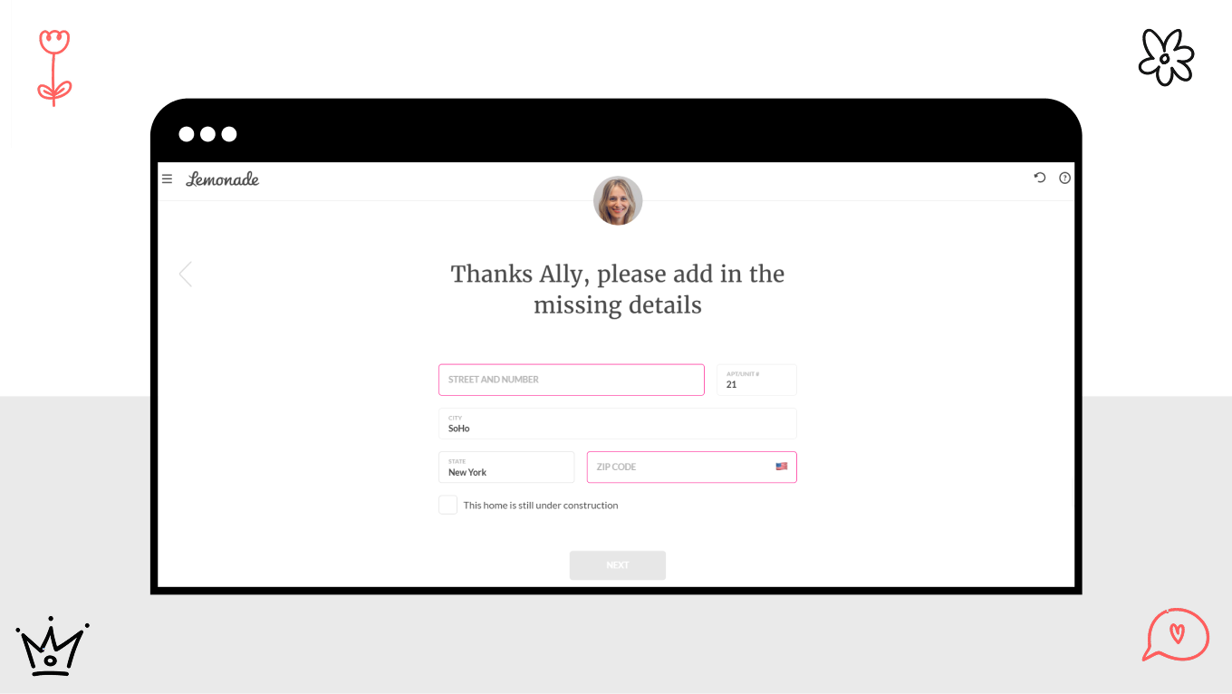
The "Glass Box" of Trust in Lemonade 

Insurance is an industry plagued by mistrust. Users instinctively assume that if a process is hidden, it is rigged against them. When filing a claim, the "black box" of a traditional insurance review feels like a wall. Lemonade’s bot, "Maya," uses radical transparency to dismantle this wall.

Maya is a masterclass in the "Glass Box" design pattern. From the zero-state greeting, she is disarmingly simple: "Let's get you covered in seconds." But the magic happens during a claim. Instead of a static "Pending" screen, Maya visualizes her agency. She walks the user through the steps in real-time, cross-referencing data and often approving simple claims in seconds.

Crucially, Maya never pretends to be human. She introduces herself explicitly as a bot that handles the "boring stuff," so the human team can handle the complex cases. This honesty bridges the uncanny valley.

Engineer Conversations with Our Experience

Let’s be honest: most chatbots are terrible. They’re rigid, robotic, and stuck in a loop of "I didn't quite get that."

We build differently. Gapsy Studio believes a conversational UI is the difference between a user feeling processed and a user feeling understood. Our design process combines qualitative and quantitative research to uncover where users struggle and where automation can help. That’s why we engineer the intelligence behind it.

Here is how we can help you build the next generation of agentic AI:

  • Moving beyond simple keywords to map user intent. We script for the chaos of real life, ensuring your bot has a distinct voice and handles "edge cases" without breaking character.

  • Shifting your interface from reactive chat to proactive agency. We build multimodal systems (Voice + Visuals) that can take action, book services, and solve problems in real-time.

  • Already have a bot that’s failing? We step in as the user advocate, analyzing sentiment data to find dead ends, fix frustration loops, and optimize the handoff.

Create Conversational UI with Gapsy!

Our design studio is ready to work with you.

Final Thoughts

Conversation was the first interface. Long before screens, buttons, and keyboards existed, people used language to understand, coordinate, and act.

Designing conversational UI today involves going back to that basic simplicity. As interfaces change from scripted chatbots to systems that can take real action, the designer’s role changes. We are no longer just creating flows; we are building trust.

The best conversational interfaces do not pretend to be human. They respect the user by being clear, efficient, and truly helpful. In the end, great conversational UI technology does not compete for attention or put on a show for you. It quietly understands what you want and helps you achieve it.

Here, you’re in the right place. Gapsy helps teams design conversational systems that actually scale — reach out to explore what that could look like for your product.

Rate this article

20 ratings
Average: 4.9 out of 5

If you like what we write, we recommend subscribing to our mailing list to always be aware of new publications.

Do you have any questions? We tried to answer most of them!