E-commerce Product Page Design for High Conversion

    10minutes read
    ecommerce-product-page-design

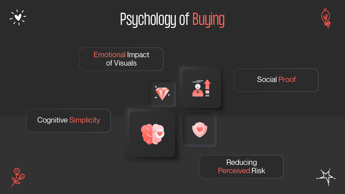
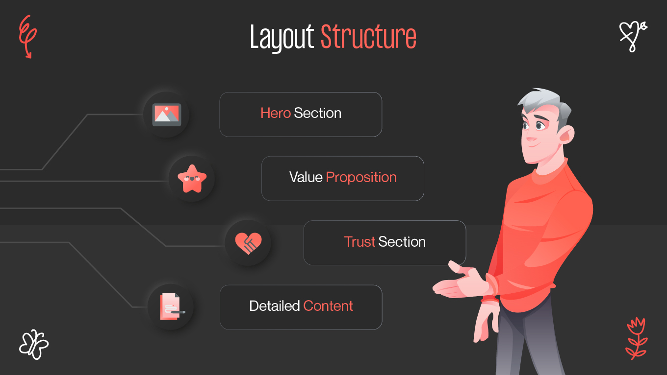
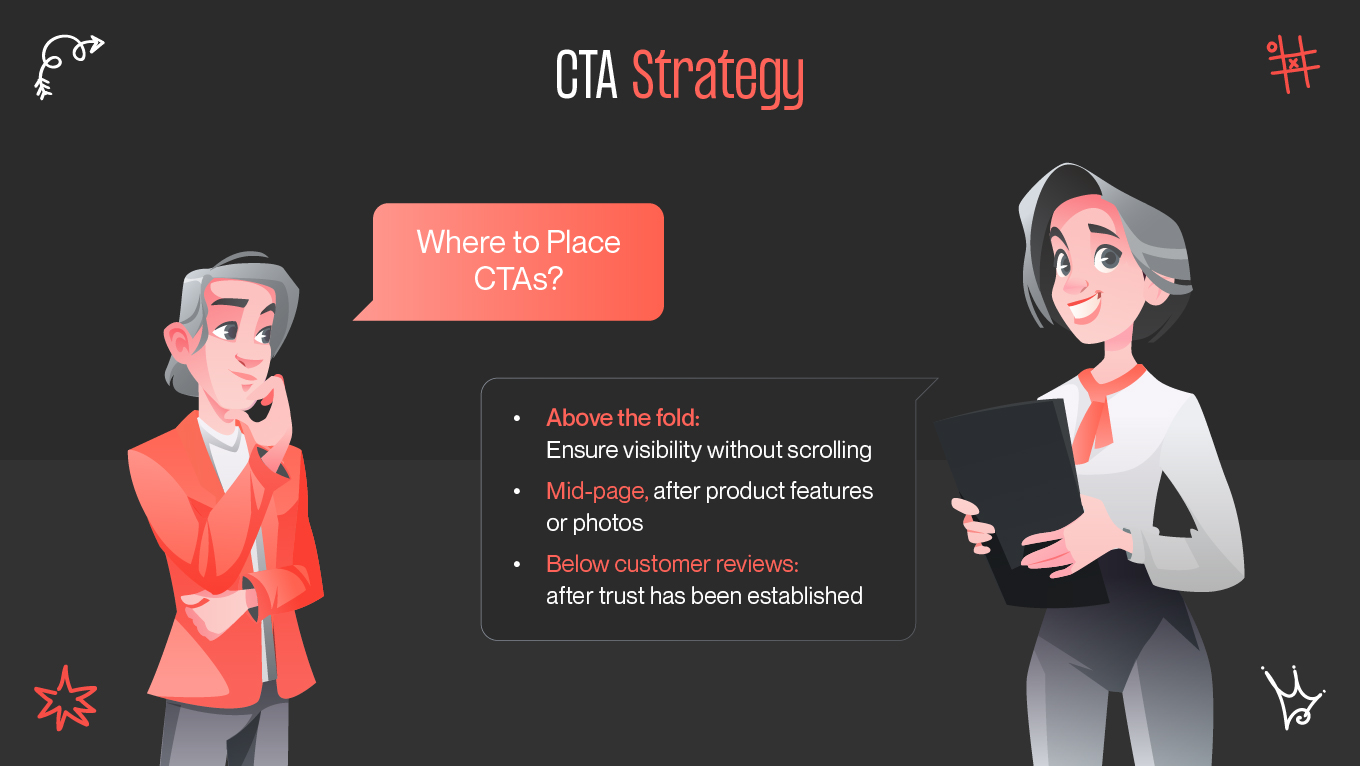
    Successful ecommerce product page design is about more than just visuals—it’s the strategic alignment of user psychology, layout, trust, and mobile optimization to drive sales. Welcome to Gapsy Studio’s practical guide to designing high-conversion product pages using behavioral insights and clean UI practices.

    Psychology of Buying

    Consumers don’t buy only on specs—they buy based on confidence, clarity, and trust. To master conversion design e-commerce, tap into these psychological motivators:

    Psychology of Buying
    Psychology of Buying
    • Emotional impact of visuals. High-quality product images evoke desire and trust from first impression.
    • Social proof. Ratings, testimonials, user photos reduce hesitation and increase credibility.
    • Reducing perceived risk. Clear return and delivery policies, guarantees, and secure payment options reassure buyers.
    • Cognitive simplicity. A clear layout makes the decision process effortless.
    • Gapsy Studio insight: “We design product pages to ease decision-making, making purchase feel intuitive and trustworthy.”

    Layout Structure

    A high-converting product page follows a predictable and user-friendly layout:

    Layout structure
    Layout structure

    Core Elements

    1. Hero section – prominent images, product name, price, and CTA (“Add to Cart”).
    2. Value proposition – bullet points or icons highlighting key features.
    3. Trust section – secure payment icons, free shipping, and policy highlights.
    4. Detailed content – specs, reviews, FAQs, and related items.

    Example Layout Table

    Section

    Purpose

    Recommendation

    Hero Area

    Immediate engagement

    Include 3–5 polished images, clear title, price, and CTA

    Bullet-Point Details

    Quick understanding

    Use icons + short labels for features

    Trust & Offers

    Build reassurance

    Visible safe payment logos, badges, and warranties

    User Reviews

    Social validation

    Display top reviews with verified purchase indicators

    When the layout aligns with buying behavior, customers progress naturally toward purchase.

    CTA Strategy

    Your CTA is your conversion engine—optimize it maximumly.

    CTA Strategy
    CTA Strategy

    Where to Place CTAs

    • Above the fold: Ensure visibility without scrolling.
    • Mid-page, after product features or photos.
    • Below customer reviews: after trust has been established.

    CTA Best Practices

    • Use high-contrast buttons with clear messaging (e.g., “Buy Now”, “Add to Cart”).
    • Repeat CTAs 2–3 times on longer pages.
    • On mobile, use sticky CTAs for thumb-friendly access.

    Real-World Examples

    Real-world examples
    Real-world examples
    • Amazon – Hero section with image, price, and CTA above the fold; reviews and suggestions below.
    • Apple – Emotionally driven visuals, clean layouts, aspirational messaging.
    • Zalando – Sticky CTA for effortless mobile purchases.
    • Mind Cleanse — A Gapsy Studio case:
    • Client’s Challenge: Mind Cleanse is a meditation app aiming to create a digital space for peace and mindfulness in an increasingly noisy online environment. The challenge was to design a UI that reflects tranquillity while still meeting all the standards of conversion and engagement.
    • Approach: We crafted over 50 interactive screens with a calming color palette, intuitive navigation, and clear call-to-action placements. The focus was on guiding users seamlessly through meditation sessions, subscription flows, and personal progress tracking without cognitive overload.

    Key Features:

    • Personalized onboarding for new users.
    • Quick access buttons for most-used features.
    • Subtle animations for smoother transitions.
    • Cross-device consistency for both mobile and tablet use.

    Results: The new design attracted 45,000+ unique visitors in 3 months, with a significant uplift in retention and subscription conversions.

    Lesson Learned: Even in wellness-focused apps, conversion principles like clarity, trust signals, and thoughtful CTA design remain essential.

    Explore the full case study →

    Additional Enhancements

    To elevate ecommerce product page design to 1300–1500 words, consider these enhancements:

    • Visual content beyond static photos. Videos, 3D renders, and AR try-ons enrich product presentation and reduce uncertainty.
    • Personalization widgets. Dynamic “You may also like” or “Recently viewed” sections increase cross-selling opportunities.
    • Micro-interactions. Subtle animations (e.g., adding to cart, hover-over effects) significantly improve UX and reassure users immediately.
    • Trust badges & certifications. ISO, eco-labels, or industry seals elevate authority and reduce hesitation for first-time buyers.
    • Localized experiences. Currency converters, language toggles, and region-based shipping build trust in global audiences.

    A/B testing & heatmaps. Regular testing of CTA colors, layouts, or content ensures the page stays optimized for actual user behavior.

    Conclusion

    Effective ecommerce product page design turns visitors into customers by aligning layout, psychology, trust, and usability. With prioritized photos, strategic CTAs, trust signals, and mobile-first thinking, every element accelerates the conversion journey.

    Gapsy Studio delivers product pages that balance clarity, engagement, and revenue growth. Ready to elevate your design? Discover our approach with our UI/UX services.

    Rate this article

    20 ratings
    Average: 4.9 out of 5

    If you like what we write, we recommend subscribing to our mailing list to always be aware of new publications.

    Do you have any questions? We tried to answer most of them!