Form Designing Best Practices: Turn User Input into Revenue

13minutes read
forms-designing-best-practices

Every form you ship is a small bet on user patience. Most of them lose.

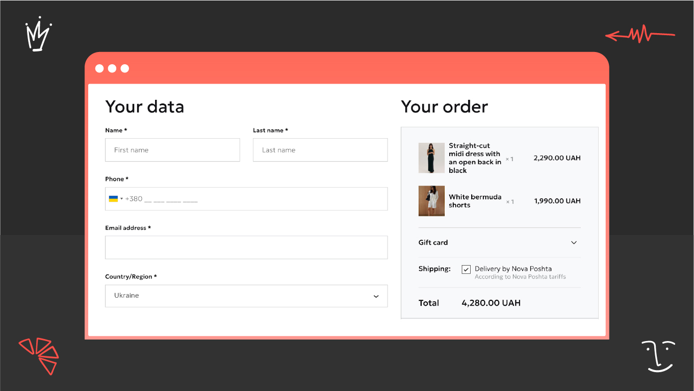
18% of users abandon checkout simply because the process feels too long or complicated. This is revenue that marketing has already paid to acquire, only to leave before it converts. At scale, it inflates customer acquisition costs without ever appearing as a line item anyone investigates.

The frustrating part is that forms are one of the most controllable assets in a digital product. Unlike brand perception or market timing, form performance can be engineered. Small structural changes produce measurable gains in completion rates within weeks. In many cases, fixing a high-traffic form delivers faster ROI than a full website redesign.

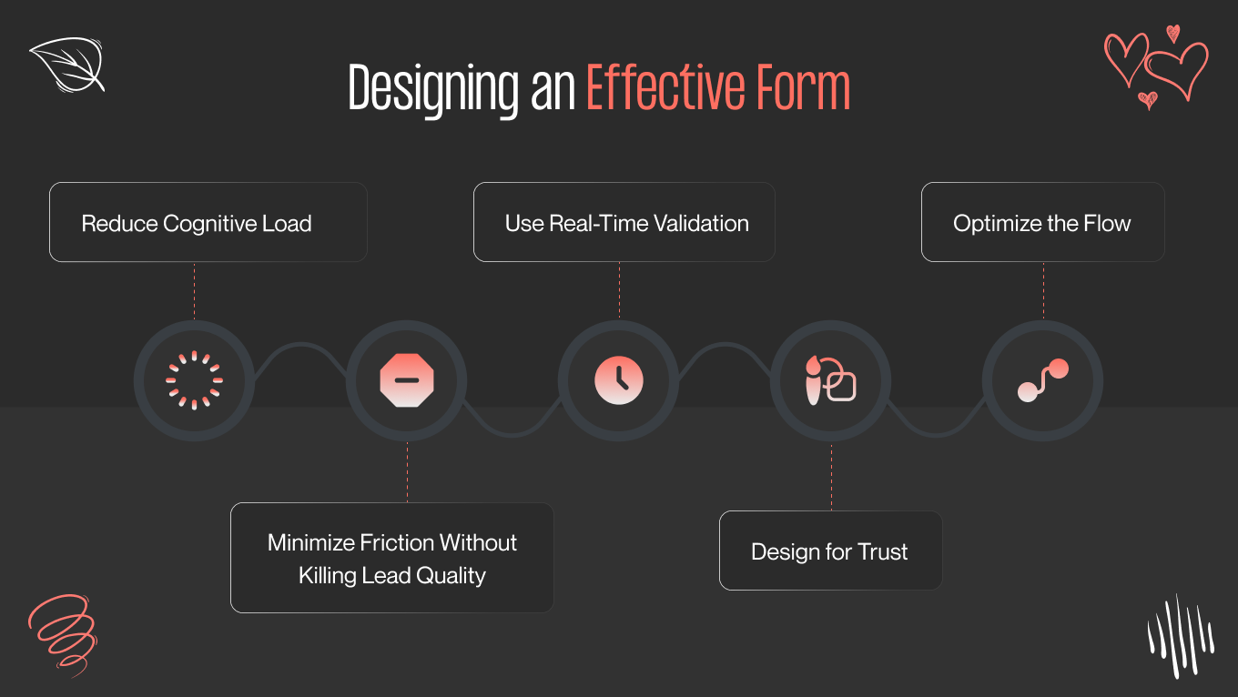
This article reframes form design as revenue infrastructure embedded in your funnel. We’ll examine how form experience affects conversion rate and long-term customer value. Also, you will see the behavioral mechanics behind abandonment and the form designing best practices that turn user input into measurable commercial performance.

Key Takeaways

  • Form design directly affects conversion rate, CAC, and customer value, not just user experience. 

  • Reducing cognitive load leads to more completions and lower acquisition waste when designing forms properly. 

  • The right amount of friction improves lead quality without killing volume.

  • Validation, trust signals, and clear microcopy prevent drop-offs at the moments that matter most. 

  • Most users fill out forms on mobile, so designing for that isn't optional. 

  • Consistent measurement and A/B testing turn forms into something you can compound over time.

What Good Form Designing Actually Is

A form is where intent either converts or walks away. By the time a user reaches it, you've already spent on acquisition. The form is what determines whether that spend pays off.

In practice, form design controls whether a qualified lead completes the process or drops before you ever see them. The way you sequence fields, request information, and handle errors has a measurable effect on completion rates and, by extension, on CAC, pipeline volume, and revenue efficiency.

If treating form designing as behavioral systems rather than data-collection tools, you consistently outperform those that don't. A well-structured form guides attention, distributes effort across the experience, and lowers the perceived risk of submitting. When it works, completion feels like a logical next step. When it doesn't, you're paying to lose people at the finish line.

5 Things Good Form Design Delivers for the Bottom Line

  • Reduces cognitive effort. Every extra field is another decision. When perceived effort outweighs value, users leave (and you've already paid to get them there). Strong form design removes unnecessary thinking, sets clear expectations, and makes completion feel proportionate to what's being asked.

  • Creates momentum toward completion. Logical sequencing, low-effort early inputs, and visible progress build psychological commitment. Users who sense forward movement are more likely to finish than those who feel like they're negotiating with the interface.

  • Minimizes uncertainty. Ambiguous labels, unclear formatting rules, and delayed validation introduce hesitation. Each of these moments is a drop-off risk. Proactive clarity is a conversion lever.

  • Reinforces trust at high-stakes moments. The moment you ask for personal or payment information, users run an instant risk calculation. Clean structure, transparent data explanations, and subtle reassurance signals shift that calculation in your favor.

  • Aligns data collection with revenue goals. The objective is to capture what moves a lead forward. Calibrated web form designing protects lead quality while maintaining a high enough volume to feed the pipeline.

Well-Designed Form Designing Examples (And Why They Work)

Form design doesn't have a single shape; it changes depending on the business's needs. A form built for volume looks different from one built for revenue completion or pipeline quality. Here are three examples of how structure follows commercial intent.

Example 1: Newsletter Sign-up

A single email field. A clear value proposition. One button. The entire structure is built to make the decision feel effortless; you're in, or you're out. There's nothing to navigate, no extra steps to negotiate, and no reason to hesitate. When the goal is volume, every element that isn't essential to that decision is a liability.

Key structural elements

  • One input field only

  • Strong visual hierarchy

  • Immediate validation

  • Secondary “No thanks” option

Newsletter Sign-up
newsletter sign-up example

Why it works from:

  • The user gives one piece of information and receives ongoing value

  • Reduced cognitive load increases submission rate, which grows your owned audience

  • Higher subscription volume lowers long-term reliance on paid acquisition channels

Example 2: Checkout Form

The checkout layout keeps customer information and the order summary in view at the same time. This way, users can verify what they're paying for while filling in details. Required fields are clearly marked, and dropdowns replace open text wherever possible to reduce the effort required to get through it.

Key structural elements

  • Grouped personal data inputs

  • Persistent order breakdown

  • Transparent pricing display

  • Clear progression toward payment

Checkout Form
checkout form example

Why it works:

  • Clear structure protects revenue at the final conversion stage

  • Visibility of totals reinforces trust and reduces abandonment

  • Improved checkout completion directly increases realized sales

Example 3:  B2B Contact Form

The company details form collects structured business data: industry, company size, role, etc through dropdowns and clearly organized fields. A "Next" button signals a logical sequence to follow, making the process feel like progress rather than a form to fill out.

Key structural elements

  • Essential qualification fields

  • Standardized dropdown inputs

  • Balanced spacing and hierarchy

  • Step-based forward movement

B2B Contact Form
b2b contact form example

Why it works:

  • The form gathers meaningful qualification data without overwhelming prospects

  • Sales teams receive better-prepared leads

  • Engagement remains high while lead quality improves

Well-structured forms don't work in isolation. They should be a part of a broader design system where every element earns its place. When you work with us on web design, form architecture is built in from the start. The result is an acquisition experience where copy, structure, and conversion logic reinforce each other at every stage of the funnel. Contact us to see where your current forms are losing ground and what a cohesive approach would change.

Core Form Designing Best Practices

You can invest heavily in acquisition, sharpen your positioning, drive qualified traffic, and still lose it all at the form. That's the part most teams underestimate. The form at the point of conversion is where the entire funnel either pays off or doesn't.

Here are our form design best practices that directly impact completion rates, lead quality, and the efficiency of everything upstream. Apply them with intention, and commercial priorities start becoming visible in user behavior.

Reduce Cognitive Load

Every additional field you add increases perceived effort. Users estimate how difficult the process feels, so once that perceived effort exceeds the value they expect, abandonment rises.

We reduce cognitive load by simplifying the structure while form designing. That means removing fields that do not directly support qualification or transaction goals. You should group related inputs so users can process information faster. Also, use clear labels and a strong hierarchy to make expectations obvious, aligning layout decisions with current responsive design trends that prioritize clarity and adaptability across devices.

In practice, this means:

  • Eliminate non-essential fields that do not influence qualification, segmentation, or transaction approval

  • Combine related questions into logical sections to reduce context switching

  • Break complex inputs into smaller, structured steps if necessary

  • Use concise, descriptive labels that remove ambiguity

  • Avoid duplicating data requests across pages or stages of the funnel

When you lower cognitive effort, completion rates improve. In turn, they increase acquisition efficiency because more of your existing traffic converts without additional spend.

Minimize Friction 

Friction determines who completes your form. The goal is calibrated friction that supports qualification without suppressing intent.

The bad approach is to require information that does not materially improve the qualification. It creates resistance without a business benefit. On the other hand, removing too much structure may increase volume but weaken lead quality and burden your sales team.

The right approach is to maintain balance:

  • Required fields serve a measurable purpose

  • Optional fields collect additional insight without blocking entry

Progressive disclosure allows you to introduce complexity after commitment has started. Multi-step forms often feel easier, even when the total information requested remains the same.

Use Real-Time Validation

If users complete the whole form and only then discover errors, frustration rises sharply. Many will not attempt a second submission. Designing a form, you can prevent this by validating inputs as they are entered. To keep the process smooth, use:

  • Inline feedback. Validate fields in real time, immediately after input. Confirm correct entries with subtle visual cues and highlight incorrect ones before the user moves forward. 

  • Clear error messages. Replace generic alerts with precise instructions. Instead of “Invalid input,” explain what needs correction and provide an example when relevant. 

  • Field-level guidance. Use short helper text beneath complex fields to clarify format requirements, character limits, or acceptable values.

  • Input constraints and formatting support. Apply input masks for phone numbers, dates, and payment details. 

  • Visual emphasis on the exact issue. Highlight only the field that requires attention rather than displaying a generic banner at the top. 

Applying these small improvements at the field level, you’ll have a measurable impact at the funnel level. Fewer frustrations lead to fewer drop-offs and stronger overall conversion performance.

Design for Trust

Every form that asks for personal or payment data introduces vulnerability. At that moment, users evaluate whether they feel safe proceeding. When applying principles of the UX trust design, you ensure that structure, messaging, and visual clarity reinforce credibility rather than trigger hesitation.

We strengthen trust through clarity:

  • Short reassurance messages explain why information is required

  • Security indicators and a clean visual structure signal legitimacy

  • Transparent communication about data usage increases perceived control

Build a form that your users will trust. Thanks to this, they move forward with less hesitation. That confidence shows up directly in your completion rates. People are more willing to submit personal details, payment information, or business data when the form’s UI/UX design feels secure and professional.

Optimize the Flow

Start with the easy questions. Name, email, and basic context are low-effort inputs that don't ask much and don't trigger hesitation. By the time users reach the more difficult or sensitive fields, they've already invested enough to want to finish. This sense of early progress is what carries people through the part of the form that would otherwise make them stop.

Designing a form flow intentionally, we guide users step by step toward action. An example of a structured flow:

  1. Start with low-effort information. Ask for basic details such as name or email first. Early completion builds psychological commitment.
  2. Introduce contextual or qualifying questions. Once engagement is established, move into questions that help you segment or qualify the lead.
  3. Request sensitive or high-friction data later. Payment details, budget ranges, or personal identifiers should appear after users have invested time and attention.
  4. Reinforce progress before final submission. Provide a clear summary or confirmation step so users feel in control before committing.
  5. End with a single, focused call to action. One clear next step reduces hesitation and prevents decision overload at the final moment.

A form that's structured with intention protects every dollar you've already spent getting someone there. Get a consultation to identify where your current forms are losing ground and what it would take to fix them.

Advanced Form Designing Tactics That Drive Conversion

Once the fundamentals are solid, the gains get quieter, but they compound faster. At this stage, you're moving beyond core form designing best practices into refinements around speed, clarity, and the psychological comfort of the submission process. These changes tend to produce outsized returns because they touch every single conversion attempt that moves through your funnel.

A small lift in completion rate doesn't stay small for long. Applied across thousands of sessions, even a fraction of hesitant users choosing to continue instead of leaving adds up quickly; in volume, in pipeline, and in revenue that was already within reach.

Smart Defaults and Autofill

The most efficient website design form minimizes manual effort. Instead of requiring users to start from zero, you can shorten the path through intelligent assistance:

  • Pre-fill known information, such as email or company name, for returning users

  • Detect location automatically to suggest country, region, or currency

  • Use stored preferences to eliminate repetitive data entry

  • Surface previously entered shipping or billing information for repeat purchases

Time-to-completion is a meaningful performance variable. Users move through the process faster, and abandonment declines. Across high-volume funnels, even a modest reduction in completion time can translate into measurable gains in revenue efficiency.

Progressive Disclosure in Complex Systems

Long forms designing fails because it shows too much at once. When users see a dense block of required fields, most of them make an effort to calculate before they've typed a single character. Progressive disclosure can help you with this. 

Instead of presenting everything upfront, you reveal the form in structured stages that align with conversational UI design principles, guiding users through one step at a time rather than confronting them with a wall of inputs.

In practice, this means:

  1. Conditional logic that surfaces follow-up questions only when relevant.
  2. Step-based progression that breaks large forms into manageable segments. 
  3. Context-aware branching that adapts the flow based on what the user has already told you.

The psychological effect is that users judge effort by what's in front of them, not by what's coming. Reduce visible complexity, and you decrease the instinct to abandon. That’s why this approach is effective in loan and financing applications, insurance and quote systems, enterprise onboarding flows, and multi-product checkout environments.

Microcopy as a Conversion Lever

The smallest copy in your form can do the heaviest lifting. For example, a single line placed at the right moment can be the difference between a user continuing and leaving. That’s because it answers the question they were already asking silently.

Effective microcopy does three things:

  1. Explains why the information is needed. When users understand the purpose behind a question, resistance drops. A short clarification reframes the request from intrusion to relevance.
  2. Reduces anxiety around sensitive fields. Personal details, payment information, and business data trigger instant caution. Brief reassurance about security, encryption, or limited usage lowers perceived risk at the moment users are most likely to hesitate.
  3. Makes the benefit of completing the step visible. Users are more willing to give information when they can see what they get in return. Highlighting personalization, faster processing, or better recommendations reinforces the fairness of the exchange.

In practice, it looks like this:

  • "We use your phone number only for delivery updates."

  • "Your payment details are encrypted and never stored."

  • "This helps us tailor recommendations to your business size."

None of these lines is long. Microcopy works because it's precise.

Mobile-First Form Design Optimization

Most visitors are now on phones when they encounter your forms. Smartphones account for roughly 64.35% of global web traffic, a share that continues to grow as people use their devices for browsing, research, and transactions on the go. 

This shift has direct implications for forms. If it feels like a desktop experience on a tiny screen, you lose conversions before the first field is touched. The same principles that guide strong mobile app design apply here: prioritize touch ergonomics, clarity, speed, and contextual interaction.

Mobile-first form designing best practices focus on minimizing physical effort and cognitive interruption. The goal is to:

  1. Reduce the number of taps
  2. Prevent avoidable errors
  3. Preserve momentum from the first field to the final submission

Even small adjustments will produce measurable gains for you. The structural elements of the mobile-first design strategy below address the most common friction points and show how each one influences performance outcomes:

Mobile Optimization Area

What You Should Implement

Business Impact

Proper Input Types

Use email, number, tel, and date input types to trigger the correct mobile keyboard or native picker

Faster data entry, fewer errors, reduced abandonment

Large Touch Targets

Increase button size, spacing between fields, and tappable areas

Lower mis-taps, smoother interaction, improved usability

Keyboard Optimization

Keep active fields visible above the keyboard, and close the keyboard when appropriate

Maintains flow, prevents disruption, and shortens completion time

Autofocus Logic

Automatically move users to the next logical field after completion

Fewer unnecessary taps, higher momentum, improved finish rates

One-Column Structure

Use a vertical, single-column layout aligned with scrolling behavior

Clear progression, lower cognitive load, stronger completion rates


How to Measure Your Forms Performance

If forms are revenue infrastructure, they deserve the same measurement discipline as paid campaigns or sales funnels. Every field, step, and hesitation produces a behavioral signal. It tells you where users move forward and where they walk away. This information is too valuable to ignore.

Form Completion Rate

Completion rate measures the percentage of users who start the form and finish it. When traffic quality remains stable, but completions drop, the problem is almost always within the form, not upstream of it.

The levers are removing non-essential fields, improving label clarity, tightening validation, and rethinking field order. A 3-5% lift in completion rate doesn't sound dramatic, but applied across a high-traffic form, it translates into revenue without touching acquisition spend.

In our experience, the field that kills the most completions is rarely the one you'd expect. Before restructuring an entire form, you should map drop-off by field. In several projects, a single ambiguous label or an unexpected input type was responsible for the majority of abandonment. Fix the specific friction point first, then optimize the broader structure around it.

Field Drop-Off Analysis

Field drop-off analysis shows where users abandon the form. Instead of looking only at overall completion, you need to examine which specific question or step causes hesitation. This form designing metric gives you operational visibility into friction at a granular level.

We use this data to make targeted adjustments. You can rewrite unclear labels, reposition sensitive questions, simplify complex fields, introduce progressive disclosure, or align inputs with accessible design standards. Small corrections at high-drop-off fields often generate immediate performance gains.

Time to Completion

Time to completion measures how long it takes users to submit the form. For you, this reflects how demanding or confusing the experience feels in practice. Longer completion times indicate hesitation, uncertainty, or structural inefficiency.

To reduce completion time, we streamline inputs, enable autofill, improve the logic of the mobile UI design, and eliminate redundant steps. Shorter completion cycles preserve momentum and typically increase submission volume across the same traffic base.

Error Rate

Error rate tracks how often users trigger validation failures while completing the form. High error frequency signals unclear instructions, improper input types, or weak guidance.

We improve this form design metric by implementing real-time validation, adding field-level guidance, and using appropriate input formats. Also, you can support feedback with a clear illustration design that helps users understand and correct mistakes faster with visual cues. After you reduce error friction, users experience fewer interruptions, which strengthens completion consistency.

Abandonment Rate

Abandonment rate measures how many users start the form but leave before submitting. This affects your acquisition efficiency because paid traffic that does not convert represents a lost opportunity.

To lower abandonment through good form designing, we analyze structural bottlenecks, test simplified versions, and adjust sequencing. You can also evaluate whether friction aligns with qualification goals. When abandonment declines, effective cost per lead improves without additional marketing investment.

A/B Testing Strategy

A/B testing allows you to validate changes with measurable data instead of relying on assumptions. For you, this ensures that every structural adjustment has a proven performance impact.

We recommend testing one variable at a time, such as field count, flow structure, CTA wording, or microcopy placement. Controlled experiments, often informed by insights from a strategy workshop, allow you to isolate impact and scale improvements confidently. Over time, incremental gains compound and strengthen overall revenue performance.

Hire Gapsy for Revenue-Driven Form Designing

At Gapsy, we approach form designing as part of a broader conversion and growth strategy. With over 12+ years of experience in digital product design, UX research, and performance optimization, we understand how structural decisions at the form level influence acquisition cost, lead quality, and long-term customer value.

Our process combines:

  • UX research to understand user hesitation points

  • Behavioral analysis to identify friction and drop-off drivers

  • Conversion rate optimization methodologies

  • Data-informed iteration through testing and validation

When engaging with us, you gain:

  • Structurally optimized forms aligned with your funnel economics

  • Mobile-first execution built around real user behavior

  • Reduced time-to-completion and lower abandonment

  • Clear measurement frameworks to track performance improvement

  • Continuous optimization

Your forms may be leaving measurable revenue on the table through avoidable friction and structural inefficiencies. Book a call to evaluate your current performance and identify clear opportunities to increase conversion and acquisition efficiency.

Final Thoughts

Form design is rarely treated as a strategic priority, yet it sits at one of the most commercially sensitive points in your funnel. Every campaign, SEO effort, and outbound initiative converges at a moment where a user decides whether to complete a form or leave. That decision is influenced less by intent and more by structure, clarity, and perceived effort.

Well-designed forms protect the investment you have already made in acquisition. They reduce unnecessary friction, preserve lead quality, and increase the percentage of qualified users who convert into pipeline or revenue. Over time, even small improvements in completion rate compound into meaningful gains in customer acquisition efficiency and long-term value.

Many businesses are sitting on unrealized conversion potential hidden inside their existing forms. Contact us to evaluate your current form performance and uncover clear, data-backed opportunities to increase revenue impact.

Rate this article

20 ratings
Average: 4.9 out of 5

If you like what we write, we recommend subscribing to our mailing list to always be aware of new publications.

Do you have any questions? We tried to answer most of them!