Gapsy’s Breakthrough — The Best Website Design for September 2023 on DesignRush

5minutes read
gapsy best website design

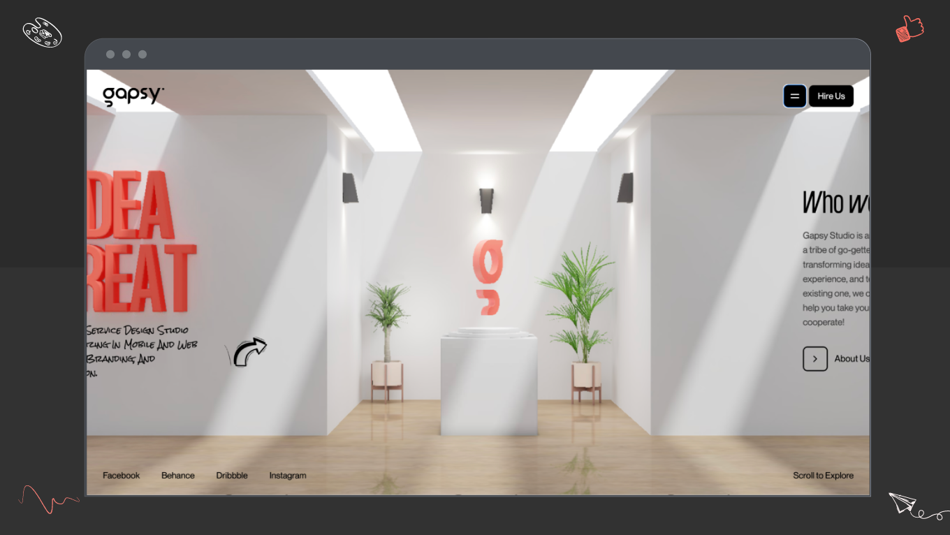
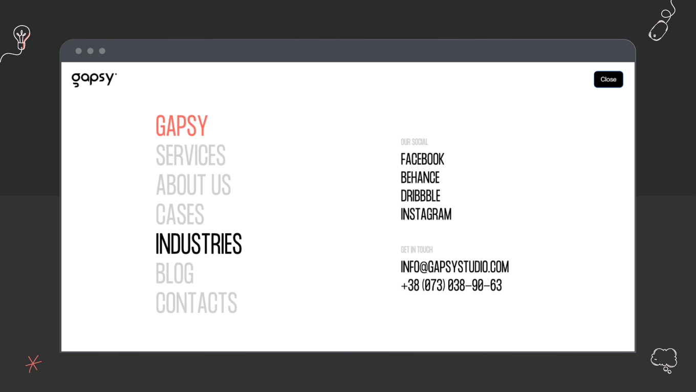
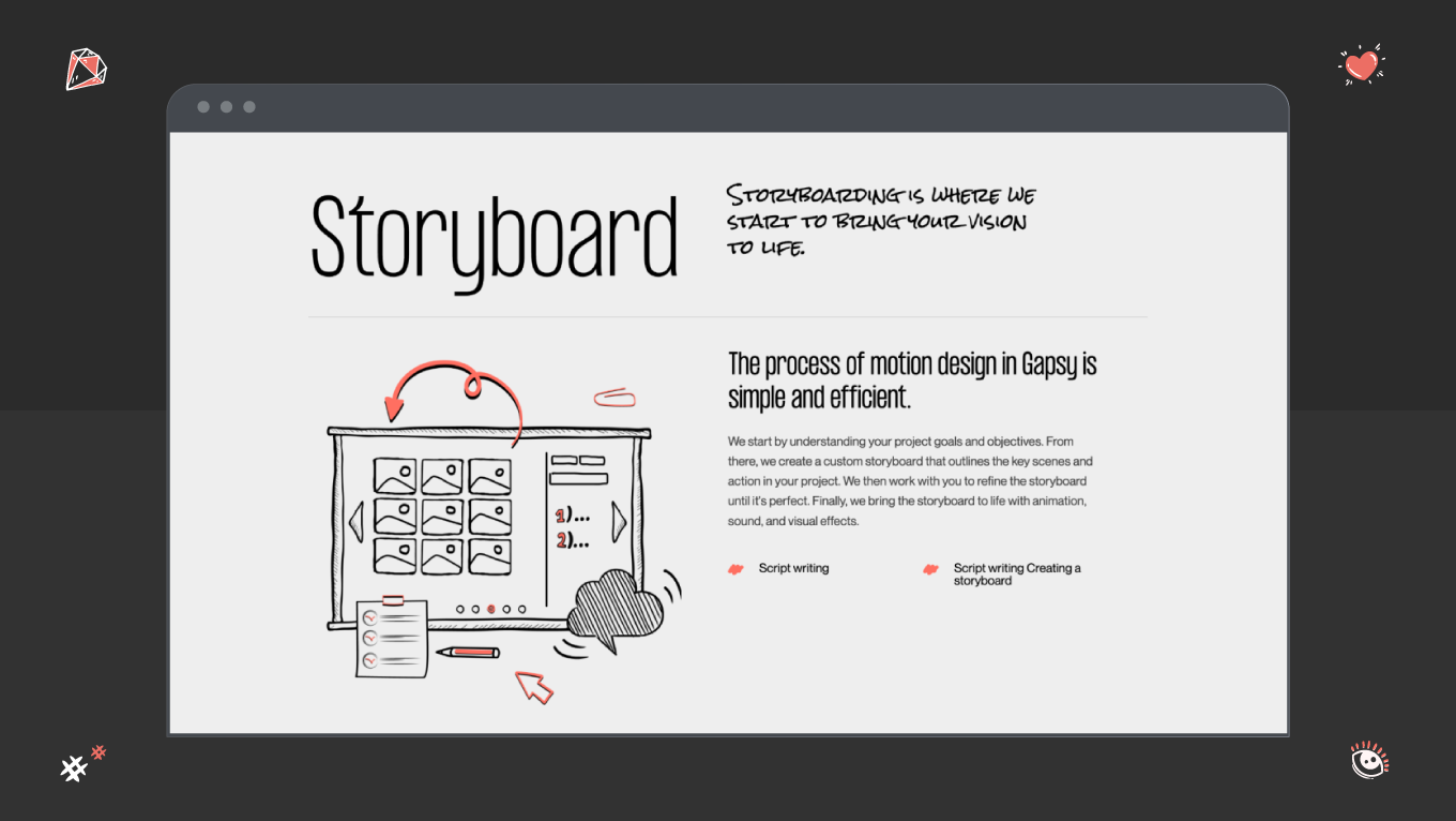
In September 2023, Gapsy Studio got on DesignRush’s list of the best design. We want to share this achievement with you. Join us as we break down the details of our website’s design! This article seeks to enlighten the pathways taken, the decisions made, and the intricate details incorporated into the digital fabric of Gapsy’s design. Let’s open the curtain and see what’s under the facade.

Beyond Aesthetics: Our Cutting-Edge Design

Our task was to combine user-friendliness and innovative design. The homepage welcomes you into “the building” — as if you look inside Gapsy’s work atmosphere. 

The 3D solution we implemented provides a smooth experience for users. Design is about emotions, so have fun with this! Our user interfaces are a testament to innovation, seamlessly blending intuitive navigation with visually engaging elements. Dynamic UI components respond to user interactions, providing an immersive and fluid experience beyond static web design norms. 

gapsy studio 3D elements
gapsy’s homepage

Microinteractions are the hidden heroes of user experience, and we tried to leverage them with the best practices. Every click, hover, or scroll triggers subtle animations that delight users and guide them through the digital journey, creating a sense of continuity and connection. 

Look at all the primary services we provide!

Gapsy introduces inventive menu structures and navigation pathways, breaking conventional navigation paradigms. It adds an element of surprise and simplifies user journeys, making information discovery a seamless and enjoyable process.

gapsy studio navigation menu
gapsy’s navigation menu solution

Our design adapts seamlessly to various screen sizes and resolutions to ensure a consistent and delightful user experience across diverse devices. The website's responsive design isn't just about fitting content; it's about optimizing the user experience for every context.

Crafting Gapsy’s Identity with Branding

Consistent branding leaves an impression on users. From unique illustrations to distinctive typography and color schemes, we create an unforgettable experience for site visitors. Branding allows you to express yourself and show your company’s essence. At Gapsy, we demonstrate our character throughout the website — amusing and compelling. 

We leverage design as a storytelling medium. Each visual element, from hero images to iconography, contributes to a narrative that reflects the brand's identity. This strategic storytelling creates an emotional connection, making the brand memorable and relatable to visitors.

gapsy studio illustrations
gapsy’s brand identity throughout the website

It’s essential to note that we maintain brand consistency across various platforms and devices. Whether accessed on a desktop, tablet, or smartphone, the brand elements adapt seamlessly, providing a uniform brand experience. This consistency reinforces trust and reliability in our brand. 

We create for numerous industries and strive to be the best.

Typography on our website is more than just words on a screen; it's a carefully curated expression of the brand's identity, personality, and user experience. From the choice of fonts to the spacing between letters, our approach to typography is an ode to the art and science of effective communication. Typography plays a pivotal role in guiding users through content. Gapsy employs a clear hierarchy of font sizes, weights, and styles to establish visual flow and prioritize information, ensuring users can effortlessly navigate and absorb the content in a logical sequence. The hand-written-like font across the site’s pages adds zest and some sense of casualness for users. 

The primary color palette isn't just a collection of visually pleasing shades; each color is chosen with strategic intent. Whether it's a bold accent or a calming backdrop, the primary colors work together to convey the brand's personality and evoke specific emotions. The color scheme adapts seamlessly to different devices and screen sizes. Our responsive design ensures the colors remain vibrant and accurate, regardless of whether you view the website on a large desktop monitor or a compact smartphone screen.

Gapsy’s Design Illuminates the Future of Web Development

Our achievement is not just a recognition; it's a glimpse into the future of web development. It's a tribute to the idea that, in the ever-evolving digital landscape, success lies not just in aesthetics but in the seamless fusion of technology, design, and a deep understanding of user needs. We want to remind you that excellence is not a destination; it's a continuous evolution, and the journey is as significant as the goal itself. Stay tuned, work with Gapsy, and contact us if you want to develop a high-quality product!

Rate this article

20 ratings
Average: 4.9 out of 5

If you like what we write, we recommend subscribing to our mailing list to always be aware of new publications.