A Complete Guide to Healthcare App UX for Modern Digital Health Products

13minutes read
ux for healthcare apps

Designing a healthcare app sounds straightforward, until you remember that every tap, delay, and confusing screen can directly affect someone’s wellbeing. This is why 72% of health system executives say improving consumer experience, engagement, and trust is their top priority in 2025. The problem is that most digital healthcare products still overwhelm patients, frustrate clinicians, and fall short of accessibility and compliance expectations.

And when the experience breaks, the consequences are real: patients abandon portals, telemedicine visits go unfinished, clinicians revert to manual workflows, and trust erodes fast. The more complex the app, the more emotional and cognitive load it places on people who are already anxious or unwell.

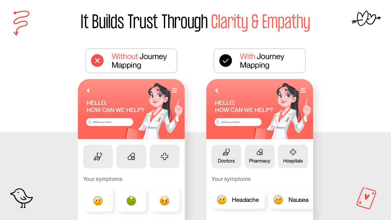
The way forward is shaping a healthcare app UX that anticipates stress, reduces friction, and prioritizes clarity, safety, and empathy at every step. In this guide, we’ll break down the unique challenges of healthcare UX and share practical design patterns and examples that help digital health products actually support the people who rely on them.

Our UI/UX Case Study on Healthcare App Design: Calming, Accessible Wellness Experience

While healthcare apps must handle complex data, strict compliance, and multi-role workflows, the core UX challenge remains the same: reducing cognitive load for people who are stressed, anxious, or overwhelmed. A good example is our work on Mind Cleanse, a meditation app designed to help users manage stress, anxiety, and emotional tension through guided practices.

The Challenge

Mind Cleanse approached us with a simple but demanding goal: create an experience that immediately feels safe, effortless, and emotionally grounding. Unlike utility apps, meditation tools must avoid overstimulation. So, every element needs to support calmness, clarity, and ease of use.

We worked with a diverse audience: users experiencing anxiety, those unfamiliar with meditation, and regular practitioners seeking structure and personalization. The challenge was designing a flow that works equally well for both first-time and returning users without creating confusion or cognitive friction.

Design Objectives

  • Reduce cognitive load by simplifying navigation and minimizing decisions.

  • Support emotional states through color, typography, and micro-interactions designed to lower stress.

  • Provide clear feedback so users always feel guided, not lost.

  • Create accessible paths for different skill levels, energy levels, or moments of anxiety.

  • Personalize the journey using user preferences and progress analytics.

Our UX and UI Approach

To reinforce mental relaxation, we built a calm, unobtrusive interface with:

  • A gentle color palette designed to reduce visual strain.

  • Simple, role-driven navigation (morning, afternoon, night modes) for quick entry points.

  • Predictable layouts that lower cognitive effort and support intuitive interaction.

  • A structured library with filters so users can quickly find meditations for stress, sleep, focus, or anxiety relief.

  • A dedicated Story screen offering context, guidance, and personalized recommendations. 

  • A minimalistic player to avoid distraction and keep attention on the meditation experience.

We also incorporated light analytics to help users understand their progress. 

The Outcome

The redesigned experience led to strong engagement results:

  • 50+ well-structured screens supporting multiple user intents

  • 45,000 unique visitors in the first three months

  • Thousands of minutes of completed meditation sessions

  • Positive feedback from users who reported improved focus, calmness, and relaxation

Most importantly, users described the app as “easy to navigate,” “stress-reducing,” and “comforting.” These are metrics that matter just as much as clinical accuracy in healthcare UX.

If you're planning something similar in healthcare or wellness and want to talk through ideas, we’re open to a conversation. Sometimes a short discussion is all it takes to find the right direction.

What Makes Healthcare App UX Design Different From Other Industries?

Designing for healthcare isn’t like designing for retail, travel, or even fintech. Healthcare UX stands apart because people rarely open these apps in a neutral state. They’re worried about symptoms, waiting for test results, trying to understand treatment instructions, or navigating a care task they’ve never done before. This emotional weight changes everything. A button that’s slightly unclear in an e-commerce app is an inconvenience. In healthcare, it can increase anxiety or lead someone to postpone a critical action.

Area

Healthcare UX

Typical Consumer App UX

User mindset

People come in worried, tired, or trying to make sense of something unfamiliar. The design has to calm, not overwhelm.

Most users are relaxed and exploring; small frustrations rarely carry emotional weight.

Audience range

A single product may serve patients, caregivers, nurses, and doctors. Each group needs a different level of depth and clarity.

Audiences are more uniform, with similar expectations and digital skills.

Type of tasks

Actions often involve health data, symptoms, appointments, or treatment steps—things people don’t want to get wrong.

Tasks are simpler: browsing, buying, booking, or reading. Mistakes are rarely serious.

Impact of errors

A confusing screen can delay care or increase anxiety. The stakes are higher than in most industries.

Errors usually lead to a minor inconvenience, not a health consequence.

Privacy expectations

Trust is non-negotiable. Users need to feel safe sharing personal and often sensitive information.

Privacy matters, but it’s not tied to someone’s wellbeing in the same way.

Accessibility needs

You design for people with limited vision, reduced mobility, chronic conditions, or age-related changes by default.

Accessibility varies by product and is often treated as an enhancement, not a requirement.

Information load

Medical information is complex, so the UI must simplify without losing accuracy. Clarity is everything.

Content can be lighter and more flexible; precision isn’t always mission-critical.

Emotional responsibility

The experience should feel supportive and steady, especially during stressful moments.

The primary goal is convenience or delight; emotional stakes are much lower.


Why Mapping the Patient Journey Matters

In healthcare, people rarely interact with a mobile app in isolation. Every interaction is part of a larger personal story. Mapping the patient journey helps you understand these moments in context, not as separate screens or features.

It Reveals What Patients Are Experiencing

Patients move through healthcare in emotionally loaded moments: worrying about symptoms, trying to interpret information, waiting for clarity. Mapping the journey helps teams understand:

  • What patients feel at each step

  • What they expect or fear

  • Where confusion or hesitation appears

  • When reassurance matters most

This context shapes a more humane and supportive experience.

It Highlights Pain Points That Aren’t Obvious From the UI Alone

A screen may look simple, but the moment it appears in the journey can make it complicated. Journey mapping uncovers:

  • Emotional spikes, like checking test results

  • Long, silent waiting periods with no feedback

  • Repetitive forms or unclear questions

  • Steps that assume too much medical or digital literacy

Fixing these points often has a bigger impact than adding new features.

It Prevents Designing Around Assumptions

Healthcare teams often build experiences based on internal workflows, not patient reality. Journey mapping shifts that by showing:

  • How people actually move through tasks

  • Where they rely on guesswork

  • Which steps feel heavier than expected

  • How different users (patients, caregivers, older adults) approach the same flow

This keeps products grounded in real human behavior.

It Builds Trust Through Clarity and Empathy

Journey mapping encourages design decisions that make difficult moments feel manageable. It helps teams create:

  • Clear instructions when patients feel uncertain

  • Predictable flows that minimize stress

  • Feedback that reduces anxiety during waiting periods

  • Interfaces that feel calm rather than clinical

When the journey makes sense, trust grows naturally.

Designing for Patients vs Providers: Different Needs, Different UX Rules

Patients and healthcare providers often use the same app, but they’re not living the same experience, and their expectations couldn’t be more different. Designing for both groups requires understanding how they think, what pressures they’re under, and how quickly they need to act. One-size-fits-all UX simply doesn’t work in healthcare.

Patients Need Clarity, Reassurance, and Fewer Decisions

Patients approach digital health tools with mixed levels of literacy, emotional readiness, and confidence. Many are anxious, sick, or trying to complete a task they’re unfamiliar with. Their experience should feel:

  • Simple and guided, with clear next steps

  • Emotionally supportive, avoiding medical jargon

  • Calm and predictable, reducing anxiety

  • Accessible, especially for older adults or people with impairments

In patient-facing flows, success often means removing steps. A good patient interface gives people one clear path forward, backed by language that feels human and reassuring.

Providers Need Speed, Precision, and Information Density

Clinicians, on the other hand, live in a world of rapid decision-making. They jump between patients, systems, and tasks all day. Their interface can’t slow them down.

Providers need:

  • High information density, without noise

  • Fast access to critical data—vitals, charts, diagnostics

  • Predictable shortcuts and workflows tailored to clinical routines

  • Zero ambiguity, as mistakes can have real consequences

  • Seamless switching between multiple patient records

For clinicians, simplifying too much becomes a liability. They need depth—just surfaced in a way that never disrupts their flow.

Two Worlds in One Product: How to Balance Healthcare UX

Designing a product that serves both patients and providers means building two experiences that feel effortless for very different reasons. Patients need emotional clarity; clinicians need operational speed. Balancing these worlds isn’t about compromising between them—it’s about shaping an architecture that respects the reality of each role.

Below are practical ways to achieve that balance, along with insights we’ve gathered from working on complex healthcare and wellness products.

1. Start With Role-Based Interfaces

Trying to force patients and clinicians into the same UI is where most healthcare apps break.

  • Create separate entry points or role-based dashboards

  • Patients see tasks like appointments, symptoms, and instructions

  • Providers see charts, notes, and urgent items.

In several of our projects, introducing role-based flows reduced screen complexity by 40% and immediately cut “I can’t find this” feedback from testers.

2. Let Information Density Match the User’s Reality

Patients often get overwhelmed by too much medical data. Providers get frustrated when important data is buried.

To overcome this: 

  • Use progressive disclosure for patients.

  • Use high-density, high-accuracy layouts for clinicians.

We’ve seen patient satisfaction rise when lab results were simplified with “what this means for you” summaries, while clinicians continued to view the full raw data.

3. Simplify Cognitive Load for Patients, Optimize Workflow Load for Providers

Patients benefit from fewer decisions. Providers benefit from fewer clicks.

  • Patients: linear flows, calm copy, one task at a time.

  • Providers: shortcuts, batch actions, keyboard support, fast record switching.

During testing, providers often complete tasks 3–4x faster when small workflow accelerators (like quick actions) are added, even when patients never see those elements.

4. Use Language as a Design Tool

Patients need human, gentle wording. Providers need precise terminology.

For example: 

  • Patient-facing: “Your symptoms today”

  • Provider-facing: “Clinical observations”

We’ve learned that adjusting microcopy for patient flows can reduce support queries dramatically, especially around understanding results or next steps.

5. Build Trust Into Both Experiences, But in Different Ways

Trust looks different on each side.

  • Patients trust clarity, transparency, and predictable interactions.

  • Providers trust accuracy, system reliability, and speed.

In product audits, we consistently see patient trust drop when data feels “hidden,” while provider trust drops when the system feels slow or too simplified.

6. Map Both Journeys Separately and Overlay Them

Patients and clinicians often meet at key touchpoints: appointments, messages, results. Mapping each journey separately helps identify where they diverge. Overlaying them shows where they align.

Overlay reveals:

  • Where timing breaks

  • Where expectations don’t match

  • Where the product must support both sides at once

This technique helped us redesign a care coordination flow where provider delays triggered patient anxiety. The overlay revealed exactly where the communication gaps lived.

7. Always Test With Both Groups

Patients can’t accurately predict what clinicians need. Clinicians can’t accurately predict where patients get confused. That’s why you should run parallel usability sessions and compare patterns. 

Every time we test with both sides, we find blind spots we couldn’t foresee. Especially around emotional responses from patients and workflow bottlenecks for clinicians.

8. Keep the System Architecture Flexible

As medical workflows evolve, both patient and provider needs will change.This means designing with modularity, where interchangeable components, scalable layouts, pluggable features are non-negotiable. 

This approach consistently reduces redesign costs and helps teams roll out updates faster without disrupting either role’s experience.

Building or improving a healthcare product and want a UX that genuinely supports both patients and providers? Feel free to reach out. We’d be happy to discuss your project and explore how we can help.

How Compliance Shapes Healthcare UX

Compliance directly shapes how people interact with the product. When you’re dealing with sensitive medical data, every screen, message, and flow needs to protect users without overwhelming them. This is where UX and compliance become inseparable.

Compliance Is a UX Constraint

Standards like HIPAA, GDPR, and WCAG influence the design from the earliest wireframes. They affect everything from how patients sign in, to how results are shown, to how long information stays on screen. If compliance is treated as an afterthought, the user experience quickly becomes clunky and stressful.

Secure Actions Must Still Feel Effortless

Healthcare products need strong authentication, but not at the expense of usability. Patients already dealing with anxiety shouldn’t fight their way through an overly strict login process.

Good UX balances both by using:

  • Clear explanations for why certain steps are required

  • Predictable flows (e.g., two-factor authentication that behaves consistently)

  • Biometrics where possible to reduce friction

Security shouldn’t feel like punishment.

Transparency Builds Trust

Patients want to know what’s happening with their data. Simple, plain-language explanations go a long way toward easing concerns.

Strong UX communicates:

  • Why you’re asking for certain data

  • How it will be used

  • How users stay in control (permissions, exports, revocations)

In healthcare, trust is a usability feature.

Accessibility Is a Compliance Requirement

WCAG standards shape everything from color contrast to tap-target sizes, and they’re especially important in healthcare where many users live with visual, cognitive, or motor challenges. 

Key WCAG requirements that influence healthcare UX include:

  • Minimum color contrast ratios so text and icons remain readable for users with low vision.

  • Larger tap targets to support users with limited dexterity or tremors.

  • Screen-reader compatibility, including proper labels, alt text, and logical reading order.

  • Keyboard and assistive-tech navigation, ensuring all actions can be completed without touch.

  • Predictable layouts and consistent patterns to reduce cognitive load and avoid confusion.

  • Avoidance of jargon and unnecessarily complex language, supporting users with cognitive challenges.

  • Captions and transcripts for audio or video content, crucial for users with hearing impairments.

  • Error prevention and clear instructions, especially for form fields related to health information.

These requirements ensure that every patient, regardless of ability, age, or emotional state, can access the care and information they need safely and confidently.

Consent Flows Need to Be Clear and Reassuring

Consent should never feel hidden or forced. A good consent experience:

  • Uses human language, not legal jargon

  • Breaks information into digestible steps

  • Offers clear “allow” and “decline” options

  • Reminds users they’re in control

The Cost of Poor Healthcare UX and Why Better Design Pays Off

Healthcare products fail quietly: through daily friction, small moments of confusion, and workflows that never quite fit the reality of patient or provider needs. When this happens, the financial impact grows slowly but steadily, often unnoticed until it becomes impossible to ignore.

How Poor UX Erodes Revenue and Efficiency

When the experience doesn’t support users, organizations see a pattern:

  • More no-shows because booking or reminder flows feel confusing or unreliable.

  • Higher call-center volume from patients who can’t complete simple tasks on their own.

  • Patient churn as people move toward providers with clearer, more supportive digital tools.

  • Delays in reimbursement when forms or data-entry flows create errors that slow administrative processes.

  • Compliance risks (including HIPAA or WCAG violations) that come with direct financial penalties.

  • Low adoption of digital tools that cost a lot to build but don’t feel intuitive enough to use regularly.

Where Strong UX Creates Measurable ROI

The good news is that thoughtful healthcare UX delivers clear returns that leadership can feel across the organization.

  • Streamlined appointment flows increase completion rates, stabilizing revenue and reducing schedule gaps.

  • Accessible interfaces reduce legal exposure, supporting WCAG compliance while serving more patients effectively.

  • Simplified onboarding boosts digital engagement, lowering support demand and improving patient satisfaction.

  • Clearer information architecture helps clinicians work faster, cutting down on time spent navigating systems instead of caring for patients.

3 Examples of Great Healthcare UX

Real-world healthcare products show how thoughtful, research-driven UX can improve access, trust, and clinical efficiency. These examples, ranging from telehealth to patient portals, demonstrate how the right design decisions create measurable impact for both patients and providers.

MEDIC Doctor App: Makes Telehealth Accessible Across Diverse User Groups

The MEDIC Doctor App is a strong example of designing for markets where digital literacy, trust, and access create real barriers. The team followed a full Design Thinking approach, beginning with user interviews to understand personas—from busy professionals to elderly patients—before moving into clear problem definition, ideation, prototyping, and testing with eight participants.

What makes MEDIC stand out is its focus on reducing cognitive load and building trust. Transparent doctor profiles, assisted phone-based booking for seniors, clear medical record access, and multiple payment methods make the experience usable even for first-time digital health users. Accessibility considerations (like clear text hierarchy and color-blind–friendly UI) broaden inclusivity.

Impact in practice:

  • 90% user satisfaction from usability testing

  • High task completion, especially for consultations and booking

  • Faster booking and fewer steps led to 20–30% reduction in cognitive load

  • Better adherence to follow-ups thanks to a smoother flow

  • Potential to reduce unnecessary in-person visits by 20–30% in underserved regions

MEDIC succeeds because it treats every user, tech-savvy or not, with equal care. It’s a powerful example of how inclusive, trust-centered UX can scale healthcare access in markets where it’s needed most.

2. Teladoc Health: Reduces Friction in Remote Care

Teladoc Health remains one of the clearest demonstrations of how simple, predictable digital flows can remove barriers to care. Its UX centers around easy scheduling, flexible consultation modes (video, text, phone), and quick provider matching, features designed after extensive user research and iterative testing.

Teladoc’s biggest strength is its ability to minimize friction. Tasks that traditionally required forms, phone calls, or waiting rooms now take minutes. Pre-consultation tech checks and secure messaging reduce drop-offs and user anxiety, especially for remote or rural patients.

Impact in practice:

  • Adoption jumped from 5% pre-pandemic to 25% in 2022 (with peaks around 70%)

  • Sustained high adoption shows UX is not a pandemic anomaly but a long-term behavior shift

  • 20–30% reduction in administrative overhead for providers

  • Improved patient satisfaction (80%+) due to flexibility and clarity

  • Industry-wide estimates suggest a 15–25% drop in visit drop-offs due to smoother flows

Teladoc proves that when UX removes complexity, patients stay engaged and providers work more efficiently.

3. Mayo Clinic Patient Portal: Empowers Patients Through Accessible Design

The Mayo Clinic Patient Portal shows how strong UX can turn large, complex medical systems into approachable, patient-centered tools. Built in collaboration with Mayo’s KER (Knowledge & Evaluation Research) team, the portal prioritizes accessibility and clarity, offering everything from appointment scheduling to medication refills and shared decision-making guides.

The standout feature is how it simplifies complex medical information. Clear language, structured data, intuitive navigation, and interactive SDM tools support patients in making informed choices—essential for chronic conditions like diabetes.

Impact in practice:

  • 10–15% improvement in patient satisfaction, largely tied to better clarity and communication

  • High adoption rates reduced administrative load through self-service

  • Fewer errors and misinformation due to structured SDM tools

  • Better adherence to treatment plans, lowering readmission risk by an estimated 5–10%

Mayo’s portal turns overwhelming medical information into something people can actually act on. It’s a reminder that accessibility isn’t just compliance—it’s a driver of better health outcomes.

Looking for a Design Team That Understands Healthcare UX? Here’s Why We’re the Right Match

Healthcare products are tools people turn to when they’re worried, tired, or trying to make sense of something important. Designing for those moments requires a team that doesn’t just think about screens, but understands the emotions and limitations behind them. 

Since 2017, we’ve been designing digital experiences that put clarity and comfort first. Our team sees how a calm interface can lower stress, how accessible layouts empower users who often feel overlooked, and how thoughtful UX can make healthcare feel more human. 

  • We design for real moments. Our work focuses on clarity, calm, and emotional ease.

  • Accessibility is built in from day one. We treat inclusive design as a responsibility, not a feature.

  • We research before we design. Seniors, parents, clinicians, patients with chronic conditions: we learn how each group actually behaves, then shape UX around their reality.

  • 100+ projects since 2017. A mix of health, wellness, and medical products where trust, readability, and simplicity mattered most.

  • Clients highlight our communication and care. Reviews consistently mention clarity, reliability, and a grounded design process that feels collaborative, not chaotic.

  • Design community recognition. Awards from Clutch, Awwwards, CSSDA, and TITAN validate our work. Nonetheless, the real win for us is when a product feels easier, safer, or more supportive for the people who depend on it.

If you want a design partner who listens first and helps you think through the details, we’re always open to a conversation.

Conclusion

Designing healthcare apps should be an act of listening. Every patient, provider, and caregiver brings their own worries, limitations, and expectations into the product. When UX respects those realities, the experience becomes more than functional and supportive. 

As the industry becomes more digital, the responsibility grows. Thoughtful UX has the power to improve adherence, strengthen relationships, lower operational strain, and make care feel more human, even through a screen.

If you’re building something in healthcare, keep empathy at the center, stay curious about real user behavior, and remember that the smallest design choice can have an outsized impact on someone’s wellbeing. And if you ever want to talk through ideas or challenges, drop up a line.

Rate this article

20 ratings
Average: 4.9 out of 5

If you like what we write, we recommend subscribing to our mailing list to always be aware of new publications.

Do you have any questions? We tried to answer most of them!