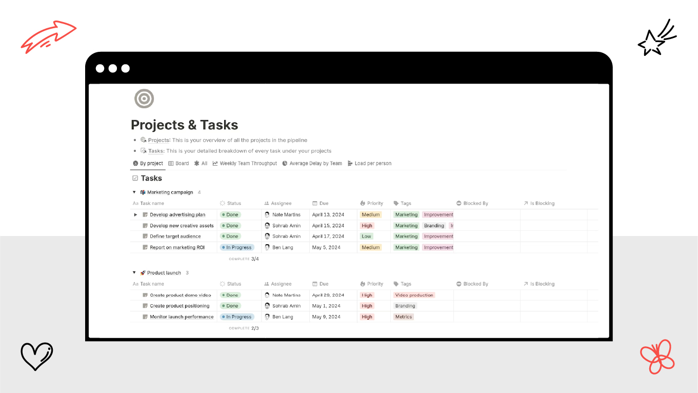
The worldwide SaaS market is projected to $1,131.52 billion by 2032, making SaaS platforms highly in demand [1]. But have you ever felt overwhelmed opening a dashboard for the first time? You’re not alone. In the B2B SaaS world, dashboards are often the control centers of entire operations - but not all are created equal. A well-crafted SaaS dashboard design should do more than just display data - it should guide, inform, and drive action.
But here's the twist: the best dashboards are not necessarily about aesthetics. They're strategic instruments built upon a deep understanding of user behavior tracking, KPIs, and product goals. Whether it's a product manager monitoring churn or a marketer attempting to optimize campaigns, the dashboard must give immediate insight.
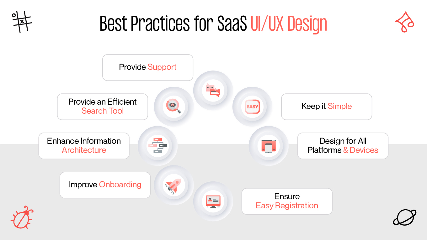
In this article, we'll explore the basics of SaaS UX design, review common pitfalls (and excellent examples), and learn how CTA and conversion elements can elevate your dashboard from adequate to amazing.