How to Use UX Metrics to Improve Design

8minutes read
how to use ux metrics

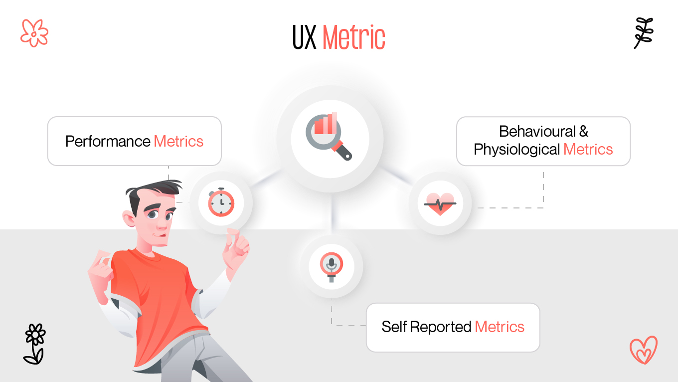
Design is not just about creating something that looks good. The real job is making sure what you design works for the people using it. That's where UX metrics play a role. They offer an organized way to measure how users feel about your product, how well they can achieve their intended goal, and their level of satisfaction throughout the process. Instead of relying on assumptions or hunches, UX metrics give you tangible information on what's working and what isn't.

What are UX metrics?

In their most basic form, UX metrics are quantifiable indicators that measure the quality of user experiences. They provide a glimpse to evaluate usability, functionality, and overall satisfaction. Without them, it's easy to end up designing based on gut.

Consider UX metrics as the scorecards of your product. They indicate whether or not users are able to accomplish tasks, the effort required, and if they leave happy. By monitoring these figures regularly, product teams and designers have a clear picture of how design choices affect real-world use.

what is ux metric
what are ux metrics

UX metrics don't just track surface behavior. They peer beneath the surface, exposing patterns that may otherwise be invisible. You can observe maybe that users can get through a checkout flow, but task time is inordinately long, potentially signaling extra friction. Or maybe onboarding flow completion is high, but later surveys indicate low satisfaction. Every measure is telling part of the story, and they together collaborate to create a whole story.

Ultimately, UX metrics are not a pursuit of perfection but an ongoing process of improvement. They take ambiguous feedback and turn it into quantifiable data so that design can grow with user needs.

Types of KPIs

All UX metrics are not made equal. Teams measure UX performance differently based on their targets. Some track for efficiency, others for how users perceive it, and many do a combination of both. Let's dissect the main categories.

types of KPIs
types of metrics

Metric

What it Measures

Why it Matters

Example Use Case

Success rate

% of users completing a task

Shows task effectiveness

Checkout completion in e-commerce

Task time

Time taken to finish a task

Reveals efficiency and friction points

Onboarding flow setup duration

User satisfaction

User’s emotional response

Indicates enjoyment and loyalty

Post-task rating surveys

System Usability Scale

Overall usability score (0–100)

Provides benchmark vs industry standards

Comparing old vs new product versions

Error rate

Frequency of mistakes

Highlights confusing or unclear design

Incorrect form submissions

Success rate

The simplest yet most powerful KPI is success rate. It determines what proportion of users get something done successfully. How many, for example, add a product to the cart, register error-free, or fill in a form without errors?

A high success rate usually indicates your design is intuitive and inclusive. A low success rate indicates obstacles—maybe buttons are confusing, instructions are confusing, or it's too hard. Teams often aim for success rates of 80-90% before considering a task or feature “usable” enough [1].

This measure is simple to collect but is very informative. If individuals continually fail at a particular step, you know exactly where to aim your design solutions. 

Task time

Another very important KPI is task time, and it reveals how long it takes for users to complete a specific action. Faster is not always better, but most of the time, too much time means friction.

For example, if it takes five minutes to create a profile when it should take less than one minute, it's worth looking into. Maybe the form requests too much information, or navigation isn't clear enough. Minimizing task time not only makes things more efficient but also increases overall user satisfaction.

Time monitoring over iterations is especially helpful. If your redesign cuts average time in half, that's something to measure and be proud of.

User satisfaction

Numbers alone are not enough. That's why user satisfaction is a key KPI. It measures what users feel after using your product. Do they like using it, do they get frustrated with it, or is it somewhere in between?

You can measure user satisfaction through post-task questionnaires, rating systems, or open-ended feedback. Subjective as these measures are, they provide valuable context. Your product can be an effective performer and yet leave users dissatisfied if the experience is cumbersome and uninspiring.

Satisfaction at high levels is normally associated with loyalty. If users enjoy using your product, they will be more likely to return and recommend others.

System Usability Scale (SUS)

The System Usability Scale is one of the most common usability measuring tools. It is a brief questionnaire in which the users answer on a scale how much they agree with statements regarding your product. The resulting score from 0 to 100 is a benchmark of usability.

Although SUS won't be able to identify exact issues, it provides a valid snapshot of how users find your product versus industry average. A score over 68 is typically considered to be above average [2].

The simplicity is the secret to the beauty of SUS. It's quick for individuals to complete and provides an equal means to contrast usability between different products or product variations.

Error rate

Error rate quantifies the amount of users who make mistakes while using. Maybe they click on the wrong button, enter wrong data, or get it wrong for instructions. High error rates typically mean the interface is not as simple as it can be.

This KPI is especially valuable in processes where accuracy matters, i.e., finance transactions or medical applications. Reducing errors not only makes it more usable but also fosters trust.

Retention and engagement

Aside from task-based measurements, consideration of long-term usage is also crucial. Retention shows how many users continuously use your product, while engagement shows how frequently they use its features.

A product that's simple to use but fails to keep customers returning might require more engaging design. Measuring retention and engagement indicates whether your design contributes lasting value or merely one-time convenience.

Read also: Everything About UX Audit And How Businesses Can Benefit From It.

UX measurement tools

Having determined which UX metrics KPIs are most important, the next move is determining how to measure them. Fortunately, various tools can be used to gather both quantitative and qualitative data.

ux measurement tools
tools to measure ux

Analytics platforms

Google Analytics, Mixpanel, and Amplitude are tools that offer in-depth data on how users behave. They report on activity like clicks, time on page, and funnel completion rates. Analytics platforms excel at reporting on what users are doing at scale but not necessarily why they are doing it. That is where other tools come in.

Heatmaps and session recordings

Hotjar and FullStory allow you to watch how users interact with your product in real time. Heatmaps show where people click, scroll, or ignore, and session recordings reveal their step-by-step process.

These tools are worth their weight in gold in unveiling patterns that just numbers won't. For example, if you see repeated failed clicks on a non-clickable item, this means confusion that needs to be addressed.

Usability testing tools

Software like UserTesting and Maze allow you to run structured usability testing with real participants. You can observe how smoothly they get things done, record task time, and get instant feedback.

Usability testing is one of the simplest ways to measure UX performance. It pairs observation with user understanding, giving you both quantitative and qualitative results.

Surveys and feedback tools

Tools like Typeform, SurveyMonkey, or in-app surveys allow you to measure user satisfaction on the fly. Questions asked after the task, such as "How easy was this?" or "How satisfied are you with this experience?" pick up on first impressions.

Surveys, when well-designed, complement analytics nicely. They add an emotional dimension that numbers alone can't give.

System Usability Scale tests

Since SUS is standardized, it can be passed through standard survey instruments or injected into usability studies. A frequent collection of SUS scores assists in benchmarking progress against previous achievement and comparing different versions of your product.

Product analytics suites

All-in-one solutions like Pendo or Heap combine behavioral analytics with in-app surveys, heatmaps, and feature usage tracking. These are particularly valuable for those who like to have everything managed in one system without needing to cope with several systems.

Using data to iterate

Collecting UX metrics is just the tip of the iceberg. The real value is in using them to drive design changes. Data shouldn't just sit on a dashboard—it should fuel iteration.

using data for design improvement
tips for using data

Find pain points

Metrics are what pinpoint where the users are being straitjacketed. An abysmal success rate on a checkout flow, for example, speaks directly to a design constraint. Task time metrics may flag that onboarding is taking more time than expected. Each pain point uncovered through metrics provides a chance to improve.

Prioritize changes

Not all issues are equal. Some might be small annoyances, while others block users entirely. Metrics help prioritize changes based on impact. For instance, reducing error rate in a critical form might be more urgent than improving a rarely used feature.

By combining quantitative data (success rate, task time) with qualitative insights (user satisfaction surveys), teams can decide where to invest design resources first.

Test and validate

Design is an iterative process. Change things, and try them out. Conduct usability testing, collect SUS scores, and measure before-and-after task times. Did success rate improve with the redesign? Did satisfaction?

Iteration isn't guesswork—it's experimentation, measurement, and testing. Each round produces a better product that better serves user needs.

Monitor long-term trends

UX metrics are not snapshots. They reflect trends over a period of time. New issues following a release could be indicated by a sharp decline in retention. Consistent improvement of SUS scores could confirm that your direction of design is right.

By monitoring metrics closely all the time, you can react proactively rather than waiting for issues to mature before responding.

Balance numbers with context

Although metrics are strong, they mustn't be used in isolation. Quantities indicate what's occurring, but for comprehension of the reasons why, dig deeper. Pair analytics with user interviews, usability testing, and open-ended feedback for an entire view.

The secret is to utilize metrics as a compass, never an endpoint. They direct the path but must invariably be examined in context.

Conclusion

The key is not just to collect data but to act on it. Metrics highlight pain points, guide priorities, and validate improvements, turning UX into a continuous cycle of learning and iteration. When combined with context and qualitative feedback, these numbers become more than statistics—they become the voice of your users. And by listening carefully, you can shape designs that don’t just look good but truly work for the people who matter most.

References

  1. https://www.tability.io/templates/metrics/t/8sHBBdjoF8R3
  2. https://www.sciencedirect.com/topics/computer-science/system-usability-scale/

Rate this article

20 ratings
Average: 4.9 out of 5

If you like what we write, we recommend subscribing to our mailing list to always be aware of new publications.

Do you have any questions? We tried to answer most of them!