The Power of Microcopy in UX Writing

7minutes read
microcopy in ux writing

When people use a digital product, whether it's an app, a website, or a service, every word on the screen matters. UX writing is the practice of choosing those words carefully to help users feel confident and stay on track. It's not about marketing or flashy headlines, it's about guiding people through an interface in a way that feels clear, helpful, and intuitive.

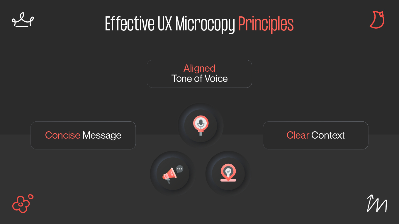
One of the most important parts of UX writing is microcopy, the small bits of text you see on buttons, error messages, form instructions, and confirmation popups. These tiny phrases might seem like an afterthought, but they can make a big difference in how easy (or frustrating) something feels to use.

As researchers Momoka Muto and Wonseok Yang point out in their open-access study [1]:

“Microcopy is gaining attention in UI design for the purpose of improving user Conversion Rate (CVR). It is particularly used to help users make choices.”

Their work highlights how microcopy does more than decorate a UI, it helps users decide, act, and trust the product in front of them.
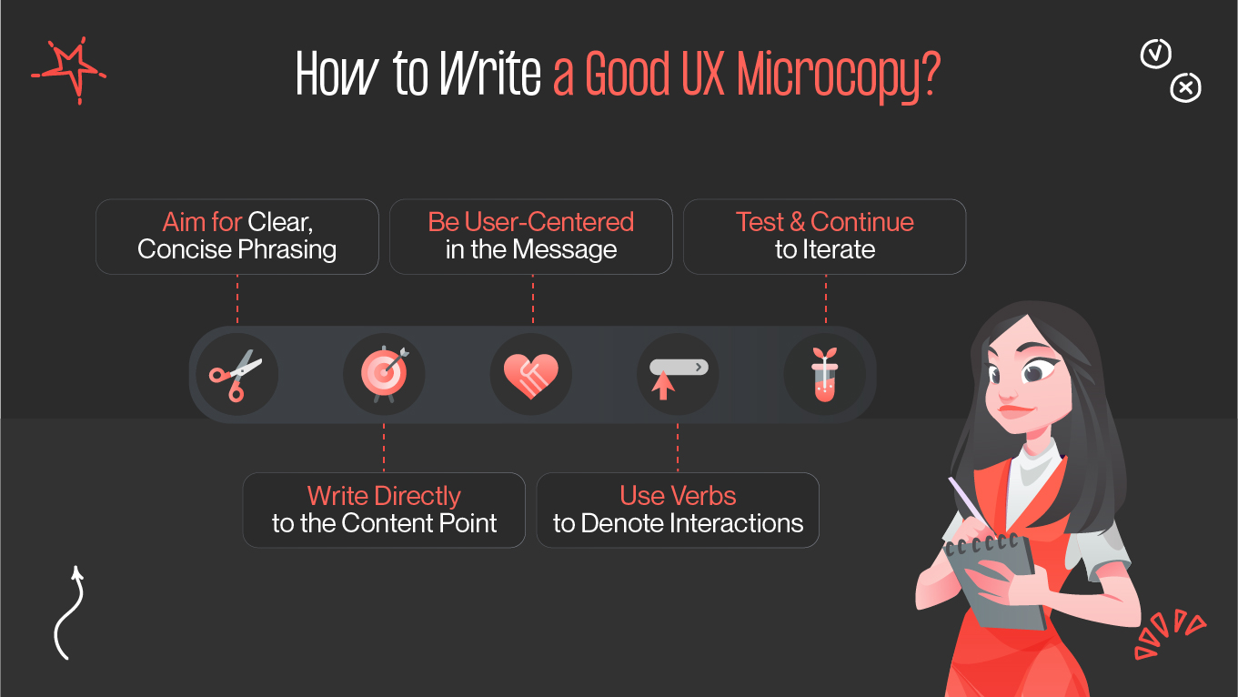
In this article, we’ll look at what makes microcopy effective, share some real-world UX microcopy examples, and give you a few testing tips to improve your product’s UX writing.

What Makes First-Class Microcopy

Great microcopy does more than fill in space. The microcopy is able to drive decisions, build trust, and remove friction in user experiences. Although these bits of text are small and often overlooked, their impact is profound: they guide users smoothly through interfaces, clarify steps to be followed, and reduce uncertainty that can cause hesitation or abandonment.

ux microcopy principles
how to create an effective microcopy

In fact, Nielsen Norman Group emphasizes that users typically read only 20–28% of the words on a page—meaning every word must carry weight and be immediately useful [2].

This insight underscores that crafting microcopy isn’t just about good writing. It’s a critical usability practice that can influence how easily users navigate your product and how confident they feel. Here are the core principles of effective microcopy, summarized:

Principle

Why it matters

Example

Be clear and concise

Users skim interfaces, so direct cues work best

“Proceed to checkout” vs “Click here to continue”

Align tone of voice

Builds brand trust and emotional connection

Friendly error vs robotic: “Oops, something went wrong”

Provide context

Reduces hesitation by clarifying intent or reassurance

“We never share your data”

When thoughtfully made, microcopy becomes the invisible guide that helps users navigate your product effortlessly, making the experience feel natural and reducing frustration. It sets the tone of voice for how users perceive your brand, reliable, user-focused, and easy to interact with.

To further enhance its effectiveness, follow these microcopy best practices:

  • Use action verbs in button text (e.g., “Get your free trial now”) to get decisive actions.
  • Solve concerns with assuring notes like “You can change this later” to ease anxiety.
  • Make consistency across the UI via a style guide that keeps terminology uniform.

Together, these UX writing principles and practices ensure your microcopy acts as a subtle but powerful force, gently guiding users toward a smoother, more satisfying experience.

How Write Better UX Microcopy

Effective microcopy is a powerful yet often overlooked element of user experience design. Clear, succinct, and meaningful language may help users navigate digital interfaces more easily, decrease mistakes, and increase user happiness and engagement.

This checklist draws on research-backed microcopy best practices to help you audit, refine, and test your UX microcopy. Whether you’re developing error messages, calls to action, or instructional text, these tips will ensure your microcopy works harder for your users and your product.

how to write a good ux microcopy
essential principles of a good ux microcopy

Aim for clear, concise phrasing

The most effective language is often succinct and direct, which may seem paradoxical. Steer clear of jargon and lengthy, complex phrases when writing. Actions to take include:

  • Avoiding jargon and speaking simply.
  • Sentences should be brief and simple to scan.

Users will swiftly grasp your content without being mired down in superfluous words if your writing is clear and succinct.

Write directly to the content point

Regardless of wording, most users will only read 18–20% of the text on a page (or interface screen). Instead of presenting lengthy passages of text or subtle messages, get right to the point.

Determining the precise "point" of an interaction—whether you're writing tooltips or a warning message—may need some testing. You should:

  • Focus on the core message users need to see.
  • Test to find what phrasing drives action best.

Being direct respects users’ limited attention and improves the chances they’ll engage with your content.

Be user-centered in the message

Dark patterns may easily infiltrate your microcopy when commercial objectives take precedence over user demands since you may feel compelled to "influence" the user to do something. The user-centric strategy is to keep your microcopy informative rather than promotional.

  • Prioritize clarity and support over persuasion.
  • Avoid misleading or manipulative wording.

Helpful copy builds trust and creates a better overall experience, encouraging users to feel confident about their choices.

Use verbs to denote interactions

Interactive elements, like button text or links, should always begin with an active verb. This not only incentivizes users to take action, but helps them understand the context of what will happen when they interact with the element.

In UX microcopy examples, a button that merely says “sale” isn’t as clearly directive as one that says “shop the sale.” Using clear verbs makes interactions intuitive and reduces user hesitation.

Test and continue to iterate

Just like your design work, no copy is ever truly “final.” You can maintain a data-driven approach to your UX microcopy with usability testing to determine the effectiveness of copy variations … and keeping an open line of communication with your company’s customer support team to hear what users continue to struggle with. Focus on:

  • Using usability testing to measure copy success.
  • Gathering ongoing feedback to continuously improve.

Regular testing and iteration ensure your microcopy remains relevant and effective as user needs evolve.

Case Studies: The Impact of UX Microcopy

Gapsy Studio developed a mobile application for barbershops, enhancing the barber-client experience by integrating simple features for scheduling, communication, and navigation [3]. The design aimed to streamline the process, ensuring a smooth experience for both barbers and clients. We sought to improve the overall service delivery within the barbershop industry.

guile project by gapsy studio
guile: mobile ui/ux for barbershops

In UX microcopy examples, the appointment booking message says, “Select your preferred barber and choose an available time slot,” providing clear instructions that guide users step-by-step without overwhelming them. When errors occur during scheduling, instead of “Booking failed,” Guile uses the friendly and specific message, “Sorry, this time slot is no longer available. Please select a different time,” which helps reduce confusion and frustration.

In another project, Gapsy Studio redesigned the onboarding flow for CreatorSet, a creative asset platform [4]. We used clear microcopy like “Create your first collection in minutes” and “Your assets are safe and ready to sell.” This led to a 25% increase in user activation and fewer drop-offs during setup. It shows how precise microcopy boosts user confidence.

Final Thought

In conclusion, thoughtfully built microcopy enhances usability, reduces friction, and guides users smoothly toward their goals. It acts as the supportive voice that reassures users, clarifies actions, and prevents confusion, strengthening trust with your product.

Because of its outsized influence, it’s essential not to overlook microcopy in your UX process. Audit and test the words your users encounter daily. Regularly revisiting and refining microcopy ensures it remains clear, helpful, and aligned with user needs.

Want to level up your UX writing? Explore Gapsy Studio’s UX training services to build your skills and create microcopy that truly makes a difference. By making microcopy a priority, you’ll create more intuitive and enjoyable experiences that keep users coming back.

References

  1. Muto, M., & Yang, W. (2023). The influence of microcopy on user decision-making. In AHFE International Conference Proceedings. Retrieved August 5, 2025, from https://openaccess.cms-conferences.org/publications/book/978-1-964867-20-5/article/978-1-964867-20-5_19
  2. Nielsen Norman Group. (n.d.). How users read on the web. Retrieved August 5, 2025, from https://www.nngroup.com/articles/how-users-read-on-the-web/
  3. Dribbble. (n.d.). Guile: Mobile UI/UX for barbershops [Design project]. Retrieved August 5, 2025, from https://dribbble.com/shots/24202305-Guile-Mobile-UI-UX-for-barbershops
  4. Gapsy Studio. (n.d.). CreatorSet case study. Retrieved August 5, 2025, from https://gapsystudio.com/blog/creatorset-case-study/

Rate this article

20 ratings
Average: 4.9 out of 5

If you like what we write, we recommend subscribing to our mailing list to always be aware of new publications.

Do you have any questions? We tried to answer most of them!