Microinteractions in UX: Enhancing Engagement

6minutes read
ux design microinteractions

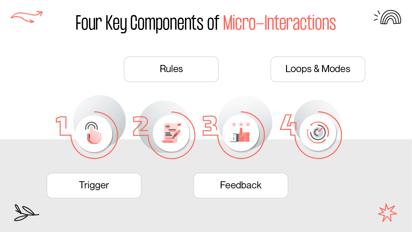
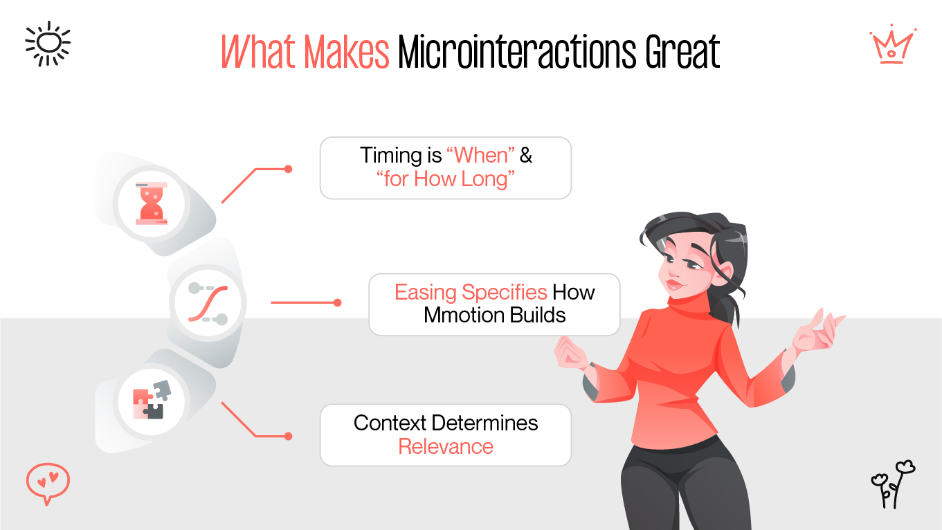
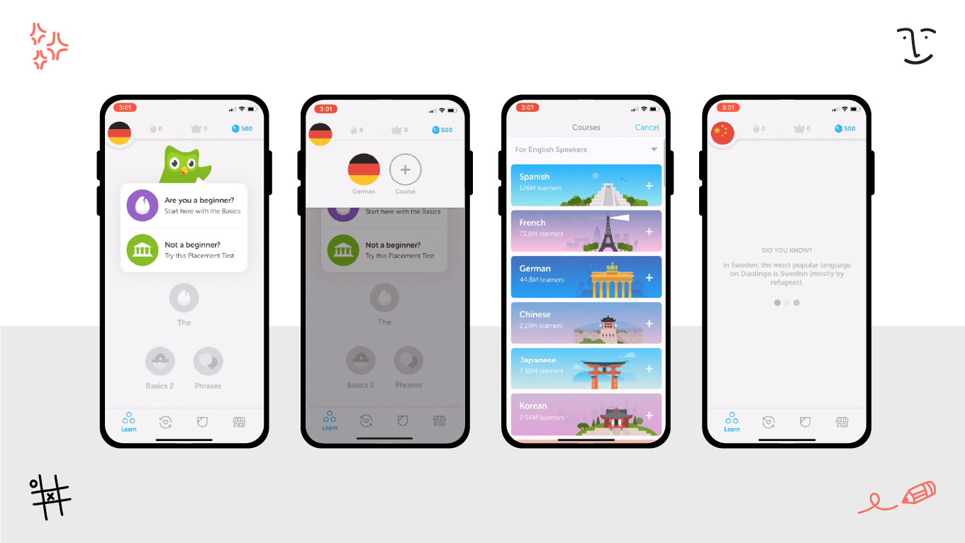
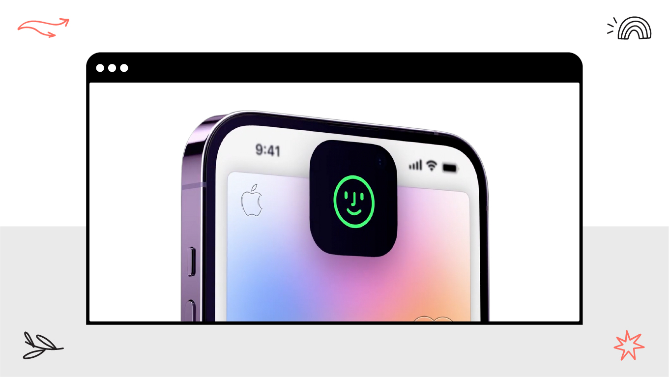
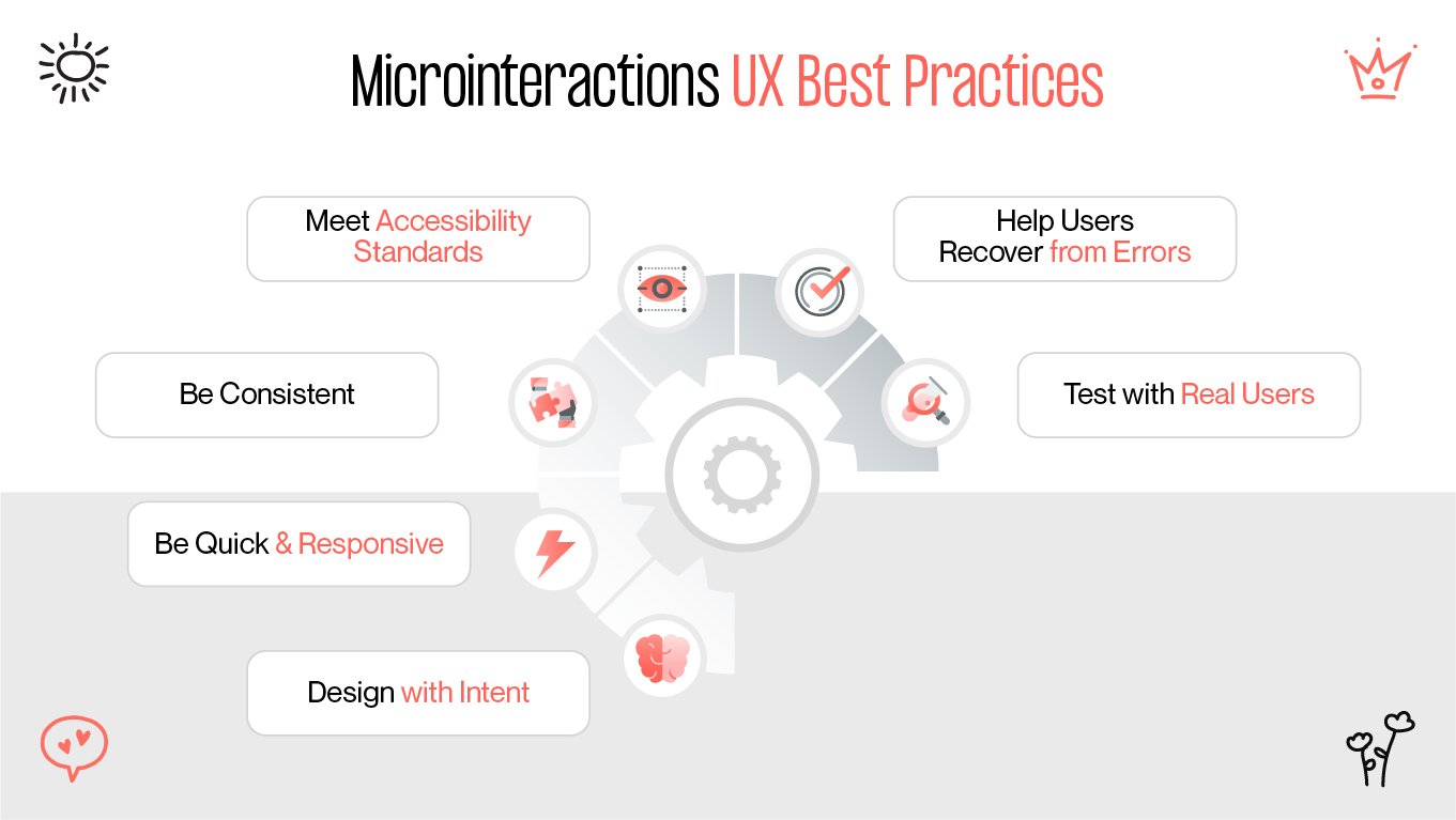
The soothing "pop" when you're about to like something, the nice bounce at the scroll's end, the reassuring checkmark when you've submitted a form—none of them change the essence of the functionality of a product. Still, each of them makes people feel capable, on the right path, and even exhilarated. These are microinteractions: tiny, focused moments of interaction that respond to a single user action. When well-executed, they stitch together usability and personality into a seamless, memorable experience.

The Role of Microinteractions

What is so potent about these tiny moments? Microinteractions are at their best when they guide behavior, communicate system state, and set brand voice - often without the user even realizing it. They reduce uncertainty (Did my tap register?), aid learnability by indicating what's interactive and adding emotional punctuation along a path.

Here's a snapshot, at a glance, of the value they produce:

  • Acknowledge action: Confirm taps, drags, voice triggers, and submissions quickly so users never wonder if something "worked."
  • Guide and orient: Gentle movement can suggest direction, illustrate hierarchy, and associate cause with effect.
  • Express brand personality: Bouncy happiness? Slick fading? Crisp snap? Movement is the brand tone at the micro-scale.
  • Reduce friction & errors: Plain affordances and on-time feedback minimize the learning curve and allow users to recover graciously.
key components of microinteractions
microinteractions in ux key components

Feedback, Animation, Affordance

Let's cut microinteractions into three interrelated pillars. Think of them as the "what," "how," and "why this is usable."

Feedback informs the user that the system has received their input. A pressed button will fade; a toggle clicks into position; a haptic buzz follows a long-press. Without feedback, actions are a scream into thin air. With it, users believe instantly.

Animation connects states. Interfaces don't usually stay the same; things come into view, refresh, and change. Animation provides continuity, ensuring users don't lose context. The heart that expands for a moment in a social app, the card that slides into place, the progress ring that fills—each converts invisible system logic into visible narrative.

Affordance communicates possibility. An edge lift invites "press me." A handle invites "drag." Even a faint hover state whispers "interactive" barely at all. UX microinteractions make affordance more robust the moment a user explores—hover, focus, touch, or dwell—and robustness can avert errors while accelerating onboarding.

Principles of Effective Microinteractions

Small does not mean trivial. Crafting elegant microinteractions requires attention to detail in terms of duration, motion curves, and context awareness.

what makes microinteractions great
effective microinteractions principles

Timing, Easing, Context

  • Timing is “when” and “for how long”. The majority of interface feedback cues fall within the 150–500 ms range: long enough to be noticeable but short enough to be responsive. Immediate state changes for confirmation are beneficial; more gradual transitions for incremental processes (e.g., uploading) can also be effective. No lag—animation in UI should not slow down, or users perceive it as a performance failure.
  • Easing specifies how motion builds. Linear movement is robotic-sounding; easing in/out is more natural and human. A slight overshoot and settle can imply elasticity; an instant snap-back sounds crisp and decisive. Employ easing to align with brand voice: playful products may bounce; corporate dashboards like gentle glide.
  • Context determines relevance. A typing cursor belongs in chat; it would be disorienting on a static page. Haptics that are celebratory when finishing tasks can be thrilling on mobile devices, but jarring on wearables in quiet rooms. Respect platform conventions, user control (such as reducing motion settings), and moment-to-moment task demands.

With timing tuned, easing emotive, and context respected, microinteractions fade away into "of course it works this way"—UX's highest compliment.

Examples in Real Products

Eventually, after you start noticing UX microinteractions, you'll catch yourself seeing them everywhere:

X’s (Twitter’s)  heart blinks momentarily after a like—swift, emotive, confirming. Instagram's double-tap heart appears over images, offering immediate feedback without interrupting flow. 

Duolingo showers celebratory motion and sound following lesson streaks, reinforcing progress loops. 

duolingo microinteractions example

iOS offers haptic toggle taps, elastic scroll boundaries, and smooth Face ID unlock animations that strike a balance between security and delight. 

Airbnb couples a dynamic map pin highlight with list scrolling to preserve spatial context.

ios microinteractions example

Spotify's scrubber and volume controls provide low-latency, high-resolution interactive feedback to facilitate an eyes-half-offscreen model of listening.

Best Practices & Mistakes to Avoid

Microinteractions should help, never overpower. Use them as seasoning—just enough to enhance flavor.

microinteractions ux best practices
microinteractions best practices to follow
  • Design with intent, avoid decorative noise: Every micro UX design element should address a user need (feedback, direction, background). Random prettiness turns into bloat.
  • Be quick & responsive, avoid slow delays: Keep interactions visible but fast; long animations feel like waiting, not refinement.
  • Be consistent, don't drift pattern: The same action must provoke the same response across the product to build user trust.
  • Comply with accessibility standards, don't rely solely on motion: Provide alternatives (such as color contrast, text, vibration-off switches, and reduced motion compliance) so that everyone can benefit.
  • Help users recover from errors, don't provide success-only feedback: Microinteractions can warn users about validation errors, retry states, and connectivity loss—times when they need guidance the most.
  • Test with real users, avoid designer tunnel vision: What is "fun" in Figma may be distracting at scale; observe how people respond in context.

Wrapping Up

Microinteractions rarely win awards on their own, but they win loyalty. They are the connective tissue between intent and outcome, between interface and emotion. Nail the little moments, and your product feels alive, trustworthy, and distinctly yours. Neglect them, and users may never quite bond with what you’ve built—even if the core features are strong.

So here's the assignment: the next time you're designing a button, a toggle, a confirmation state—ask yourself, What tiny moment here could turn basic use into a satisfying exchange? That's where engagement is born, one microinteraction at a time.

Rate this article

20 ratings
Average: 4.9 out of 5

If you like what we write, we recommend subscribing to our mailing list to always be aware of new publications.