UX/UI of Small Screen Applications for Mobile First Design Strategy

7minutes read
mobile-first-design-strategy

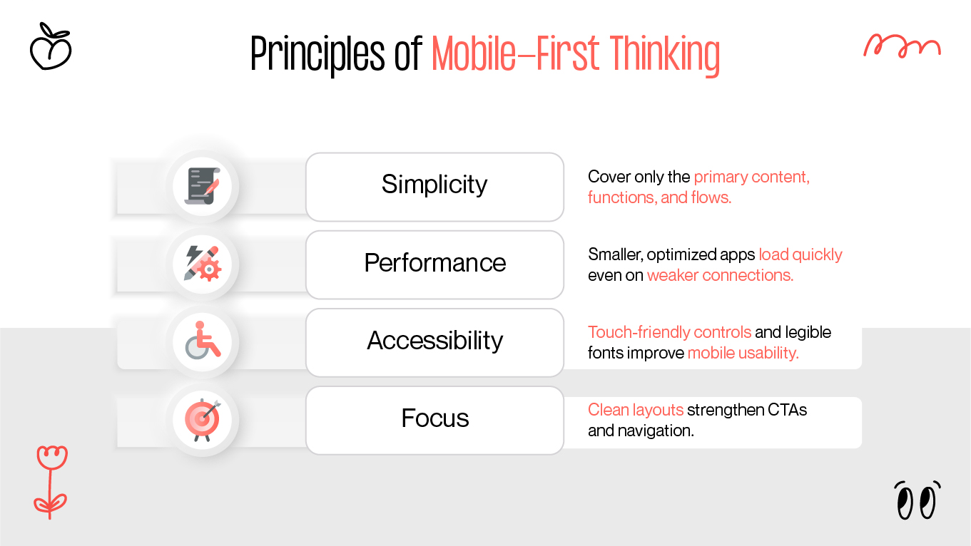
In the past year, more than half of all web traffic has come from mobile devices. Millions of people now rely on their phones for shopping, socializing, and daily tasks. A mobile first design strategy ensures products are fast, intuitive, and accessible everywhere.

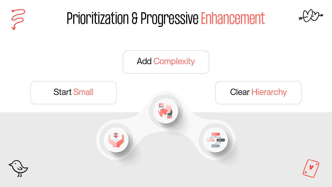
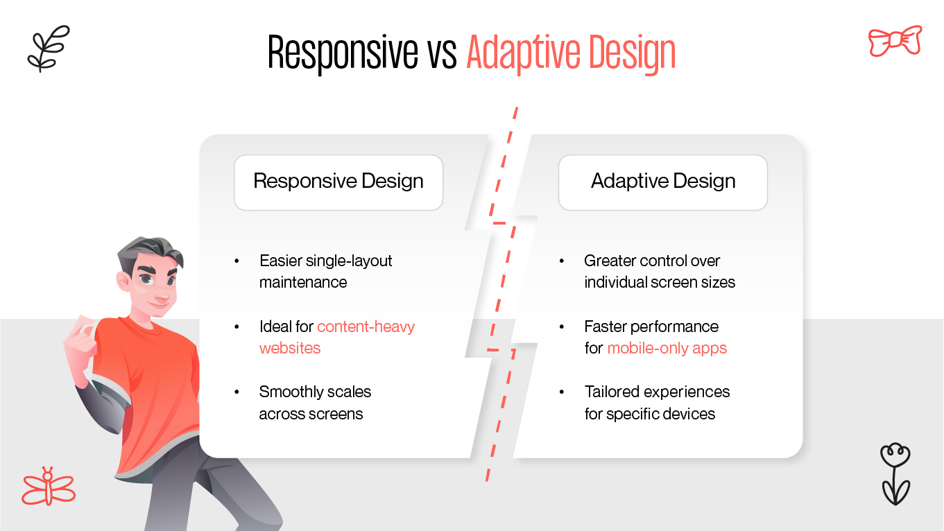
This article explores the principles of mobile UX, explains the difference between responsive design vs adaptive design, and highlights why real-device testing is essential for usability and performance.

Principles of Mobile-First Thinking

The essence of mobile first design is simplicity. It begins with a lighter version of components for small screens and builds toward progressive enhancement as devices allow.

Principles of Mobile-First Thinking

Core Principles

  • Simplicity. Cover only the primary content, functions, and flows.
  • Performance. Smaller, optimized apps load quickly even on weaker connections.
  • Accessibility. Touch-friendly controls and legible fonts improve mobile usability.
  • Focus. Clean layouts strengthen CTAs and navigation.

With a strong mobile UX strategy, mobile users are prioritized without compromising the desktop experience.

Prioritization & Progressive Enhancement

Progressive enhancement ensures products scale gracefully, starting from a strong foundation and adding complexity only when supported by larger devices.

Prioritization & Progressive Enhancement

How It Works

  • Start small. Mobile comes first, desktop second.
  • Add complexity. Visuals, animations, and interactions are introduced on bigger screens
  • Keep hierarchy clear. Mobile-first design pushes only the essential elements forward.

This guarantees the product stays available, usable, and performant across all platforms.

Responsive vs Adaptive Design

The two primary strategies for building across devices are responsive design and adaptive design. Though often confused, they are distinct.

Responsive VS Adaptive design

What’s the Difference?

  • Responsive design. Uses CSS media queries to create fluid layouts that adapt automatically.
  • Adaptive design. Relies on pre-set layouts that trigger at breakpoints, delivering tailored versions.

Pros of Responsive Design

  • Easier single-layout maintenance.
  • Ideal for content-heavy websites.
  • Smoothly scales across screens.

Pros of Adaptive Design

  • Greater control over individual screen sizes.
  • Faster performance for mobile-only apps.
  • Tailored experiences for specific devices.

👉 A combination of responsive and adaptive design often produces the best overall user experience.

Layout Patterns & Grid Systems

Smart layouts are the backbone of mobile first UX. Grid systems help maintain structure, scalability, and clarity.

Layout Patterns & Grid Systems

Mobile-First Layout Tips

  • Use a 4- or 8-point grid. Keeps alignment consistent across devices.
  • Card-based UI. Cards stack neatly on mobile and remain modular on desktop.
  • Hierarchy first. Place CTAs, product info, and actions at the top.
  • Touch-friendly targets. Buttons should measure at least 44x44 pixels for thumb usability.

A solid grid system enforces visual balance and accessibility across responsive and adaptive layouts.

Testing on Mobile Devices

Design validation comes only through testing. Both real devices and simulators are crucial for a reliable mobile-first experience.

Testing on Mobile Devices

Real-Device Testing

Pros:

  • Identifies usability issues (touch, glare, brightness).
  • Detects performance slowdowns (e.g., animations).
  • Confirms consistent behavior across OS versions, browsers, and resolutions.

Emulators & Simulators

Pros:

  • Quick, cost-effective testing across devices.
  • Useful for early layout checks.
  • Easy integration into workflows.

👉 Best practice: Validate layouts in emulators first, then confirm usability on real devices.

What to Measure

  • Tap target accuracy.
  • Load time and responsiveness.
  • Scroll behavior.
  • Visual hierarchy across screens.
  • Navigation clarity and gesture compatibility.


Final Thoughts

Today’s users expect seamless mobile experiences:

  • Quick, lightweight interactions (average ~60 seconds).
  • Single-thumb navigation for multitasking.
  • Clean, distraction-free layouts.

A mobile first UX strategy supported by progressive enhancement and real-device testing ensures your product delivers high performance and user satisfaction.

At Gapsy Studio, we design conversion-focused mobile-first UIs with clarity, accessibility, and usability at the core — helping digital products achieve measurable results.

Rate this article

20 ratings
Average: 4.9 out of 5

If you like what we write, we recommend subscribing to our mailing list to always be aware of new publications.