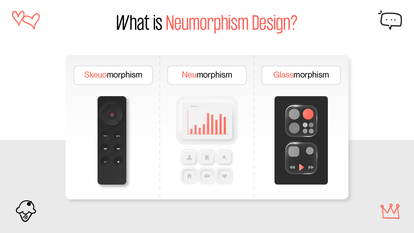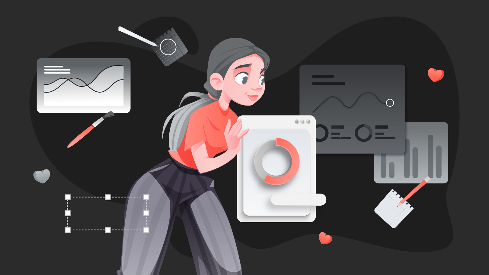
One of the more recent UI design trends is neumorphism, one of the descendants of two of its precursors: flat design and skeuomorphism. Neumorphism creates a bold user interface with its minimal shadows, dull color schemes, and mid-air objects.
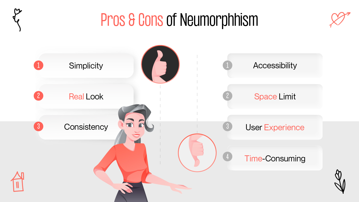
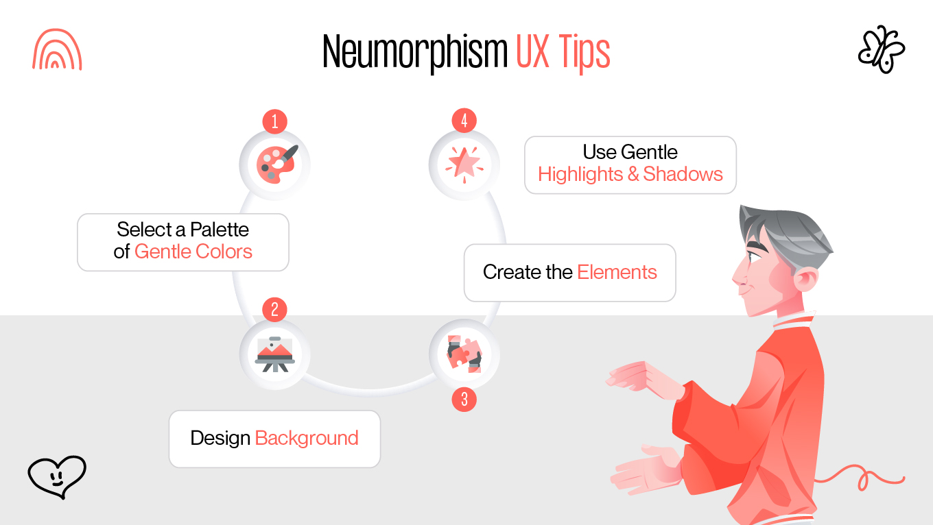
What effects does neumorphism have on accessibility trade-offs, however, if aesthetics are ignored? Is it better to keep this design trend in your portfolio, or does it have a place in actual digital products? We'll go over all you need to know about neumorphism, including best practices and useful hints for applying it to your upcoming design endeavor.