Progressive Disclosure in UX: When Less Is More

7minutes read
progressive disclosure in ux

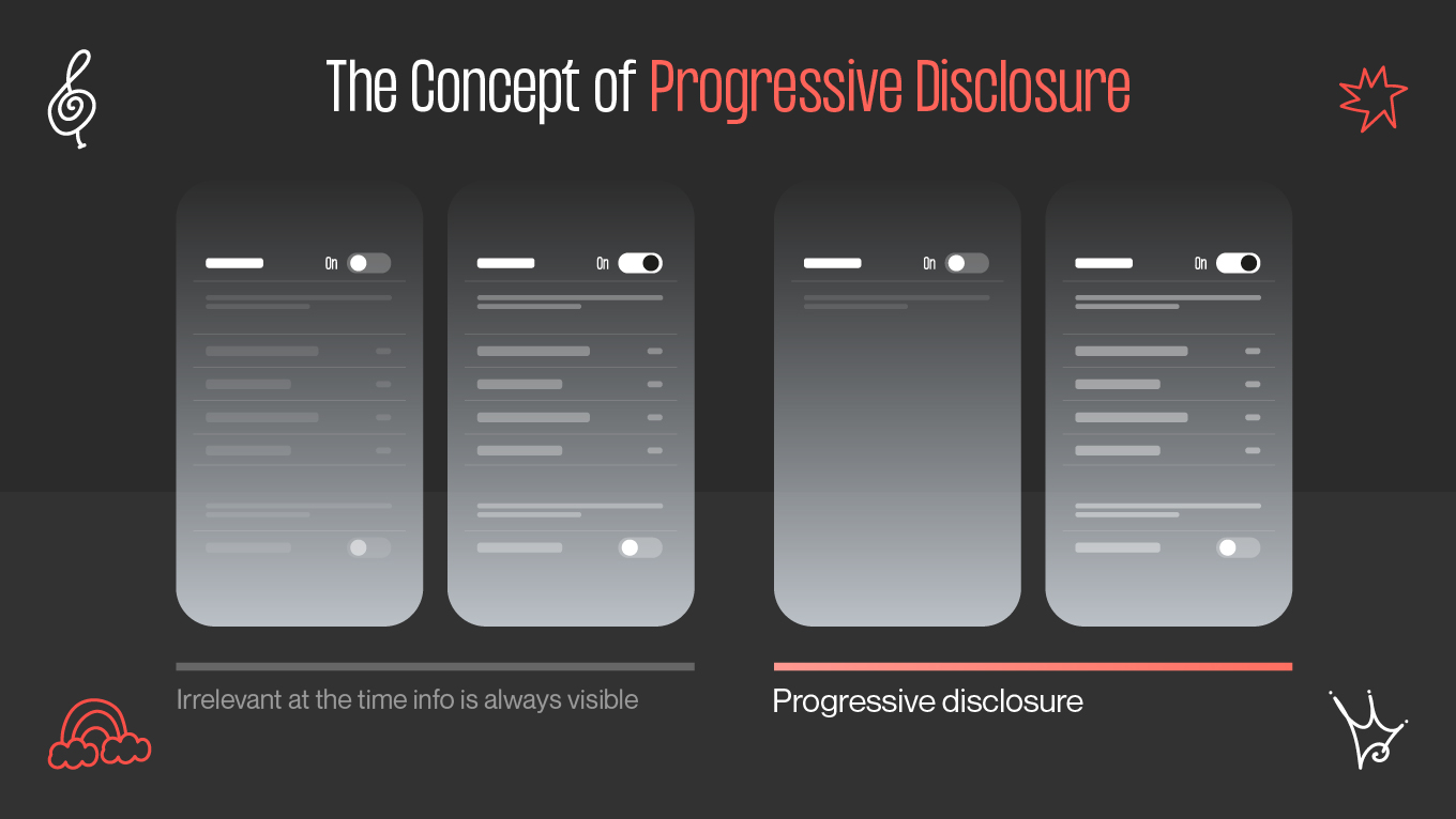
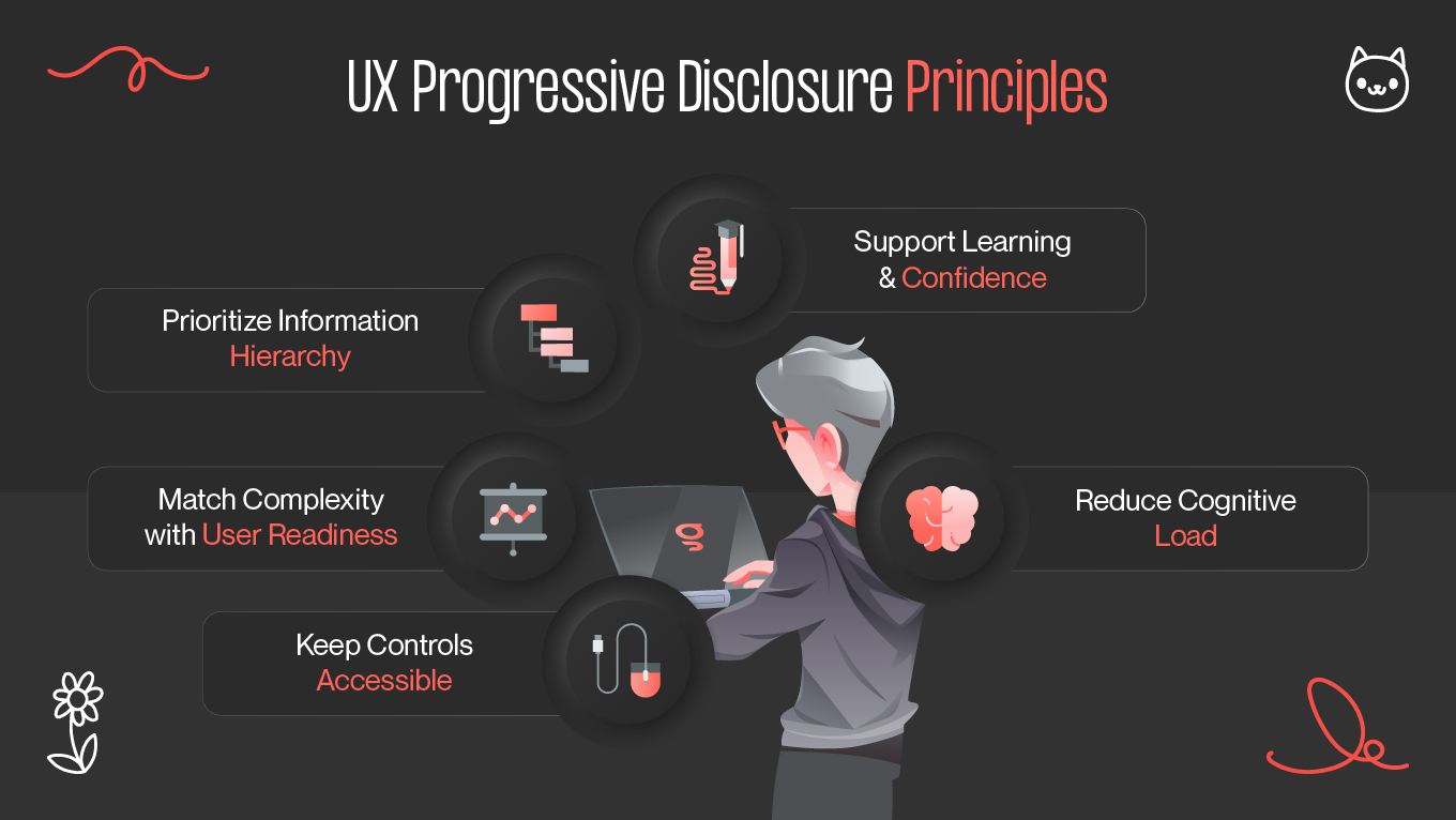
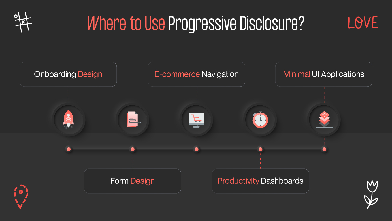
Digital products today are feature-rich. On the positive side, this offers users limitless possibilities. But on the negative side, it also presents a risk: too many options, too much information, and too little knowledge. The challenge for designers is to offer power without overwhelming humans. Progressive disclosure is the solution. By presenting information in layers, it allows users to focus on what's most important at exactly the right time.

The Concept of Progressive Disclosure

Progressive disclosure in UX is a design method that uncovers information, choices, and features stepwise rather than on first exposure. Instead of confronting the user with too many choices on the first screen, the interface displays only what is required to perform the task, with more sophisticated features or more detailed data on hand but not accessible until the time is right.

It's like a conversation. You don't make your life story with another person in the first five minutes of acquaintance. You start small, provide just enough to sustain a natural exchange, and reveal more as there is increasing trust and context. Interfaces that follow this same principle are fluid, natural, and usable.

the concept of progressive disclosure
progressive disclosure in the working

The principle is not new. It originated in psychology, where reducing mental load enables humans to focus on what is most important. In UX, progressive disclosure brings this principle to practical use, guiding users smoothly from basic to more complex features. Progressive disclosure thus improves 3 of usability's 5 components: learnability, efficiency of use, and error rate [1].

This is not about not disclosing information but about structuring it in a clever manner. It respects the user's intellectual power, builds confidence step by step, and makes complexity accessible without being daunting. As digital products continue to grow richer in functionality and interdependent with other systems, progressive disclosure is no longer a courtesy but a necessity to simplify UX design.

Read in our blog: Everything About UX Audit And How Businesses Can Benefit From It.

Key Principles of the Method

The rationale behind successful progressive disclosure is rooted in some simple principles. These principles ensure that while less is disclosed at the onset, nothing of importance is hidden forever or rendered inaccessibly more than necessary.

ux progressive disclosure principles
how to make progressive disclosure work

Prioritize information hierarchy

A clear information hierarchy is the basis of progressive disclosure. Designers must know what information is necessary at the outset and what information can wait. For example, showing just the required steps in onboarding design makes the process manageable. The user doesn't need all the configuration options all at once—they need just enough to start successfully.

This means asking tough questions:

  • What does the user absolutely need right now?
  • Which data drives advanced use cases?
  • How do we naturally sequence information, not artificially?

By layering information in this manner, designers can maintain things in focus without sacrificing depth.

Match complexity with user readiness

Another principle is synchronizing the revealed complexity with the level of user involvement. A beginner doesn't need power-user behavior at this point, yet hiding the same behavior indefinitely would infuriate more advanced users. Progressive disclosure satisfies both extremes.

The trick is anticipating user journeys. When a user gets more comfortable, shortcuts, customization, or detailed analytics can be uncovered by the interface. A budgeting app, for instance, may first show simple spending categories. Then it can expose forecasting capabilities or integrations if users are ready.

Keep controls accessible

Just because it is hidden at first doesn't mean that it must be entombed. Users must be left with the feeling that they can always dig deeper if they choose to. That's why discoverability is one of the principles. Minimal UI design does not imply less functionality; it implies thought-through staging of features.

Design patterns like expandable areas, progressive onboarding series, or "learn more" links help with providing information at all times. The user never desires to feel as though they're being tricked into thinking there isn't functionality available—it must be discoverable at the right moment.

Reduce cognitive load

Ultimately, progressive disclosure minimizes cognitive load. The human brain can process only so much information at one time. Overwhelming users with too many options can cause them to become lost, make errors, and abandon. In fact, 18% of users abandon orders because the checkout is too long or complicated due to UX issues [2]. By revealing information in incremental, step-by-step increments, interfaces facilitate easier decision-making.

This philosophy is typically enforced by breaking down large tasks into smaller, manageable steps. A multi-step checkout process, for example, feels easier broken down into steps than being presented to the user in a massive form all at once. 

Support learning and confidence

Progressive disclosure must be an experience that conveys a tutored education. Each step must reaffirm trust, encouraging users to proceed further. Where staging is natural, users are rewarded with more capacity because they learn it. This fosters a sense of mastery and encourages prolonged use.

UX Examples

The best way to learn about progressive disclosure UX is to observe examples of products and features that utilize it effectively.

progressive disclosure in the use

Area of UX

How Progressive Disclosure Helps

Example Case

Onboarding design

Simplifies the first steps and builds confidence

Mobile app walkthroughs

Form design

Reduces overwhelm by revealing only relevant fields

Healthcare or government forms

E-commerce navigation

Organizes filters and categories into stages

Clothing store search filters

Productivity dashboards

Keeps focus on essentials while offering depth

Project management tools

Minimal UI applications

Presents clean layouts without losing power

Email or note-taking apps

Mobile app onboarding

When someone first installs an app, they are usually greeted with an onboarding design highlighting the product value. Apps that use progressive disclosure techniques start with the minimal action—a simple thing like creating a profile or requesting permissions—and reveal optional features in time.

Take meditation apps as a case. The initial experience is nothing more than a guided breathing exercise. Advanced features like tracking progress or meditation length customization are introduced only after users complete a couple of sessions. This systematic step-by-step approach builds confidence and reduces abandonment.

Search filters in e-commerce

Shopping websites generally enable a large set of filtering possibilities. Showing all at once would confuse the interface. Progressive disclosure keeps them in collapsed categories instead. A user might be shown basic categories, such as price and size, with more advanced filters, like material or shipping speed, only appearing when the category is expanded.

Reducing UI thus allows for easier browsing without sacrificing support for those users who need more control.

Email composition tools

Email applications typically use progressive disclosure in their composition windows. The main window typically displays only the most basic fields: recipient, subject, and body. More sophisticated features, such as scheduling, formatting, or encryption, are located under menus or icons.

In this way, the simple task—writing and sending an email—remains fast and distraction-free, while still leaving power tools accessible to those who need them.

Form design in government or healthcare

Long forms are notorious for being infuriating. Progressive disclosure breaks them down into manageable steps or segments. Instead of thirty fields on one overwhelming page, users cycle through phases such as "Personal Info," "Contact Details," and "Preferences."

Some types also merely show conditional fields where relevant. For example, if a user selects "Yes" for dependents, additional fields are displayed. If they select "No," they are not seen. This responsive method prevents unnecessary complexity.

Productivity dashboards

Capabilities like project management software are available through progressive disclosure. A light UI begins with a lean interface showing just the bare minimum: tasks, due dates, and activity. More advanced capability—like integrations, detailed reporting, or custom workflows—is only revealed after users dig deeper.

This prevents new users from being swamped without compromising for power users who need full customization.

Voice assistants

Voice interfaces rely heavily on progressive disclosure. Instead of overwhelming users with a long list of capabilities, assistants reveal capabilities in context. When you request a weather report, the assistant does not also recite unrelated capabilities. But the more users work with assistants, the more they pick up new commands and capabilities naturally.

Progressive disclosure design must be well-balanced. Disclose too little, and users will never find core capabilities. Disclose too much, and you're missing the point. These best practices can help achieve the right balance.

Wrapping Up

Progressive disclosure isn't just a visual trick—it's a philosophy of user respect for time, attention, and learning curve. By making UX design elegant with clear hierarchy of information, reduced UI, and timely staging, designers produce products that are accessible but potent.

The design proves that less is more. By offering complexity step by step, interfaces guide people from novice to expert without ever overwhelming them. From onboarding design to e-commerce filtering and productivity dashboards, progressive disclosure UX ensures usability is always at the center, even in most feature-rich solutions.

For businesses, this approach generates loyalty and involvement. For the consumers, it generates satisfaction and trust. And for the designers, it's a warning that the most successful experiences are the simplest, at least at first glance.

References

  1. https://www.nngroup.com/articles/progressive-disclosure/
  2. https://baymard.com/learn/ecommerce-cro?

Rate this article

20 ratings
Average: 4.9 out of 5

If you like what we write, we recommend subscribing to our mailing list to always be aware of new publications.

Do you have any questions? We tried to answer most of them!