Responsive Design Trends in 2026: What to Watch

7minutes read
responsive design trends 2026

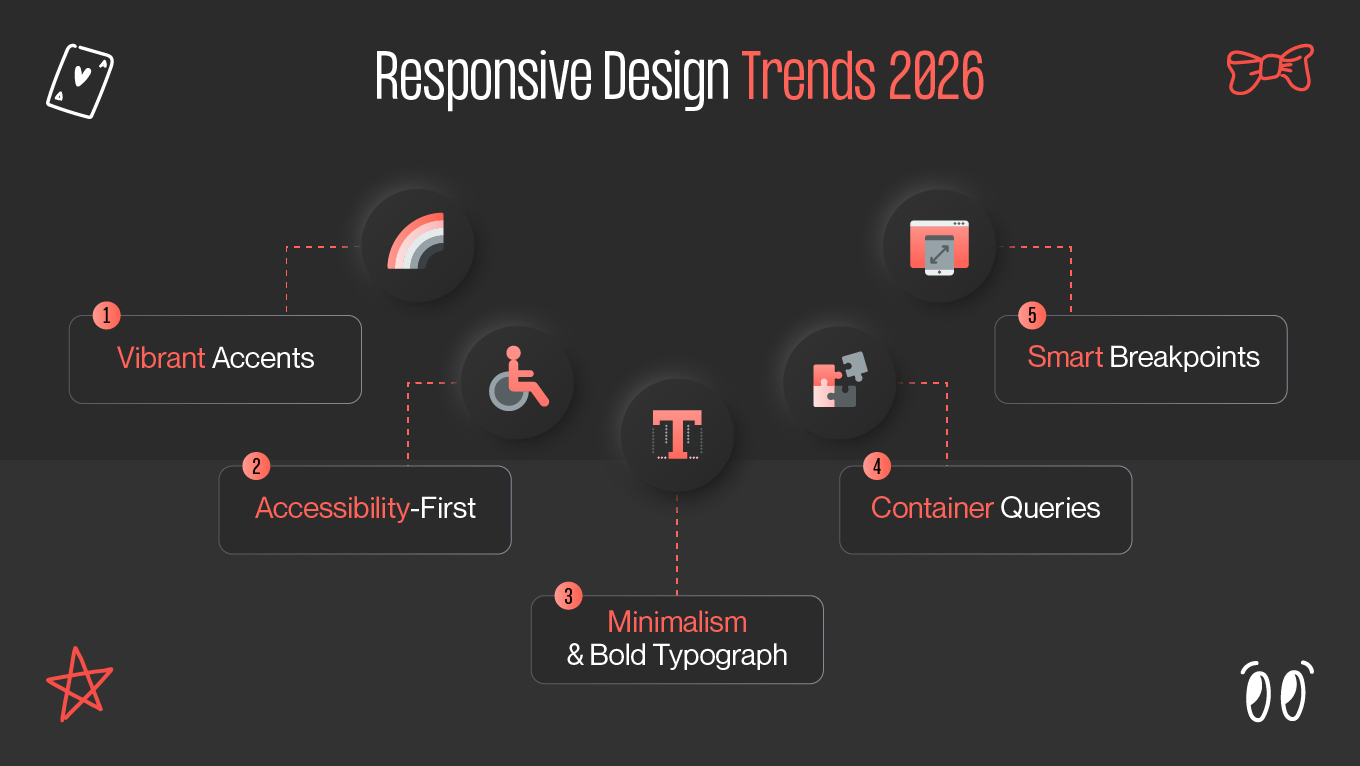
Observe how responsive design trends 2026 evolves to provide more intelligent, human-centered experiences. Anticipate AI-powered customization, flexible typography, and inclusive design that puts an emphasis on interaction and accessibility. Don't act as though your design will hold up over time. It's likely that your bright new user interface may feel stale by the end of your next sprint if you shipped it last month.

It's the fact of creating a world that changes more quickly than your Figma updates, and it's not meant as an insult. New technologies and a better grasp of what users actually need are enabling us to see new visual styles. Because of this, several of these web design trends are becoming widely popular, and in other words, everyone is utilizing them!

This blog will teach you which trends will influence future responsive web, how to stay ahead of the curve and capitalize on them, and why you should utilize them before others do.

Evolution of Responsive Design

Since the launch of Berners-Lee's initial website, the web has undergone fast evolution. New design methods emerged as quickly as web technology itself, and thousands of new websites were published annually. Web design was relatively basic in the early 1990s. To arrange information, the majority of websites used basic header, paragraph, and early list tags like <dl>,<dt>, and <dd> tags.

While working at CERN in 1994, Håkon Wium Lie was the first to propose CSS, even though there were already ways for decorating websites in one form or another. The first official definition for Cascading Style Sheets, level 1 (CSS1) was then published in 1996 by the World Wide Web Consortium (W3C), which Berners-Lee also created. Web developers may be more imaginative and adventurous with their designs with CSS and other technologies like JavaScript and Flash.

The Early Design Methods

As CSS became more widely used, developers had to devote a lot more time on layout, design, and typography. However, adjusting to various screen sizes wasn't a major concern for them. The majority of people's monitors at the time were either 1024 x 768, 800 x 600, or 640 x 480.

Nevertheless, developers discovered a few strategies to cope with various monitor or browser window widths, which ultimately resulted in the development of modern responsive web design. Let's examine a couple of them.

Liquid layouts

MDN claims that the two primary fluid layout choices available to developers in the early stages were liquid, where content was sized using percentages, and fixed-width, where content was set to an exact, to-the-pixel width.

MDN offers some excellent illustrations of both liquid and fixed-width layouts.

One of the earliest significant approaches to responsive web design was the use of liquid layouts, which were innovative when they were originally introduced and made popular by Glenn Davis.

Fluid layout was far more adaptable to various browser sizes and monitor resolutions than fixed-width layouts, which could break if your monitor's resolution differed from the one the site was developed on.

What’s New in 2026?

Finding the most prevalent patterns in the UI/UX business is not the only way to identify the newest UI trends. It involves examining a design trend's aim, purpose, philosophy, and other elements in greater detail than just its level of popularity.

For any design movement to be considered responsive design trends 2026, it must have an impact, solve a real-world issue, be adaptable, and allow for expansion.

It is crucial that you review these seven recent UI design trends if you are seeking UI/UX design services in order to know what to look for:

1. Vibrant accents in dark mode are transforming UI

From being a developer preference, dark mode has become one of the most popular UI design trends of 2025, with users of all demographics adopting this interface style. Dark mode, by definition, is a display setting that turns any application's or device's interface's color scheme from a light accent background, like white, to a dark background, like black or dark gray, with light-colored text in contrast.

Did You Know? With their interface that makes record artwork pop like it's under stage lights, Spotify got dark mode right away. After X (previously Twitter) did the same, everyone learned that dark backgrounds weren't just for hackers.

But implementing dark mode successfully calls for more than just adding a black background to your mobile apps or webpages. Carefully chosen color schemes that preserve visual hierarchy and readability are used in a successful dark mode design.

2. Accessibility-first design is the new normal

By 2026, it will be essential to create universally accessible websites that adhere to WCAG guidelines by making accessibility a fundamental necessity from the very beginning of construction.

Here, we discuss effective color contrast to make content easy to see, keyboard navigation (no mouse required!), and ensuring the website is compatible with text-to-speech software.

The goal is to make the web accessible and useable for everyone, even if you have vision problems, have a hard time using a mouse, or have a slightly different way of processing information.

3. Minimalism and bold typography are playing it small

The first thing you'll notice is how much easier and cleaner websites are becoming. Designers are utilizing a straightforward, minimalist layout and a lot of white space. However, they're making a statement using large, bold typefaces to avoid boredom.

Over time, typography has evolved beyond being "only for reading" to become an integral part of the design that immediately draws your eye.

Some Dribbble eCommerce site designs understand that visual noise is your worst enemy when it comes to selling visual goods. Products may shine because the design takes a backseat. Instead of overpowering customers with loud and distracting images, a smart design always aims to draw them to the product or service and encourage them to interact with the information. Given the limited screen real estate in mobile app design services, this principle is particularly crucial.

4. Container queries: component-level responsiveness

In 2026, container queries are redefining how responsive layouts are built. Unlike traditional media queries that respond only to the viewport size, container queries let components adapt to the size of their parent container. This means that elements like cards, navigation bars, or product tiles can dynamically adjust typography, spacing, and layout based on where they appear in the grid — not just how wide the screen is.

For example, a product card might display a compact layout with a single image and short text when nested inside a sidebar, but automatically expand to show pricing, ratings, and additional metadata when used in a main content area. This component-level adaptability enables designers to build highly modular systems that work across complex interface architectures, such as multi-pane dashboards or adaptive marketing layouts.

5. Smart breakpoints: AI-driven layout adaptation

Static breakpoints are fading into the past. In 2026, smart breakpoint strategies leverage AI and machine learning to dynamically adjust layouts based on real user behavior and device context. Rather than manually defining fixed screen widths (like 768px or 1024px), modern frameworks analyze usage patterns, viewport dimensions, input types, and even device orientation, to generate adaptive thresholds that better match actual conditions.

Some frameworks already hint at this direction, using AI-assisted layout engines that calculate optimal grid behavior, adjust padding ratios, or reposition call-to-action buttons for better accessibility and engagement. In practice, this creates interfaces that don’t just look good across screens, they learn and evolve with how users actually interact.

Preparing Your Website for the Future

Technology advances too quickly for us to pinpoint exactly where UI design will go, and half of today's "revolutionary" concepts may seem antiquated in five years (remember the fascination with parallax scrolling?).

What we know: Long-lasting trends address issues that affect people in actual life, not merely those related to appearance.

What Really Counts:

  • User needs come before following trends.
  • Everyone benefits from accessible designs, and actual user testing outperforms designer conjecture.
  • Innovation is most effective when it builds upon established patterns.

Future responsive web interfaces that solve problems people didn't realize they had and that users don't even consider will be the best.

These responsive design trends are reactions to changing human behavior and technology, not fashion statements. Taking them seriously involves identifying underlying patterns that influence user expectations and corporate success rather than only adhering to checklists.

Final Thoughts

In 2026, responsive design involves more than just resizing information to fit on devices. It involves designing experiences that are intelligent, human-centered, and adaptive. Designers are entering a new era when layouts learn, components self-adjust, and accessibility is a must as AI, container queries, and smart breakpoint strategies transform how interfaces react.

The web is evolving toward context-aware responsiveness, in which each element adjusts to the surroundings, user intent, and behavior in addition to screen size. Who adopts the most trends won't be what sets the leaders apart from the laggards. It will depend on who makes use of these resources to produce scalable, meaningful experiences.

You should reconsider your strategy if responsiveness is still treated as an afterthought in your product. Design with inclusivity and adaptability at the forefront, test in a variety of scenarios, and account for real-world variability.

Rate this article

20 ratings
Average: 4.9 out of 5

If you like what we write, we recommend subscribing to our mailing list to always be aware of new publications.