The Role of Typography in UX: Design Beyond Fonts

12minutes read
role-of-typography-in-ux

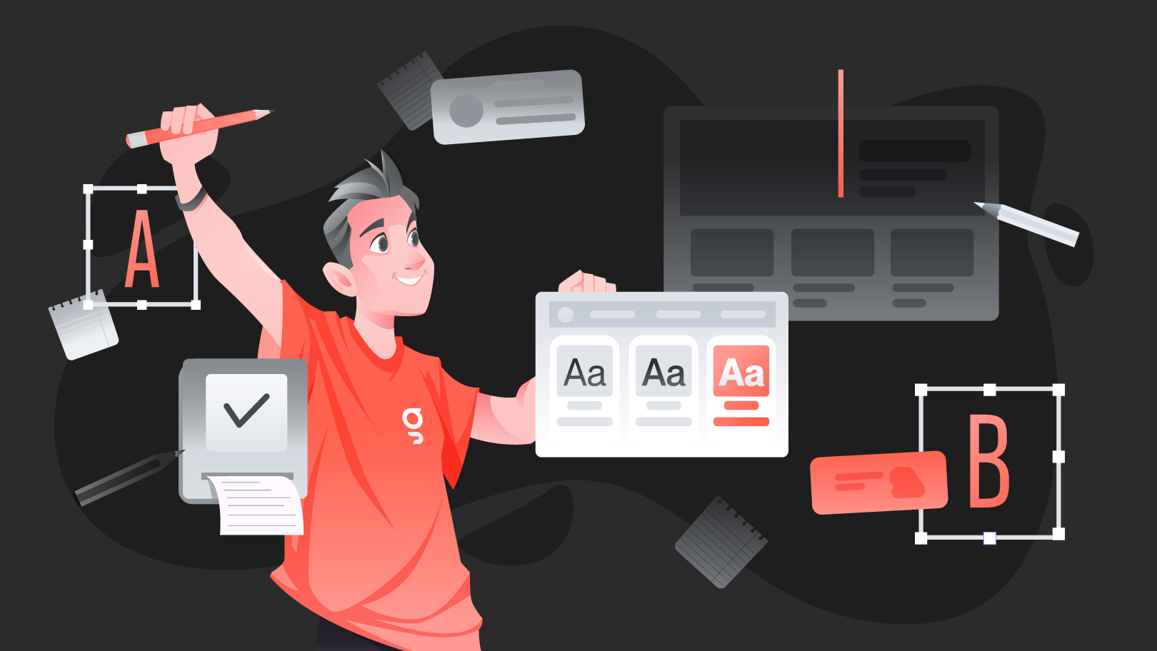
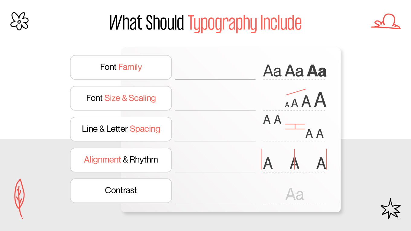
Typography is one of the most underestimated tools in digital design. While many brands focus on visuals, animations, or layouts, text is often the primary medium through which users interact with a product. Every button, label, and paragraph carries meaning — and the way that text is presented can either simplify or complicate user journeys. Good typography doesn’t just “look nice”; it shapes perception, guides behavior, and enhances accessibility.

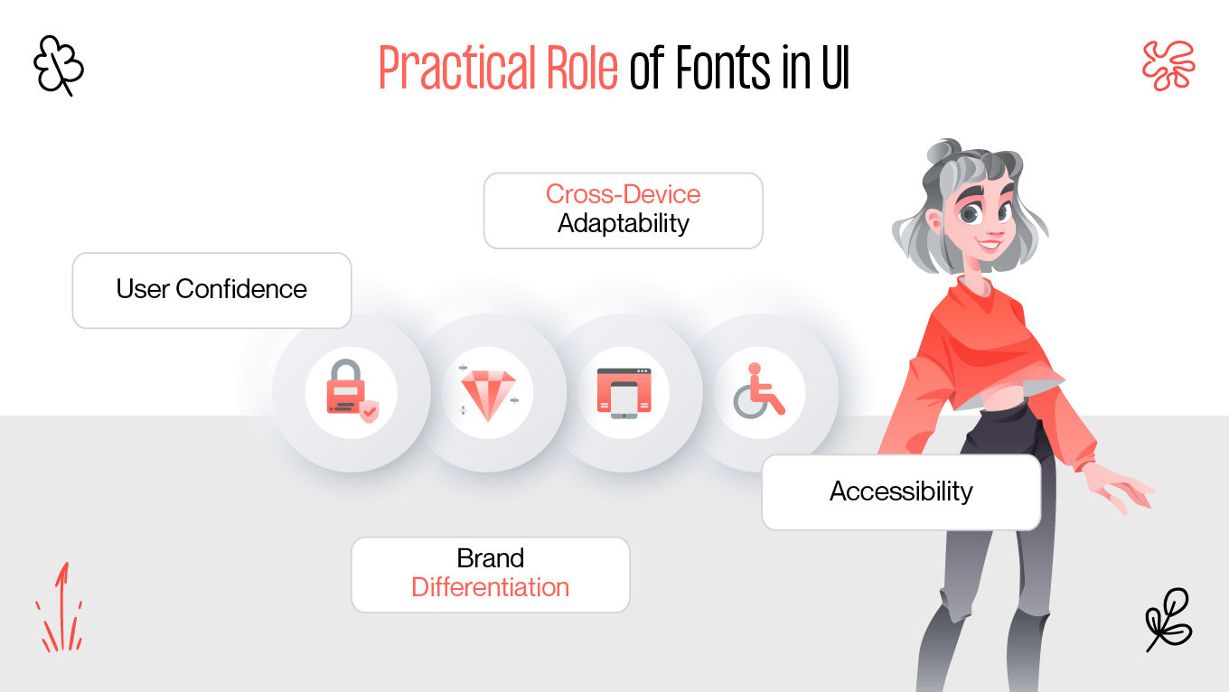
At Gapsy Studio, we see typography as a bridge between design and communication. By going beyond fonts and treating text as a design system, we help brands deliver digital experiences that feel natural, trustworthy, and aligned with their identity.

Typography Basics

Typography is more than the art of arranging letters. In digital product design, typography in UX design is the foundation of how users consume information, perceive credibility, and make decisions. Every choice — from typeface to line spacing — influences whether the message is clear or confusing.

At Gapsy Studio, we emphasize typography as a functional system, not just visual styling. A well-structured typographic system helps users scan content effortlessly, understand hierarchy, and stay focused on the key actions. In contrast, poorly managed typography increases cognitive load, discourages engagement, and weakens brand identity.

Typography includes:

  • Font family: The style of characters, defining personality.
  • Font size and scaling: Determines readability across screen sizes.
  • Line spacing and letter spacing: Influences comfort during reading.
  • Alignment and rhythm: Ensures logical text flow and balance.
  • Contrast: Defines accessibility and clarity.
Elements of typography
Caption

In short, typography solves the problem of communication in digital interfaces. It makes content not only visually appealing but also functional and inclusive.

How Fonts Shape Experience

Fonts are silent storytellers. They influence how users feel before they even read a single word. Studies in cognitive psychology show that font choices affect trust, emotions, and perceived usability.

Emotional impact of fonts

  • Serif fonts (e.g., Times New Roman, Georgia): evoke reliability, tradition, and authority. Perfect for legal, publishing, and financial platforms.
  • Sans-serif fonts (e.g., Helvetica, Roboto): create a modern, minimal, and user-friendly impression. Widely used in tech, fintech, and SaaS products
  • Display fonts (decorative styles): ideal for marketing campaigns, but risky in interfaces due to limited readability.
  • Monospaced fonts (Courier, Source Code Pro): communicate technical precision, often used in developer tools.

“At Gapsy Studio, we always align typography with brand strategy. A lifestyle app may use playful, rounded fonts to highlight friendliness, while a healthcare platform needs clean, serious typography to build trust and credibility.”


Practical role of fonts in UI

Fonts also shape functionality:

  • User confidence: Clear fonts reduce friction during form-filling or checkout processes.
  • Brand differentiation: Unique font choices strengthen identity in competitive markets.
  • Cross-device adaptability: Responsive fonts adjust well to mobile, tablet, and desktop.
  • Accessibility: Open, simple fonts support users with visual impairments or dyslexia.
Practical role of fonts in UI

That’s why font choices in UI are never purely aesthetic — they are strategic.

Readability Rules

Typography only works if users can actually read and process information with ease. Good readability combines legibility (clarity of individual letters), readability (ease of reading entire blocks), and visual hierarchy (logical order of content).

Direct answers to common questions

  • What fonts improve UX? Highly legible typefaces like Roboto, Open Sans, Inter, and Helvetica are considered UX-friendly. They are optimized for screens, ensuring clarity even at small sizes.
  • How to choose the right size? The rule of thumb: body text should be 16–18px on desktops and slightly larger on mobile devices. Headings must scale progressively (24px, 32px, 48px) to build structure.
  • How to align text with brand? Define personality first. A fintech startup might use geometric sans-serifs to communicate innovation, while an educational platform could combine serif headings with sans-serif body text for balance.

Key rules for readability

  1. Line spacing (leading): Should be 120–150% of the font size.
  2. Contrast: Black text on white is safest, but modern interfaces may use softer contrasts for comfort — as long as WCAG accessibility standards are met.
  3. Line length: Ideal lines are 50–75 characters long. Too wide strains the eyes; too narrow breaks rhythm.
  4. Hierarchy cues: Use size, weight, and color to guide users, not decoration.
  5. Consistency: Limit fonts to 2–3 families to avoid visual clutter.

Table: Typography Guidelines

Element

Best Practice

Why It Matters

Font Family

2–3 families maximum

Too many fonts reduce consistency

Size

16–18px body, scalable headings

Balances readability and hierarchy

Line Spacing

120–150% of font size

Reduces eye strain and improves clarity

Contrast

High contrast (e.g., 4.5:1 ratio)

Ensures accessibility (WCAG compliance)

Line Length

50–75 characters per line

Improves rhythm and scanning

“Typography is invisible when it works well. Users don’t notice it — they just feel that reading is easy and natural. That’s the benchmark we use at Gapsy Studio when testing readability.”

Best Practices for Typography in UX

Typography requires consistent application and regular validation. Below are principles every product team should adopt.

Best Practices for Typography in UX

1. Maintain consistency

Define clear text styles in your design system. Establish rules for headings, body, captions, and links. This prevents inconsistency across pages and accelerates collaboration between designers and developers.

2. Support accessibility

Follow Web Content Accessibility Guidelines (WCAG). Use scalable fonts, sufficient color contrast, and avoid text embedded in images. Accessibility ensures inclusivity for users with impairments.

3. Balance hierarchy

Use visual cues such as weight, size, and spacing to establish priority. Important actions like CTAs should always stand out through typographic emphasis, not flashy decoration.

4. Test typography on real devices

Prototypes in Figma or Sketch look perfect, but real devices tell the truth. Test typography across operating systems, screen resolutions, and browsers. Small details — like system font rendering — can affect perception.

5. Integrate typography into UX audit

Typography should be evaluated as part of a full product check. For example, during a UX audit, we identify whether font size is sufficient for mobile use, whether hierarchy is clear, and whether accessibility standards are met.

6. Evolve with brand growth

Typography systems should scale as your brand grows. If your product expands to multiple regions or languages, you may need multilingual font support (Cyrillic, Arabic, Chinese). Choosing versatile font families upfront prevents costly redesigns later.

7. Apply micro-typography

Small details — kerning, alignment, spacing between bullets and text — influence perception subconsciously. Professional designers refine these micro-interactions to create a polished look.

Checklist for designers

  • Is the text legible on both light and dark backgrounds?
  • Do headings and subheadings create a clear structure
  • Are interactive elements (buttons, links) emphasized with consistent typography?
  • Does the system support future scaling (new languages, features)?

Key Takeaways

Typography in UX is not decoration — it is communication. It guides users, builds trust, and reflects brand identity. By making thoughtful font choices in UI, ensuring legibility, and designing with accessibility in mind, products become easier to use and more engaging.

At Gapsy Studio, we believe typography is the silent foundation of UX. It influences emotions, credibility, and navigation before users even notice the interface details. Our approach combines design systems, readability testing, and brand strategy to ensure that typography becomes a true asset for every product.

Rate this article

20 ratings
Average: 4.9 out of 5

If you like what we write, we recommend subscribing to our mailing list to always be aware of new publications.

Do you have any questions? We tried to answer most of them!