The Impact of UX on SEO: What Designers Need to Know

12minutes read
the-impact-of-ux-on-seo

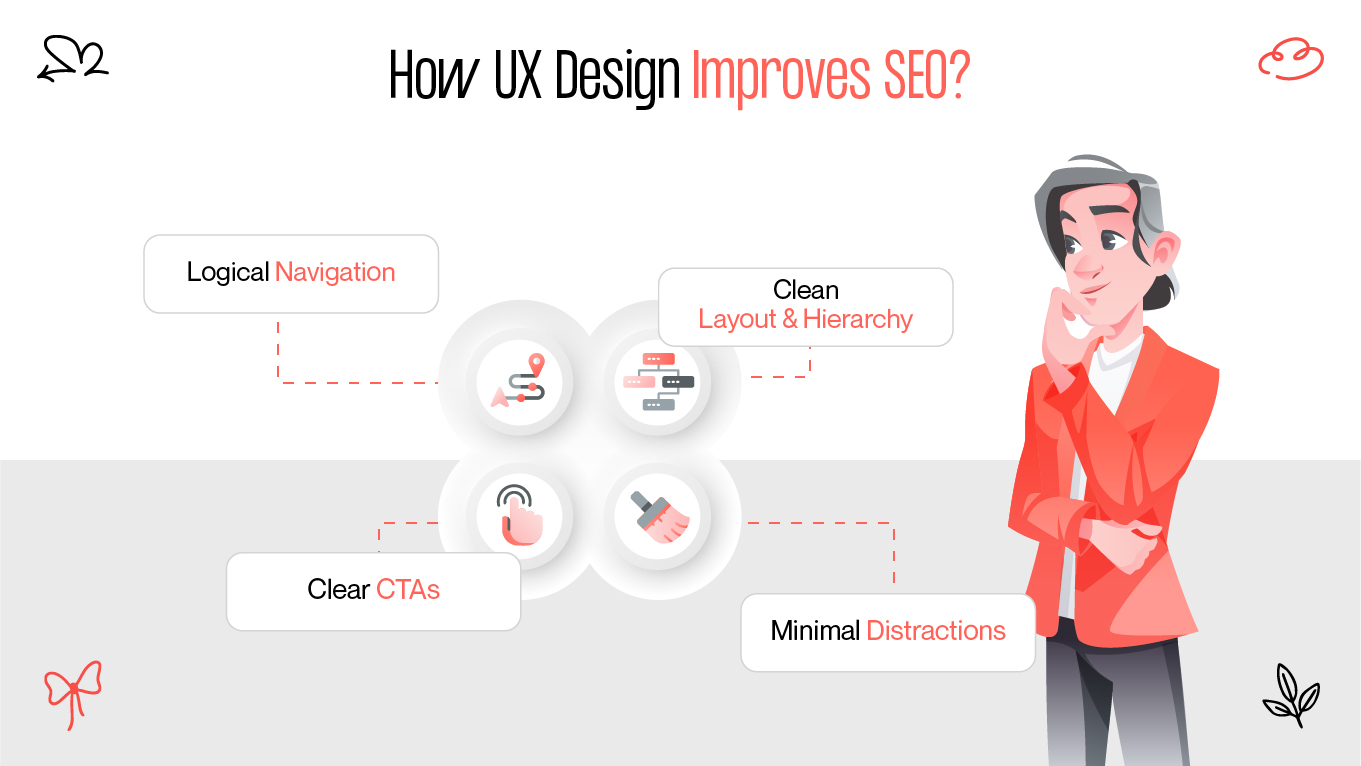
You spent weeks perfecting your site’s design — but your traffic still isn’t growing. Why? Because Google doesn’t just rank content. It ranks user experience.

Great UX isn’t just for users — it matters for Google too.

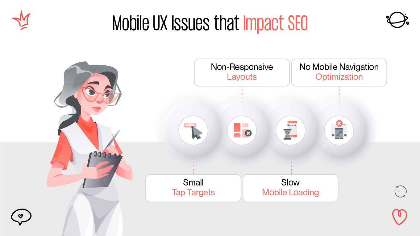
Search engines evaluate websites based on design fundamentals such as layout clarity, loading performance, and mobile accessibility. That’s why modern designers need to think beyond visuals and consider how their work influences SEO.

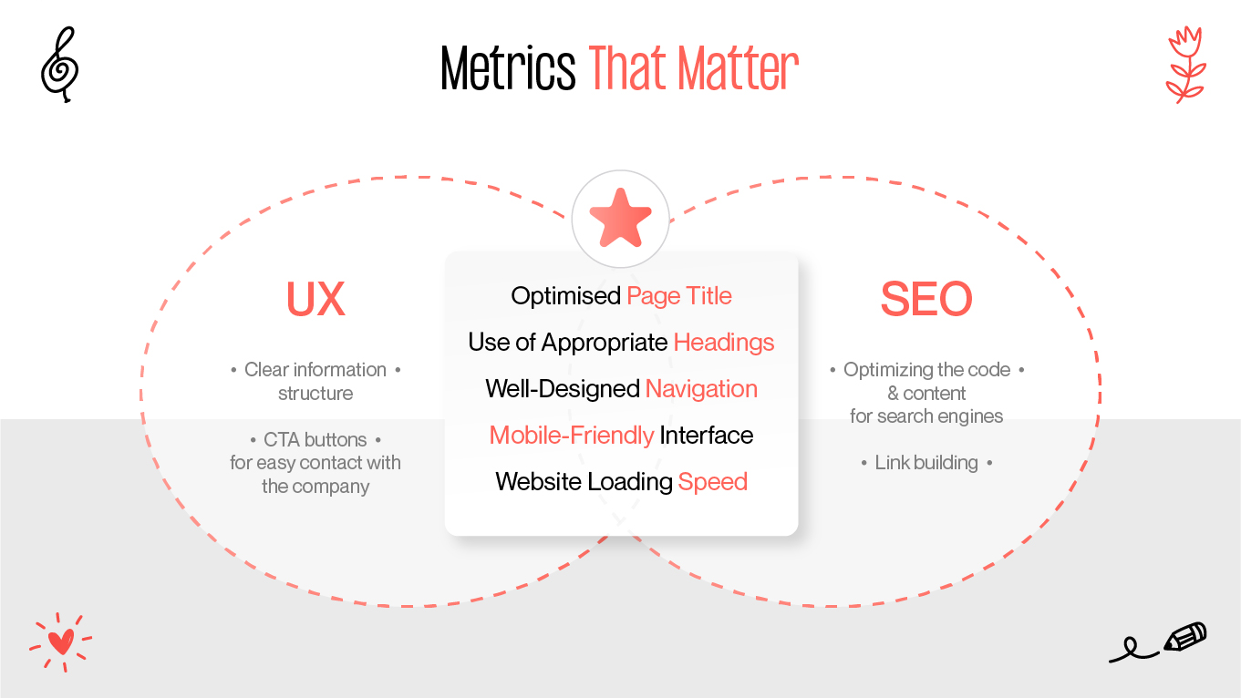
In this article, we’ll break down the real ux impact on seo, explain key metrics like bounce rate, dwell time, and Core Web Vitals, and show what design decisions improve both SEO and user experience.

UX-SEO Connection

Search engines no longer rank websites based solely on keywords and backlinks. They also analyze how real users interact with the content — and that’s where UX makes a difference.

As confirmed by Google in their SEO Starter Guide, usability and page experience are essential ranking factors.

They also analyze how real users interact with the content — and that’s where UX makes a difference.

When a user lands on your website and finds it hard to navigate, slow to load, or confusing to use, they’re more likely to leave — fast. This behavior signals to Google that your page isn't meeting user expectations, which can push your rankings down.

In contrast, a well-organized and user-friendly interface encourages visitors to stay and interact longer.This improves behavioral signals like dwell time, pages per session, and bounce rate, all of which Google uses to assess content quality and relevance. Studies from Ahrefs show that higher dwell time is correlated with better rankings, as it reflects content relevance and strong user experience.

How UX Design Improves SEO

Here’s what matters most from a UX standpoint:

  • Logical navigation — Helps both users and search bots crawl your site easily.
  • Clean layout & hierarchy — Makes information easy to digest, especially for mobile users.
  • Clear CTAs — Guide users through their journey, increasing conversions and engagement.
  • Minimal distractions — A cluttered UI leads to frustration and higher bounce rates.

“UX isn’t just about visual appeal — it’s about helping users (and search engines) understand your site fast.” 

— Gapsy Studio

Well-designed UX bridges the gap between what people want and what search engines reward. If your site is useful, fast, and easy to use, it ranks better — simple as that.

Metrics That Matter

If you're designing with SEO in mind, it’s not enough to create beautiful interfaces — you need to understand the metrics Google uses to evaluate user experience.

Metrics that matter
Metrics that matter

Here are the key behavioral and technical indicators that link UX and SEO directly.

Dwell Time

What it is: The total time a user spends on your page before returning to search results.

Why it matters: A long dwell time suggests your page offers relevant, engaging content. Poor UX (slow load, bad layout, poor readability) can drastically shorten it.

Bounce Rate

What it is: The percentage of users who leave your site after viewing just one page.

Why it matters: A high bounce rate often signals that the page didn’t meet the user's expectations — which could stem from confusing design, slow loading, or lack of useful content.

Core Web Vitals

Introduced by Google as part of the Page Experience update, these metrics evaluate three key aspects:

  • LCP (Largest Contentful Paint) evaluates how quickly the main visible element on your page becomes fully loaded — a critical factor in perceived performance.
  • FID (First Input Delay) indicates how responsive your website is by measuring the delay between the user’s initial action (like clicking a button) and the system’s first response.
  • Cumulative Layout Shift (CLS): How stable the layout is while loading.

They are part of Google's Page Experience update, introduced to emphasize the importance of UX in search performance. Poor performance in any of these areas can negatively impact rankings — and they’re directly tied to design and front-end development decisions.

Mobile Usability

Since Google prioritizes mobile versions for indexing, optimizing for mobile experience has become non-negotiable. If your site isn’t easy to navigate on a small screen, it won’t rank well, even if the desktop version is perfect.

Table: UX Metrics and Their SEO Impact

UX Metric

What It Measures

Impact on SEO

Dwell Time

Time spent on page

Longer time = higher relevance = better rankings

Bounce Rate

% of users who leave after one page

High bounce rate can reduce rankings if caused by poor experience

LCP (Core Web Vitals)

Loading speed of main content

Slow LCP negatively affects SEO

FID (Core Web Vitals)

Responsiveness of page interaction

Fast FID = better UX = positive SEO signal

CLS (Core Web Vitals)

Visual stability during load

High CLS = frustration = possible ranking drop

Mobile Usability

Mobile navigation, tap targets, text size

Poor mobile UX = lower rankings in mobile-first index

“Design decisions directly shape these metrics. Overlooking these elements means missing out on real SEO gains.” — Gapsy Studio.

Mobile UX

Statista reports that mobile browsing has surpassed 58% of all global web traffic — a trend that shows no signs of slowing.

To reflect this shift in user behavior, Google now prioritizes the mobile version of websites when determining search rankings, a concept known as mobile-first indexing.

So what does this mean for designers?

If your mobile UX is poor — think tiny buttons, unreadable text, horizontal scrolling, or broken layouts — it won’t just frustrate users. It will actively hurt your search visibility.

Key mobile UX issues that impact SEO

Mobile UX Issues that Impact SEO

Many mobile usability problems directly affect how long users stay on your page — and how Google interprets that behavior. Let’s look at frequent mobile UX issues that can hurt your site’s visibility in search:

  • Small tap targets. Buttons or links that are too small lead to misclicks and user frustration.
  • Non-responsive layouts. A layout that breaks on different screen sizes increases bounce rate and CLS (layout shift).
  • Slow mobile loading. Mobile users expect fast loading. High LCP (Largest Contentful Paint) on mobile leads to ranking drops.
  • No mobile navigation optimization. Menus that are hard to reach, hidden behind multiple taps, or too small to use quickly will push users away.

Addressing these issues doesn’t just improve user satisfaction — it sends clear positive signals to search engines that your site is modern, usable, and built for real people.

For instance, after improving mobile navigation and reducing CLS, one of our e-commerce clients saw a 28% decrease in bounce rate and a 3-position jump in Google results within weeks.

“Designing for mobile isn’t optional anymore. If your mobile UX is broken, your SEO is broken too.”
— Gapsy Studio

Best practices for mobile-friendly design

To make sure your mobile design works for both users and search engines, certain principles should always guide your approach. These best practices help avoid the most common mobile UX pitfalls:

  • Use a responsive grid system and test layouts on real devices to ensure consistency across screen sizes.
  • Optimize images and media for fast loading using modern formats (e.g., WebP) and lazy loading techniques.
  • Keep tap targets large enough — at least 48x48 pixels — to reduce user frustration and accidental taps.
  • Choose readable font sizes — a minimum of 16px ensures legibility without zooming.
  • Simplify navigation with mobile-friendly menus, sticky headers, and clear page hierarchy.

Following these practices not only improves usability but also aligns your website with Google’s technical expectations for mobile-first performance.

Structure & Speed

A well-structured, fast-loading website benefits everyone — users find what they need faster, and search engines can crawl and index content more efficiently. From both a UX and SEO perspective, site structure plays a key role in discoverability, engagement, and ranking performance.

When websites are designed and structured thoughtfully, users have equal access to content and functionality — a principle that applies to both accessibility and SEO.

As noted by the W3C, correct web design ensures usability and discoverability for all.

Why structure matters for SEO and UX

Clear, intuitive structure isn’t just a UX best practice — it’s a powerful ranking signal. Well-organized headings, logical navigation, and consistent page layouts help both users and search engines understand your content.

When the structure is weak, users struggle to find what they need, leave quickly, and send negative signals to Google — all of which can hurt your visibility in search results.

Why speed matters even more

Page load time is one of the most direct ways UX affects SEO. Google includes loading speed (especially mobile speed) in its ranking algorithm. A one-second delay in load time can reduce conversions by up to 20% and significantly increase bounce rate.

Table: UX Elements That Influence Structure and Speed

UX Element

Effect on User Experience

Effect on SEO

Recommendation

Navigation/Menu

Easier site exploration, less user frustration

Better crawlability and internal linking

Use semantic HTML and logical hierarchy

Page hierarchy (H1-H6)

Clear content flow and readability

Helps Google understand page context and relevance

Use headings consistently and avoid skipping levels

Internal linking

Keeps users engaged with relevant content

Distributes SEO value and helps indexing

Link contextually to related pages

Page load speed

Reduces wait time and bounce risk

Direct Core Web Vitals signal for ranking

Optimize media, use caching, minify CSS/JS

Layout stability (CLS)

Prevents frustrating “shifts” as page loads

Google penalizes pages with poor CLS scores

Set fixed sizes for images, avoid late-loading banners

“Structure is what guides both your visitors and Google — and speed is how fast they get there.”

— Gapsy Studio

A fast and well-structured website not only ranks better, but also retains users longer and guides them more effectively toward your goals — whether that’s conversion, engagement, or brand trust.

Conclusion

Let’s build experiences that both users and Google will love.
Tell us about your idea — and we’ll show you how UX can drive your growth.
Start your project with Gapsy Studio.

Rate this article

20 ratings
Average: 4.9 out of 5

If you like what we write, we recommend subscribing to our mailing list to always be aware of new publications.

Do you have any questions? We tried to answer most of them!