UI Animation Best Practices for Web Interfaces

6minutes read
ui animation best practices

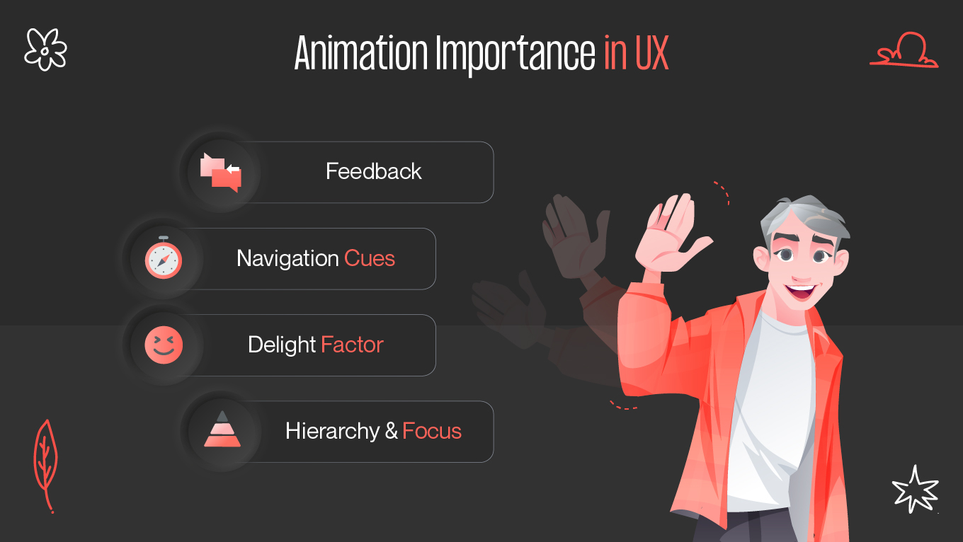
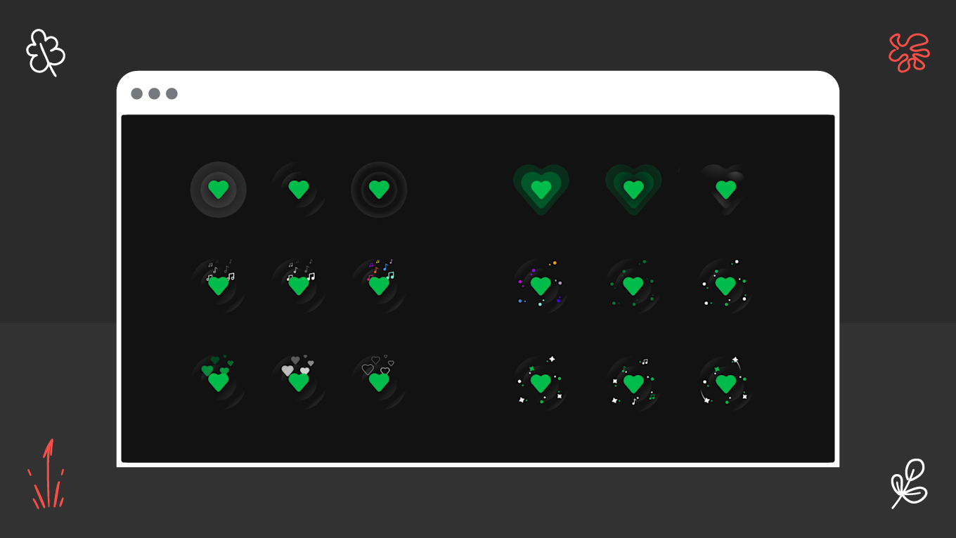
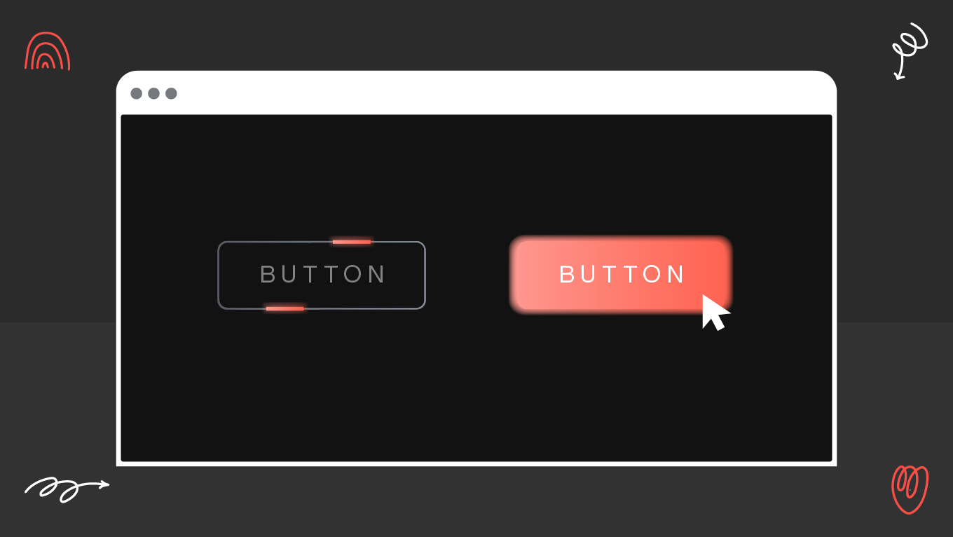
Animation is no longer just a flashy addition to web design. Today, it's a fundamental aspect that shapes how people interact with digital products. From subtle microinteractions to smooth transitions, thoughtful motion can transform a static interface into a dynamic, intuitive, and enjoyable experience. But without a solid understanding of UI animation best practices, designers can all too easily overwhelm or even annoy users. This article delves into using animation with a purpose, finding the right balance between aesthetics and function.

Animation isn’t just about pretty pictures—it’s about keeping viewers engaged with your message from beginning to end. The retention metrics tell us whether we’re creating content that truly connects,” - Michelle Connolly, Founder of Educational Voice. [1]

The Role of Animation in UX Design

Imagine clicking a button and suddenly popping to a new page without a visual hint. The interaction might be jarring or even disorienting. Now imagine the same interaction with a smooth transition that slides the content in while the button subtly reacts with a press animation. Suddenly, the interaction is natural, polished, and reassuring.

This is the magic of motion in UX design. It creates continuity, makes cause-and-effect obvious to users, and guides them through digital experiences.

Why animation is important in UX

According to animation retention rates statistics, 7.7% of marketers agree that animation increases information retention [2]. 

animation importance in ux
why implementing animation in ux?
  • Feedback: Animations give assurance that an action has been registered. For example, a heart icon that beats on click provides instant assurance.
  • Navigation cues: Motion can visually guide users from one item to the next, reducing cognitive load.
  • Delight factor: Considerate animations bring happiness, making users feel good about the product.
  • Hierarchy and focus: Animation helps draw attention to key elements without the need for additional text or graphics.

The takeaway? Animation in UX is not decoration—it's communication.

Functional vs Decorative Animation in UX

All animations are not created equal. While designing for web interfaces, it's essential to differentiate between functional and decorative animation.

Aspect

Functional Animation

Decorative Animation

Purpose

Guides, informs, gives feedback

Adds style and delight

Examples

Button states, loaders, transitions

Parallax, background loops

Impact

Improves clarity and usability

Enhances branding, may distract

Best Practice

Keep consistent and purposeful

Use sparingly for effect

Functional Animation

Functional animation is purposeful. It supports usability by:

  • Focusing attention (e.g., highlighting a new message or error state)
  • Conveying system feedback (e.g., loading spinners, progress bars)
  • Facilitating orientation (e.g., animated page transitions)
  • Simplifying tasks (e.g., drag-and-drop animations that show where items are dropped)

A straightforward example is a microinteraction: when you toggle a switch, the slider smoothly moves to the other side with a color change. This animation is not just for show—it's feedback that recognizes your action.

Decorative Animation

Decorative animations are there to entertain, not to inform. Think background loops, floating shapes, or parallax scrolling. While they can contribute to brand personality, they need to be used judiciously. Too much decoration can distract users or slow down performance.

Best practice tip: Start with functional animation, then add decorative flair if it truly adds to the user experience.

Examples of UI Animation Done Right

Looking at real-world examples is one of the most effective ways to see web animation tips in action.

Microinteractions

The Spotify like button provides a satisfying burst animation when clicked. This microinteraction provides feedback and emotional gratification at the same time.

spotify microinteractions animation
spotify microinteractions animation example

Smooth transitions

Airbnb uses smooth transitions when navigating between property listings and maps. The animation maintains context by zooming in and sliding panels, making it easy for users to stay oriented.

CSS animation

E-commerce sites commonly employ CSS animation for hover states, such as buttons that swell slightly on hover. Such subtle feedback enhances discoverability without taxing the user.

css animation example

Motion UI frameworks

Libraries such as Motion UI simplify adding meaningful animations, such as fade-ins or slide-ins, without overburdening the design process.

The takeaway from these examples: animations succeed best when they serve clarity, rather than vie for attention.

Accessibility Considerations

Animations can be potent, yet they're not admired by all. For people with motion sensitivity, quick or overstated effects can cause discomfort or even nausea. This is why accessibility needs to be at the center of UI animation best practices.

Primary accessibility principles

  • Reduce motion settings: Honor system preferences. Most operating systems enable users to minimize motion. Designers should make sure animations comply accordingly.
  • Control speed: Animations that are too quick confuse; too slow and they annoy. Adhere to natural timing—usually between 200–500 milliseconds.
  • Avoid unnecessary loops: Infinite or flashy animations distract users and degrade usability.
  • Provide alternatives: Where motion communicates information (e.g., a shake to show an error), also offer textual or visual confirmation.

Accessibility in animation isn't removing motion entirely—it's making it optional, subtle, and inclusive.

UI Animation Best Practices

Enough with the theory, let's get practical. The following web animation tips will have you designing with intention.

  • Keep it simple. Use motion sparingly—clarity over decoration.
  • Time it right. Follow naturalistic timing: short for simple feedback, slightly longer for transitions.
  • Be consistent. Establish a visual vocabulary for animation (e.g., easing curves, durations) and apply it across the interface.
  • Prioritize performance. Optimize your animations for buttery playback. Jerky motion destroys the effect.
  • Test with users. Observe real users react to your animations. Do they feel guided or distracted?

Final Thoughts

Animation isn't just eye candy—it's a critical component of modern web design. When used thoughtfully, it provides feedback, builds trust, and brings interfaces to life. But the gold standard of best practices for UI animation is restraint. Motion should always have a purpose, never overshadowing content or accessibility.

Whether you’re experimenting with CSS animation, designing microinteractions, or leveraging Motion UI frameworks, remember: the goal is to guide, not to dazzle. Good motion design is invisible—it feels so natural that users barely notice it, yet it shapes their entire experience.

References

  1. Brand Storytelling Through Animation: How to Transform Your Digital Strategy from https://educationalvoice.co.uk/animation-for-effective-brand-storytelling/
  2. Animation Retention Rates Statistics: Recent Trends and Insights from https://educationalvoice.co.uk/animation-retention-rates-statistics/

Rate this article

20 ratings
Average: 4.9 out of 5

If you like what we write, we recommend subscribing to our mailing list to always be aware of new publications.

Do you have any questions? We tried to answer most of them!