UI for Fintech: Design Considerations & Security UX

7minutes read
ui for fintech

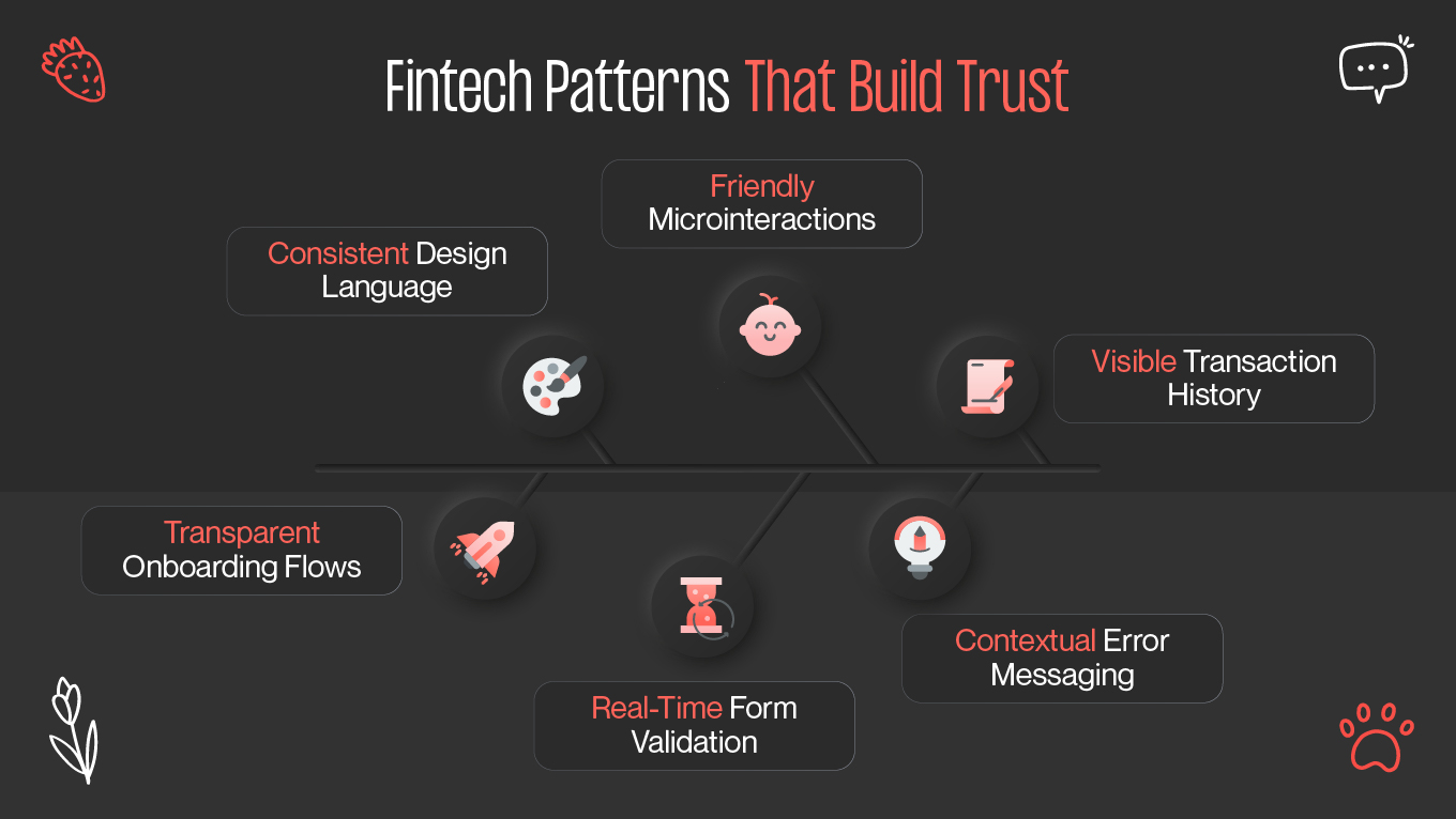
Designing a financial technology interface isn't just about looks. It's about shaping experiences that build confidence, simplify complex transactions, and protect sensitive data at every interaction. Great UI for fintech design brings together usability, security, and trust — making users feel in control and protected while managing their finances online. Let's explore the key challenges, trust-building design patterns, real-world case studies, and underlying guidelines that characterize secure, user-friendly fintech experiences.

Unique UX Challenges of Fintech

Visuals are not the only challenge in fintech design. All the intricate processes that come with handling finances must be taken into consideration when developing such a product. So, how to find balance in the complex design process when it comes to users’ security? Let’s find out.

Juggling security and usability

You don’t want to confuse users with all of the technicalities. In fact, your main goal is to secure and facilitate the user experience. For example, there are several verification types you can implement, including multi-step, CAPTCHA, or biometric scanning. Strive to find a perfect balance and avoid frustrating your target audience.

Displaying complexity simply

Fintech can indeed be multifaceted (in a bad sense of the word). But don’t be afraid — data visualization will help you achieve the desired result. It is paramount in the fintech world. Translating complex numbers into actionable insights will help users feel more confident while using the platform. Implement infographics, graphs, and charts to allow them to make decisions without feeling overwhelmed.

Navigating trust in digital interactions

Contrary to conventional banking, face-to-face reassurance is not something that can be relied upon in fintech. Everything is through screens. This means that UI and microinteractions must express safety, stability, and reliability. From the recognizable security badges to consistent branding and smooth navigation, every aspect contributes to building digital trust.

Handling human errors gracefully

Your users will inevitably make mistakes, such as entering incorrect account numbers, using inaccurate passwords, or misinterpreting terms. This is why correct error messaging is important. Here, a good UX microcopy comes in handy — you should sound persuasive and safe; otherwise, users may lose trust in you. Incorporate explanatory feedback and form validation in your design. A well-crafted fintech UI will gently guide users through error recovery.

UI Patterns That Build Trust

Trust is the foundation of any fintech experience. Without it, features and innovation alone don't count. Let's dive into some of the UI patterns and design strategies that build credibility and user trust.

Explore Gapsy Studio’s UX/UI design services.

Transparent onboarding flows

From the very first interaction, transparency builds trust. Onboarding screens should explicitly explain why personal data is required and how it will be used. Progress bars let users know how many steps remain, removing uncertainty. Visual cues like lock icons or subtle security notifications reassure them that their information is being handled responsibly.

Consistent design language

Consistency makes users feel safe. Design is tightly connected to emotions, especially in fintech. Use it for your users' good. Implement familiar design patterns that your audience may have encountered elsewhere. Balance it with consistent design elements such as colors, iconography, and typography. This is a key to successful user experience.

Real-time form validation

Clear, concise, and readable error messages build trust among your consumers. Besides, consistent feedback can prevent frustration. Be your user’s best friend and help them find a solution in a real-time form validation. This way, you can make their experience much more enjoyable.

Friendly microinteractions

Offer reassurance with microinteractions. The best part — you can let your creative side shine. Microinteractions can be implemented in the form of small animations in your fintech platform. From loading screens to feedback loops, you can make the experience more fun and relaxing.

Contextual error messaging

The effective use of error messaging will help identify problems more efficiently. Don’t just use a simple and confusing “An error occurred”; try to word it better, for example: “Please check your account number”. Polite and explanatory messaging is a far better option for maintaining a positive experience.

Visible transaction history

Let users feel more control. Don’t hide the transaction history deep in the menu; consider putting it on the main screen or making it more accessible and understandable. Make the receipts and audit trails available at any moment to achieve higher trust and satisfaction levels.

Case Study Examples

Real-world examples illustrate how successful fintech platforms balance design, trust, and security. Let's examine some high-profile cases.

PayPal – Trust Through Familiarity

The interface of PayPal has evolved over the years, but its foundational principles have remained consistent: trust through consistency. The same blue colors, rounded buttons, and clear call-to-action hierarchy instill a sense of reliability. PayPal also uses strong visual trust indicators — padlock icons, security disclaimers, and confirmation screens — to assure the user at each step. Their real-time form validation reduces errors, and smart error messaging prevents confusion while making payments. Familiarity and transparency together sustain the users' trust in sharing financial information.

Robinhood – Empowering Through Visualization

Robinhood's fintech triumph has everything to do with its data visualization approach. Investing is intimidating, yet Robinhood renders it a frictionless process through real-time graphs and interactive charts. Each motion design element is there to inform rather than distract. The secure UI design of the app also integrates biometric login and easy account management, merging usability and security. Robinhood proves that visual engagement and security can comfortably coexist when meticulously balanced.

Monzo – Communication and Error Clarity

Monzo manages to keep the tone friendly in an industry that can occasionally come across as stodgy. The conversational microcopy in form validation and error messaging is what makes it all so approachable. Instead of "Incorrect PIN," for example, users are informed "Hmm, that PIN doesn't look right — want to try again? " This humanizes the experience, with users feeling at ease even when mistakes occur.

Paired with a visually minimal dashboard and strong trust signals, Monzo's UI is friendly and secure. 

Guidelines

Designers need to follow key guidelines that balance usability and security in order to create successful, secure, and trusted fintech interfaces. These principles will not only make users trust your platform but also enjoy using it.

Prioritize security without friction

This is the moment when intuitive design shows its significance. Security is the key to a successful fintech UX. From transaction confirmation to password creation, make sure you don’t give out many security requests; consider providing a “remember this device” button to reduce user frustration.

Be clear about data usage

Some users might be cautious about giving away personal data. When necessary, add pop-ups and detailed explanations during onboarding, telling why particular information is required.

Use form validation intelligently

Forms are just so key fintech UX touchpoints. Validate inputs in real time, using color cues (green = correct, red = error) and also make error messages actionable. A well-implemented form validation system is a time-saver and confidence-builder in your platform's reliability.

Optimize for accessibility

Fintech platform users can be anyone, meaning that your audience comes from various backgrounds. Here, accessibility and inclusivity are essential. There are plenty of options to serve this cause — from color contrast to text-to-speech capabilities. Ensure your app is accessible for everyone.

Use human-centered error messaging

When something goes wrong for the user, the design should teach, not preach. Step-by-step instructions and a welcoming tone keep users aboard even when there are problems. Attempt to utilize effort-acknowledging microcopy — "Almost there! Just recheck your CVV code" doesn't judge, yet motivates.

Conclusion

Secure UI design fintech should balance function, reassurance, and accessibility. Your fintech platform must be about fostering trust among users, making the experience secure, and delivering clarity with every interaction. 

Each design decision, from real-time form validation to data visualization that's easy to understand, serves a greater purpose: making users feel in control and confident in their financial lives.

When your users have faith in your platform, they engage more, explore more, and stay longer. Fintech offerings that blend transparency, consistency, and empathy thrive in a competitive market. At the end of the day, great UI design in fintech isn't about technology only — it's about the human element. A truly successful design doesn't just secure transactions; it builds relationships on trust and reliability.

Rate this article

20 ratings
Average: 4.9 out of 5

If you like what we write, we recommend subscribing to our mailing list to always be aware of new publications.

Do you have any questions? We tried to answer most of them!