UX Metrics That Matter: Measuring Success Beyond Vanity Metrics

12minutes read
ux-metrics

Metrics affect every decision a product team makes. 'How can we measure that?' appears to be a trick question at times. Metrics related to product and user experience should link user needs and corporate goals in order to be genuinely strategic. Your team can replicate wins and determine where and how to improve when you understand what your customers are doing and why.

Your team may confidently move from working reactively and independently to implementing cross-functional collaboration with metrics that make sense for your product and business. By working together, you may find beneficial use cases, point out enhancements, and flag annoying defects to help your product advance.

Why Does UX Metrics Matter?

When you clicked on a webpage, did it take a long time to load? Or did the layout make it difficult to access the information you needed? The likelihood is that you left.

User experience (UX) metrics are important for just this reason. They let you know how actual people use your website, whether they are interested or dissatisfied, and what has to be fixed.

Real-world interactions, usability, and performance are measured using UX metrics to assist identify problems before they cost you customers or revenue.

What they monitor is as follows:

What do UX Metrics Monitor?
  • Engagement: The way visitors engage with your website (click-through rate, time on page, and bounce rate).
  • Usability: The degree to which a task is simple to finish (task success rate and navigation efficiency).
  • Performance: The speed and stability of your website (mobile responsiveness, Core Web Vitals, page speed).

When determining whether your website should rank highly, Google considers user behavior. You won't rank if people leave too quickly or find it difficult to browse. You can enhance conversions, increase retention, and address friction points by monitoring key user experience KPIs.

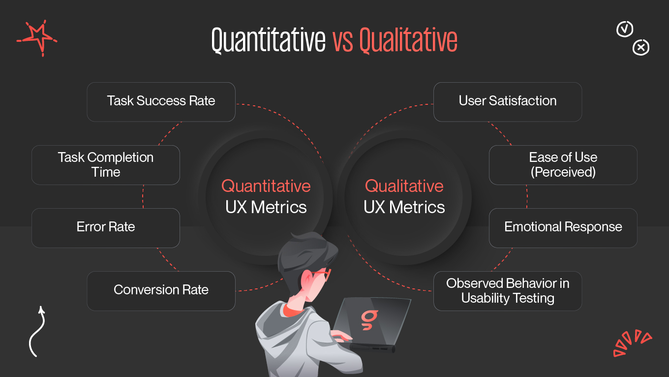
Quantitative vs Qualitative

Quantitative vs Qualitative UX Metrics

There are two types of UX metrics: qualitative and quantitative. Although they measure different facets of user experience, each offers insightful information. Hard figures known as quantitative metrics are used to monitor user performance and behavior. They are simple to assess, scalable, and objective.

Examples:

  • The percentage of visitors that depart after only one page is known as the "bounce rate."
  • Time on page: The amount of time visitors spend on a certain page.
  • Task success rate: The proportion of users that finish a task (such as signing up or checking out).
  • Page load speed: The rate at which a page loads completely.
  • The percentage of users who click on a link is known as the click-through rate, or CTR.

Friction points are highlighted by quantitative data. A high rate of bounce? Your page may be irrelevant or sluggish. Low rate of task success? Your checkout procedure can be too difficult.


Key UX KPIs

Every organization has different priorities when it comes to user experience KPIs. Which ones are best for you will depend on your industry, user path, and goals. Time is lost and inaccurate insights are obtained when the wrong ones are tracked. So, how can you determine which UX indicators are truly important?

Key UX KPIs
Key UX KPIs

Task Success Rate (TSR)

Task Success Rate (TSR) calculates the proportion of users who successfully finish a certain task, such as creating an account or making a transaction. Whereas a low TSR implies process friction, a high TSR denotes a seamless, intuitive experience.

How to improve it:

  • To find obstacles, do usability testing.
  • Reduce the number of steps in procedures and provide clear directions.
  • Make the form look better and cut out fields that aren't needed.

Teams can find usability problems and streamline processes to lower drop-offs by tracking TSR.

Time on Task

Time on Task measures the amount of time it takes for users to finish a task. Tasks should ideally be simple and quick. Longer delays could be a sign of misunderstanding, ineffectiveness, or more steps. 

How to improve it:

  • Identify the user flow's friction points.
  • Make navigation easier and cut off steps that aren't necessary.
  • Give in-app instructions to expedite task completion.

Although less time is generally preferable, context is important. Efficiency and user needs must be balanced because some tasks need greater engagement.

User Error Rate (UER)

User Error Rate (UER) indicates the frequency of errors that users make when using an interface. Errors can indicate a poorly designed user interface, confusing instructions, or too complicated procedures.

How to improve it:

  • Include validation feedback and unambiguous error warnings.
  • To avoid confusion, make use of tooltips and onboarding instructions.
  • For greater clarity, reposition the buttons and redesign the form.

Finding and fixing these mistakes can significantly increase usability and decrease annoyance.

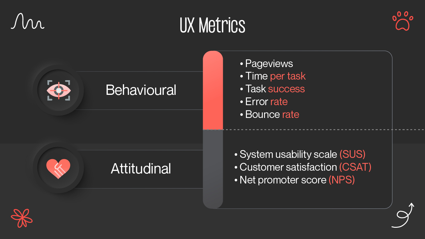
System Usability Scale (SUS)

A standardized survey called the System Usability Scale (SUS) gives a brief overview of how users see usability. Teams can gain a comprehensive picture of user satisfaction and possible problem areas by assigning a score to replies on a range of 0 to 100.

How to improve it:

  • Test usability with actual consumers.
  • Adjust the design iteratively in response to comments.
  • Make layout and interaction patterns more consistent.

While a low SUS score indicates room for improvement, a high score indicates that consumers find the system straightforward to use.

Net Promoter Score (NPS)

Net Promoter Score (NPS) calculates the likelihood that customers will suggest a good or service. It's a reliable gauge of general contentment and brand loyalty.

How to improve it:

  • Improve client service and interaction.
  • Address frequent issues based on input from users.
  • Improve user experience (UX) to make it more seamless and pleasurable.

While a low score could point to underlying UX or customer service problems that require repair, a high NPS indicates that people are satisfied and eager to recommend the product.

Engagement Rate

Through clicks, time spent, conversations, or return visits, engagement rate gauges how actively consumers engage with your product. While a low rate suggests disinterest or annoyance, a high rate indicates that users find value in your content and experience.

How to improve it:

  • To promote engagement, use interactive components such as films, quizzes, and calls to action.
  • Improve the readability and usability of UX design.
  • To increase interaction, A/B test headlines, layouts, and CTA positions.

Enhancing material quality, optimizing procedures, and improving user interface aspects are frequently necessary to increase engagement.

Retention Rate

The number of customers who return to a product after their first visit is measured by the retention rate. While a low retention rate could indicate dissatisfaction, a lack of interest, or competition luring customers away, a high rate indicates that users find continuous value.

How to improve it:

  • Enhance onboarding to ensure a smooth initial experience.
  • Use re-engagement tactics like push notifications and customized emails.
  • Provide features and information that add value to keep users interested.

Teams may improve UX tactics by knowing why users stay (or leave).

Conversion Rate

One of the most important user experience KPIs is conversion rate, which calculates the proportion of users who finish a desired activity like buying something, registering, or subscribing. Conversion rates rise when users are guided through the process with ease by a well-optimized user experience.

How to improve it:

  • Make CTAs as explicit and action-oriented as possible.
  • Reduce drop-offs by increasing load speeds.
  • Make forms and checkout procedures simpler.

Low conversion rates could be a result of imprecise CTAs, convoluted navigation, or a deficiency of trust signals.

Abandonment Rate

Abandonment Rate measures how often people begin a procedure, such as checkout or form submission, but do not complete it. High abandonment rates typically indicate friction, such as a complicated process, sluggish load times, or unexpected expenditures.

How to improve it:

  • Use analytics to find frequent drop-off locations.
  • Simplify the conversion process's intricate processes.
  • Provide incentives such as temporary discounts or free shipping.

Simplifying processes, giving clear instructions, and improving performance are frequently the keys to lowering abandonment.

Page Load Time

One essential UX component is page load time. While faster load times promote engagement and conversions, slow pages irritate users and raise bounce rates.

How to improve it:

  • Optimize media files and reduce image size.
  • Reduce the amount of JavaScript and eliminate any extraneous third-party scripts.
  • Global loading can be accelerated by using a content delivery network (CDN).
  • Every second matters: studies reveal that even a one-second lag can result in up to 7% of severe drop-offs. 

Click-Through Rate (CTR)

The frequency with which users interact with buttons, links, or CTAs is measured by the Click-Through Rate (CTR). While a low CTR might be an indication of bad design, ineffective messaging, or lack of visibility, a high CTR indicates that consumers find the information intriguing and easy to understand. 

How to improve it:

  • A/B test CTA language, size, and location.
  • Make use of clear and appealing CTA language.
  • Use a keyword research tool to optimize meta titles and descriptions so that the content matches search demand and user intent.

Optimizing language, location, and visual components to promote interaction is frequently necessary to increase CTR.


Tools to Measure UX

The proper tools are necessary for tracking UX metrics in order to gather information, examine user behavior, and make well-informed adjustments. These tools offer profound insights into how users interact with your website, whether you require heatmaps, session recordings, funnel analysis, or real-time performance tracking.

Hotjar

By displaying the precise locations where people click, scroll, and drop off, Hotjar goes beyond simple statistics. This tool aids marketers and UX designers in comprehending actual consumer annoyance points:

  • To monitor engagement hotspots, use heatmaps.
  • Recordings of sessions to examine actual user interactions.
  • Widgets for user feedback that gather opinions.
  • To identify UX friction, use conversion funnel tracking.

With its clear visual representation of what is and is not working, Hotjar aids in the rapid diagnosis of usability problems.

Google Analytics 4

For tracking conversions, user journeys, bounce rates, and site traffic, Google Analytics is still the preferred solution. Google Analytics 4 provides improved cross-device analytics and event tracking:

  • Insights into user engagement and tracking in real time.
  • Recording events to gauge interactions.
  • Funnel analysis for locating drop-off locations.
  • Google Search Console integration for SEO information.

High-level data on UX performance is provided by Google Analytics, which aids teams in identifying patterns and improving site navigation.

Final Thoughts

There is much more to measuring UX success than vanity metrics like page views or social media likes. Real UX measurement explores how consumers interact with your product, feel, and accomplish their objectives.

Every design choice, iteration, and optimization is guided by UX metrics, which are used as a compass by the most successful product teams. Metrics establish a common language for development and innovation when they are in line with user requirements and corporate objectives.

Recall that each interaction, click, and scroll conveys a narrative. Your ability to create experiences that are user-friendly, captivating, and long-lasting will improve as you gather more insightful data from your consumers.

Rate this article

20 ratings
Average: 4.9 out of 5

If you like what we write, we recommend subscribing to our mailing list to always be aware of new publications.