Designing for Trust: Visual & UX Patterns

6minutes read
ux trust design

Users make decisions in a matter of seconds regarding whether or not they can trust a website or app, and that decision is likely to be based on subtle visual design and user experience signals. Here's the thing, though: trust can't be asked for. It must be designed.

Here, we explore UX trust design — breaking down how visual and user experience trends, trust triggers, security signals, and simple design choices can craft an environment that users not only transit through but also trust.

Trust Triggers in UI Design

Have you ever wondered what makes you, as a user, pause and understand that the digital product looks legit? Here are some reliable trust signals UI of a website you can trust:

trust triggers in ui design
ui design trust triggers

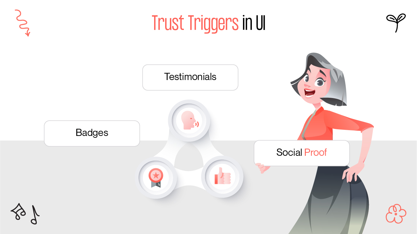
Testimonials, Badges, Social Proof

Humans are social creatures. We like to see that others have walked the same path and survived, making social proof design one of the most powerful trust triggers.

  • Testimonials are the online version of word-of-mouth. When customers hear testimonials from actual customers — particularly with a name, photo, or title — it personalizes the product and gives it credibility. It's no longer a feature; it's a story.
  • Badges and certifications are quick credibility symbols. Think "Google Partner," "ISO Certified," or "Top App of 2024." These icons are quick, familiar signals of authenticity — visual short-cuts that dispel skepticism.
  • User numbers and live data such as "Over 1 million users," "Trending now," or "3 people bought in the last hour" leverage a small psychological trigger: If others are doing it, it must be okay.

But here's where the subtlety comes in — too much social proof comes across as desperate, and too little can come across as evasive. A finely-tuned design with trust signals UI integrates these things organically, without screaming or overwhelming the interface.

Security Indicators for Users

Even the most beautiful design will fail under a user's scrutiny if they feel at any moment that a danger is present. Nobody is going to provide a credit card number to a website that makes them feel uneasy. That's where security UX patterns come in—nondescript but often necessary.

ui design security indicators
example of security indicators in ui design

SSL Signals, Encryption Icons

Security in UX trust design isn't just about what's occurring in the background. It's also about how that protection is visually communicated.

  • SSL padlocks and "https" URLs are the norm nowadays, but not everyone goes out of their way to search for them. But their lack will certainly raise suspicions. The little padlock image in the browser bar has quiet power.
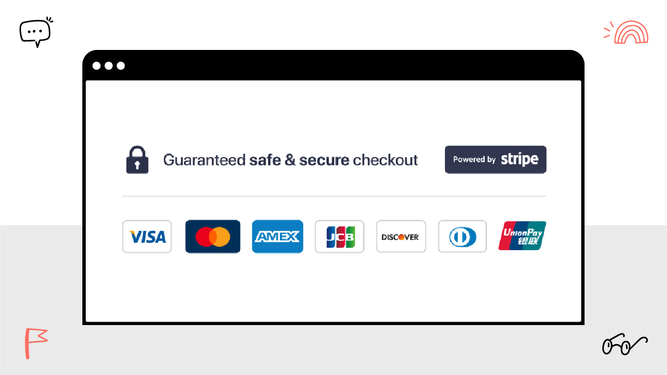
  • Icons of secure checkout (e.g., padlocks, shields, biometric symbols) placed near forms, login areas, or payment gateways highlight safety at pivotal moments. Use these with short reassuring messages like "Your data is encrypted" or "Trusted by banks."
  • Trust badges such as "Verified by Visa" or "McAfee Secure" will often hover above call-to-action buttons. They are not there for decoration — they reduce friction by dispelling security anxiety at conversion-critical moments.

More advanced techniques are progressive disclosure — revealing detailed security information only on hover or click. This keeps things tidy but still offers transparency where necessary.

Balancing Simplicity & Credibility

This is where most designers fall down: in the desire for minimalism, trust signals get jettisoned. Minimalist design is great, but sterile design is danger ground. Users crave reassurance — not white space.

minimalism ux trust indicators
minimalism trust patterns

Minimalism with Trust Elements

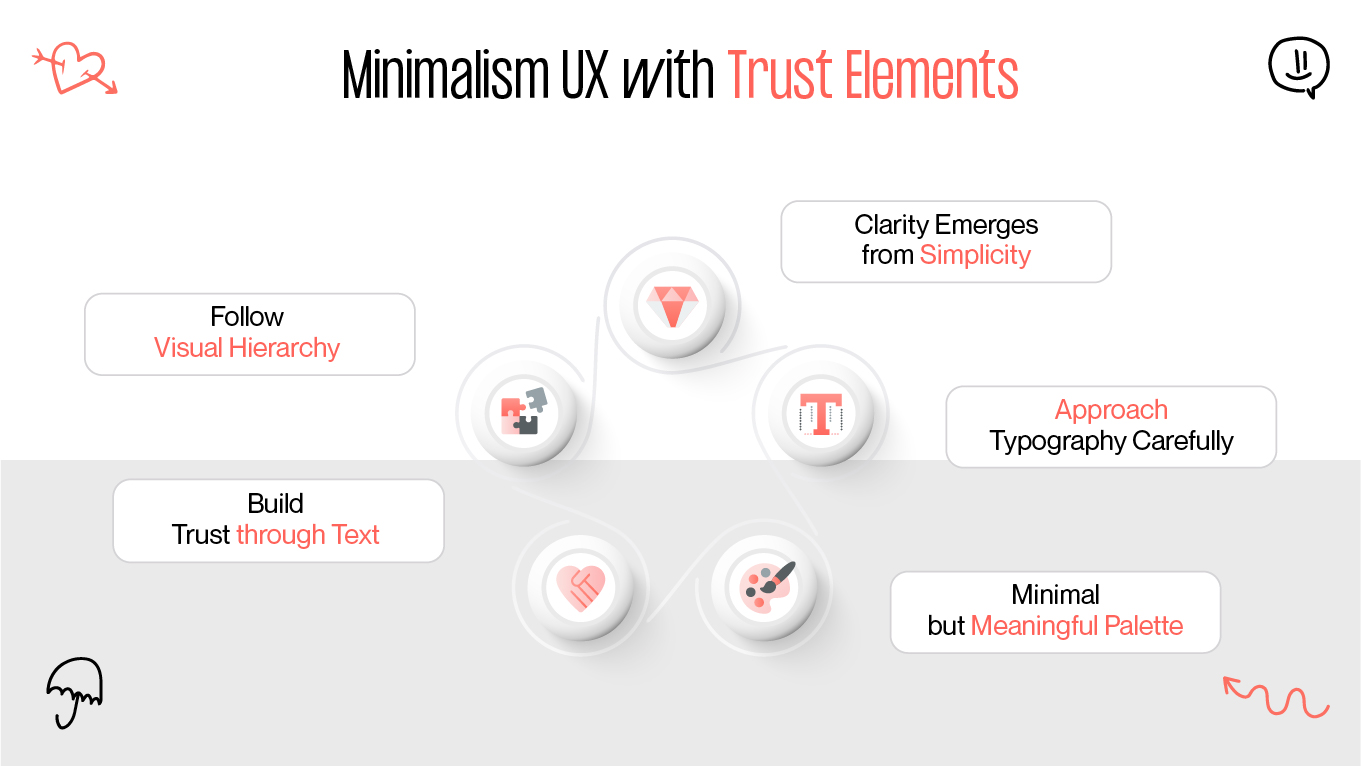
  • Clarity emerges from simplicity, but trust does not necessarily emerge from clarity. The trick is to weave trust factors into minimalist design in subtle ways without sacrificing an edge.
  • Approach typography carefully. Too quirky fonts are often amateur-ish, and ultra-generic fonts are lazy or old-fashioned. Choose typefaces that are in line with your brand but assertive. Legibility is more important than personality.
  • Keep color palettes basic but meaningful. Blue naturally conveys trust, green protection, and black luxury. Refrain from using them in a catch-all manner — your palette must be considered, not trendy.
  • Make microcopy do the heavy lifting. A short sentence beneath a "Sign Up" button like "No spam. Ever." is a strong impression. An assurance like "We never share your data" next to a form is what makes the experience human and ethical.
  • Visual hierarchy matters. Users will scan the page initially and then read. Your design should naturally guide users to trust factors, such as a testimonial, security badge, or support chat bubble. Don't keep your credibility hidden — display it boldly, but discreetly.

Well-designed minimalism does not eliminate trust signals — it brings them forward. By emphasizing what matters, and stripping away distractions, you get users to notice the cues that cause them to engage, sign up, or purchase, thanks to minimal trustworthy UI.

Final Words

Trust design is not manipulation. It is strategy, empathy, and sincerity. Every color, icon, testimonial, and microcopy line is saying something. The question is: what are you saying?

The truth is:

  • Users don't read everything — they scan for signals.
  • Users don't wish to think — they wish to feel safe.
  • Users don't trust by default — they must be persuaded why to.

In an era where scams are just a click away and cynicism is greater than ever, trust is more than a nice-to-have design element. It's your top conversion tool — saturated in buttons, badges, and even whitespace.

So when you're doodling a wireframe or honing a landing page next, ask yourself: Does this design make me feel safe? If not — trust us, your users will feel the same.

Rate this article

20 ratings
Average: 4.9 out of 5

If you like what we write, we recommend subscribing to our mailing list to always be aware of new publications.