UX Writing Tips: Crafting Microcopy That Converts

6minutes read
ux writing tips

The purpose of writing any kind of material is always to educate you about what you are doing and what you ought to do. But the specific goal of UX writing is to guide you through an interface using clear, succinct, and interesting language.

Also known as "Microcopy" or "UX Copy," it improves the user experience for people who access or use digital products by using the text they click or see.

UX writing will assist users in finding their way and completing their tasks, much like a well-designed user interface (UI) will help you establish a connection with your users, represent your brand, and educate your audience. The outcome? A higher conversion rate and fewer irate users. Everyone has won with our UX writing tips!

What Is UX Writing?

Writing thoughtfully about people's settings, requirements, and behaviors is known as user experience (UX) writing. Writing copy requires many of the same abilities as visual or interaction design, with the exception that writers connect with consumers throughout the experience using words rather than pixels.

Unfortunately, in product development, copywriting and content design are sometimes overlooked, hurried, or misinterpreted. They are far more intricate and detailed than most people realize or believe. Good content communicates effectively, fosters trust, and motivates individuals to take action in support of company objectives.

The Role of Microcopy

The tiny but important textual elements in the user interface that aid users in navigating the program or website are known as microcopy UX. Its primary objective is to assist and educate consumers while improving their experience by making it more user-friendly, efficient, and intuitive.

Although microcopy may not seem very exciting or remarkable, it has a significant impact on the likelihood that a product will succeed and the quality of the user experience. It can take many different forms:

  • Call-to-action (CTA) button labels (such as "Learn more," "Book the demo," and "Sign up")
  • Error messages
  • Users are assisted in understanding what information to submit via placeholders and form instructions ("Password must be at least 8 characters").
  • Clarification of a feature or UI piece by in-app guidance (e.g. when you hover over it)
  • Announcements of new features and product updates
  • Messages of confirmation ("Profile updated successfully.")

By offering succinct, straightforward instructions or information within a user interface, microcopy aims to improve the user experience. It emphasizes usability, assisting users in completing activities, comprehending features, navigating a website or app, and avoiding mistakes.

Enhances user engagement

When it comes to onboarding users and assisting them in finding the pertinent functionality, microcopy is crucial. By assisting consumers in understanding how to fully utilize the capability that is accessible, it also lowers the learning curve.

User engagement is driven by UX microcopy. For instance, just because you demonstrate a feature to people once does not guarantee that they will utilize it. Well-written copy, such as that found in a contextually prompted tooltip, can encourage users to use a feature repeatedly until they develop a habit of doing so.

Increases conversion rates

Regardless of how user-friendly your product and UX design are, some customers will still encounter difficulties. Microcopy increases conversion rates by guiding consumers at critical touchpoints and assisting them in overcoming obstacles.

Customers just require encouragement to act, even in the absence of bottlenecks in the user experience. This may be a popup urging them to upgrade their subscription based on their usage or a CTA text button asking them to sign up for the free trial.

Builds customer trust

Microcopy also boosts client loyalty and trust. How? Helpful microcopy UX first and foremost gives users a sense of support. Their confidence in the platform is bolstered by this assistance, particularly in times of difficulty or when they must make critical choices.

Additionally, the microcopy's tone might elicit empathy and understanding, giving consumers the impression that their demands and worries are acknowledged. Error messages that are informative and kind, as opposed to "cold" technical ones, might make the experience more pleasurable.

This is accomplished through the use of clear and educational language.

Writing That Converts

Effective UX writing can address issues that design and copywriting are unable to address.

For instance, the UX writer can utilize tooltips and in-app instructions to make a feature's purpose more clear if user testing indicates that users are confused about it.

Here's how to begin using UX writing immediately. Check out your product or website to see how you can apply these baseline UX writing tips.

Voice and Tone

The secret to creating readable and reliable copy is consistency. A sense of professionalism and dependability is created when the microcopy UX in various sections of an application or website sounds as though it was created by the same person. This can boost users' trust in the product.

Additionally, consistent microcopy can help you stand out from the competition, interact with users, and reinforce the personality of your business.

In certain situations, you might need to express optimism, reflect joy, express thanks, and speak with empathy. In order for the typical user to have an emotional connection to your digital product, you must adapt your tone to the situation.

Placement and Brevity

Every piece of copy will show up precisely where and when the user wants it thanks to careful placement. When microcopy is positioned next to button labels, input fields, or feedback messages, it encourages users to act with confidence without looking elsewhere for direction.

Reducing friction and maintaining user concentration can be achieved, for instance, by placing an error message directly beneath a form field or by placing real-time hints next to a password input. Text that is positioned correctly foresees user queries before they come up and provides responses when needed.

Brevity is equally important. Users quickly scan interfaces, and the cognitive strain increases with each additional word. Brevity preserves flow and engagement by enabling people to grasp what to do next without uncertainty. It's important to refine each sentence so that it conveys only the essential information rather than snipping words carelessly. For instance, a succinct "Try again" in an error condition works better than a long explanation since it helps people stay focused and continue.

Examples from Leading Apps

In order to establish context, motivate action, and strengthen brand identity, top apps regularly employ strategic messaging throughout crucial interface points, such as empty states, error pages, and form validations. By examining these instances, we can observe how well-chosen copy, positioning, and tone turn everyday exchanges into simple, easy-to-use experiences. View examples:

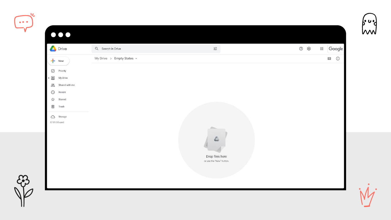
Empty states

Actionable prompts like "Upload your first file" or "Create a new folder" are displayed alongside instructive pictures on empty folder screens in apps like Dropbox. By giving customers instructions on what to do next, this method transforms a potentially perplexing or annoying encounter into a chance to interact with the product. Trello makes the UI feel approachable and friendly even when there is no content by using lighthearted messages and images on blank boards to inspire actions like adding lists or inviting teammates.

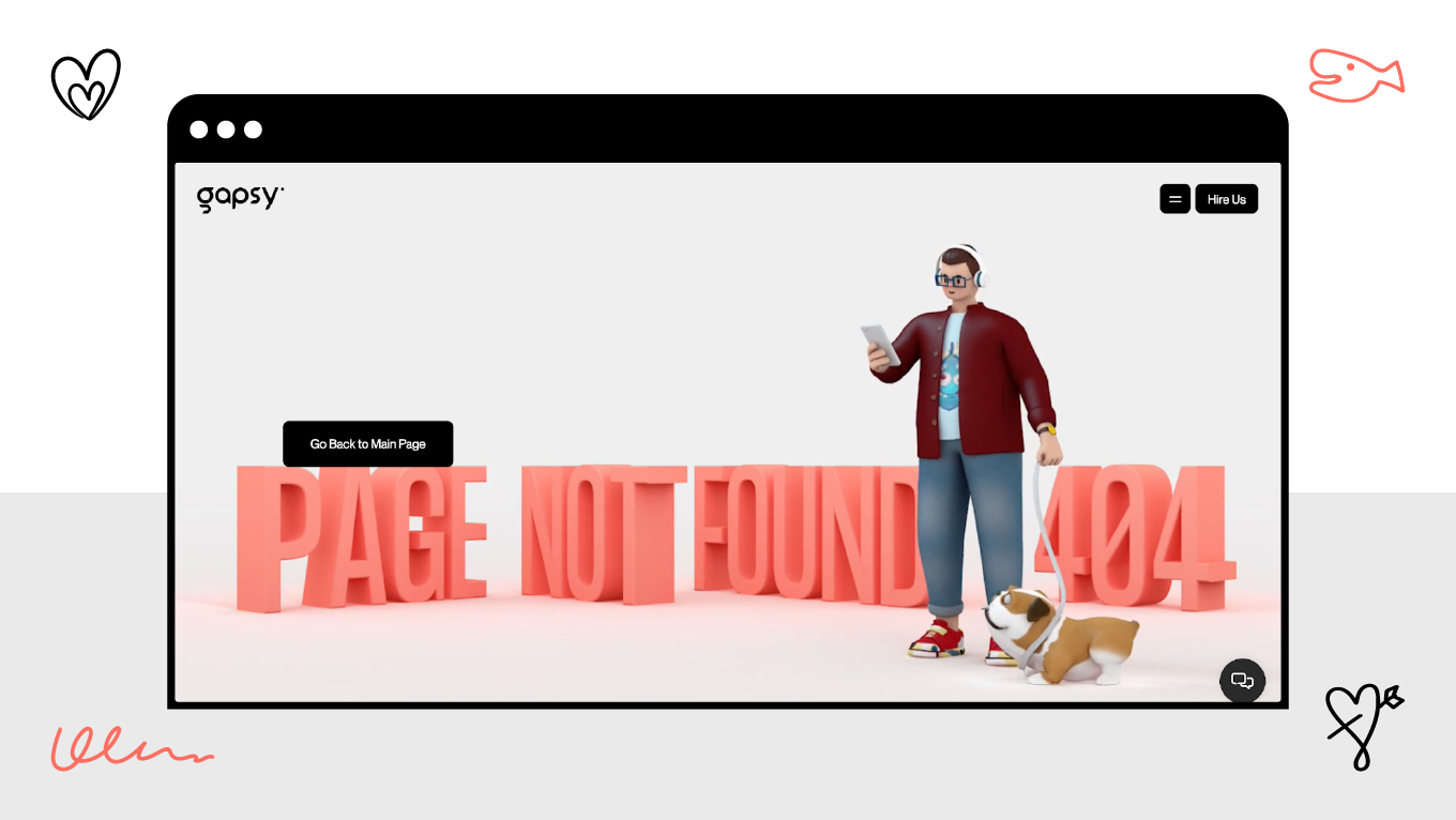
404 pages

Effective 404 pages provide both context and help. The humorous and obvious call-to-action on Airbnb's 404 page directs consumers back to search or explore listings. Slack keeps users focused within the program and minimizes annoyance by presenting a branded illustration along with a succinct message and a navigation link to the dashboard. Dead ends don't detract from the entire experience because these pages combine tone, visual signals, and clear next steps.

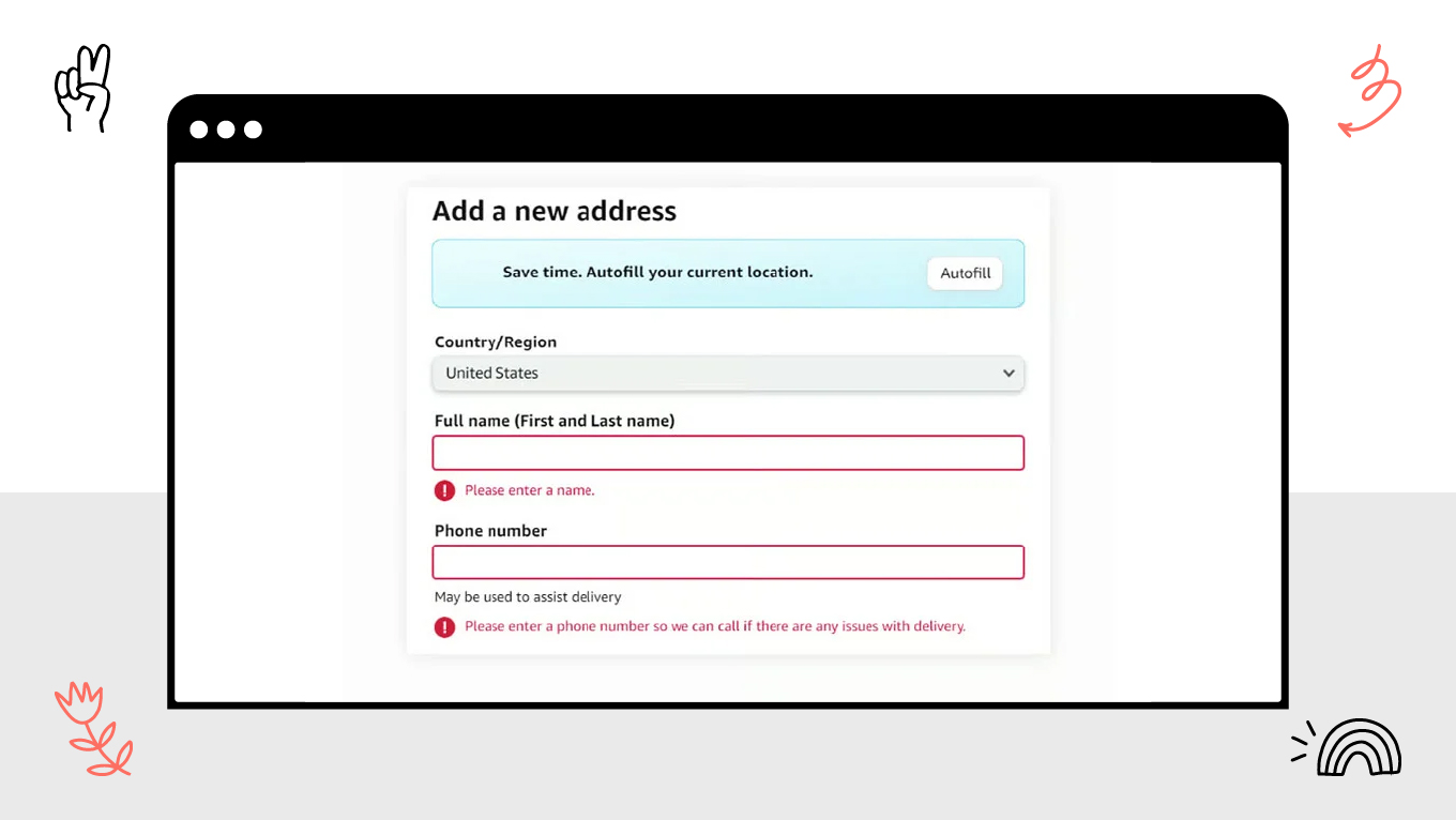
Form validations

Forms with real-time feedback are easier to use and have fewer mistakes. With inline messages, Gmail immediately flags invalid email addresses and offers correction tips or advice.

Stripe helps consumers complete transactions quickly and confidently by using inline suggestions and subtle color changes during payment input.

LinkedIn guides users without making them search for errors by highlighting missing required information or invalid formats just beneath the pertinent input. These validations increase user satisfaction and completion rates by making forms more user-friendly, effective, and less frustrating.

Final Thoughts

Well-written microcopy UX promotes brand personality, fosters trust, clarifies instructions for users, and eventually increases engagement and conversions. Prominent applications show how placement, tone, and conciseness can change everyday interactions into simple, intuitive experiences that empower and pleasure users.

At Gapsy Studio, we use accurate microcopy, design intelligence, and UX strategy to produce interfaces that are not only aesthetically pleasing but also effectively communicate and convert. Careful UX writing may make the difference between confusion and clarity, frustration and satisfaction, whether you're redesigning an existing product or creating a brand-new one from the ground up.

Are you prepared to improve the user experience of your product? Get in touch with Gapsy Studio right now, and we'll assist you in creating microcopy that converts.

Rate this article

20 ratings
Average: 4.9 out of 5

If you like what we write, we recommend subscribing to our mailing list to always be aware of new publications.