How to Use a Triadic Color Scheme: Complete Guide by Gapsy

    12minutes read
    triadic color schere

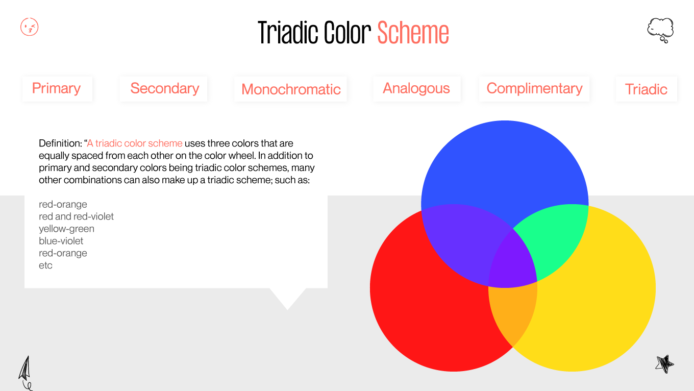
    Did you know that the right splash of color could skyrocket user engagement on your website by up to 80%? Can you believe that a mere change in hue could inject such vitality? We were just as astounded to discover the compelling influence of color. In the bustling digital arena, where every pixel counts, the triadic color scheme emerges as a beacon of balance, harmony, and visual appeal, but what's the catch?

    Navigating the color wheel can feel like deciphering an ancient code. The pain point for many IT CEOs, Project Managers, and Design Team Leads is finding that sweet spot where color becomes more than just decoration—it becomes a language. This is where the triadic color scheme comes in, a seemingly mystical art that, believe it or not, is grounded in science and psychology.

    In this comprehensive guide, we're not just talking about theory. We're providing actionable advice backed by the latest studies to help you harness the power of three perfectly spaced colors on the wheel. With our experience in this niche, we'll demonstrate how applying this scheme can increase user satisfaction and, ultimately, a more successful business outcome.

    Say goodbye to the color problem and hello to a world where every shade is a strategic choice. Stick with us, and by the end of this article, the triadic color scheme will no longer be a source of mystery but a trusted ally in your design toolkit.

    Definition of Triadic Color Scheme

    In the realm of design, a triadic color scheme refers to a color combination strategy that involves using three colors that are evenly spaced around the color wheel. These colors are typically equidistant from each other, forming a triangle when connected. The primary advantage of this scheme is its ability to create vibrant and visually appealing designs while ensuring balance and harmony.

    What is triadic color
    Triadic color definition

    Importance of Color in Design

    Color plays a pivotal role in design as it evokes emotions, conveys messages, and influences user behavior. When utilized effectively, colors can enhance the user experience, strengthen brand identity, and improve overall aesthetics. Selecting the right color scheme is crucial as it can impact how the audience perceives and interacts with the design.

    Basic Concept

    The color wheel serves as a fundamental tool in understanding and implementing triadic color schemes. It consists of primary colors (red, blue, and yellow), secondary colors (green, orange, and purple), and tertiary colors (mixtures of primary and secondary colors). Triadic colors are chosen by selecting three hues that are equidistant from each other on the color wheel.

    To illustrate, let's consider an example using the primary colors: red, blue, and yellow. These three colors form an equilateral triangle on the color wheel, representing a triadic color scheme. Similarly, combinations such as orange, green, and violet or cyan, magenta, and yellow can also be used to achieve a triadic scheme.

    Application in Design

    When implementing a triadic color scheme in design, it's crucial to adhere to key principles to ensure effective and visually appealing outcomes. Let's delve deeper into these principles:

    Color Harmony

    Triadic colors inherently offer a high level of contrast while maintaining harmony. This contrast adds visual interest and vibrancy to the design. However, it's vital to strike a balance between the hues to prevent overwhelming the overall composition. Achieving harmony ensures that the colors complement each other rather than compete for attention.

    Dominance

    Selecting one color as the dominant hue while using the other two as accents or supporting colors helps establish hierarchy and visual interest within the design. This principle guides the viewer's focus and provides structure to the composition. By assigning dominance, designers can effectively create focal points and guide the viewer's eye through the layout.

    Use of Neutrals

    Incorporating neutral tones like white, black, or gray alongside triadic colors can help temper their vibrancy and balance the composition. Neutrals act as stabilizing elements, allowing the triadic colors to stand out without overwhelming the viewer. They also enhance readability and ensure the design remains visually pleasing and accessible across various platforms.

    Color Psychology

    Consideration of color psychology is essential when applying triadic colors in the design. Each color carries specific psychological associations that can influence how the audience perceives and interacts with the design. For example, red may signify energy, passion, or urgency, while blue conveys trust, professionalism, or calmness. By leveraging these associations, designers can evoke desired emotions and convey intended messages effectively.

    Color Psychology
    What is color psyhology

    According to a study by the Institute for Color Research, people subconsciously judge a person, environment, or product within 90 seconds of initial viewing. Up to 90% of that assessment is based on color alone. This statistic underscores the significance of color in design and highlights the importance of strategic color selection, including triadic color schemes, in shaping perceptions and experiences.

    You may also be interested to read this article: How to Choose the Correct UI Design Colors for Your Product to Reinforce Your Business

    By adhering to these key principles and leveraging the psychological impact of color, designers can harness the full potential of triadic color schemes to create compelling and impactful designs that resonate with their target audience.

    Benefits of Using Triadic Color Scheme

    Utilizing a triadic color scheme in design offers numerous advantages, from enhancing harmony and balance to the infusing visual interest and versatility into the composition.

    Harmony and Balance

    Triadic color schemes inherently provide a high contrast level while maintaining harmony among the chosen hues. By selecting colors that are evenly spaced around the color wheel, designers can ensure that the composition feels cohesive and well-balanced. This harmony prevents any color from overpowering the design while allowing each hue to complement the others effectively. As a result, triadic color schemes create visually pleasing and harmonious layouts that captivate the audience's attention.

    Visual Interest

    One of the primary benefits of triadic color schemes is their ability to infuse visual interest into the design. The contrast between the three chosen colors creates dynamic and eye-catching compositions that draw viewers in. Whether used in graphic design, web design, or branding, triadic color schemes add vibrancy and excitement to the visual experience. Additionally, the balanced distribution of colors ensures that no element of the design appears dull or monotonous, keeping the audience engaged and intrigued.

    Versatility in Design

    Triadic color schemes offer unparalleled versatility, allowing designers to create a wide range of looks and styles. With three distinct hues, designers can experiment with different combinations and variations to achieve various effects. Whether aiming for a bold and energetic design or a subtle and sophisticated one, triadic color schemes provide the flexibility to adapt to diverse design needs and preferences. Furthermore, these schemes can be applied across various mediums and platforms, including websites, mobile apps, print materials, and more, making them an ideal choice for designers seeking versatility and adaptability.

    By harnessing the benefits of triadic color schemes, designers can elevate their creations to new heights, fostering harmony and balance, captivating visual interest, and unlocking limitless possibilities for creative expression.

    How to Choose Triadic Colors

    Selecting triadic colors involves careful consideration to ensure a harmonious and balanced composition. Here are key steps to guide you through the process:

    Selecting a Dominant Color

    Begin by choosing one color as the dominant hue in your triadic scheme. This color will play a prominent role in the design and set the tone for the overall aesthetic. Consider factors such as brand identity, target audience, and desired emotional impact when selecting the dominant color. Ensure it aligns with the design's objectives and effectively communicates the intended message.

    Dominant colors
    What is dominant color?

    Identifying Secondary and Tertiary Colors

    Once you've chosen the dominant color, identify the secondary and tertiary colors to complete the triadic scheme. These colors should complement the dominant hue while providing contrast and visual interest. Refer to the color wheel to select hues that are evenly spaced from each other and the dominant color. Experiment with different combinations until you find a harmonious balance among the three colors.

    Secondary Color
    Secondary and tertiary colors

    Considering Color Intensity

    Another crucial aspect of choosing triadic colors is considering their intensity or saturation levels. Aim for a balanced distribution of colors with varying intensities to create depth and dimension in the design. Avoid using overly bright or muted colors, as they may overpower the composition or appear dull. Instead, opt for colors with moderate intensity levels that enhance visual appeal without overwhelming the viewer.

    Maintaining Consistency Across Design Elements

    Consistency is key when implementing a triadic color scheme across different design elements. Ensure the chosen colors are applied consistently throughout the layout, including text, graphics, buttons, and background elements. Consistent use of colors helps establish visual cohesion and reinforces the design's overall aesthetic. Additionally, pay attention to color contrast and readability to ensure that the content remains easily accessible and engaging for the audience.

    Experimenting with Color Combinations

    Don't be afraid to experiment with different color combinations and variations to find the perfect triadic scheme for your design. Consider using color palette generators or design tools to explore various options and visualize how different colors interact with each other. Be open to adjustments and refinements as you fine-tune the color scheme to achieve the desired look and feel. Ultimately, trust your instincts and aim for a balance of creativity and functionality in your color choices.

    By following these steps and principles, you can confidently choose triadic colors that elevate your design and create impactful visual experiences for your audience.

    Examples of Triadic Color Combinations

    Exploring real-world examples of triadic color combinations can provide valuable inspiration and insight into how these schemes can be effectively applied in design. Here are some illustrative examples:

    Example 1: Vibrant and Playful Triadic Palette

    Vibrant and Playful Triadic Palette
    Vibrant and playful triadic palette
    • Dominant Color: Electric Blue

    • Secondary Color: Lemon Yellow

    • Tertiary Color: Fiery Red

    This triadic combination exudes vibrancy and playfulness, making it ideal for designs targeting a youthful and energetic audience. The electric blue serves as the dominant hue, providing a bold and striking foundation. The lemon yellow and fiery red accents add contrast and visual interest, creating a dynamic and attention-grabbing composition.

    Example 2: Sophisticated and Elegant Triadic Palette

    Sophisticated and elegant triadic palette
    Sophisticated and elegant triadic palette
    • Dominant Color: Deep Purple

    • Secondary Color: Emerald Green

    • Tertiary Color: Rich Gold

    This triadic palette exudes sophistication and elegance, making it suitable for luxury brands or upscale design projects. The deep purple serves as the dominant color, evoking a sense of luxury and refinement. The emerald green and rich gold accents add depth and opulence, creating a harmonious and visually captivating ensemble.

    Example 3: Subtle and Serene Triadic Palette

    Subtle and Serene Triadic Palette
    Subtle and serene triadic palette
    • Dominant Color: Soft Sage Green

    • Secondary Color: Powder Blue

    • Tertiary Color: Warm Peach

    This triadic combination exudes tranquility and serenity, making it ideal for designs that evoke a sense of calmness and relaxation. The soft sage green serves as the dominant hue, creating a serene and soothing backdrop. The powder blue and warm peach accents add subtle pops of color, infusing the composition with warmth and tranquility.

    Example 4: Bold and Dynamic Triadic Palette

    Bold and Dynamic Triadic Palette
    Bold and dynamic triadic palette

    Dominant Color: Crimson Red

    • Secondary Color: Royal Blue

    • Tertiary Color: Golden Yellow

    This triadic palette exudes boldness and dynamism, making it suitable for designs seeking a strong visual statement. The crimson red serves as the dominant color, commanding attention and conveying energy. The royal blue and golden yellow accents add contrast and vitality, creating a visually impactful and engaging composition.

    Example 5: Modern and Minimalist Triadic Palette

    Modern and Minimal Triadic Palette
    Modern and minimalistic triadic palette
    • Dominant Color: Slate Gray

    • Secondary Color: Dusty Rose

    • Tertiary Color: Mustard Yellow

    This triadic combination exudes modernity and minimalism, making it suitable for contemporary design projects. The slate gray serves as the dominant hue, providing a sleek and sophisticated backdrop. The dusty rose and mustard yellow accents add warmth and personality, creating a balanced and visually appealing ensemble.

    By studying these examples, designers can gain valuable insights into the diverse applications and creative possibilities of triadic color combinations in design.

    Implementing Triadic Color Scheme in Design

    Implementing a triadic color scheme in design requires careful planning and execution to ensure a harmonious and visually appealing result. Here's a step-by-step guide to effectively incorporate triadic colors into your design projects:

    Implementing Triadic Color Scheme in Design
    How to implement triadic color scheme in design

    1. Selection of Triadic Colors

    Begin by choosing three evenly spaced colors around the color wheel to form a triadic combination. Consider factors such as brand identity, target audience, and design objectives when selecting these colors. Aim for a balance of hues that complement each other while providing contrast and visual interest.

    2. Establishing Dominance

    Identify one color from the triadic scheme to serve as the dominant hue in your design. This color will play a primary role in setting the tone and mood of the composition. Ensure that the dominant color aligns with the overall theme and message of the design, reinforcing brand identity and visual hierarchy.

    3. Applying Secondary and Tertiary Colors

    Once the dominant color is established, apply the remaining two colors from the triadic scheme as secondary and tertiary accents. Use these colors strategically to add depth, contrast, and visual interest to the design. Experiment with different combinations and proportions to achieve a harmonious balance among the three colors.

    4. Creating Color Blocks or Swatches

    Organize the triadic colors into color blocks or swatches within your design layout. This helps visualize how each color interacts with the others and ensures consistency and coherence throughout the composition. Pay attention to the placement and distribution of colors to maintain balance and harmony across different design elements.

    5. Incorporating Neutrals

    Incorporate neutral tones like white, black, or gray to complement the triadic colors and provide balance to the composition. Neutrals act as grounding elements that help temper the vibrancy of the colors while enhancing readability and visual appeal. Use neutrals strategically to create contrast and highlight key elements within the design.

    6. Testing and Refinement

    Once the triadic color scheme is implemented, test the design across various devices and platforms to ensure consistency and accessibility. Solicit feedback from colleagues or stakeholders and be open to making adjustments based on their input. Iterate on the design as needed to refine and optimize the color scheme for maximum impact and effectiveness.

    By following these steps and principles, designers can effectively implement triadic color schemes in their projects, creating visually stunning and engaging designs that resonate with their audience.

    How are Triadic Color Schemes Used in Various Industries?

    Triadic color schemes find diverse applications across various industries, contributing to the creation of visually appealing and impactful designs. Here's a glimpse into how triadic color schemes are utilized in different sectors:

    1. Graphic Design:

    In graphic design, triadic color schemes are employed to create eye-catching visuals for advertisements, posters, and branding materials. Designers strategically combine three colors from equidistant points on the color wheel to achieve balance, contrast, and harmony in their compositions.

    2. Fashion and Textiles:

    Fashion designers leverage triadic color schemes to craft captivating clothing collections and textile patterns. By selecting three colors that complement each other, designers can create cohesive and visually striking garments that resonate with consumers.

    3. Interior Design:

    In interior design, triadic color schemes are used to create harmonious and visually dynamic spaces. Designers incorporate triadic color combinations into furniture, decor, and paint selections to evoke specific moods and enhance the overall ambiance of residential and commercial interiors.

    4. Web Design and Digital Marketing:

    In the digital realm, triadic color schemes play a crucial role in web design and digital marketing. Websites, mobile apps, and online advertisements often utilize triadic color combinations to create memorable and user-friendly interfaces that attract and engage audiences effectively.

    5. Product Packaging:

    Triadic color schemes are prevalent in product packaging across industries such as food and beverage, cosmetics, and consumer goods. Brands use triadic color combinations to create visually appealing packaging designs that stand out on store shelves and convey the product's identity and value proposition.

    6. Fine Arts and Illustration:

    Artists and illustrators employ triadic color schemes to create captivating artworks and illustrations. Whether painting landscapes, portraits, or abstract compositions, artists use triadic color combinations to evoke emotions, convey messages, and express their creativity.

    7. Digital Media and Entertainment:

    In digital media and entertainment, triadic color schemes are utilized in animation, video production, and digital art. By incorporating triadic color combinations into visual effects, set designs, and character designs, creators can enhance the visual appeal and storytelling impact of their content.

    8. Architecture and Urban Planning:

    Architects and urban planners integrate triadic color schemes into building facades, urban landscapes, and public spaces. By carefully selecting three harmonious colors, designers can create visually striking architectural designs that contribute to the aesthetic and functional aspects of built environments.

    In summary, triadic color schemes serve as versatile tools that enhance visual communication and creativity across a wide range of industries, contributing to the creation of memorable and impactful designs in various contexts.

    Recap of Triadic Color Scheme: How Gapsy Can Help

    In summary, a triadic color scheme offers a powerful tool for creating visually striking and harmonious designs. By leveraging three colors evenly spaced around the color wheel, designers can achieve balance, contrast, and visual interest in their projects. From vibrant and playful combinations to sophisticated and elegant palettes, triadic colors offer endless possibilities for creative expression.

    At Gapsy Studio, we specialize in crafting efficient and effective web design solutions that leverage the principles of color theory, including triadic color schemes. Our experienced design team is well-versed in creating visually appealing and user-friendly websites that align with your brand identity and objectives.

    Ready to Elevate Your Web Design? Transform your online presence with our expert design services tailored to your unique needs. Whether you're launching a new website or revamping an existing one, we're here to help you harness the full potential of triadic color schemes for impactful and engaging design solutions.

    Let Gapsy Studio be your partner in unlocking the power of triadic color schemes for your web design projects. Elevate your online presence and captivate your audience with stunning visual experiences. Contact us and we will be happy tp help.

    Rate this article

    20 ratings
    Average: 4.9 out of 5

    If you like what we write, we recommend subscribing to our mailing list to always be aware of new publications.

    Do you have any questions? We tried to answer most of them!