How to Choose the Correct UI Design Colors for Your Product to Reinforce Your Business

6minutes read
ui design colors

Color does not add a pleasant quality to design – it reinforces it.Pierre Bonnard

Any web or app design is about creating an aesthetically pleasant and functional product that would satisfy all users’ needs (or solve their problems). Color choice has always been one of the main ingredients of carefully elaborated UI design. It can have a considerable impact on how customers see your business.

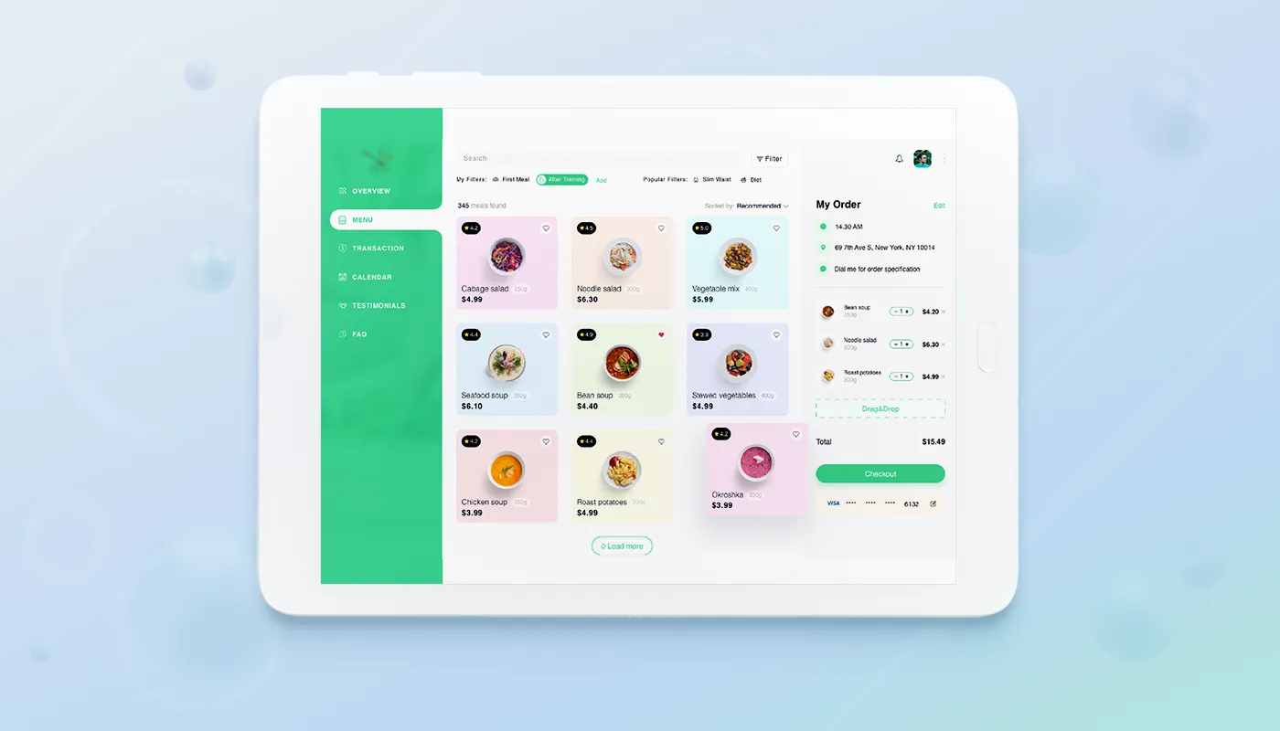
Indeed, color is the first thing that the user sees interacting with the product, and only after that, they see text and pictures. When the right color palette is combined with readable text and beautiful graphics, your work is destined to succeed. In this article, we want to tell you how to choose colors for UI design colors so that your product wouldn’t remain in the shadow and please the user’s eye.

UI color types

First, let’s talk a little about what color types are distinguished.

  • Primary colors – three basic colors – yellow, red, and blue. All other colors are obtained by mixing these three primary colors. These three colors cannot be accepted by combining any others.
  • Secondary- these colors are shades of color that can be obtained by mixing the two main ones.

Yellow + red = orange

Yellow + blue = green

Red + blue = purple

  • Accent-these are colors that accentuate specific details. In web or app design, accent colors are most often used for the call to action. A conversion action is what you want your visitors to do, so push them to do that. CTA elements should be visible at first glance and can be achieved with accent colors.
  • Neutral-it is black, white, and gray. Most often, in UI web design or app design, it is used to create a background.
  • Semantic-it is a light or dark version of the primary color chosen. These colors help emphasize or highlight your product.

Understanding the types of colors will help make it easier to create the right color palette for your product.

Top tips on how to choose the right colors for the UI of your product

We’ve put together some of the top color tips for your app UI design or website design. Use them if you want to create a cool color palette for your product that will correctly present your business and be liked by users.

1) Learn the psychology of colors

Scientists have studied the psychological effects of specific colors for centuries. Colors create emotions and associations beyond aesthetics. This is why fashion boutiques often have black and white websites. They want to look elegant and noble.

psychology of ui colors
user interface psychology of colors

Marc Jacobs is entirely black and white, with a black CTA And it’s for a reason. All colors have a specific meaning:

  • Red: passion, love, danger
  • Blue: calmness, responsibility, safety
  • Black: mystery, elegance, evil
  • White: cleanliness, silence, neatness
  • Green: novelty, freshness, nature
  • Orange: energy, feelings of excitement
  • Yellow: happiness, sunlight, joy, and warmth

But designers should also remember that color perception is individual for everyone. Therefore, it is vital to know your target audience to choose the right color scheme that will definitely be the best for the created product.

2) Stick to color harmony

Color harmony in UI design helps people get a good first impression of the app or website they interact with.

Harmonious colors give the elements a logical meaning. There are many ways to create color harmonies. One is to use similar colors, which are contiguous colors on the color wheel.

Why are analog colors attractive? Because this is how color behaves in nature. Sunset colors the sky from orange to purple, the sea can change color from blue to turquoise; the seven colors of the rainbow have harmonious transitions. Therefore, we can assume that the human eye finds natural pleasure in analog colors.

color harmony of ui colors
user interface harmony of colors

It is recommended to stick to only warm or cold colors, as temperature also significantly affects harmony. You can also experiment with the saturation and brightness of analog colors for depth. It all depends on the effect you want to create and the content that the interface displays.

3) Follow the 60-30-10 rule

60% is your dominant color, 30% is your secondary color, and 10% is your accent color.

This design rule helps you quickly create a color scheme. The proportion 60% + 30% + 10% reflects the balance of colors. This formula works because it creates a sense of balance and allows the eyes to move comfortably from one point to another. It is also straightforward to use.

60-30-10 rule of ui colors
user interface colors 60-30-10 rule

4) Bear in mind cultural differences

The perception of color is more visual, and it depends not only on mood or associations but also on culture. Choosing a color, it is always worth remembering that in different countries, cultures have various meanings. So when you create a product, think carefully about your color scheme. For example, red color is a symbol of love, birth, life, and good luck and a holiday for the people of the Far East. In China, red is worn by brides as a symbol of endurance and faith, while in India, it symbolizes purity. Europe, on the contrary, sees sin and sacrifice in this color. For South Africans, it is the color of sorrow, and for Australian Aborigines, it is the color of the earth. In the USA and Japan, red symbolizes danger and terrorist threats. For the Japanese, red is the color of anger and rage, so they are shown blushing very much in anger in cartoons. In France, it is the color of aristocrats, while the Egyptians associate this color with mourning.

ui colors cultural difference
user interface colors cultural difference

Want to create a beautiful UI design? Then we suggest you read our article about the top 8 emerging trends of User Interface design for 2020.

5) Balance the contrast

Color contrast adds dynamism to the interface. Another form of color harmony is achieved by using complementary colors that face each other on the color wheel. By using additional color elements, you can achieve contrast and dynamism in your design.

Among the advantages of contrasting colors are the effect of energy and movement and the enhancement of an important point to which we want to draw the user’s attention. It is not easy to achieve harmony with these colors, as their misuse can create visual havoc and be unpleasant to the eyes. Proportion is the key to success.

balance the contrast in ui colors
user interface colors balance

Whichever color contrast we choose, it should be maintained across all pages of a site or application to ensure UI consistency in design.

6) Focus on grayscale first

Everyone loves to play with colors and shades when starting with a design, but you might not like the color when you realize you’ve spent 3 hours adjusting the primary colors. It’s tempting, but you need to learn how to avoid such a reckless waste of time.

Instead, try focusing on layout and design. This will save you a lot of time in the future. If you want it to look good too, choose a few key tones and mid-tones.

focus on grayscale first in ui colors
user interface colors grayscale first applying

7) Get inspiration from nature

The best color combinations come from nature. They will always look natural. The most important thing for a designer is that the palette in nature is ever-changing.

You just need to look around to get inspiration.

inspire from nature in ui colors
user interface colors nature inspiration

Wrapping Up

UI design is essential for many reasons. First, the intuitiveness makes it easier to work with the interface and reduces training time. Thanks to the improved interface, users will have no problem using your application. Since the good news spread quickly, the number of users will grow in parallel with their satisfaction.

In conclusion, using the essential elements and principles of UI design (color, light, and contrast) can help you create the perfect interface that will bring profit to your business and a favorite product for your customers to use.

You can check out our works on Dribbble to make sure that we are professionals and can help you create an impressively beautiful UI design and more besides.

Rate this article

20 ratings
Average: 4.9 out of 5

If you like what we write, we recommend subscribing to our mailing list to always be aware of new publications.

Do you have any questions? We tried to answer most of them!