Proximity Web Design: From Psychology Concept to Improved User Experience

8minutes read
proximity in web design

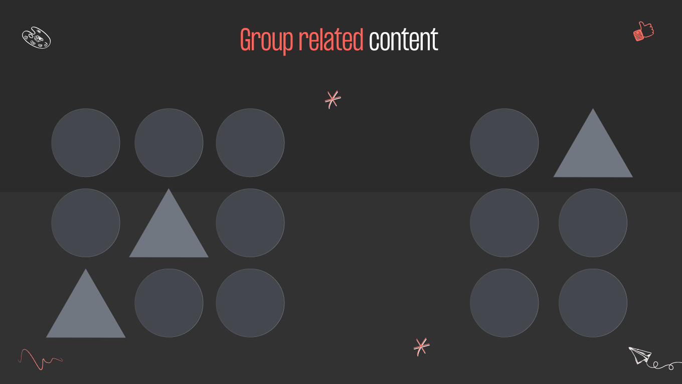
The quest for creating seamless and engaging user experiences remains a constant pursuit. One of the fundamental principles that has emerged as a guiding force is the concept of proximity. Beyond its conventional definition, proximity in web design transcends mere physical closeness; it embodies a dynamic interplay of elements that can significantly influence how users navigate and interact with digital interfaces. The strategic placement and relationships between webpage elements are crucial in shaping their journey.

What is Proximity in Web Design?

Proximity in web design is the visual and spatial relationship between elements on a webpage. It is one of the principles of design that involves grouping related items and creating a visual connection between them. Elements close to each other are perceived as being related, while components farther apart are seen as less connected.

Proximity helps to organize information and guide the viewer's eye through the content on a webpage. Designers can create a clear, logical layout that enhances the user experience by placing related elements nearby. This principle is necessary for the design of navigation menus, forms, and other interactive features where grouping related items improves usability.

what is proximity web design?
how to use proximity in web design. crypto exchange scheme

Proximity enhances the visual communication on a website, aids in information organization, guides user attention, and contributes to the overall success of the user interface. It is crucial for several reasons:

  • Visual hierarchy. You can create a coherent look on a web page by manipulating the proximity between elements. It guides users' attention and helps them navigate through the content in a structured manner.
  • Readability. Users can quickly scan and absorb information when content is organized with appropriate spacing. It’s particularly essential in today's fast-paced online environment, where users often skim through content.
  • Reduced cognitive load. Cluttered or disorganized layouts can increase the cognitive load on users, making it more challenging to process information. Proximity reduces it by visually indicating relationships between elements, making it easier for users to perceive the content.
  • Aesthetics and white space. Well-managed white space creates a visually pleasing layout, preventing a cluttered appearance and giving the design a sense of balance and elegance.
  • Mobile responsiveness. Proximity becomes even more critical in responsive web design, where screen sizes vary across devices. Proper spacing ensures that elements remain accessible and readable on smaller screens, contributing to a positive mobile user experience.

Any design is closely related to psychology. According to Gestalt psychology, we should organize what we see to make sense of it. Web design is no exception. We would overwhelm our brains without patterns to organize our vision. The Gestalt psychologists formalized those patterns as the Gestalt principles that are part of the most crucial design theories. Structured information means understanding, and the designer’s task is to make content as easy to comprehend as possible.

How to Use Proximity in Web Design?

By effectively leveraging proximity in web design, you can guide users through a seamless and intuitive experience, facilitating efficient navigation and enhancing the overall impact of a website.

Group related content

Grouping related content is a fundamental principle in web design that enhances organization, readability, and user experience. Well-structured visual containers are essential in web design. They are graphical elements that hold and organize content within a user interface. For example, place related text, images, and buttons within a shaded or bordered area. Today, the practice of placing related content together and separating unrelated elements is almost everywhere in UI UX design. Look at the example below. Whitespace uses the proximity principle to divide the shapes into two separate groups. These two groupings remain clear even when different shapes are included within each group:

group related content for proximity
proximity web design: grouping related content

Whitespace contributes to visual clarity by preventing elements from appearing cluttered or crowded, allowing each element to breathe and be easily distinguishable.

Even when presenting basic text content, sentences are usually grouped in paragraphs separated by whitespace above and below, giving an example of using proximity to create meaningful groupings. To enhance it in your design, use consistent typography and formatting for related content. It includes employing the same font styles, sizes, and colors for text within a content group. Don’t forget to create visual consistency by aligning text and other elements within the specific elements group.

Create visual hierarchy

Visual hierarchy arranges elements to guide users through a webpage seamlessly. Maintain consistent spacing and proximity throughout your design to create a cohesive and organized look. Consistency helps users understand the structure of your website and find information more easily. 

Naturally, every website is different and implies its unique meaning. Based on this, create your website wisely. You are responsible for combining proximity web design and user experience in the best way. Proximity helps to establish a logical flow of information. The user expects a familiar layout when visiting your webpage for the first time. But remember that a UX design pattern is not a standardized template. Instead, it is a collection of best practices that solve a user-centered problem. Proximity is one of them. 

Not all content on a webpage is of equal importance. Visual hierarchy allows designers to prioritize information, emphasizing key messages, calls-to-action, or critical content. It ensures users focus on what matters most, improving the chances of them engaging with the site as intended. 

Read also: Understanding Proximity Design Principle.

Make the webpage readable

Readability is crucial, especially for content-heavy websites. It’s closely tied to comprehension. Clear and well-structured content is more likely to be understood by the audience. Whether it's instructional content, product information, or educational material, readability ensures that users grasp the intended message. 

The proximity in web design makes websites easy to read. You can improve the page’s legibility by creating distinct content blocks. Each block can represent a specific idea, section, or topic, making it easier for readers to navigate and understand the structure of the content. 

Proximity is a powerful tool for emphasizing critical information. Place essential text or visual elements close to each other to draw attention to specific details. It helps readers identify and focus on vital content, improving overall readability. Navigation menus can be a perfect example. Grouping menu items together and separating them from other content helps users navigate different website sections. 

Consistency in spacing contributes to readability. Users follow the content effortlessly when there is consistent and well-maintained spacing between text, images, and other elements. Inconsistencies in spacing can disrupt the flow and reduce readability.

Want to create an outstanding web design?

You are in the right place! Gapsy is ready to work with you, so press the button, and we will contact you.

Examples of Proximity in Web Design

Let’s look at some examples of proximity in web design now that you have a basic understanding of these principles.

Navigation menus

In navigation menus, related items are grouped in close proximity. Menu items are subsequent, and dropdown sub-menus appear in proximity to their parent items, making it clear which items are part of the same navigation category. 

gapsy navigation menu proximity
proximity principles in gapsy’s navigation menu

Consistent spacing between menu items contributes to an organized look. Evenly distributed space helps users distinguish between individual items and prevents visual clutter. Proximity web design creates visual cues that help users understand the navigation’s hierarchy. Indentation or subtle separators between menu items can indicate levels of hierarchy, making it clear which items are part of a specific category.

Website’s copy

The law of proximity makes written content more scannable. For example, headings and subheadings are close to the text they introduce or summarize, which helps users understand the hierarchy of information and locate specific sections of content. Check the design Gapsy created for Adsellr using the proximity principles.

Adsellr’s website copy
adsellr’s proximity in website copy

Headlines should have more space above than below to organize paragraphs and ensure readers comprehend that they're part of the same content grouping. Line height and spaces between lines should be more prominent between words to create paragraphs, while letters are close enough to form words. Captions for images or other media must correspond to visual elements. It ensures users connect the descriptive text with the relevant image, enhancing the content understanding.

Check the website design services we offer.

E-commerce product listings

The product listing design is crucial for guiding users through the available products and facilitating their decision-making process. Proximity in web design enhances the organization and clarity of such web pages. 

Products are often arranged in a grid layout, where each product is placed close to others. This grid structure helps create a visually cohesive display and allows users to quickly scan through multiple products. 

nike’s proximity in web design
proximity e-commerce design at nike

If there are filter options for refining product listings (by category, price range, or brand), these filter elements are placed in proximity to the product grid, helping users efficiently access and use filtering options to narrow down their choices. Group the product image, title, price, and other relevant information to allow them to associate the product’s visual representation with its details. 

Footer content

The footer is a valuable space that includes vital information and navigation elements. Contact details, such as the company's address, phone number, and email, are typically grouped, allowing users to find and access the information they need for communication.

amazon’s footer proximity web design
footer content with proximity principles at amazon

Group secondary navigation links or quick links to important pages (such as Terms of Service, Privacy Policy, or FAQs) to create a clear and organized section for users seeking additional information. Often, a website’s footer can contain social media links. Consider the proximity in web design when creating website footer design. If you include a "Back to Top" button, position it near the footer content. It allows users to quickly navigate back to the top of the page without scrolling, like in Amazon’s example above.

Optimize Your Design with Proximity Principles

The thoughtful application of the proximity web design empowers designers to guide users seamlessly through the digital landscape, enhancing usability and aesthetic appeal. By leveraging the power of proximity, you can create interfaces that captivate attention and facilitate efficient information processing. 

In essence, proximity in web design is not a static principle but a dynamic force that adapts to the evolving needs of users and the ever-changing digital landscape. Elevate the user experience by creating intuitively navigable web interfaces. Gapsy Studio can help you create a smooth and intuitive design. With our experience, we can provide you with a high-quality user experience, so check our portfolio and contact us to discuss all the details.

Rate this article

21 ratings
Average: 4.9 out of 5

If you like what we write, we recommend subscribing to our mailing list to always be aware of new publications.

Do you have any questions? We tried to answer most of them!