How to Incorporate a Conversion-Centered Design Principles And Skyrocket Sales

10minutes read
conversion centered design

This happens to all sites daily: your audience judges your business by its appearance.

Unprofessional or outdated designs have a more negative impact than you might think. There is a study on “Should you trust health websites?” The survey participants used Google to find relevant health information. Upon completion, they were asked to share their first impressions of the resources visited.

And here’s an interesting result: among the factors based on which customers decide whether to trust or not trust a site, 94% were related to design. 94 percent, it’s shocking!

Design is of the utmost importance. It has the most substantial impact on conversion rates, user experience, and customer loyalty. The bar for web design quality is rising higher and higher.

We decided to release these seven principles of conversion-centered design to help you optimize your sales and prevent your product from a high bounce rate.
What is conversion-centered design?

Conversion-Centered Design (CCD) is a discipline aimed at solving one specific business problem. Its main principle is to direct the visitor along the path to committing one specific action, using convincing design and psychological triggers as tools that increase conversion.

Conversion designs shouldn’t have anything extra. Everything aims to solve one single task – to bring the visitor to the finish line, namely conversion.

7 Main principles of conversion-centered design

Conversion optimization is not a guesswork process but a systematic approach to website improvement. This checklist will become a cheat sheet for analyzing your site and the sites of competitors. As a result, you will receive clear indications of what needs to be improved to increase the conversion rate.

If you enter in the search the best website design, you will indeed find the first 5-6 options that will differ radically from each other. It’s difficult to understand which elements keep the visitor on the site and lead them to take the required action. In addition, the best design in different ways can be the most beautiful, the most optimized, or the most creative. Today, we have selected seven design tricks for you that work and help improve conversions. All you need to do is test these elements one by one on your pages and track how the conversion rate changes. Test until you find the best option that worked precisely on your site, in conjunction with a specific offer.

1) Create a catchy headline

Think what is the first thing you see when you first visit the page? Most likely, it’s a headline, right? Therefore, you need to make sure you have a clear headline that will serve as a starting point and get people to read the rest of the page to the end. Writing a headline like this isn’t difficult when you know exactly what problem you want to solve. Such a title will be clear and understandable because the readers will immediately understand that they have “come to the right place.”

Here’s a good strategy for making a headline like this:

Copywriting is the most versatile tool for heading and main page design. Before you can even think about writing good copy, you need to think about your audience:

  • Sex
  • Age
  • Ethnos
  • Family status
  • Income
  • Profession
  • Interests
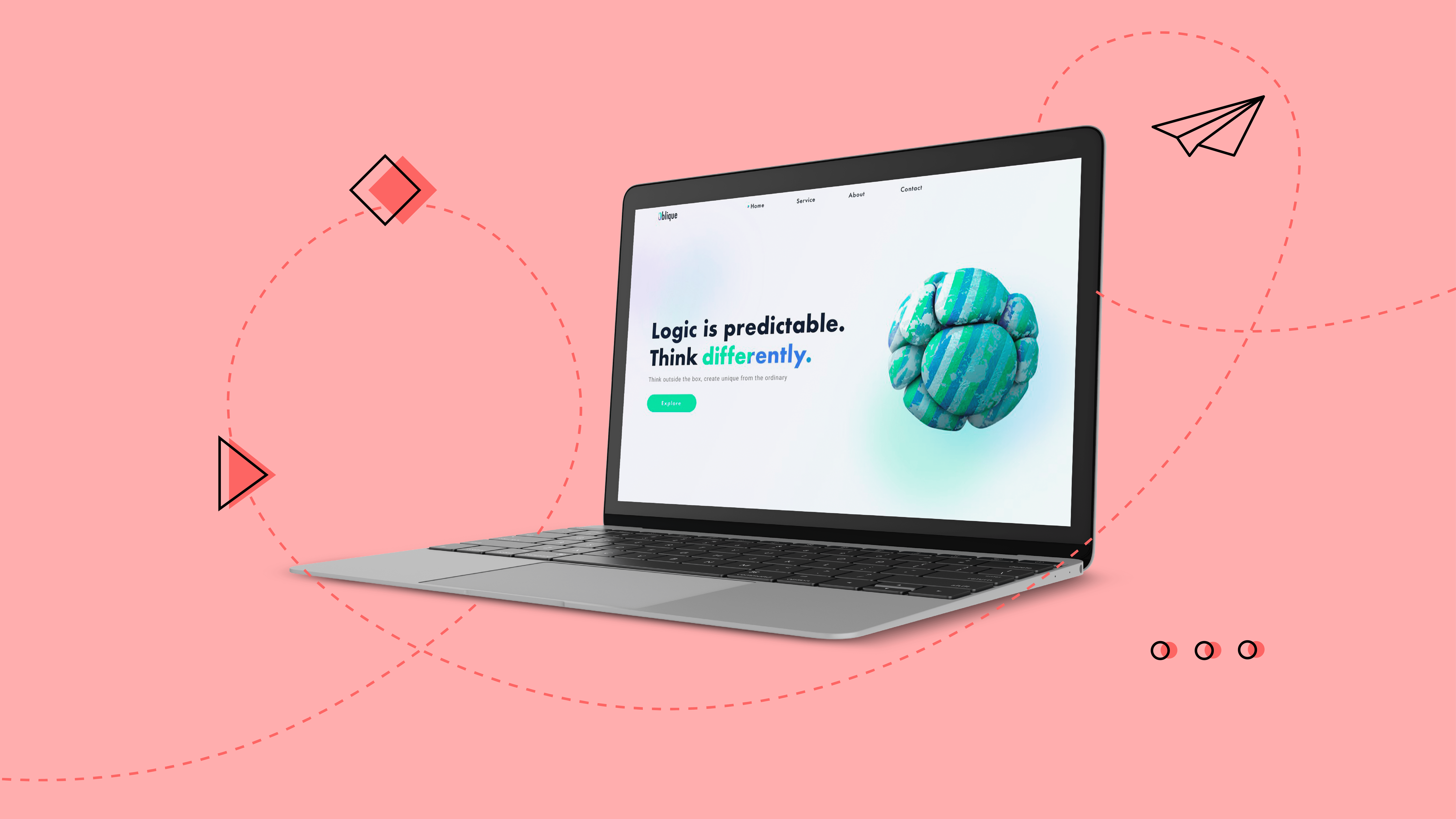
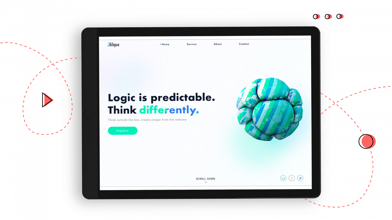
Provide a catchy headline for a conversion-centered design

That’s how we implement catchy headline in one of our projects.

For certain products, some of these points won’t matter, but overall it’s worth considering each variable so you can write compelling copy.

Then, remove the clutter from your homepage. It’s not a good idea to place your ads and recent blog posts alongside your primary CTA because you won’t make money if everyone ends up just reading your blog and buying nothing. When creating a title, it is necessary that the title solves the user’s problem, talks about the benefits that the user will receive here, but the designer must already design the main page correctly.

2) Prove that you are trustworthy!

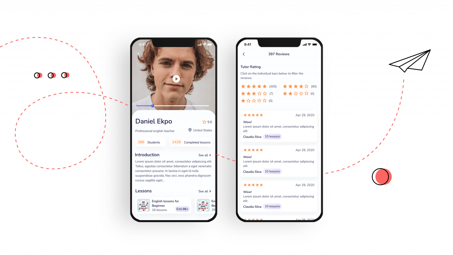
According to numerous studies, most buyers, before purchasing a particular product, always try to find out other buyers’ opinions about it. Therefore, these reviews are often a fundamental factor in making a purchase decision. Hence the logical conclusion: product reviews from real customers are an effective marketing tool that must and must be used in sales.

Where can I get product reviews for my website?

It’s always nice to get feedback from your customers, but how do you encourage users to leave product reviews? “This product has not yet been reviewed” is a familiar pattern found in product cards on more than half of sites. Or even worse: “Add a review first!” – only for some reason, users are clearly in no hurry to leave their reviews on your site, right? Have you ever asked users to leave a review of a product after purchase? If not, then it’s in vain because it works! In our experience, one of the most effective methods is automated feedback collection by sending follow-up emails a few days after ordering. The letter is tied to a specific product and is a “technical completion of the purchase.” The letter expresses gratitude for the purchase and contains a link to the form for adding a product review. A person leaves a review, after which he appears in the corresponding product card of the online store with the note “customer review”.

Reviews for conversion-centered design by Gapsy Studio

By the way, reviews work well for online stores and other commercial sites where a product or service is ordered online.

Read one of our latest articles on the Top 6 Ways to Improve Your Web Design. Don’t miss out; these tips will definitely come in handy!

3) Pay attention to the proper CTA.

It would be helpful to remind once again about a clear Call to action. This is a must-have for any conversion site or landing page that will tell the client exactly what action to take. Even if you have the coolest product in the world, with the most fantastic design and sales copy – without a clear call to action, this is a complete loss of the opportunity to get a conversion design. Feel free to use large, colorful buttons that stand out from the rest of the page.

Use flash elements, even gif animation, but make sure that the client understands exactly what needs to be done.

Reviews for conversion-centered design by Gapsy Studio

4) Provide customer security

If you don’t accept payment directly on the site, then let the client know about it. So that understand that there’s nothing to worry about the bank card details because they will need to pay upon receipt by mail.

If you accept payments – worry about the presence of a verified card register. Many people who shop online want to be sure that their information is kept confidential, especially today when identity theft is high.

What can you do? For example, don’t ask the client to enter payment information directly on the site, but redirect the session to their online banking. This way, you will get a higher client trust, not raising doubts when making a purchase.

Also, don’t forget to check your domains so that Google doesn’t flag them as sites containing malware. Finally, the globally presence of an SSL certificate is your guarantee that the browser won’t present the connection with your site as insecure, which can be another factor in reducing the conversion.

Not sure how to further increase your website’s conversion rate? Make sure to trend your product. Read our Web Design Trends article and change for the better!

5) Remember the purpose of your product

To be motivated to develop the best design for your product, it’s essential to understand the value of your product or service. Only then will it be possible to create and customize web or mobile app design elements to be crisp, clear, and help your visitors stay focus. Go over the competitors in your niche, see how their sites are designed, what images, what headers, what blocks and information they use.

Try different combinations of elements to see how they work. Then, remove those elements that don’t give any results, even if they seem successful. Instead, it’s best to focus on the elements that will help you achieve your conversion rate.

6) The main thing is convenience

Shoppers are now more sophisticated than ever. Therefore, the more convenient and understandable your website or landing page is, the higher the conversion. Make it easy to navigate through the website or app to understand what the following action is expected and where to do. Thus, it’s vital to work on seamless navigation and a straightforward menu to help visitors use your site comfortably.

7) Less = Better

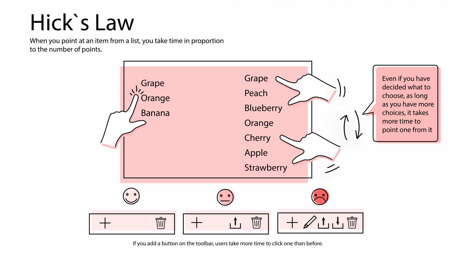
The more information or potential options, the more difficult it’s for a person to choose. This is evidenced by the law derived by the psychologist William Hick (Hick’s law). How does it work? For example, you have a line of products that you are selling. It can consist of 30 items, and it can be much less – 5-7 products. According to Hick’s law, a person’s probability is higher in the line where there are 5-7 products.

Hick’s law for excellent conversion-centered design

Remember Hick’s Law when designing your website or app. If possible, reduce the number of options for the user to select or group them and sort alphabetically or by popularity.

This will make the interaction with the site more convenient and faster, reducing the number of users who have left the site.

Want a conversion-centered design for your site?

Them hurry up to hire Gapsy's best designers!

Summarizing

Go through this list, point by point, and find weaknesses that need to be corrected. Consider how you can improve your title or increase the page’s trust. Develop a strategy and start implementing it. Focus on what will help you improve your page performance and generate more design conversions. Ask your friends/acquaintances about the weak points of your product. Let them evaluate your site, give comments on such characteristics as convenience, trustworthiness, the formation of a desire to buy a product. Remember that the quality of the content and the quality of the execution must be up to par. Only in this way can you achieve the location of the more than once deceived and frustrated average static Internet client.

If you are just at the stage of creating a product and still do not know how to create a conversion design, then our design studio Gapsy will come to your aid! Our team of professionals knows how to create functional, attractive, trendy designs that are highly convertible. We are ready to prove it to you. So check out the finished projects on Behance and Dribbble. And also take a look at the services we provide.

Rate this article

20 ratings
Average: 4.9 out of 5

If you like what we write, we recommend subscribing to our mailing list to always be aware of new publications.

Do you have any questions? We tried to answer most of them!