Top E-commerce Web Design Tips for Improving Your Sales

13minutes read
ecommerce website design tips

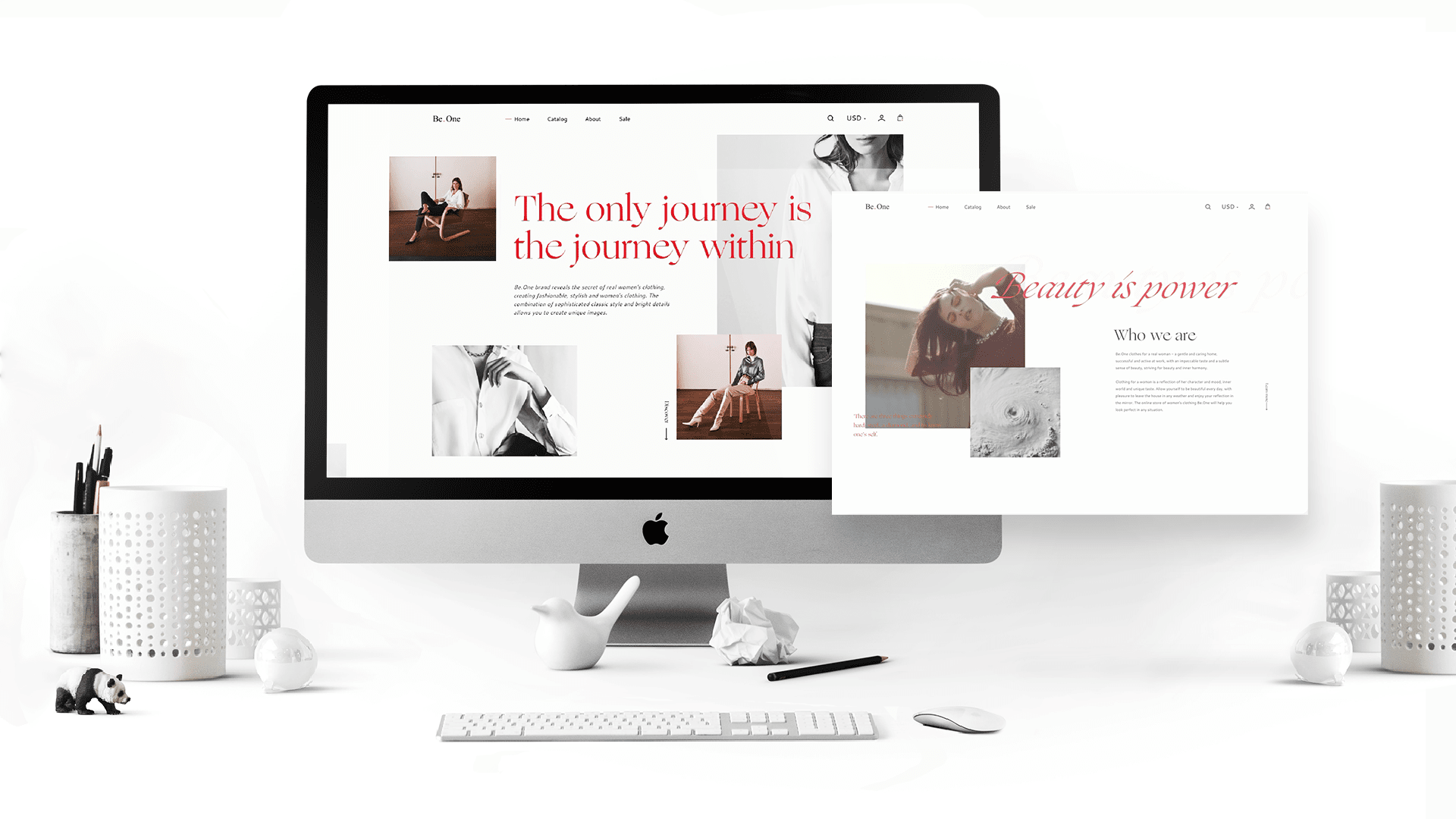
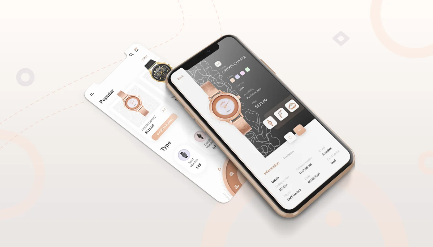
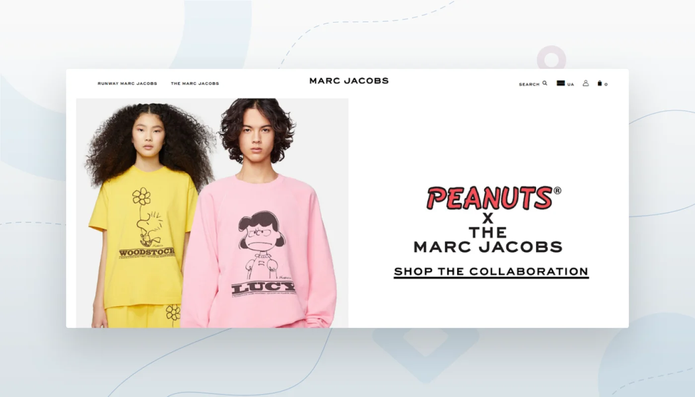
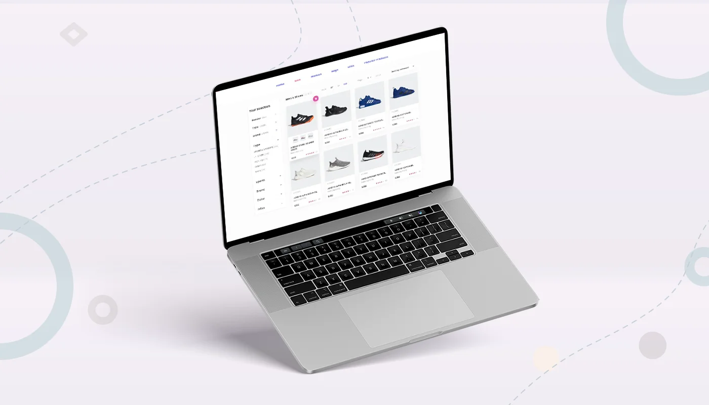
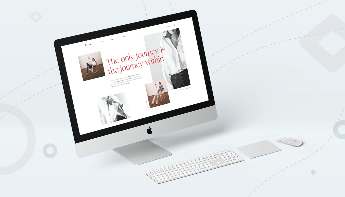
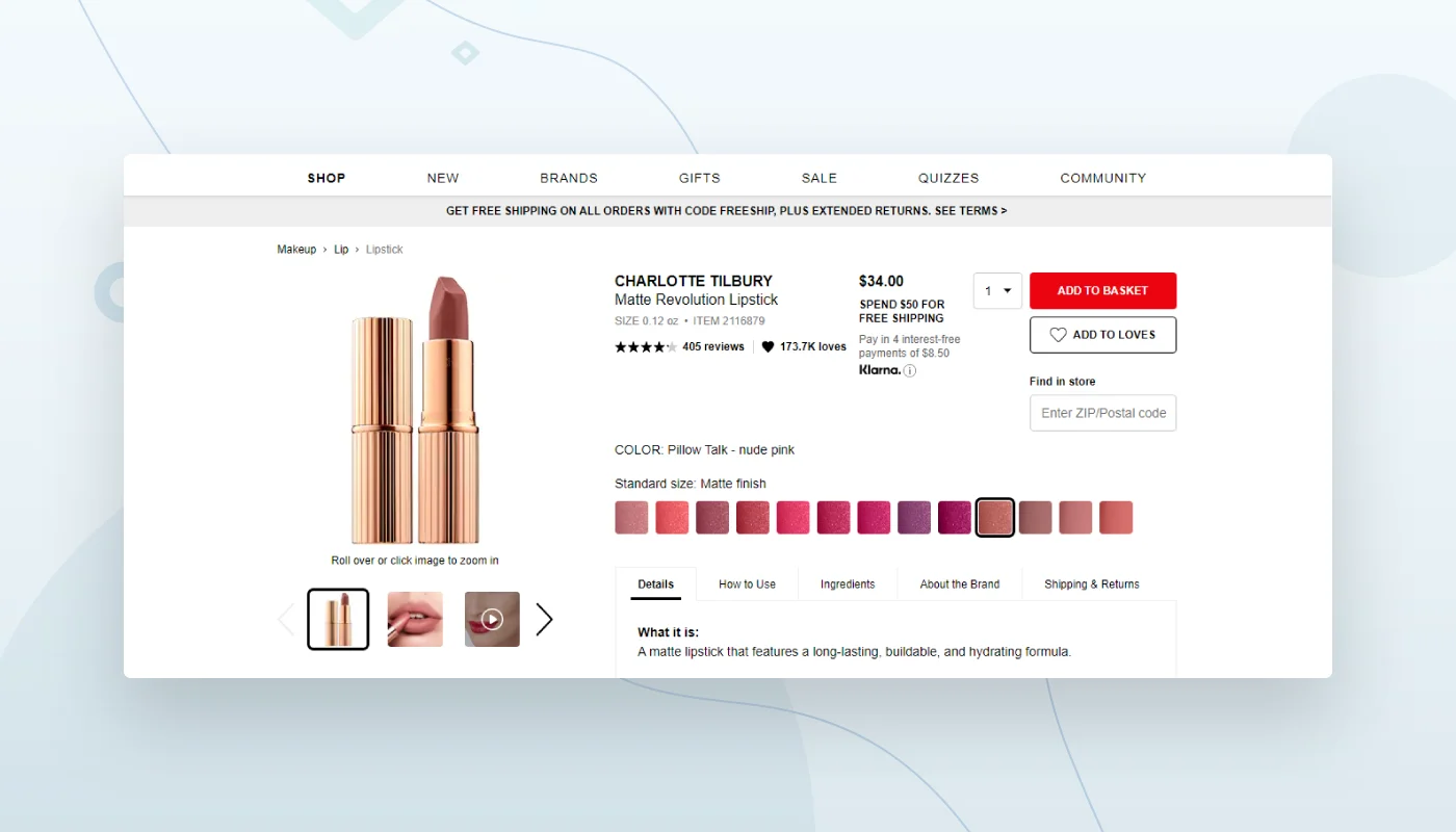
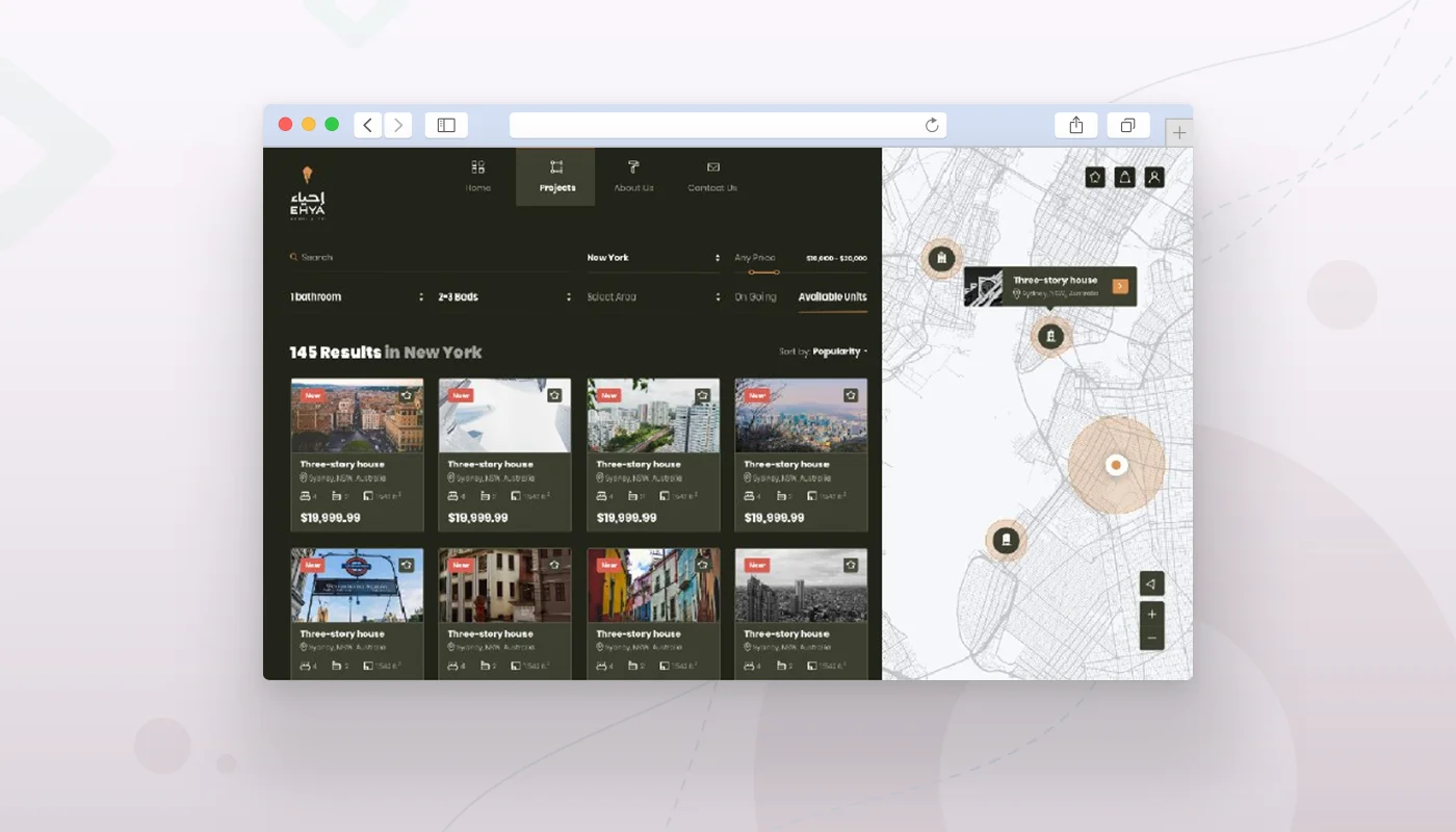
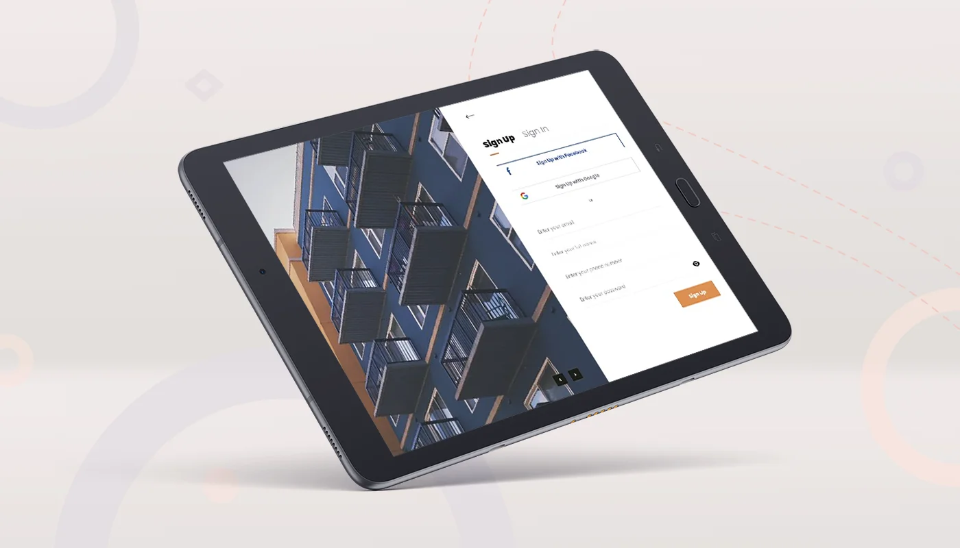
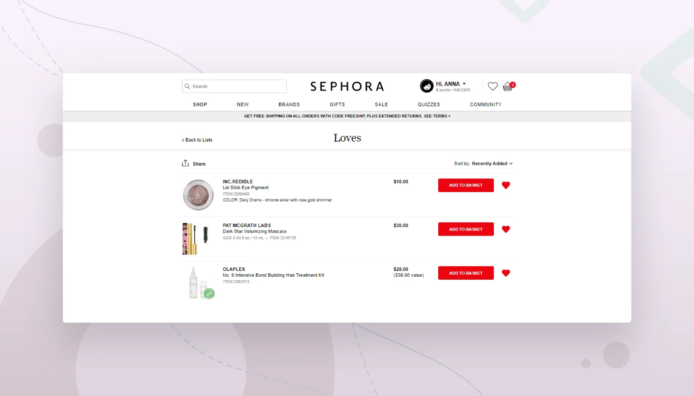
When running an e-commerce business, your website’s design is critical to your success. A well-designed website can help you attract new customers, boost your sales, and increase brand awareness.

According to a report by eMarketer, global retail e-commerce sales will reach $4.13 trillion in 2022. This figure represents more than 21% from the $3.42 trillion in sales expected in 2019. Retail e-commerce currently accounts for 14.1% of all retail sales worldwide, and this is likely to grow to 22.0% by 2022. If you want to take advantage of this growing market and improve your sales in 2022, here are some top e-commerce web design tips by our Gapsy Studio that you should follow:

1. Mobile-first approach

More than 52% of all website traffic worldwide was carried out through mobile devices in 2018. It means users shop more through mobile devices than by PCs.

The “mobile-first” is a site development approach that starts with the development of a lightweight and straightforward mobile version of the site. Then, developers create a functional resource for desktop computers.

Here is one of our e-commerce projects that shows the mobile-first approach.

e-commerce website design mobile-first example
how e-commerce web design mobile-first approach look

If you want your design to look profitable and attractive on all devices of your users, read our article on How Responsive Web Design Works. It will definitely be helpful!

What are the benefits of this approach?

1) Easy navigation

Developing a site using a mobile-first approach usually requires only a few items to be added to the menu due to the small space on mobile devices. As we know, the easier the navigation is, the simpler it is for a visitor to use your site or app. Since the screen has minimum elements, you need to think about the navigation through. As a result, users get an interface that is easy to work with.

2) Clear and understandable content

Thanks to this approach, everything that is displayed on the screen should be clear, concise, and honed. Since you have minimal space for developing a mobile version of the site, a user must very quickly find what they need. The small screen size requires thinking over which content is most important and using it without cluttering the interface.

3) Better visibility and reach of your site

Great visibility of your site is achieved due to the fact that Google sees whether the site has mobile optimization and can rank sites with such a layout higher than those that do not have one. Therefore, creating a mobile version of your site can lead to increased profits for your business.

Despite all the benefits, there are some difficulties with this approach. In designing a website for a smartphone first, designers need to use vertical resolution, which is different from developing a computer layout with a vertical orientation. The sizable horizontal screen is more flexible and multi-functional. Nevertheless, you need to focus on a small screen because your customers use it. Your goal is to create a simple and enjoyable experience for the users of mobile devices while offering the maximum possible experience to users of desktop computers.

2. Minimalism

The days when complicated bright designs were in fashion are gone. Now users expect a minimal, calm design with convenient navigation and functionality, and they don’t pay attention to complex graphic design or wow effect elements.

Just look at how great Marc’s Jacobs minimalistic ecommerce website design looks.

ecommerce website ui design minimalism
e-commerce web ui design minimalistic style

How to create a website or app with an appealing minimal design? Here are some ideas for you.

Choose a white background

The multipurpose background color is always white, as your colored goods aren’t merged with it, and look holistically and harmoniously. The white color allows you to focus all the client’s attention on products that your site provides, without distraction.

e-commerce website UI design background example
e-commerce mobile web ui design background

One of the Gapsy Studio website design projects for the e-commerce industry demonstrates this approach. As you can see, the products look organic and holistic on a white background.

Apply just several colors

Use simple web design color schemes for an e-commerce sites. You don’t need too elaborate colors. The best solution would be to use monochrome colors (you take one color and change its brightness or saturation and get a palette of similar colors) or a similar scheme (use three adjacent colors with your primary one). Using these types of color palettes helps to highlight the most important information on a screen without being overwhelming.

Just look at how aesthetically beautiful one color scheme looks in our Dribbble shot.

e-commerce web several colors design
e-commerce web ui design of several colors

Use a few fonts

With the correct creation and use, fonts can attract a visitor and encourage them to make a purchase. Use one font, do not mix them together. To enhance the effect of the text or attract attention to it, you can make it bigger (or smaller), as well as make it bold or bright. It is very important to have a clear consistency between the fonts so that they look good both on a computer or phone screen.

e-commerce web design few fonts
e-commerce web ui design few fonts example

3. Effortless user journey

The more understandable and intuitive your design and site navigation is, the easier it will be for users to make a purchase, and the more users will be satisfied dealing with your site.

When a site or an app is launched, you can check user flow to find obstacles preventing users from purchasing using heatmaps, scroll maps, confetti maps, and many other tools. However, it’s challenging to analyse the future design before the launch. So use our UX tips below to create a user-friendly, hurdle-free interface for your e-commerce web page design.

Employ three-tap rule

This rule implies users need to undertake three clicks to find the product of interest. This is justified because users often remain unsatisfied if they do not receive the information, product, or service they need within three clicks. For e-commerce sites, you can employ such three-tap rule order: category – subcategory – and the actual product. It will make the user journey as short as possible.

e-commerce web design three-tap rule
e-commerce web ui design three-tap rule

Think the navigation out

The navigation of your e-commerce website should be intuitive. To make your users’ journey pleasant, use the following tips:

Horizontal filters

In recent years, more and more sites are using the horizontal panel. Although the horizontal filter panel is not suitable for each website, it significantly surpasses the side panel’s convenience and efficiency. Visual information is much easy to perceive. Besides, horizontal filters are always on a screen, so users don’t need to search for them.

Left side filtering is more difficult to reach, it takes users one additional action, and as a result, filters overlap the image on the main screen, which is also not very pleasant and user-friendly. A horizontal bar has one significant disadvantage ‒ the screen’s width limits it. You can add more detailed ranked filters in the horizontal filter, like in the example below.

This photo shows a huge list of auxiliary filters that drop down if you mouse on the accessories section.

ecommerce website design filters example
how e-commerce web design best filters look

Go-back button

You need to place the navigation elements so that they are always visible. This is especially important for a mobile layout of a site or app. It is necessary to think over where to place the BACK and HOME buttons so that they do not interfere with other elements.

Breadcrumbs

Create breadcrumbs for your product catalog so it’s easy to navigate from one directory of products to another. Thanks to this simple feature, the visitor can go back from this point or jump to the main category. Breadcrumbs don’t only make shopping and viewing of products much more accessible, but also improve your search result position, as Google sees this element and takes it into account when ranking. In the example below, you can see how different categories and subcategories are arranged in breadcrumbs.

e-commerce website design breadcrumbs example
how e-commerce web design breadcrumbs look

Consider a UX audit if you already have an e-commerce product that doesn’t convert. Find out what’s that and what benefits your business can get from applying UX audit from our article.

4. Intuitive design

When the design is intuitive, the user doesn’t even notice it. But when the design is not thought out, a user has to search for items they need for a long time, they can’t understand the logic of navigation, and simply cannot finish the purchase due to some obstacles. Intuitive design means that users know exactly how to use your product, even if this is their first time on your site or app. Your site will be considered intuitive if users can focus on the required task and quickly fulfill it without using any tips.

The intuitiveness and consistency of your site or app eliminate the confusion; users don’t waste time learning how to use it. Otherwise, they just go to the site, where they don’t have to bother to think about what their next step should be.

5. Simple search

A clear and simple search feature on your e-commerce website can improve your conversion rate and satisfy your customers. Your search feature should be effective and contain only the necessary filters since a quick and successful search increases the trust of your customers.

Let’s take a look at some e-commerce website design best practices for improving your site’s search and understand how to make it more targeted to your users.

Add more filters

Use widescreen filters if you want your customers to find what they need quickly.

Some websites make their filters visual for buyers. Here, for example, you can not just see the shades of lipstick, but also the texture and the final look on the lips.

e-commerce web design example of filters
e-commerce website ui design variety of filters

Some websites that sell bags, for instance, offer visual fabric filters, that demonstrate how an item will look in leather or suede fabric.

Voice search

An excellent advantage of your e-commerce site will be the feature of voice search. According to statistics, 50% of buyers will use voice shopping by 2022. Though the voice search isn’t very trendy these days, it is easy to implement, and it can give you a good advantage over competitors.

E-commerce web design voice search
e-commerce website ui design voice search

Parameter search

Search by parameters is a way of searching products when a user can determine the necessary parameters of a required item (price range, minimal and maximal width, length, and so on). A search by parameters makes the user experience more pleasant and improves customer satisfaction.

e-commerce website design parameter search example
how e-commerce web design parameter search to look

Auto-suggestions

You can also add an auto-suggestion search so that users can enter the first letters in the investigation, and they will be given several possible options and suggestions. An automatic offer helps users quickly find the product they are looking for or find something completely different that may also interest them.

Read also about TOP E-commerce Web Design Trends in 2022.

6. Painless signup and checkout

Users don’t like extended multi-page signup or checkout processes. They don’t have enough patience. Instead, simplify the registration and checkout processes using the ideas below.

Don’t ask to sign up until checkout

Do not force users to register on your e-commerce until they complete the order. If the registration window pops up immediately, visitors will likely go to a site where registration isn’t required. Perhaps a person is just perusing or comparing prices.

Use the social sign up

Simplify the registration process with the help of social networks. Provide users with several registration options through different social networks, such as Facebook or Google account, for example. It is much faster and more convenient for users to register this way, than creating an account from scratch, and entering all the data.

e-commerce website design social sign up example
how e-commerce web design social sign up look

Enable guest checkout

According to statistics, there are many reasons for the high cart abandonment rate. One of them is the inability to purchase as a guest. What’s more, 21% of users abandon shopping carts if it is too long or complicated a checkout process. That’s why it would be good to allow new users to make purchases as a guest.

Add in-line form validation

In-line validation is a way to correct errors that a user may make during registration. For example, an error message pops up next to each field if a user fills it incorrectly. This allows visitors to quickly complete the registration process without correcting errors several times after reloading the registration field page.

Use smart default

Make it easy for your users to gather the information they have already contributed. Use smart defaults. If a user is already your client or subscriber, enable the information about email or phone number to be automatically filled in when users check out, so it’s faster and more convenient to complete a deal.

Show a progress bar

This feature lets your users see how many steps they need to complete the registration process. Demonstrate how many steps it takes a user to register or check out, so they understand if they want to spend their time on it or not.

7. Personalization

Personalize your e-commerce site or app so that users feel that they are being paid attention to and their tastes are taken into account. Treat each visitor as an exclusive customer. But what kind of data to use to improve personalization?

The show recently viewed items

Add a recently viewed section where users can see what products they viewed when they last visited your website or app. People do not always immediately buy what they see. But, maybe they need to think about it. This function allows visitors to remember what they viewed last time. A simple reminder can be potent. Use this trick if you want to increase your sales.

Add a wish list feature

Many users need some time before buying. So allow your customers to add products that they like to their favorites or a wish list so that they can come back later and view the collected goods.

Another powerful approach is to enable notifications connected with the wish list. For instance, a price on an item has decreased, or it’s on a sale. Send a notification to your customers to make your offer more attractive. And even if there are no promotions or discounts, remind users about the product they selected but didn’t buy.

Just look how Sephora’s website wish list of features looks like.

e-commerce website design wish list of features example
how e-commerce web design features a list of wishes look

Show recommendations based on previous purchases

Use the information about previous purchases or views of your users to offer them a product they might like. As statistics show, 56% of online shoppers are more likely to return to a website with product recommendations based on their previous purchases.

8. Test the design of your e-commerce product

Regularly test your website so that your visitors face no problems with its usage. Except for usability, functional, load, security, and performance testing, you’ll need to run the following must-have types of checks for e-commerce products:

e-commerce website design testing
how e-commerce web design testing look

Hallway testing

Hallway usability testing is a technique for target groups of your future e-commerce product to test the convenience of your navigation, location of icons, and the ease of use of your site or an app.

In creating a layout, you need to demonstrate a prototype to a person from your target audience and ask them to perform several actions, like find a product, add an item to the cart, or checkout. Thus, you can understand how convenient it is for ordinary users to use your product.

Hallway testing helps you to get fast feedback on your prototypes and improve them. For example, if a person is confused and doesn’t understand how to make a purchase, you need to change everything that prevents users from completing a task.

Mobile and browser compatibility testing

Your e-commerce product should be supported on both mobile and PCs. Browser compatibility testing is exactly what you need in this case. Many online tools can help you with this type of testing. For instance, use Browserstack, Browsershots, or CrossBrowserTesting. These tools allow you to test your site in more than one thousand browsers. Also, there’s a Perfecto Mobile tool, that you can use to run testing on different phone types to ensure the maximum compatibility of your site with various devices.

Final Thoughts

We hope these tips will help you understand the specifics of an e-commerce website design better and possibly improve your existing e-commerce product. E-commerce web design is essential for driving online sales. By following the tips in this article, you can improve your e-commerce website design and increase your sales. By investing in a good e-commerce web design, you will see an increase in your online sales. If you take the time to improve your website’s design, you will be rewarded with more customers and higher sales. So, what are you waiting for? Get started today!

Our design team provides professional web design services to help you create a convenient and modern e-commerce design. Contact us to discuss the details of your future web design design strategy. We will be happy to help with any of your questions! Looking forward to cooperation.

Rate this article

20 ratings
Average: 4.9 out of 5

If you like what we write, we recommend subscribing to our mailing list to always be aware of new publications.

Do you have any questions? We tried to answer most of them!