Step-by-Step Guide: How to Design a Website Homepage

7minutes read
how to design a homepage

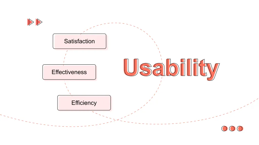
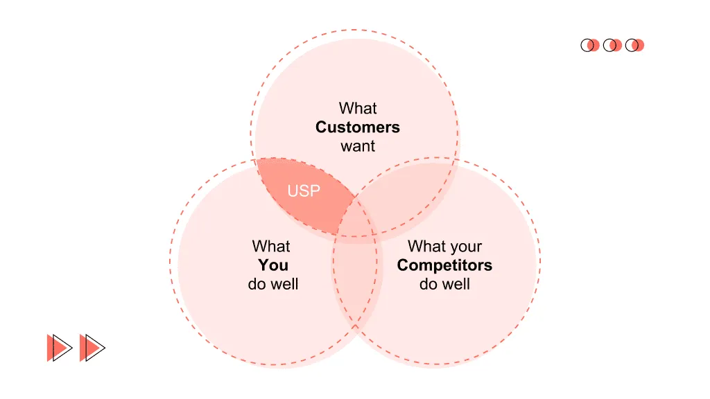
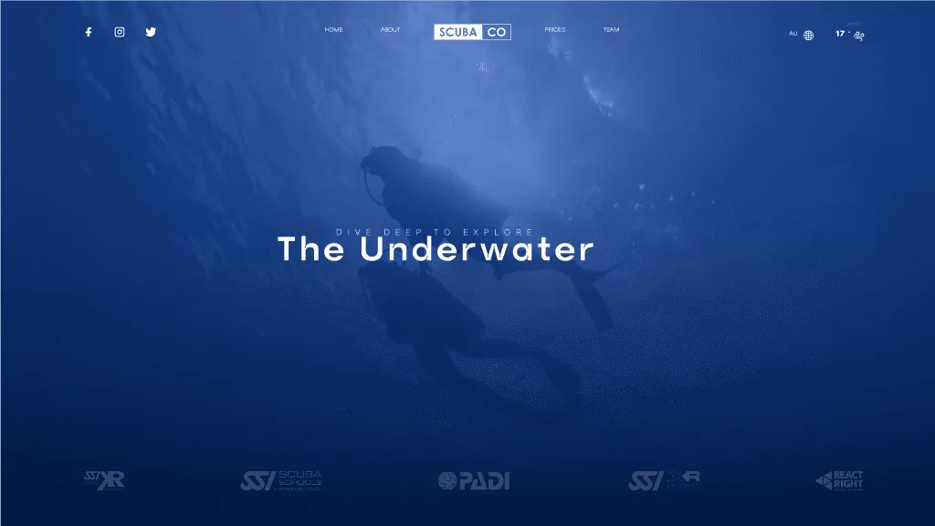
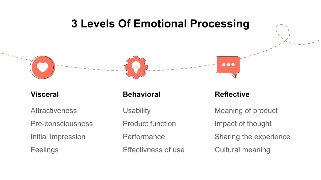
Potential clients often start their acquaintance with your business from the website home page. The user’s first impression of the brand depends on its design, functionality, usability, and information content. Therefore, homepage design is a necessary process that includes design, usability, text, logo, navigation, and more. It’s essential to consider the target audience’s interests, the relevance of the content, and even the peculiarities of color design when designing. This article will show you how to design your home page.

What tasks does the website homepage solve?

The home page is the first point of contact between a business and a potential client. Therefore, it should make a good impression on users. Secondly, the website home page plays the role of an information hub. With its help, the user should understand where to look for the information they need. Thirdly, the homepage should provide the user with basic functionality such as registering and logging into an account, ordering a callback, quickly purchasing a top product, subscribing to a newsletter, etc.

An ideal homepage design should have the following characteristics:

1. Informativeness.

The visitor should find a short and clear answer to several questions on a homepage:

  • General information about the business (what kind of company/site it is).
  • General product information (what they can buy on the website).
  • Information about the benefits (why it’s worth cooperating with this company and buying its product).

2. A persuasive value proposition.

You should tell the visitor in a nutshell why it’s worth cooperating with you. By the way, this information can be conveyed not only in words.

3. Usability and functionality.

The homepage should be intuitive and easy to use. Convenient navigation, registration and authorization forms, the ability to order a call back, adaptation to mobile traffic, the ability to buy some products from the homepage – these are just some of the components that make the page usable and functional. At the same time, the homepage should not be overloaded with content, controls, and available blocks.

usability and functionality for homepage design
 homepage design usability and functionality

4. Call to Action.

The homepage design should unobtrusively invite the user to take the actions the site owner needs: from going to a section of the website or subscribing to a newsletter- to ordering a call back or making a purchase.

using a call to action in homepage design
homepage design call to action

5. Dynamism.

The homepage design should constantly change and meet the actual needs of the audience. This can be achieved by automatically updating articles and news announcements, rotating products presented on the homepage, and other forms of dynamic content.

6. Visual appeal.

This is an obvious requirement, but site owners sometimes forget about it. The first impression of a site occurs within a fraction of a second after landing. Therefore, it depends precisely on the visual characteristics of the landing page.

How to design a homepage? Step by step guide by Gapsy Studio

1) Generate interest by focusing on Unique Selling Proposition (USP).

Reputable global brands with a rich history can only afford to list their name on the homepage. As a result, little-known companies are obliged to hook users with the benefits they will receive after purchasing a product or service. At first glance at the homepage, a person should understand what problem they will solve with the help of your product. Two points require special attention:

  • Don’t list your own merits – tell how the consumer’s life will improve after the purchase.
  • Confirm the benefits of your offer with positive reviews.
focus on unique selling proposition
USP for homepage

The user doesn’t need to know how good your business is regarding the technologies or financial stability. On the website’s homepage, the user wants to see the answer to the question: “What can I get here for my benefit? Is this resource worth my attention?“

2) Aroused interest – keep the attention of the visitor.

Prove that you have the perfect proposal for changing the user’s life for the better, meeting their urgent needs. Your goal is to nudge the user into action, but to do it tactfully, unobtrusively, to create the complete impression that the purchase decision will be an essential step that’ll bring real value.

People tend to resist when forced to do something, so make sure that the CTA on the homepage is not overly aggressive. Buttons with categorical orders “Buy,” “Order,” “Subscribe” cause unnecessary stress. Instead, formulate your calls to action more delicately: “I want to watch a demo video,” “Ready to order a trial version,” etc. You are not forcing – the user is willing to do so. Understanding such nuances is very important because, in recent years, a selling website has gone from an Internet brochure telling about business proposals to a lead-generating machine that actively promotes users along the sales funnel.

3) Social proof.

So many people have different opinions, so negative reviews about your product can be found on the Internet. Not every user will be looking for the truth; most will interpret negative feedback, not in your favor, and refuse to buy. Pretending that there are no bad reviews is a grave mistake on your part, which will further convince the potential client that it’s better not to do business with your company. The homepage of a website is the best place to break consumer fears.

social proof on a homepage
make a social proofs on your homepage design

4) A catchy headline.

A lot depends on what phrase you put on the home page. The title has several functions at once: hook, make you stop, and make you want to know more.

Signs of a good headline:

  • Aimed at the consumer, informs about future benefits.
  • Reflects the essence of the proposal and refers to authoritative opinion.

Signs of a wrong title:

  • It doesn’t convey the value of the product to the user.
  • Not eye-catching – similar to many others on the web.
Gapsy Studio catchy headline example
our catchy headline

The desire to embrace immensity, to fit too much information into the headline, can lead to the opposite effect: it becomes overloaded, overly long, and incomprehensible. To find the sweet spot, use the results of research from KISSmetrics. Analysts have determined the parameters of the ideal title for the homepage: it consists of six words (3 + 3) because, in the search results, our view can cover no more than three words. The number of characters also matters: the optimal title length is 57-59 characters.

5) Concise and capacious text content.

Usability expert Steve Krug urges eliminating half of the content ruthlessly and then cutting the remaining text in half.

This rule works for almost any content on the homepage. Don’t hesitate to cross out from the text:

  • Obvious statements set on edge.
  • Template, meaningless phrases.
  • Fragments about the corporate spirit and other bragging are unnecessary for the consumer.
  • Syntactically overloaded sentences, irrelevant arguments.
  • Unjustified generalizations like “Everyone knows well …”.

A modern person values time above other resources, so nobody will spend minutes reading useless advertising turns. Briefly and clearly: why do you need your site, what benefits the user will receive after the purchase, what problems he will solve with your help. Everything else – your merits, achievements, and victories – is not attractive to anyone but you. In 10 seconds, a person should understand that he really cannot do without your proposal; therefore, the website’s homepage can only contain content that solves this problem.

Read all about UX writing in web design to know how to write sales copy in our article.

What can non-trivial tricks help you do this?

A web resource is not created for users to enjoy the exquisite style of your copywriter. Instead, the site must solve a particular task — to draw attention to the product and help sell it. Several rules contribute to achieving this goal:

  • Provide a quick view of the homepage;
  • Don’t overload tests with complex participle and adverbial constructions;
  • Use metaphors to connect the imagination of your readers;
  • Saturate articles with compelling facts, not water;
  • Evergreen content has remained saturated for a long time, so materials should be based on timeless themes close to many users;
  • People love to have fun, which means that branded content will always grab the audience’s attention.

Read about what branding is and why it’s important in our previous article.

6) Emotional design.

A well-thought-out design of the site’s homepage can multiply the text content, create the desired atmosphere, and act as a full-fledged element that encourages content study.

Several studies have shown that most human decisions are based on visual information. Furthermore, the speed of perception of graphical images is 60 thousand times higher than that of words.

levels of emotional design on homepage
emotional design levels

A modern user bears little resemblance to a consumer of information resources of half a century ago. A monotonous text today is perceived by everyone first as an order to leave the page urgently. Don’t be so cruel to your potential customers; prepare a reward kit for them in the form of easy-to-understand visual elements. This allows you to:

  • Maintain the interest of users in your resource.
  • Demonstrate a willingness to speak to the audience in a language they understand.
  • Use animation, interactivity, visualization of the completion of the stages of interaction with the visitor to increase the comfort of the stay on the site.

7) The priority is the convenience of the site visitor.

By implementing your ideas about web design and usability on the homepage, which run counter to user comfort, you risk losing part of your audience due to:

  • The growth of refusals is caused by the need to understand a non-standard interface.
  • The presence of competing sites focused on the needs of people.
  • Make your home page as visitor-friendly as possible: divide the text into short paragraphs, color-block lists and essential points, and more.

8) Optimization for mobile devices.

Mobile devices are increasingly used to browse the web, so the cross-platform interface has long turned from a luxury to a harsh necessity. However, to keep the user using the smartphone, pay attention to some points:

  • A well-thought-out content structure will save the app design visitor from having to scroll through an endless stream of text.
  • Many small optional elements that are not too annoying on a large monitor or a small screen can cause you to refuse to view the site’s pages.
  • The touch-oriented interface assumes a standard 44-pixel touch area.
mobile-devices optimization of a homepage
homepage mobile optimization

Read more about responsive design in our previous article.

Summarizing

Yes, finding a sweet spot when creating a website home page is not easy. On the one hand, template solutions and stock images will not attract a user’s attention. But, on the other hand, the desire to stand out from the crowd can lead to a jungle of bad taste and excessive enthusiasm for secondary elements.

But even with a successful result, one can’t calm down: the website’s homepage requires regular updates, adaptation to new trends in usability and SEO. By analyzing user behavior, finding weaknesses, and correcting shortcomings, you can turn your homepage into a reliable and stable tool for increasing the influence of your business.

Gapsy can help you create a design that meets users’ needs and attracts them from the very first seconds with an impressive homepage web design. Learn about our professionalism and take a look at our services and projects.

Rate this article

20 ratings
Average: 4.9 out of 5

If you like what we write, we recommend subscribing to our mailing list to always be aware of new publications.

Do you have any questions? We tried to answer most of them!