How to Create a Typography for Your Website Right

6minutes read
how to make typography

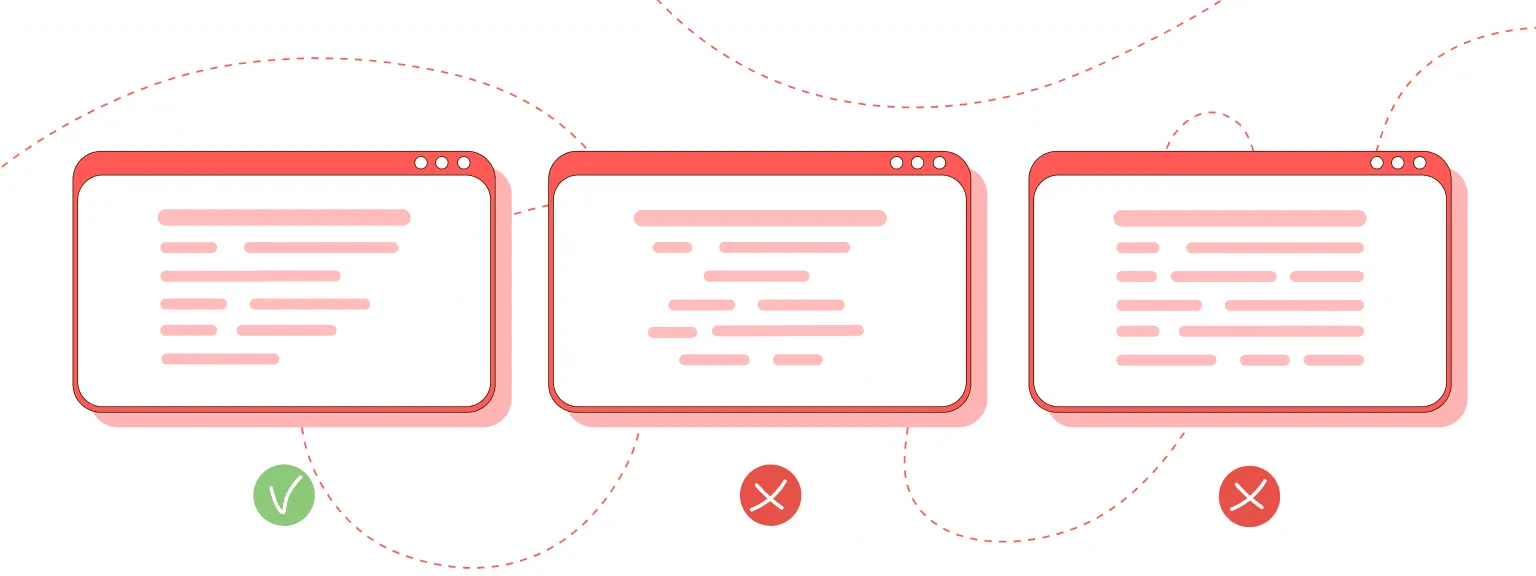
Website development is a large complex work, which includes the creation of texts. Therefore, it’s essential to use visual content correctly to direct the user’s attention to the desired action.

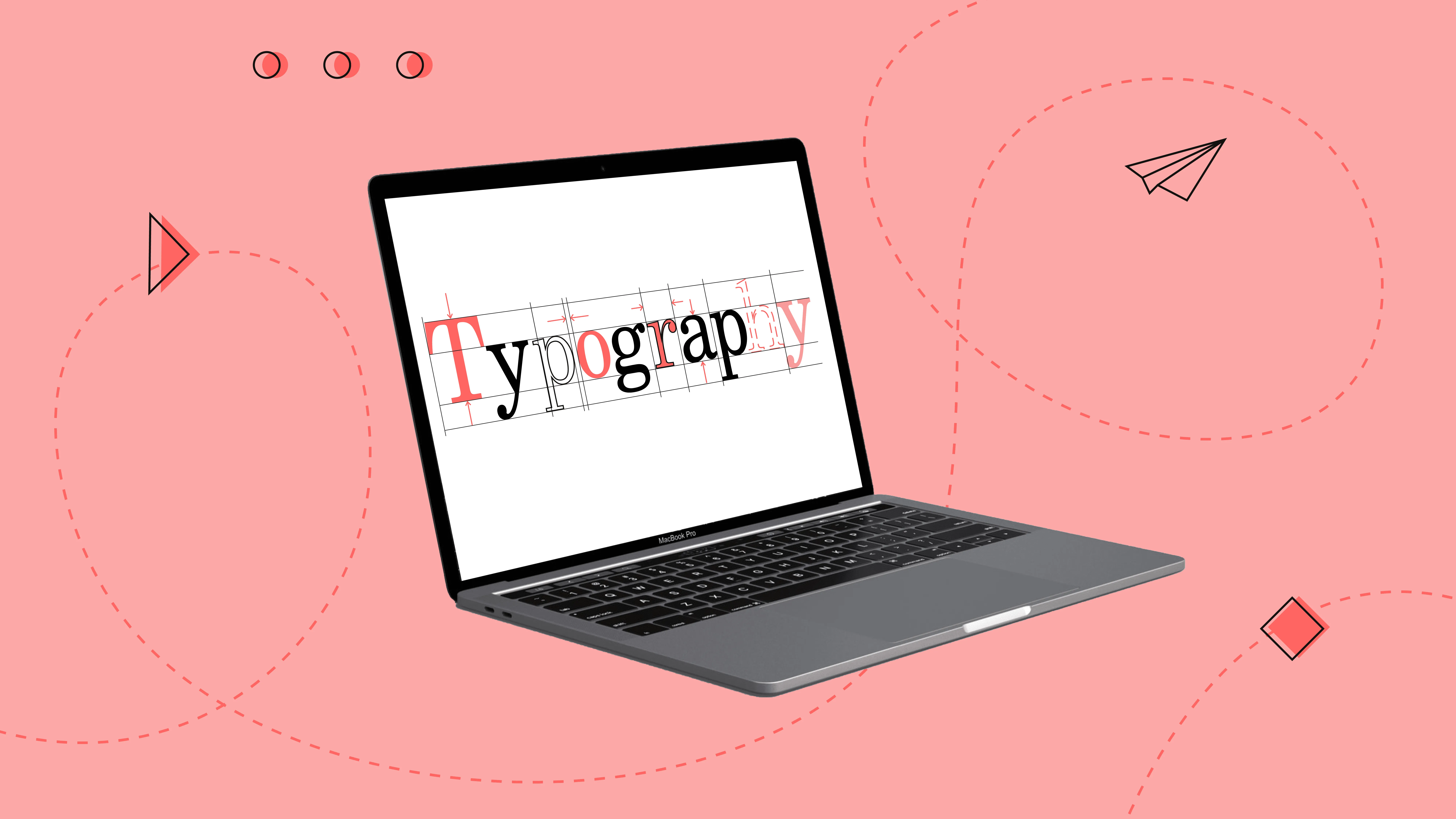
Web typography is a powerful tool for conveying the main message in marketing. With its help, text and graphic information are combined into a single meaning.

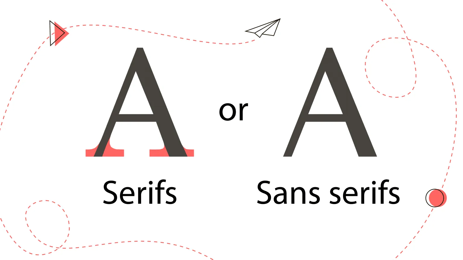
The use of fonts in web design has many nuances that you need to know to design content and convey information to users professionally. Therefore, we offer you ten rules of ideal digital typography: fonts, styles, readability—all the most important about the design of text on the site.

Ten tips for designing perfect typography

Good typography is easier to read, and lousy typography repels users. Thus, designing good typography is about optimizing readability, accessibility, usability, and overall graphic balance.

In other words, you are also optimizing your user experience by optimizing typography. So, here are our ten rules to help you improve the readability of your text content.

Learn more about what typography is and why it matters in one of our previous articles.

1) Large, small or medium text?

In recent years, large fonts have become more popular, and if the font is large, it’s better for the site. But why? This is due to the “total mobilization” – the small print is complicated to read on smartphones. Therefore, the perception of large print is much better. And it won’t be difficult to read the text or head in large print. However, small typography is also acceptable in design, as it harmoniously fills the space between images.

The text is often distorted “ostensibly for design” – but it should be done the other way around! The text component of a website always takes precedence over graphics. By itself, a picture without text prompts does not prompt you to perform the target action. But together with the text – it’s easy! Therefore, prioritize correctly to get what you want.

Make your fonts on the site as large as possible! They look incredibly cool when combined with a laconic design. Also, use responsive fonts because they are equally readable on desktop and mobile.

2) Text alignment: center or edge?

Many designers recommend left-aligning text, as it’s considered optimal for perception. You can use the center and proper alignment very carefully. But in width – by no means, such text becomes unreadable.

ways to align text
how to align text for a website

Structure the texts on the site to the left – this is an essential factor for the perception of information! All texts must be formatted appropriately, and if headings and subheadings can be centered, then bulleted lists – only on the left, so the reader will be more comfortable.

3) What is the optimal line length?

The rule of “golden mean” works well here – it should not be too long (it makes it difficult to understand the essence, and you will forget it while you finish reading it), but also not very short. Optimal line length in the range from 55 to 65 characters (for desktops) and 30 to 40 characters (for mobile)

optimal line length for mobile and web versions
which line length should you make

Make life easier for your users – don’t force them to overcome difficulties and get annoyed by making their way through the poorly readable text.

4) Quotation marks: paws or herringbones?

This is how the quotes in the text can look: «quotes» or “quotes,” German „paws, “‘single quotes,’ “double quotes.” The paws are used when it is necessary to put some quotes inside other quotes.

Professionals always put on herringbone. And it is also essential since in programming languages and HTML markup, «programmer» quotes are used, so preference should be given to such herringbone.

5) How to style headings?

Header styles are pyramid-based. H1 – main heading – the largest font, H2 – second-level subheading – more minor, and so on. Body text is less than the heading of the last level.

website heading
how to style headings on a website

It is not recommended to make headings in capital letters (caps). In this case, designers say, people perceive the headlines as an image and do not delve into the essence of the text. It is good to highlight the heading with a different font or contrasting color.

6) Special typography terms: unit, kerning, leading.

These are the terms of layout designers, but you should know them. The typographic unit is the height of the letters. Kerning is the spacing between letters. Important! Kerning can be different between different letters. This is done for better readability. Leading is the distance between lines.

special typography terms for a website
typography unit, kerning and leading

The choice of values for size, kerning, leading is always selected individually for each project. But there is one general recommendation to make the leading 1.5 times the size.

7) General style for identical elements

Combining similar elements is a basic rule in UX design, and it also fully applies to typography. This is because similar elements are visually perceived as one whole. Therefore, for the design to look stylish, all similar elements must be performed simultaneously. These are fonts in menus, headings of the same level, texts themselves, fields in forms, icons.

But it is better to be careful with the color – in any case, do not overdo it. The different colors of the rift will distract attention. The different colors will create a sense of confusion. Also, avoid highlighting the main points in bold or in droplets. Instead, it is better to place them next to the icon or on a contrasting background.

If it is essential for you not to scatter the attention of users, but, on the contrary, to concentrate it, design elements of the same type in the same way!

8) A serif or sans serif font?

This controversy is still ongoing. It was previously discouraged to use serif fonts for web design. This is partly true, as low-resolution computer screens can display serifs poorly. However, computer hardware is of much better quality today, so this problem is minimal; hence the restrictions on serif fonts can be lifted.

what is better: serif or sans serif font
choose serif or sans serif font

However, most users are used to sans serif fonts and can be annoying for small print. Therefore, it is wise to use serif typefaces in headings. The most popular and readable sans serif fonts are considered to be: Rockwell, Helvetica, Futura, Garamond, Bodoni, Frutiger, Trajan, Myriad. These fonts are most commonly used in website design.

9) What text color to use?

The classic version for the main font: a combination of white on black or black on white – better than this has yet to be invented. However, a dark gray font instead of black looks quite decent. The white font also looks good on dark red, dark blue, or dark green backgrounds. Today, another enjoyable alternative is popular – text on a transparent background.

To focus users’ attention on the main blocks of text, they can be highlighted by placing them on a colored background. The CTA button should always be in a contrasting color. Experiment carefully with “acidic” colors, especially when combining red on green or blue on yellow.

Read on in our blog. Features of color perception in web UI design. How to hook a client?

10) Readability should be a top priority

Readability is more important than all the established rules. So, first of all, rely on whether it is convenient for your users to perceive the text and whether it helps to perform the targeted action!

To do this, you cannot do without experiments. Therefore, you need to periodically conduct A/B testing, polls and ask directly whether users like how you create typography on the site and how it is perceived.

Let’s summarize

Website design development is a laborious creative process, and typography in design is only a small but essential part. However, proper use of web fonts has a significant impact on the responsiveness of text information on a web page.

Communication with users plays a huge role in web design. Designing typography is an essential part of this process because text content is approximately 90% of all information on the site. Web typography combines UX design with the WOW effect to present a sales proposition in the most accessible and expressive way.

If your website or application needs a stylish modern design, we are always happy to help. Contact us, and our team will suggest and implement fresh, innovative design ideas for the success of your project. Convince yourself of our professionalism and take a look at our projects.

Rate this article

20 ratings
Average: 4.9 out of 5

If you like what we write, we recommend subscribing to our mailing list to always be aware of new publications.

Do you have any questions? We tried to answer most of them!