Modern Responsive Grid Systems for Web Design

    12minutes read
    responsive-grid-systems-modern

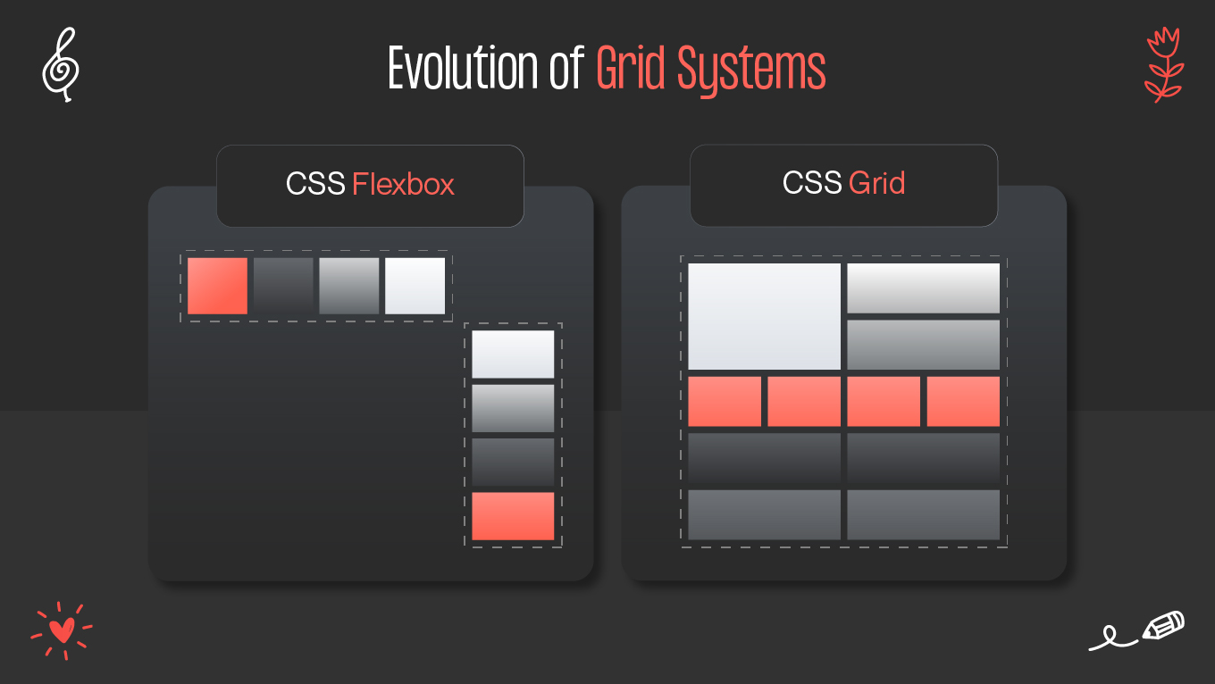
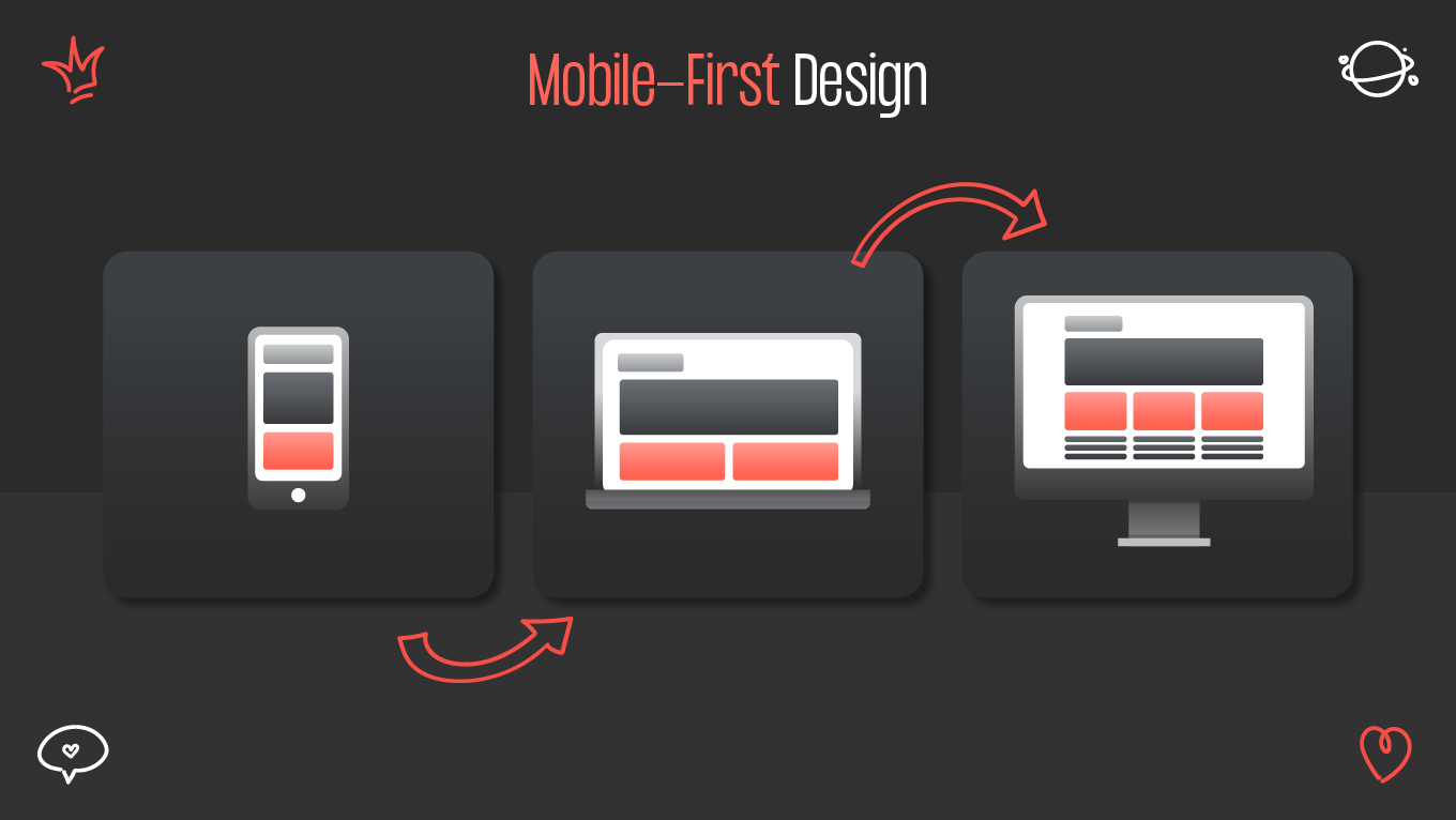
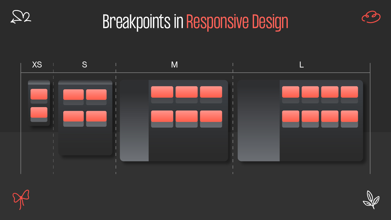
    Building a seamless user experience across devices is no longer optional—it’s essential. Whether viewed on a 4K display or a mobile phone, a website must adapt without compromising design integrity. This is where responsive grid systems come into play, forming the backbone of modern web design. Let’s explore how grid systems evolved, what modern techniques dominate today, and the best practices to create layouts that stay fluid, structured, and visually balanced.

    Evolution of Grid Systems

    Before the digital era, grids were a print design staple, used by typographers and magazine editors to align content consistently. When web design emerged, early developers tried to replicate these principles, but limited tools made adaptability difficult.

    From Tables to Flexbox

    In the 1990s, websites relied heavily on HTML tables to organize content. While functional, they were rigid, difficult to maintain, and unsuitable for responsive layouts. The introduction of CSS changed everything, allowing designers to separate structure from presentation.
    Then came Flexbox, a revolutionary layout model enabling dynamic, one-dimensional alignment. Flexbox made it easy to distribute space within containers and align items both vertically and horizontally—something that was previously complex or impossible.

    The Rise of CSS Grid

    As designs became more complex, CSS Grid arrived as the next evolution. It introduced a two-dimensional layout system capable of managing both rows and columns simultaneously. Unlike Flexbox, which handles content flow in a single direction, CSS Grid allows designers to define entire page structures with precision—turning the browser itself into a powerful layout tool.

    Modern Techniques

    The latest generation of modern CSS grid frameworks and layout technologies has transformed how designers build responsive interfaces. They combine flexibility, maintainability, and fine control over how content adapts across screens.

    1. CSS Grid for Complex Layouts

    CSS Grid remains the most robust solution for building intricate designs. With features like grid-template-areas, auto-fit, and minmax(), designers can easily create flexible and visually appealing layouts. For example, defining a fluid gallery that adjusts columns automatically is now as simple as one line of CSS.

    .grid {display: grid;

      grid-template-columns: repeat(auto-fit, minmax(300px, 1fr));

      gap: 20px;}

    This ensures images or cards dynamically resize depending on available space—no media queries required.

    2. Flexbox for Content Alignment

    While CSS Grid handles macro layout, Flexbox excels at micro-level alignment. It’s perfect for centering items, managing spacing, and creating responsive navigation bars or form layouts. Combining Grid and Flexbox often yields the most adaptable structures.

    3. Container Queries

    One of the most exciting additions to modern CSS is container queries. Unlike traditional breakpoints that depend on the viewport, container queries adapt components based on their parent element’s size. This unlocks truly modular design—components that remain responsive no matter where they’re placed on a page.

    @container (min-width: 600px) {

      .card { flex-direction: row; }}

    This approach allows for component-level responsiveness, improving maintainability and scalability.

    4. Fluid Layouts and Modern Units

    Modern layouts increasingly rely on fluid typography and CSS functions like clamp() or min() to ensure consistent scaling. For example, instead of setting static pixel values, designers can create smooth transitions that scale proportionally with screen width.

    h1 {font-size: clamp(1.5rem, 5vw, 3rem);}

    This fluid approach keeps text and spacing balanced, no matter the screen size.

    Best Practices

    Creating an efficient responsive grid system requires more than technical mastery—it demands thoughtful design strategy. Here are key best practices to ensure your layouts are both aesthetic and functional.

    1. Start with a Mobile-First Approach

    Design for the smallest screens first, then progressively enhance for larger ones. This ensures essential content loads quickly and remains accessible. Read more about the difference between mobile-first and responsive design in our previous blog article.

    2. Use Consistent Breakpoints

    Establish clear breakpoints based on your audience’s most common devices—typically around 480px (mobile), 768px (tablet), 1024px (laptop), and 1440px (desktop). Maintain consistency across your CSS or framework.

    3. Combine Flexbox and Grid Strategically

    Use Grid for the overall page structure (header, sidebar, main, footer) and Flexbox for smaller content components (buttons, navigation, forms).

    4. Embrace Fluid Layout Principles

    Avoid fixed widths. Use percentages, fr units, or relative units like em and rem to maintain flexibility.

    5. Test Across Devices

    Always validate your design on multiple devices and browsers. Tools like Chrome DevTools or Responsively App make it easy to simulate screen sizes and identify alignment issues.

    6. Keep Accessibility in Mind

    Responsive design isn’t only about visuals—it’s about usability. Ensure text contrast, scalable font sizes, and logical tab order to make your grid systems inclusive.

    Examples & Tools

    Modern frameworks and tools simplify grid implementation, speeding up development while maintaining design flexibility.

    Popular CSS Frameworks

    • Bootstrap 5 – Uses Flexbox and CSS Grid under the hood. Ideal for fast, standardized layouts with built-in responsive utilities.
    • Tailwind CSS – Utility-first framework that allows precise control over grid behavior using class-based styling.
    • CSS Grid Layout Generator – Online tool for visually building grid templates with custom row and column definitions.
    • Framer & Figma – Offer responsive layout systems for prototyping before coding, letting designers test breakpoints visually.
    • Material UI Grid – React-based grid component optimized for consistency and accessibility.

    Example: Responsive Portfolio Section

    A simple grid-based portfolio can be achieved with minimal CSS:

    .portfolio {

      display: grid;

      grid-template-columns: repeat(auto-fill, minmax(280px, 1fr));

      gap: 2rem;

      padding: 2rem;

    }

    This setup allows each project tile to adapt seamlessly across viewports—whether it’s two columns on mobile or five on desktop.

    Conclusion

    Modern responsive grid systems are the foundation of flexible, accessible, and visually balanced web design. With technologies like CSS Grid, flexbox, and container queries, designers can create adaptive structures that look stunning on every screen. By following best practices and leveraging modern CSS grid frameworks, you can achieve harmony between aesthetics and functionality—ensuring every user enjoys a consistent experience.

    At Gapsy Studio, we use these cutting-edge techniques to craft responsive, pixel-perfect interfaces that adapt beautifully to any device. Whether it’s a landing page, eCommerce platform, or mobile-first application, our team ensures every project is built on strong, scalable design foundations.

    Rate this article

    20 ratings
    Average: 4.9 out of 5

    If you like what we write, we recommend subscribing to our mailing list to always be aware of new publications.

    Do you have any questions? We tried to answer most of them!