Mobile-First vs. Responsive Web Design. What is the Difference?

10minutes read
mobile first vs responsive web design

At the moment, half of all web traffic is from mobile sessions. In addition, more and more purchases are made using mobile devices – according to forecasts, by the end of 2021, the share of mobile commerce will be about 73% of all retail sales in e-commerce.

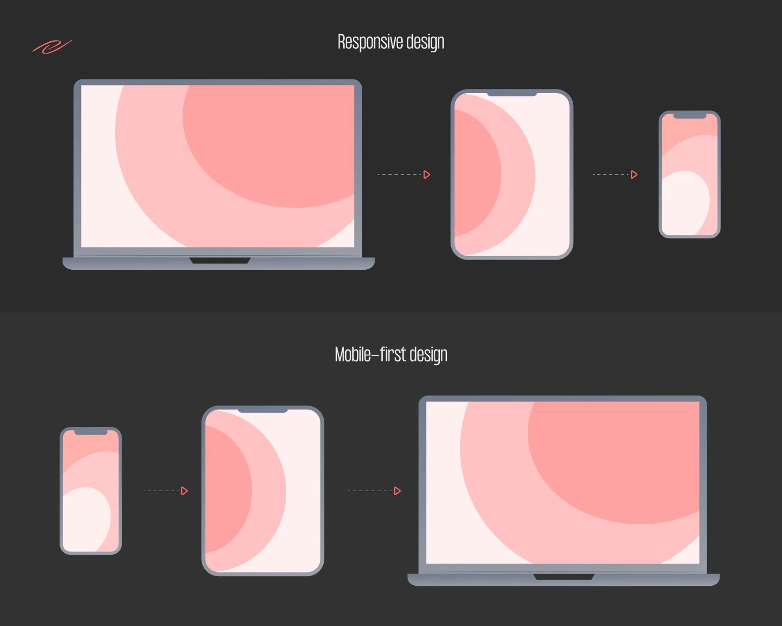
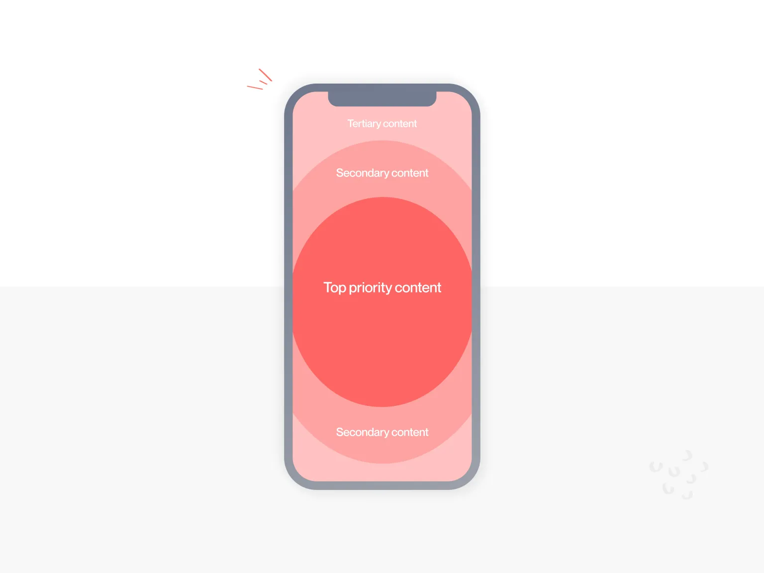
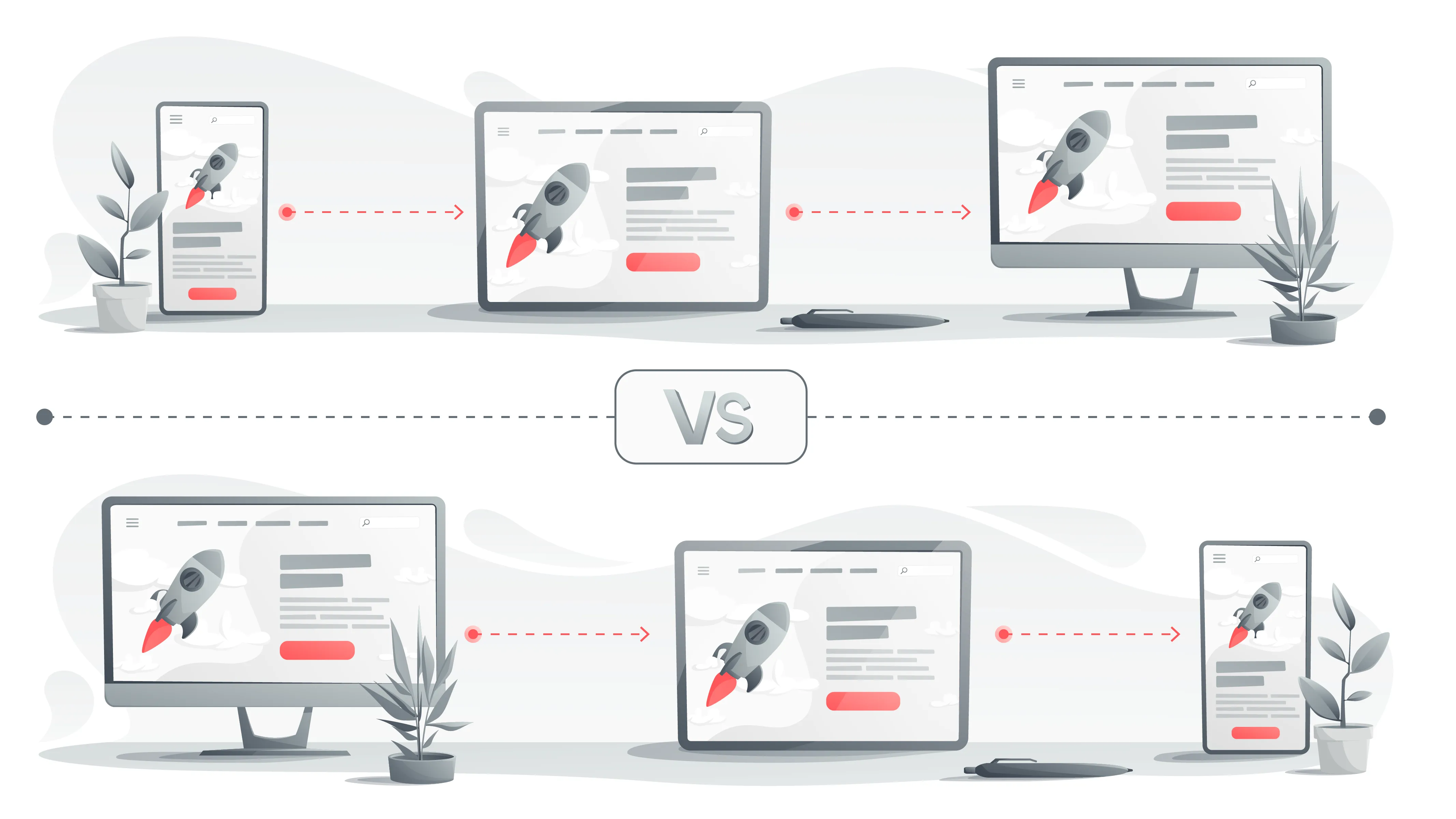
Such trends require more attention to the mobile version of the site – it should make the most positive impression on the user. Therefore, optimizing a site for various devices has long been one of the mandatory items in terms of reference for design. But what is the best approach to take for your smartphone- mobile-for оr responsive? In this article, we’ll cover the pros and cons, as well as the basic principles, benefits, and pitfalls of these two methods.

What’s the difference between responsive design and mobile-first?

Responsive design means that the site’s desktop version or landing page will adjust to mobile screens. The difference from mobile-first is that the desktop is still put in the first place with this approach.

In a responsive design, the site layout adjusts to the screen’s width a person is viewing the page on. Even if the browser window changes by one pixel, the page will automatically adapt to the new dimensions to avoid wasting time creating a mobile version of the site. At the same time, it will not be superfluous to make sure that all the elements look good on different devices.

mobile first vs. responsive web design
difference between mobile-first and responsive design

The Mobile-First strategy is built from the opposite: first, the site is made for smartphones and then finalized for desktops. There is no feeling that the mobile version is inferior in this case.

What is the Mobile-First approach?

As the name suggests, the Mobile-First strategy involves designing a site interface primarily focused on mobile devices. The philosophy behind the approach is to prototype the design for the smallest screen and then move on to larger displays. This is the main difference from the classic Desktop First approach, which web professionals have used for many years.

Traditionally, website creation begins with designing a layout for computers and laptops since they have high performance, and a lot of content can be placed on a large screen. Further, the ready-made version is adapted for other devices, considering their capabilities. So why was it necessary to develop a concept in which everything goes in reverse order?

Not all visual and functional elements of desktop sites can be transferred to the mobile version while maintaining the same ease of interaction. Website optimization for smartphones is often accompanied by various problems: long page loading, complicated navigation, inconvenient CTA buttons, etc. What can we say about the UI, which the designer tried so hard to achieve! You have to remove a significant part of the beautiful but not functional elements for a small smartphone screen.

complexity of web implementation on a smartphone
web design on mobile devices’ complexity

Not everything that looks and works well on a desktop can be implemented on a smartphone.

When comparing desktop-first and mobile-first approaches, two methodologies are often mentioned to help you better understand their underlying logic:

Graceful degradation — initially, the interface has all the complexities, the complete set of functions, and various effects. Then some of the elements are cut off for devices with weaker characteristics. This is how desktop-first responsive sites work.

Progressive development means creating a product designed primarily for devices with many constraints. This version has the most necessary set of functions and may gradually acquire new options depending on the technical capabilities of other devices. Thus, having created a basic layout for a mobile phone, we get a site that is guaranteed to work on tablets, laptops, and PCs.

Mobile First pros and cons

It is not possible to argue that mobile-first web design is suitable for everyone. This concept has its strengths and weaknesses, so every company must weigh the pros and cons before using it.

Advantages

User-friendliness

No small fonts, cropped images, and inappropriate page scaling. When designing a UX site for mobile devices, we prioritize usability on a small screen. The user’s path is thought out, taking into account all the restrictions that may arise in the mobile app design.

Continuous increase in conversion and customer retention is the concern of every company. A positive experience of interacting with the product on all devices contributes to achieving these goals along with a high level of service and quality of services and a brilliant communication strategy. Statistically, if a website is not optimized for mobile, 50% of users will visit it less even if they like the product or content.

Fast loading pages

One or two seconds is how long most people are ready to wait for the so-called First Contentful Paint (FCP). Even if the user is interested in the page’s description in the search results, there is a risk that he will leave the site, which takes a long time to load.

According to our research, if a download takes more than 3 seconds, the probability of bounce increases by 32%, and if it takes longer than 5 seconds, it increases by 90% -Daniel Ahn, Global Product Manager, Google.

Pages that are immediately mobile-optimized load faster than responsive ones. The ease of the site, designed according to the principle of Mobile First, is provided by:

  • posting only the most important content;
  • use of images without loss of quality, but of a smaller size;
  • the absence of cumbersome code, which is obtained by resizing the site elements using CSS and a lot of media queries;
  • elimination of possible “crutches” that programmers can use for adaptation.

Search Engine Ranking Priority

Google set the vector of website design towards the mobile-friendly back in 2010. Then the company announced that it would approach its products from “mobile devices first.” And six years later, the Mobile-First Index algorithm was launched, which analyzes sites for ease of use on mobile devices. It is expected that this search principle will soon be applied to the page ranking of all sites.

Does this mean that only sites designed on the Mobile First principle can claim top positions in the search results? Google itself does not mandate this approach. A correctly implemented responsive design will also satisfy mobile-prioritized indexing. However, “right” is the keyword here. This means that it is necessary to diagnose the adaptive version of the site for compliance with the Mobile-First Index algorithm. There are several ways to do this. Some of the fastest are Google Mobile-Friendly Test and Search Console.

Disadvantages

Duration and cost of design

One of the main reasons the approach has not yet gained widespread popularity is the impressive amount of work. For example, designers have to prepare not one version of the layout of each unique page but several: for mobile, tablet, and desktop devices with different screen settings. At the same time, you need to remember old devices with low resolution and non-standard characteristics. And when new models with a previously unused diagonal come out, you will have to prepare another version of the layout.

Read also Tablet App Design. Main Things to Consider

As a result, the website design becomes more expensive and time-consuming compared to the usual Desktop First method. However, if you do not consider the costs and benefits in the short term, you can feel the real benefits of such an investment over time. For example, does it make sense to build a website quickly and inexpensively if users get lost on its pages in a sea of ​​secondary elements or get annoyed by the inconvenient interface and slow loading on mobile? Obviously not.

Fixing a problem at the stage of site layout costs ten times more than fixing it when creating a prototype and 100 times more if trying to find a solution when the product is ready.

Limited visual design

Minimalism is in trend. How long? To comply with all Mobile-First principles, you often have to give up creative animations, beautiful but heavy-weight videos, and other wow effects. If on mobile, the site’s simple interface allows the user to concentrate on the target action, then on the desktop, such a version may seem somewhat modest and boring.

Analyzing competitors and studying your target audience will help you understand whether it’s worth chasing creatives. For example, the Instagram website remained at the Mobile Only level – its desktop version is almost the same as for mobile phones. Does this make users happy? Judging by the popularity of the service, it is quiet. Instagram is trying to keep up with other popular social networks and adding new features, but it has remained the same for many years in terms of design on the desktop.

Read also about Minimalist App Design in our previous article.

example of non-limited visual design on Instagram
non-limited design of Insta

Quick checklist: How to design a mobile-first approach?

1) CTA

The mobile version should be geared towards the targeted action. For example, if the goal of your site is to attract leads, calls, and requests from customers, you need to emphasize and highlight as much as possible. For example, this is very successfully implemented on our website: In the upper fixed plate, there is a CTA when you click on it, a page opens where customers can contact us, and buttons of popular platforms where you can see our work.

2) Font

The size (font size) for the mobile version should be 14-18px. This is important to maximize the readability of the text.

Read more about fonts in our article: Typography in Web Design: A Beginner’s Guide by Gapsy.

3) Emphasis on content.

The small size of smartphone screens dictates its conditions: if you want to achieve a targeted action from the user, first, you need to show the elements that will lead him to conversion. The study of user flow helps to determine what should be displayed on the site page in the first place.

More details about user flow in our blog: What Is a User Flow And How to Create It Right?

4) Visual content hierarchy

You can improve user interaction with the site if you know what to show and how to show it. The visual hierarchy of content involves highlighting its most essential components and placing them in smartphone users’ particular areas of attention. At the same time, designers can use psychological techniques to focus the site visitor’s attention on the necessary elements.

visual content hierarchy of mobile-first design
visual content hierarchy mobile approach

5) Ease of navigation

Good navigation on a mobile site is a demanding thing. It should both provide an ideal user journey through the resource and at the same time be placed in compact interface elements so as not to distract from the main content. Be mindful of left-handed and right-handed people and keep this in mind in your design.

thumb zone of mobile-first design
navigation mobile approach

What is responsive design?

Responsive design involves creating apps that stretch to fit any screen size. Initially, designers create a single version of the application, which will dynamically change depending on the size of the browser window. In other words, responsive design responds to changes in the browser window.

We already have an article in which we have detailed everything about responsive design. Learn more about What is Responsive Website Design and How it Works in this article. And we will talk about the pros and cons in more detail below.

Pros of responsive design

We already know that responsive design is a fluid way of displaying apps on various screen formats. The advantages of responsive design include the following:

Uniform appearance

Regardless of which device you are logged in from, your application will always look the same: icons, icons, pictures, and text remain the same, and if they move relative to each other, then only slightly. Your application will retain its familiar look and feel and be convenient to use, as users will not have to get used to the new markup and spend a lot of time looking for the desired functions.

Reduce design time

As you already know, the application interface looks the same on all devices because the design creates a single version that can adjust to any screen size. Designing one version of the application does not require a lot of designers’ time and significant investments on your part. This means that this design allows you to reduce costs on a limited budget. A user-familiar interface that adjusts to the browser window’s size and lean design are two factors that characterize the responsive design.

Cons of responsive design

So, responsive design gives you the ability to create a budget app that looks familiar and familiar to the user on any device. But this solution also involves specific problems in use:

Unbalanced design

When designing a responsive app, you want it to look equally good on both the web and mobile versions. However, as practice shows, it is almost impossible to achieve this solely using responsive design. The mobile version will look too overloaded with unnecessary elements, or, conversely, the application will look dull and empty on the computer.

Inconvenient interface

It would seem that everything is simple – the browser window changes, the application adjusts to the new size, and the user gets access to the entire amount of information that will be displayed in an enlarged or reduced form. However, in the case of zooming out, this leads to the fact that not all elements on the page are equally convenient to use after resizing the interface. For example, the navigation menu, which is so common for desktop use, will shrink and become illegible on a mobile device. And bulky tables with a lot of information will look completely unreadable. As a result, a mobile user who does not have a mouse and keyboard at hand, and sometimes just a few extra seconds at his disposal, will see an incomprehensible interface on his screen, will not understand, and leave the page.

A low percentage of coverage of various devices

The mobile responsive version will look unbalanced and uncomfortable for the user to use. Accordingly, a responsive design is suitable only for those applications that do not provide for the availability of mobile versions. This means that your responsive application will not cover the mobile part of users who could potentially become your customers. As the proportion of mobile users continues to grow, this disadvantage could be a decisive argument in favor of responsive design.

Final Thoughts

The growing popularity of mobile devices worldwide has led to several new questions regarding conversion optimization, the answers to many of which are still unknown to us.

Both responsive and mobile-first designs have advantages and disadvantages that should be considered when making a final decision. Evaluate your mobile site from a UX perspective, determine which of these two options work best for you, and create a mobile conversion funnel. And if you are at a loss on this topic, then our studio Gapsy will be happy to help you with this. Contact us, and we will be glad to help you with your ideas and projects. Finally, convince yourself of our professionalism by looking at our portfolio of works.

Rate this article

20 ratings
Average: 4.9 out of 5

If you like what we write, we recommend subscribing to our mailing list to always be aware of new publications.

Do you have any questions? We tried to answer most of them!