How to Make Mental Health Website Design with Empathy and Strategy in Mind

12minutes read
mental-healthcare-website-design

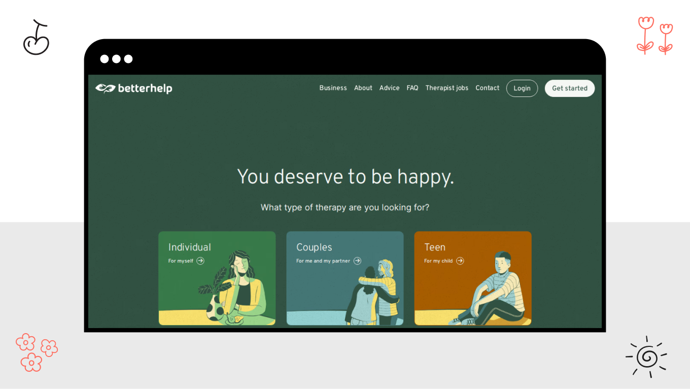
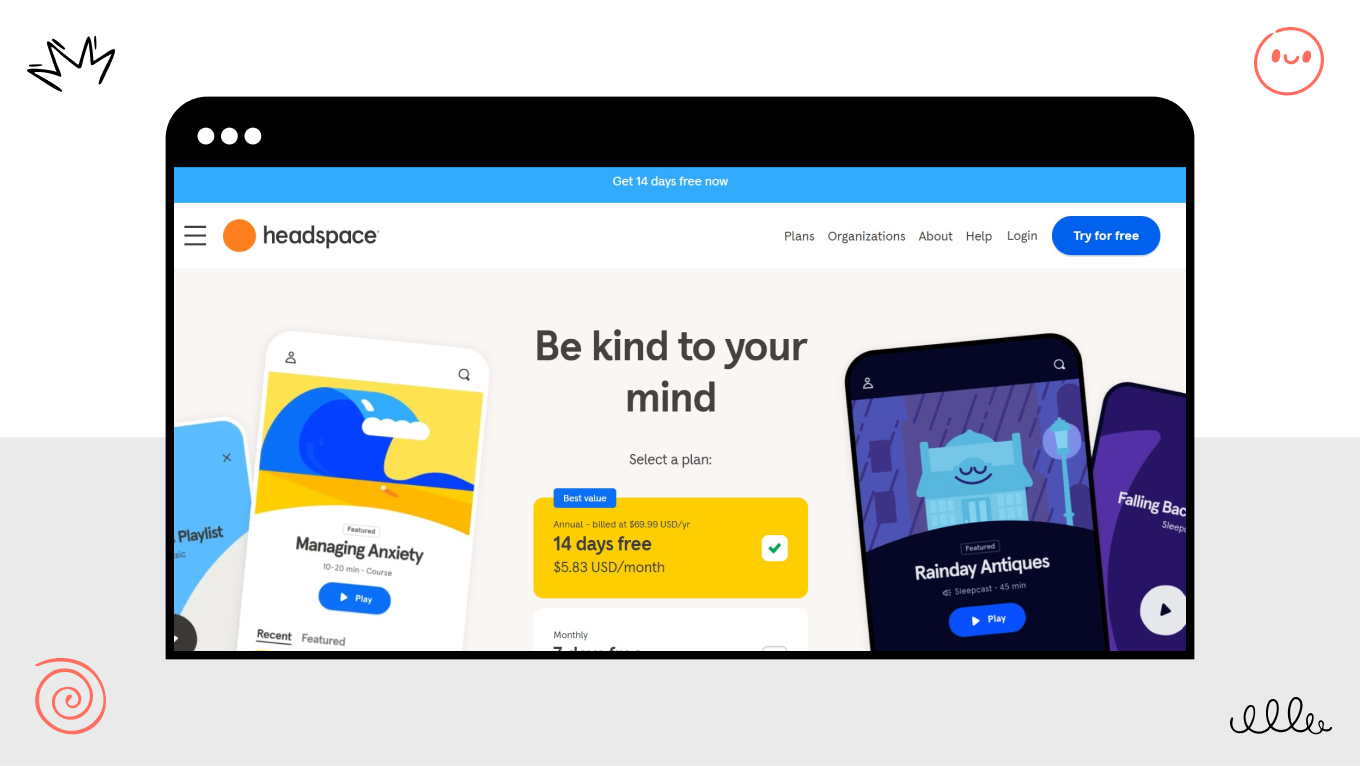
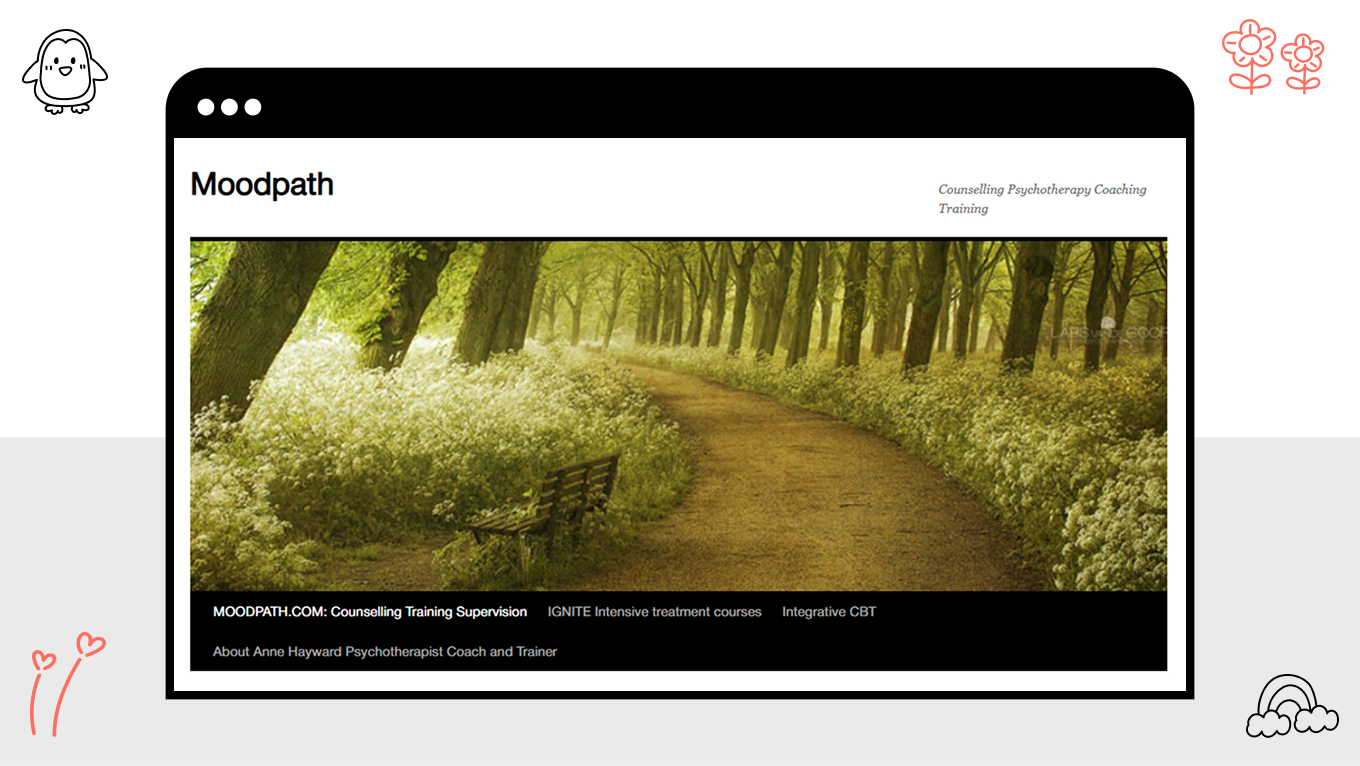
As mental health conditions now account for 62.1% of all telehealth diagnoses in the USA alone, the therapist’s office has moved to the screen. The brave act of asking for help usually starts with a blinking cursor in a search bar, often on a person's worst day. That means the mental health app or website they find has to be a safe harbor. If the first thing they encounter is chaos, confusion, or a cold interface, it feels like a door slamming shut when they need it open most.

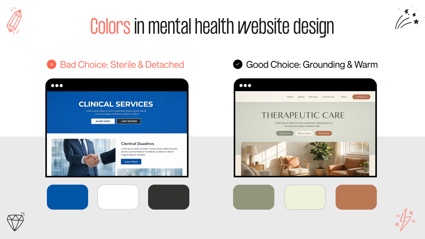
Designing for mental health requires a radical kind of gentleness. A mind navigating anxiety or trauma is already working overtime; it doesn't have the energy to fight with bad navigation or aggressive visuals. The interface needs to lower the volume. Besides, it should rely on seamless web development to feel steady, quiet, and intuitive, acting as a stabilizing force that makes taking the next step feel possible rather than overwhelming.

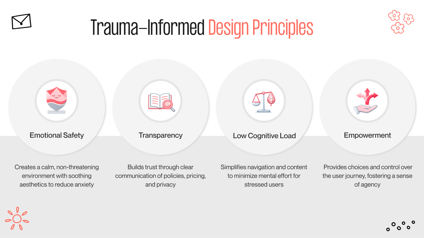
At Gapsy Studio, our work within the healthcare industry has taught us that empathy should be the foundation of digital architecture, especially when users arrive in moments of vulnerability. This article breaks down the strategies behind that approach. We will explore how visual aesthetics can regulate a user's nervous system, why navigation has to be designed for the anxious mind, and how to layer technical safety with human warmth.

Key Takeaways

  • Mental health websites should be designed with empathy first, recognizing that users often arrive in a state of emotional vulnerability and high cognitive load.

  • Clear navigation, calm visuals, and predictable interactions help create a sense of psychological safety and reduce anxiety at critical decision moments.

  • Visual identity design can actively support emotional regulation by using restrained color palettes, readable typography, and uncluttered layouts.

  • Trust is built through a balance of human warmth and technical reliability, including transparency, accessibility, and privacy-conscious design choices.

  • When empathy and strategy work together, mental health websites become supportive entry points to care rather than barriers to seeking help.

How We Put Empathy into Practice: The Mind Cleanse Case Study

Theory is vital, but seeing how empathy principles manifest in a real-world product brings the strategy to life. A prime example of such a philosophy in action is our work with Mind Cleanse, a mental wellness platform designed as a calm, user-centered SaaS experience that helps users manage stress through guided resources.

When Blake Bell, the founder of Mind Cleanse, came to us, he held a vision for a platform that could genuinely help users navigate stress. However, the project faced a unique hurdle common in the digital health space: how to build a tool that feels professional without coming across as cold.

The Challenge

The market is saturated with self-help apps that, ironically, create more anxiety through complex interfaces and data-heavy dashboards, signaling the need for a considered UX/UI redesign rather than new features. Blake’s users didn't need a digital medical chart; they required a place to exhale. Our task was to dismantle the "clinical" barrier and replace it with an environment that felt inherently safe from the moment it loaded.

Designing for the Nervous System

To create a true sense of calm, we focused on three core shifts rooted in branding design, where color, tone, and visual language work together to signal safety before a single word is read.

Our team: 

  • Moved away from the "hospital blues" and stark whites that dominate the sector, looking instead to the natural world for our palette.

  • Immersed the interface in soft sage greens and warm beiges, colors biologically wired to lower visual stress and signal safety to the brain.

  • Architected the user journey to feel less like data entry and more like a guided breath. Whether a user is tracking their mood or accessing a meditation, the interaction is frictionless, removing the cognitive weight often associated with self-care apps.

The Achieved Result

The result was a total transformation of the user experience. By prioritizing the emotional resonance of the design, we helped Mind Cleanse evolve from a functional tool into a digital sanctuary.

As the founder noted, this shift  worked. The seamless, "safe space" atmosphere became a key driver in attracting new clients, proving that in mental health, empathy is the most powerful feature you can build.

If you are building a tool for healing, the design should feel like part of the cure. Let’s talk about creating a digital space that truly supports your users.

Why Website Design for Mental Health Professionals Requires a Specialized Approach

Standard web design principles are built on a premise: catch the user's attention and drive them to a sale. Nonetheless, this logic breaks down in telemedicine, where websites should prioritize reassurance, clarity, and continuity of care. Moreover, in the mental health sector, such aggressive tactics can backfire. 

That is why we operate under a completely different set of rules when approaching website design for mental health professionals. After all, the "user" is a patient in a state of vulnerability.

A generic template cannot account for the nuance of a human being seeking help for anxiety, trauma, or depression. For these individuals, your website is a clinical environment. If the digital experience feels chaotic, cluttered, or overly "salesy," it triggers a feeling of unsafety that prevents a person from seeking care altogether.

Trauma-Informed Design

We utilize a framework known as Trauma-Informed Design. This means recognizing that the path to healing is rarely a straight line; instead, it is emotional, messy, and cyclical. To not guess at these paths, we use thoughtful customer journey mapping to understand the real human experience behind the screen. A visitor looking for a therapist is often in a state of high alert, unconsciously scanning for threats. They are looking for safety. Our design language prioritizes transparency and predictability to help that heightened nervous system finally relax.

This means that: 

  • Unexpected pop-ups, auto-playing videos, or confusing navigation menus can startle a nervous system that is already on edge.

  • Clear pricing, photos of the actual office, and explicit privacy statements answer the user's "am I safe here?" question before they even ask it.

The Cognitive Load Factor

This brings us to the critical challenge of cognitive load. A mind under stress operates with a shrinking window of tolerance; it has significantly less working memory available to process clutter or confusion.

In this state, intentional UI/UX design is what determines whether a user feels supported enough to continue or overwhelmed enough to leave. We design to preserve that limited energy, stripping away complexity so the interface acts as a clear, steady guide rather than another hurdle to overcome.

If a website forces a stressed user to click through four different pages to find a phone number, or if the layout is dense with text, the cognitive burden becomes too heavy. The user will leave; not because they don’t need the service, but because their brain cannot process the noise. 

Effective design acts as the "calm in the storm." We often achieve this through a strategic website redesign that quiets the visual noise, stripping away non-essential elements to restore the clarity a stressed mind craves.

How to Use Psychology for Best Mental Health Website Design

Visuals are the fastest language the brain speaks. Long before a user reads your mission statement or checks your credentials, their limbic system has already reacted to your design. In milliseconds, they decide: Is this place safe? Is it professional? Do I belong here?

To make great mental health website design, you should move beyond the idea of "decoration" and treat aesthetics as a clinical tool. The goal is to regulate the user's nervous system through visual cues.

The "Grounding" Color Palette

For years, the industry defaulted to clinical blue and sterile white. While these colors signal hygiene, they often feel cold, detached, or institutional, which is the exact opposite of a therapeutic environment.

Current tendencies are shifting towards Biophilic design. These are colors derived from nature that subconsciously lower cortisol levels.

  • Sage and moss greens. These tones mimic nature and are neurologically proven to reduce heart rates and induce calm.

  • Warm terracotta and sand: Unlike the starkness of white, these earth tones offer a sense of stability, warmth, and "grounding" for anxious users.

  • Soft charcoal: We often replace harsh black text (#000000) with soft charcoal (#333333). It reduces eye strain and feels less aggressive on the screen.

Typography as The Voice of Your Brand

In mental health website design, typography is about tone of voice.

We often recommend clean, rounded sans-serif fonts (like Open Sans or Lato) because they feel modern, approachable, and "human." Sharp, jagged fonts can subconsciously signal alertness or tension.

It’s also necessary to ensure high contrast and scalable font sizes, aligning with accessibility guidelines that reduce strain and frustration for users with visual or cognitive challenges. Your potential clients may have visual impairments or be neurodivergent; struggling to read small text adds unnecessary friction and frustration.

Imagery Authenticity Over Perfection

Nothing erodes trust faster than a generic stock photo of a “perfectly happy person” or the cliché stack of Zen stones, which is why thoughtful illustration design is often more effective for expressing complex emotional states without pressure or judgment. Such images feel performative and distant from the reality of the user's experience. We advocate for a shift toward radical authenticity to bridge this gap.

It starts with transparency about the environment. Showing photos of your actual office space, such as the specific chair the client will sit in or the natural light filling the room, helps demystify the process and removes the fear of the unknown. 

Similarly, when showing people, aim for candid warmth and genuine emotion rather than staged happiness. Clients need to feel that their current pain is understood, not that they are expected to arrive instantly "fixed."

Whitespace as the Visual "Exhale"

Clutter creates cognitive noise. For a brain in a state of overwhelm, a busy interface feels like a crowded room.

We use generous whitespace (negative space) to separate ideas. This isn't "empty" space; it is an active design that allows the user's eyes—and mind—to rest between pieces of information. It creates a sense of pacing, turning the scrolling experience into a digital exhale.

Best Practices for Mental Health Website Design

If aesthetics set the mood, User Experience (UX) sets the boundaries. In mental health website design, they should be defined by predictability, clarity, and emotional safety.

For a user in distress, surprise is a stressor. When working as your UX partner, we start with the understanding that a confused user is an anxious user. If your site structure is vague, or if your navigation tries to be too "clever," you risk alienating the very person you are trying to help. Our goal is to reduce the friction between the user's need and your solution, a core objective shared across well-executed healthcare UX design initiatives.

The "3-Second Rule" of Clarity

We often apply a simple litmus test: Can a tired, non-tech-savvy user find the "Book Appointment" or "Crisis Support" button within three seconds of landing on your page?

If the answer is no, the design has failed.

  • We strip away abstract icons or ambiguous menu labels, favoring clarity and convention over creativity in line with established web design standards. For example, instead of "Connect," we use "Contact."

  • Safety is built on predictability. We rely on a consistent design system to ensure that critical information (phone numbers, logins, and addresses) never shifts. This creates a subconscious anchor for the user. Much like knowing where the exit is in a crowded room, knowing exactly where the help button sits on every page provides a quiet sense of control in an otherwise overwhelming moment.

Mobile-First is a Privacy Issue

In most industries, responsiveness is discussed in terms of convenience. In website design for mental health, we view it as a privacy issue.

Data shows that over 60% of mental health searches occur on smartphones, reinforcing why mobile UX decisions in healthcare apps carry both usability and privacy implications. Crucially, they often happen in private moments, e.g., late at night in bed, in a parked car, or in a bathroom. If your site requires "pinch and zoom" or loads slowly on a 4G connection, you are failing the user in their most vulnerable moment. An adaptive, thumb-friendly design acknowledges the reality of their life, but a mobile-first design goes further by prioritizing the most critical actions before anything else.

Accessibility as Empathy

The mental health website design should be inclusive by default. You have to assume that many users visiting your site may be neurodivergent or experiencing symptoms that affect concentration, such as ADHD, anxiety, or severe depression.

How we approach this: 

  • Avoid dense walls of text that can feel suffocating. Instead, we use bullet points, bold headers, and generous line spacing to make content scannable and digestible.

  • Ensuring high contrast between text and background. Low-contrast grey text might look "sleek" to a designer, but it can cause eye strain and frustration for users with visual impairments or fatigue.

Safety First Approach

Not every visitor is looking for a consultation; some are in immediate danger. A responsible, empathetic design anticipates this difference.

We recommend placing a distinct (but not alarming) banner at the very top of the site containing immediate crisis numbers (like 988 or local hotlines). This clearly separates "emergency care" from "ongoing therapy," ensuring a user in crisis doesn't waste precious time searching for the wrong kind of help.

For practices specializing in trauma or domestic violence, a "Quick Exit" button floating on the screen is one more vital safety feature. One click instantly redirects the browser to a neutral site (like Google or a weather channel) to protect users who may be monitored.

Reducing the "Paradox of Choice"

For group practices, presenting a directory of 15 or 20 therapist profiles can be paralyzing. An anxious brain often freezes when presented with too many options.

Instead of a generic list, we implement filters based on need rather than just name. Allow users to filter by "What I'm Feeling" (e.g., Overwhelm, Grief) or "Insurance Accepted." This guides the user toward a solution rather than forcing them to “shop” for a person. This approach is grounded in data-driven insights, acknowledging that an overwhelmed mind needs a clear path. 

Reassurance Through Micro-Interactions

Anxiety breeds doubt. When a user submits a sensitive contact form or clicks "Book Now," they should never have to wonder, "Did that actually work?"

We apply this rule by using animations, like a button turning soft green or a checkmark gently appearing, to confirm an action was successful.

Nonetheless, you should avoid the robotic "Submission Received." Replace it with specific, human language: "Thank you. We have received your message and will reach out to you personally within 24 hours." This manages expectations and provides immediate emotional validation.

As designing for vulnerability requires a different level of precision, standard conversion tactics don't work. If you want to lower the cognitive load for your patients and build a platform that feels like a safe harbor, reach out. We’d love to share how we approach these sensitive challenges

5 Mental Health Website Design Ideas to Deepen Connection

Once the foundation of safety and navigation is in place, you can explore creative features that transform a website from a digital brochure into a therapeutic tool. 

These ideas aim to bridge the emotional distance between a hesitant user and the help they need.

1. The "Warm Welcome" Video

Static images can only convey so much. To truly lower the barrier to entry, consider embedding a brief, high-quality welcome video on your homepage or "New Clients" section. It’s a digital handshake. Allowing a prospective client to hear your voice, see your mannerisms, and witness your calm demeanor can instantly demystify the therapist behind the credentials. It answers the user’s most primal question: “Will I feel comfortable talking to this person?”

2. Gentle Entry Points 

Many visitors aren't ready to book a full session because they are still in the information-gathering phase. So, offering a "soft" interactive element, like a brief "Wellness Check-In" or a "Which Therapy Style Suits Me?" quiz, provides a low-stakes way to engage. 

This serves a dual purpose: it gives the user immediate value and self-insight without the pressure of a financial commitment, while simultaneously positioning your practice as a helpful guide rather than just a service provider.

3. Motion that Breathes

Animation in mental health design should never be flashy or fast. Instead, look to "biophilic motion," subtle, organic movements that mimic nature. Think of a background gradient that shifts as slowly as a sunset, or a line art illustration of a leaf that gently sways as the user scrolls. 

These micro-animations serve as visual cues to slow down and breathe, regulating the user's nervous system as they navigate the site.

4. Flipping the Script on the Bio

The standard "About Me" page often reads like a resume, filled with academic jargon and acronyms. A more effective approach is to make the client the hero of the bio. Instead of explaining where you went to school, open with a description of who you help and the specific struggles you understand. 

By mirroring the client's feelings back to them in your story, you validate their experience. The message shifts from "Look how qualified I am" to "I see you, and I know how to help."

5. The "Resiliency" Resource Hub

Trust is built through reciprocity. Instead of hiding all expertise behind a paywall, create a curated library of free resources. These can be grounding techniques, audio meditations, or jargon-free articles on common symptoms. 

Such a "freemium" model demonstrates generosity and expertise. When a user finds actual relief from a free breathing exercise on your site, they are infinitely more likely to trust you with their deeper, long-term care.

If you are rethinking how your digital presence communicates safety and care, we’d love to help. Contact us to explore how thoughtful, empathy-led design can make your users feel understood and supported long before they ever click "book appointment."

Great Mental Health Website Design Examples for Your Inspiration

Concepts like "trauma-informed design" and "biophilic aesthetics" can feel abstract until you see them lived out on a screen. The best way to truly understand the power of a digital sanctuary is to walk through one.

In this next section, we have curated a selection of websites that embody the principles we champion. These examples were chosen because they successfully bridge the gap between clinical professionalism and genuine human connection. They are functional ecosystems designed to hold space for the user. As you explore them, look beyond the surface; notice the pacing of the scroll, the clarity of the navigation, and the quiet invitation to pause and connect.

Talkspace: Low-Friction Onboarding

Talkspace understands that the hardest part of therapy is starting. Their design is engineered to remove the "clinical intimidation" factor entirely.

  • Instead of a dashboard that looks like a medical portal, the interface mimics the look and feel of standard messaging apps (like iMessage or WhatsApp). By using a UI that the user's brain already associates with casual, daily communication, they subconsciously lower the barrier to opening up.

  • Rather than presenting a daunting 20-question form, the site uses a conversational "wizard." It asks one simple question at a time ("What brings you here today?" "What is your sleep quality?"), accompanied by soothing micro-animations. This turns a medical intake into a manageable, step-by-step dialogue.

Also, notice how they balance the casual aesthetic with rigorous credibility. Verified badges, clear licensure details, and "HIPAA Compliant" seals are placed strategically near every "Join" button, answering the safety question before the user even has to ask.

BetterHelp: Guided Choice Without Overwhelm

BetterHelp tackles one of the most anxiety-inducing moments in mental health care: choosing the “right” therapist.

Instead of presenting a long list of profiles, the site leads with a guided matching flow. Users answer simple, emotionally framed questions (about what they’re struggling with, preferences, and expectations) before ever seeing a therapist’s face. This removes the pressure of making a “perfect” choice too early.

Crucially, BetterHelp positions the platform as an active helper, not a directory. The message is: you don’t need to know what you need—we’ll help you figure it out. That shift alone reduces decision fatigue.

At the same time, credibility signals (licensed providers, privacy assurances, clear pricing) are consistently present, reinforcing trust without interrupting the emotional flow.

Headspace: Emotional Regulation Through Visual Simplicity

Headspace demonstrates how visual design can actively regulate emotional state.

The interface uses soft colors, rounded shapes, and generous spacing as nervous-system-friendly cues. There is very little visual competition on screen, which helps users feel grounded rather than stimulated.

Navigation is intentionally shallow. Instead of forcing users to explore complex categories, Headspace surfaces clear, need-based entry points like stress, sleep, or focus. This respects the reality that users may not have the mental bandwidth to “browse.”

Importantly, the platform avoids clinical language entirely. The tone is warm, approachable, and non-judgmental, which makes it feel supportive.

Moodpath: Making Self-Reflection Feel Safe

Moodpath (now known as MindDoc) excels at guiding users through self-assessment without triggering defensiveness or fear.

Instead of diagnostic labels, the website emphasizes daily check-ins and reflective questions. The language is observational, not evaluative, which helps users engage honestly without feeling judged.

The design reinforces this tone: calm typography, neutral colors, and a steady rhythm to interactions. Nothing feels rushed. This pacing is critical when asking users to reflect on their mental state.

Moodpath also clearly communicates boundaries: What the app can help with and when professional support is needed. This transparency builds trust by setting realistic expectations and positioning the platform as a companion, not a replacement for care.

Let’s Create Safe Spaces Together

For a mental health professional, a website is the threshold of your practice and the place where the healing relationship begins.

We approach every project with the same empathy you offer your clients, ensuring that every color, transition, and interaction is designed to soothe rather than sell. This means that when deciding to outsource web design to us, you can be sure you are gaining a partner who understands that in this industry, the details are emotional.

Here’s what sets our design agency apart: 

  • Healthcare and mental wellness is our specialization. We understand the specific anxieties your potential clients face and how to quell them through design.

  • Psychology is built into our creative process. From color theory to navigation flow, every pixel is placed with the intent of regulating the user's nervous system and reducing cognitive load.

  • Tailored to your modality. We know that a psychoanalyst needs a different digital atmosphere than a somatic bodyworker. We avoid cookie-cutter templates and build a bespoke digital environment that mirrors the unique energy of your office.

  • Technical peace of mind. We bridge the gap between empathy and engineering. While we focus on the "feel" of the site, we also ensure the rigorous technical standards are flawlessly executed.

If you’re ready to create a website that feels as supportive and intentional as the care you provide, contact us to talk about how we can design a digital space that truly serves your clients.

To Sum Up

At its core, designing for mental health is not about pixels, code, or conversion rates. It is an act of digital hospitality and the practice of clearing a path through the internet's noise so that a person in need can find a place of rest.

We often think of the therapeutic work beginning only when the session starts, but the truth is that the healing journey begins the moment a client feels seen and understood. A thoughtful website bridges that gap. It whispers to the anxious visitor, "You are safe here. We can handle what you are carrying."

By prioritizing clarity over cleverness, warmth over sterility, and radical authenticity over curated perfection, you are extending your care beyond the four walls of your office, creating a space where the technology fades away, and only the human connection remains.

Let’s build a technology stack that feels like a human hand. Drop us a line to discuss how we can align your digital tools with the empathy your clients need.

Rate this article

20 ratings
Average: 4.9 out of 5

If you like what we write, we recommend subscribing to our mailing list to always be aware of new publications.

Do you have any questions? We tried to answer most of them!