How to Make Webflow Responsive?

8minutes read
responsive design webflow

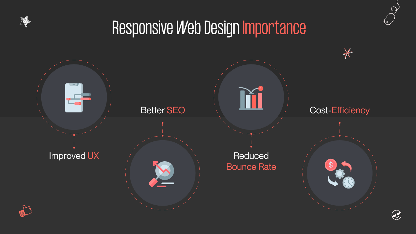
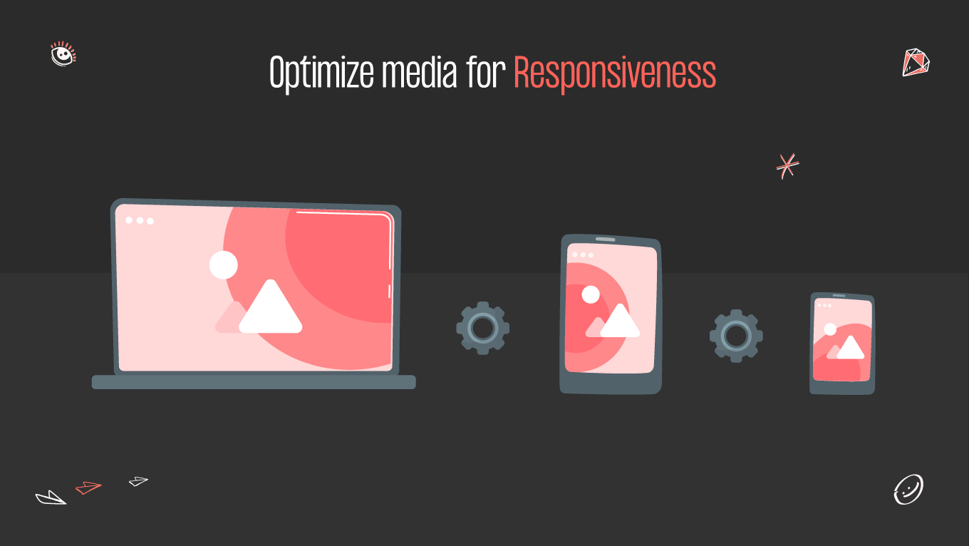
Today, the ability to create websites that look and perform flawlessly on numerous devices is more crucial than ever. Almost 60% of all Internet access is done through the phone. This statistic shows the need for developing responsive web designs. Here, we’ll explore the Webflow responsive design world. From the smallest smartphone screens to the largest desktop displays, the goal is to ensure that your website looks aesthetically pleasing and functions intuitively, offering a delightful user experience. Webflow will allow you to do so. Let’s delve into this!

What is Responsive Web Design?

Responsive web design is an approach to designing and building websites to ensure a consistent and optimal user experience across various devices and screen sizes. The primary goal of responsive web design is to make websites adaptable and visually appealing on a desktop computer, laptop, tablet, smartphone, or other devices with varying screen dimensions.

responsive web design importance
why is responsive web design important?

A survey says that 72% of people prefer mobile-friendly design. The responsive web design significance doesn’t end there.

  • Improved user experience. Responsive design ensures your website is accessible and usable across various devices and screen sizes. Visitors need to navigate and interact with your site quickly, regardless of whether they are on a desktop computer or a smartphone, which leads to higher user satisfaction.
  • Better SEO performance. Search engines prioritize mobile-friendly websites in their search rankings. A responsive design can boost your website's visibility in search results and drive more organic traffic by providing a consistent experience across devices.
  • Reduced bounce rate. Visitors are more likely to stay and explore your site if they have a positive experience. Responsive design reduces the chances of high bounce rates, where users leave your site quickly due to usability issues on their devices.
  • Cost-efficiency. Maintaining a single responsive website is more cost-effective than creating multiple versions of your site for different devices. It reduces development and maintenance overhead.

As you can see, responsive web design is crucial for providing an excellent user experience and saving time and resources. It's an essential aspect of modern web development that accommodates the diverse devices and user preferences in today's digital landscape. 

See Gapsy’s UI/UX design services.

Webflow Responsive Design Elements

Webflow provides various responsive web design elements and features, allowing you to create websites for multiple devices and screen sizes. Let’s take a look at the main ones.

  • Grids are elements with spaces in the columns and rows where content can be added. You can set a fluid grid automatically or manually to adjust across breakpoints. 
  • Breakpoints are where a website is prompted to change its layout due to changes in screen size or orientation (informed by media queries). Standard breakpoints include mobile, tablet, and desktop views. You can customize styles, layouts, and interactions for each breakpoint.
  • Media queries are the CSS function that uses size information from the user’s device to activate the design's breakpoints.
  • Responsive images are flexible images that Webflow adjusts or crops for various screen sizes. It helps optimize load times and visual quality.
  • Responsive typography is a similar function to responsive images. Webflow allows you to set font sizes, line heights, and spacing that adapt to different screen sizes, ensuring your text content remains readable on all devices.
  • The navbar component is designed to be responsive out of the box. It automatically adjusts navigation menus for smaller screens, often utilizing a hamburger menu icon for mobile devices.
  • The viewport is the visible area on the device where users can see content.

Don't know how to make Webflow responsive?

Gapsy Studio is ready to help you create a website in Webflow! Press the button and we will contact you.

Tips on How to Make Webflow Responsive

Mastering the art of Webflow responsive design requires more than just a creative eye. It demands a keen understanding of the platform's tools and techniques. Here is a list of best practices for creating an effective, responsive design.

Design for various devices

There are diverse devices people will access your website. The website’s laptop layout won’t fit the mobile layout. Given that devices now come in various sizes and proportions, it’s preferable to think of this as a fluid spectrum rather than separate categories. Additionally, users may switch between landscape and portrait while viewing on a mobile device, so don’t forget about this adjustment. 

See the mobile app design services we offer.

Different devices affect the way users interact with your website. Mobile gadgets have gestures like swipe and pinch when, for example, on desktops, users may not maximize browser windows. Consider every detail to ensure the best website performance possible. 

The digital world evolves daily. You don’t want to update the website with every technological advancement. Based on this, embed flexibility and fluidity from the beginning, thanks to the Webflow responsive design features.

Set up breakpoints

Webflow allows you to define specific breakpoints and customize your design for each one. In the Breakpoint panel, you'll see a list of default breakpoints, such as "Desktop," "Tablet Landscape," "Tablet Portrait," and "Mobile Landscape." You can add, edit, or remove breakpoints by clicking the "Add Breakpoint" or pencil icon next to each one.

webflow responsive design large breakpoints
large breakpoints in webflow responsive design

You can then adjust various design elements, including layout, typography, and visibility settings, specifically for that breakpoint. For example, you can change font sizes, reorganize layout elements, or hide specific content for a breakpoint.

webflow responsive design mobile breakpoints
mobile breakpoints in webflow responsive design

Setting up breakpoints is crucial for creating a Webflow responsive design that ensures a consistent and user-friendly experience for visitors on different devices. You can optimize your website's layout and functionality across various screen sizes by customizing your design for each breakpoint.

Consider a mobile-first approach

The mobile-first approach is a web design and development strategy that prioritizes designing and building a website's layout and functionality for mobile devices before scaling up to larger screens, such as tablets and desktops. This approach is based on the idea that mobile devices are now the most common way people access the internet, so it makes sense to design for them first to ensure a seamless user experience on smaller screens.

mobile-first approach
mobile-first approach in responsive design

With a mobile-first approach, you build a solid foundation for your website that works well on mobile devices. As you scale to larger screens, you progressively enhance the design and functionality, adding features and optimizing layouts without sacrificing the mobile experience. Designing for mobile first often results in more efficient and lightweight websites. It leads to faster load times and better overall performance, which is crucial for retaining mobile users who may have slower internet connections. 

Read in our blog: Mobile-First vs. Responsive Web Design.

Designing for mobile first means starting with a narrow viewport, which encourages simplicity and forces designers and developers to prioritize essential content and features for users. It ensures a streamlined and focused user experience. Start with mobile to ensure a consistent look and feel across all devices for building a recognizable brand and maintaining a coherent user experience. Based on this, you have a clear foundation to build upon, making it easier to add or modify features without breaking the site's core functionality.

Plan the layout

Begin by clearly defining the content and goals of your website. What information or features do you want to present to your audience? Understanding your content hierarchy and goals is essential for responsive design. Decide what content is most important and should be visible on all devices. This content should be easy to access and read regardless of the screen size. Consider what can be hidden or condensed on smaller screens to avoid clutter.

Webflow responsive design allows you to incorporate flexible grids with relative length units to make changes eventually to your layout without losing its logic. Set min-width, max-width, min-height, and max-height properties to keep those changes controlled and intentional. Additionally, Webflow provides excellent support for using Flexbox in your web designs, making it easy to create flexible and responsive layouts without complex CSS coding. 

Multiple columns on a laptop screen are readable and attractive. A mobile screen can make your content look crowded in this case. It’s where you can use the fluid grids function. The number of columns reduces as you move through progressively smaller breakpoints. 

Learn more about the web design services Gapsy provides.

Optimize media for responsiveness

Choose the image format for your content. For photographs and complex images, use JPEG. For images with transparency, use PNG. WebP is a modern, efficient format that offers good compression and quality. Webflow allows you to serve different image formats to various browsers, ensuring compatibility and performance. 

Media must scale with your layout. Think about how your images and the rest of your content are related. Are they simply decorative or informative? How will that function impact the scaling of your media content? While a background image may look good filling the screen behind, an infographic will only be useful if it's bigger to read.

optimize media for responsiveness
optimizing media for responsiveness

Webflow's responsive images feature allows you to serve different image sizes based on the user's device and screen resolution. Use this feature to ensure that visitors on mobile devices receive appropriately sized images for faster loading times. Always set the images’ dimensions (width and height) in HTML. It helps browsers allocate space for images, preventing content from jumping around as images load.

Test the website’s responsiveness

Webflow offers a built-in preview mode that allows you to see how your website looks on different devices where you can select different screen sizes and orientations to preview your site. 

For more accurate testing, it's better to test your responsive design on actual devices, including smartphones, tablets, and different desktop monitors. You can publish your project to a staging or development domain and access it on real devices for testing. 

Testing’s importance lies in its ability to uncover issues, verify functionality, and ensure quality. Detecting problems at the development stages saves time and resources by addressing issues at their source. Quality assurance is a fundamental aspect of testing. By verifying that a product or system meets defined quality standards, testing helps deliver a high-quality result that meets or exceeds user expectations. Test your website to see valuable feedback and data that can be used for continuous improvement. It helps teams learn from mistakes, optimize processes, and refine products for future iterations.

Bottom Line

The journey to creating responsive web designs in Webflow is an ongoing process of learning and adaptation. Embrace the challenge, stay curious, and never stop improving your skills. With dedication and practice, you'll be well on your way to crafting compelling user experiences that delight users, regardless of the device they're using. Webflow offers numerous tools for developing a high-quality website. Follow our tips to master the skill. 

Our team is always open to new collaborations. Check our portfolio and contact us if you want to create an outstanding design. Gapsy team can make all your wishes come true!

Rate this article

21 ratings
Average: 4.9 out of 5

If you like what we write, we recommend subscribing to our mailing list to always be aware of new publications.

Do you have any questions? We tried to answer most of them!