Design System vs Component Library: What’s the Difference and When Does It Matter for Your Business?

11minutes read
component library vs design system

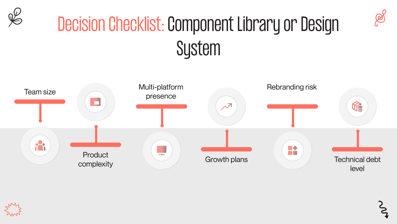
As product teams grow, one decision shapes how fast they can move: design system or component library?

McKinsey found that companies integrating design into their operating model outperform peers by 32% in revenue growth and 56% in shareholder returns. Yet most teams make this structural choice by accident and pay for it later in slower releases, rising maintenance costs, and inconsistent product experiences.

This article breaks down the difference between design system vs component library, what each approach costs you at scale, and how to make the right choice for your product.

Key Takeaways

  • A component library helps you ship faster today, while a design system keeps you shipping fast as your teams, products, and platforms multiply

  • The real cost of inconsistent UI is rework, longer QA cycles, slower onboarding, and delayed releases

  • A design system adds governance and shared standards that reduce coordination overhead and prevent fragmentation as you scale

  • Component libraries solve reuse at the feature level, design systems solve consistency and maintainability at the organization level

  • The right choice depends on your growth trajectory, platform footprint, and how much UI debt is already affecting delivery speed

  • Transitioning to a mature design system is a phased operational program that protects roadmap velocity while reducing long-term maintenance costs

Design System vs Component Library Definition and Core Concept

Before allocating budget or assigning ownership, you need a precise understanding of what design system and component library includes. Many leadership teams treat these terms as interchangeable, then wonder why velocity drops or maintenance costs rise. The difference becomes obvious once you look at scope, ownership, and long-term operational impact.

What You Get with a Component Library

A component library is a structured collection of reusable UI elements. It exists to help your team build interfaces faster by reusing prebuilt pieces instead of recreating them.

A component library includes

  • Buttons, inputs, dropdowns, modals, cards

  • Basic layout components

  • Shared frontend code snippets

  • Limited styling rules tied directly to components

The primary goal of a component library is speed at the execution level. Your engineers move faster because the building blocks are ready.

What component library does not provide

  • Clear design principles

  • Cross product consistency rules

  • Governance for introducing new patterns

  • Structured documentation for scaling teams

A component library accelerates development in the short term. However, it does not control how your product evolves as complexity increases.

What You Build with a Design System

A design system includes components, but it functions as infrastructure. It defines how your entire product design operates across teams, platforms, and future releases.

A mature design system includes

  • Reusable UI components

  • Design tokens for color, spacing, typography, and motion

  • Usage guidelines and accessibility standards

  • Clear documentation

  • Governance rules for updates and contributions

  • Defined ownership across design, product, and engineering

The primary goal of the design system is scalability and consistency. It protects your roadmap from fragmentation as you add new teams, expand to new platforms, or rebrand. Also, a well-built design system reduces duplication, limits design drift, and keeps operational costs predictable as you grow.

Design system benefits

  • Faster feature delivery across multiple teams

  • Reduced duplication and rework

  • Shorter onboarding time for new designers and engineers

  • Lower long-term maintenance and refactoring costs

  • More predictable release cycles

  • Stronger brand consistency across products and markets

Component Library vs Design System Differences That Impact Growth

Before committing resources, it's worth understanding exactly what separates a component library vs full design system. They may look similar on the surface, but affect growth, cost structure, and team coordination in different ways. Getting this clarity early prevents expensive restructuring down the line.

We’ve prepared a table that highlights where those differences become visible from a business perspective.

Design area

Component Library

Design System

Scope and Structure

Standardizes individual UI elements such as buttons, forms, and layouts

Defines the full interface architecture, including tokens, interaction patterns, and structural rules

Governance and Decision-Making

Informal ownership, usually within the frontend, new components added as needed

Structured governance model with cross-functional ownership and clear approval processes

Scalability Implications

Supports small to mid-sized teams; coordination becomes harder as squads multiply

Enables parallel team growth across products and platforms with controlled expansion

Long-Term Maintenance Cost

Increasing refactoring and QA overhead as variations accumulate

Centralized updates, reduced duplication, and predictable maintenance effort

Scope and Structure

With a component library, you standardize individual UI elements. Your team reuses buttons, inputs, and layouts to move faster inside existing product boundaries. That works well while your structure remains simple and centralized.

With a design system, you define how your entire interface operates. You can establish tokens, naming rules, interaction standards, and clear documentation that guide every new feature and product line. This gives you structural clarity as your organization grows.

Governance and Decision-Making

When you rely on a component library, your teams introduce new elements as needs arise. You gain flexibility, but you also risk duplication, gradual inconsistency, and decisions that stay local to squads.

When you implement a design system, you create a shared decision framework. This allows for defining who approves new patterns, how updates are rolled out, and how standards evolve. Thus, you can reduce friction between teams and keep your roadmap stable as more contributors join.

Scalability Implications

A component library improves execution speed inside a contained environment. You move faster on individual releases, especially with a small or mid-sized team.

A design system supports your organizational growth. Multiple squads can build in parallel without redefining standards. You maintain consistency across mobile and website design, and additional platforms while protecting velocity.

Long-Term Maintenance Cost

Component libraries tend to accumulate inconsistencies over time. Minor differences across implementations increase QA effort and refactoring workload. Large updates, such as rebranding, can turn into costly multi-quarter projects.

Design systems let you centralize control. Visual changes roll out through tokens, standards limit drift, and documentation reduces errors. You shift from reactive cleanup to controlled, predictable maintenance.

Before you scale your team further, make sure your interface foundation can support it. Book a consultation to evaluate whether a component library is enough or a design system is the smarter investment.

Design System Examples And What They Prove

Large technology companies built design systems because scale exposed a common set of problems: rising maintenance costs, inconsistent user experiences, and teams that couldn't stay coordinated. For them, a design system became a way to control complexity, align execution, and sustain delivery speed as operations grew. Their experience makes the case for treating design as a management tool. 

Google: Material Design

Google operates across dozens of products, platforms, and devices. Without a unified system, each product team would interpret interface patterns differently, creating fragmentation across Android, web applications, and internal tools.

google material design

Material Design solved several structural challenges:

  • Protect product consistency across billions of user interactions

  • Accelerate product launches across devices and platforms

  • Reduce coordination overhead between distributed teams

  • Strengthen the product adoption process by giving external developers clear standards

Material Design was about alignment at scale. Google needed a common language that worked across hardware, software, and third-party developers.

What you can learn

Even if you operate one core product today, platform expansion will expose inconsistencies quickly. A shared framework prevents divergence before it becomes expensive.

Shopify: Polaris

Shopify serves millions of merchants while continuously shipping new commerce features. As their ecosystem expanded, interface consistency became critical for merchant trust and usability.

shopify material design

Polaris addressed:

  • Increase merchant trust through a consistent user experience

  • Ship new commerce features faster without reinventing patterns

  • Lower support friction caused by inconsistent workflows

  • Scale its partner ecosystem without losing brand coherence

For Shopify, this was a scalability decision. The platform needed to evolve without confusing users or overloading engineering resources.

What you can learn

If your product includes dashboards, workflows, or multi-step processes, inconsistency increases friction. Structured standards reduce cognitive load and accelerate iteration.

IBM: Carbon

IBM operates in enterprise environments where clarity, accessible design standards, and compliance are non-negotiable. Their product ecosystem spans cloud services, AI tools, security platforms, and internal enterprise solutions.

ibm material design
ibm material design

Carbon helped IBM:

  • Reduce compliance risk through standardized accessibility practices

  • Cut redundant development effort across global product teams

  • Improve delivery predictability in complex enterprise environments

  • Present a unified branding design across legacy systems and modern platforms

What you can learn

As soon as you enter regulated markets or enterprise sales, inconsistency signals immaturity. A structured system strengthens credibility and reduces risk during procurement reviews.

Atlassian Design System

Atlassian manages a suite of collaboration tools used by distributed teams worldwide. Multiple products, shared user bases, and frequent feature releases create coordination challenges, which their design system example needs to solve.

atlassian material design

Atlassian design system enabled:

  • Seamless cross-product experience that improved customer retention

  • Faster parallel development across multiple product teams

  • Lower onboarding time for engineers entering mature codebases

  • Controlled evolution of UI without costly redesign cycles

What you can learn

When you expand your product line, users expect a unified experience. A system allows you to introduce new tools without rebuilding the foundation each time.

Common Misconceptions About Component Library vs Design System

Misunderstandings about design systems delay decisions that matter. Leadership either overestimates the complexity or underestimates the business impact. Both mistakes surface later as slower velocity and rising maintenance costs.

Let’s address the most common assumptions.

“A design system is just a bigger component library”

When you look at it through the lens of size, the distinction between component library vs design system seems minor. You may assume that expanding your component library achieves the same result as building a system. In reality, you are comparing a toolkit with an operating model.

A component library gives you reusable elements. A design system gives you rules for how decisions are made, how standards evolve, and how teams align. From your perspective as a leader, the difference is governance and predictability.

If you scale without governance, inconsistency grows with headcount. If you scale with structured ownership and documentation, growth creates leverage instead of confusion.

“It’s only for enterprises”

You might believe design systems are necessary only when you reach enterprise scale. Large companies feel the pain first because their complexity is visible. That does not mean smaller teams avoid the same pattern.

The moment you add multiple squads, expand to new platforms, or hire aggressively, coordination becomes harder than execution. Structure becomes a growth enabler.

If you wait until fragmentation is obvious, you will invest significantly more in cleanup. Building standards earlier protects you from costly restructuring mid-growth.

“It slows teams down”

You may worry that introducing a design system adds process and limits flexibility. That concern usually comes from seeing poorly managed frameworks.

When you implement it correctly, you remove friction. Clear standards eliminate recurring debates. Documented patterns reduce ambiguity between design and engineering. Your teams spend more time building and less time interpreting.

Short bursts of freedom can feel productive. Over time, the absence of structure increases rework and QA effort. Sustainable velocity requires clear constraints.

“It’s just about visual consistency”

If you view a difference between a design system vs component library as a branding tool, you underestimate its impact. Visual alignment is only one layer.

What you gain is operational consistency. Interaction rules, accessibility standards, naming conventions, and contribution guidelines become predictable across teams. That affects onboarding speed, release reliability, and long-term maintenance costs.

Users benefit from clarity and trust. Your organization benefits from reduced duplication and controlled evolution of the product.

If you are questioning whether your current setup can support your next stage of growth, it makes sense to evaluate it before complexity compounds. Contact us to review your product structure, identify hidden inefficiencies, and determine whether a component library is sufficient or a design system is the smarter long term investment.

How to Decide: Design System vs Component Library?

The decision component library vs design system should follow your growth trajectory. The right choice depends on how complex your product is today and how difficult it will become in the next 12 to 24 months. Below is a practical checklist to help you evaluate your position.

design system vs component library

Team Size

If you operate with one small product squad, a component library may be enough to maintain speed and alignment in graphic design. Communication is direct, and informal coordination still works. Once you have multiple squads working in parallel, alignment becomes harder than execution. 

Building a design system creates shared standards that reduce cross-team friction and prevent divergence. Ask yourself: are your teams debating patterns repeatedly, or building features efficiently?

Product Complexity

A simple product with limited flows can function well with reusable components. The surface area remains manageable. As workflows multiply, dashboards expand, and user roles diversify, inconsistency becomes more expensive. 

The design system gives structure to complexity. It reduces interpretation gaps and ensures that new features fit into a coherent framework. If your roadmap includes advanced workflows, permissions, or enterprise-grade functionality, structure becomes strategic.

Multi-Platform Presence

Operating on a single web platform limits variability. A component library can support that environment effectively. When you expand to mobile app design, internal tools, marketing sites, or partner portals, consistency becomes harder to maintain. 

When you create a design system, you centralize tokens, interaction rules, and standards across platforms. If your experience must feel unified across environments, infrastructure matters.

Growth Plans

Rapid hiring increases coordination overhead. New designers and engineers bring their own habits and assumptions. Without documented standards, onboarding time increases and variation spreads quickly. 

A design system accelerates integration by giving new hires a clear framework from day one. If you plan aggressive growth, your structure should support it.

Rebranding Risk

Rebranding without centralized design control is expensive. Updating scattered components across multiple repositories often turns into a multi-quarter effort.

With a design system, you reduce that risk. Centralized tokens and standardized UX design patterns allow visual changes to roll out systematically. If your brand positioning may evolve, infrastructure protects your budget.

Technical Debt Level

Look at your current UI landscape. Are there multiple versions of similar components? Do teams maintain slightly different variations of the same pattern? Does refactoring consume increasing engineering time? When technical debt is rising, a design system becomes a corrective mechanism. It helps consolidate, standardize, and prevent further drift.

How We Help Companies Build a Scalable Design System

Gapsy Studio is a product and UI/UX design partner that helps companies build structured, scalable design systems aligned with business growth. With over 12 years of experience in digital strategy, UI architecture, and product scaling, we work with founders, CTOs, and product leaders who need stronger operational control behind their interface.

We treat design systems as infrastructure that protects velocity, reduces technical debt, and supports long-term expansion.

Our Approach

We start with a comprehensive UX audit of your existing UI and component architecture. This includes mapping inconsistencies, duplication, structural gaps, as well as quantifying where engineering effort is lost to fragmented patterns.

From there, we build a scalable token and naming architecture that standardizes visual and interaction rules, backed by clear documentation that accelerates onboarding and team collaboration. Implementation follows a phased migration plan, so your teams keep shipping features while the system is introduced. 

What Problems We Typically Solve

Most companies come to us when growth begins to expose structural friction.

  • Release velocity slows as teams debate patterns instead of building features

  • Interface inconsistencies appear across products and platforms

  • New developers require extended onboarding time to understand the UI structure

  • UX/UI redesign initiatives become expensive and resource-intensive

  • Collaboration between design and engineering becomes reactive instead of aligned

Results Our Clients See

When the system is implemented correctly, improvements become measurable.

  • Faster feature delivery across parallel squads

  • Reduced rework and fewer QA cycles

  • Smoother scaling of product and engineering teams

  • More predictable UI maintenance costs over time

Assess whether your current setup can support your next phase of growth! Contact us to start the conversation.

Final Thoughts

The difference between a component library and a design system becomes visible when growth accelerates. In the early stages, reusable components may be enough to maintain speed. As complexity increases, structure determines whether your organization scales smoothly or absorbs rising coordination costs.

This decision is less about design maturity and more about operational readiness. A component library optimizes output at the team level. A design system protects alignment, controls maintenance effort, and supports predictable expansion across products and platforms.

If your roadmap includes new markets, additional teams, or platform growth, the structure behind your interface becomes a strategic asset. Investing in the right foundation early is significantly less expensive than restructuring under pressure.

To get an objective assessment of where your current setup stands, contact us to evaluate your interface structure and define the most efficient path forward.

Rate this article

20 ratings
Average: 4.9 out of 5

If you like what we write, we recommend subscribing to our mailing list to always be aware of new publications.

Do you have any questions? We tried to answer most of them!