8 Steps How Design Can Help to Reduce Bounce Rate on a Website

13minutes read
how to reduce bounce rate of website

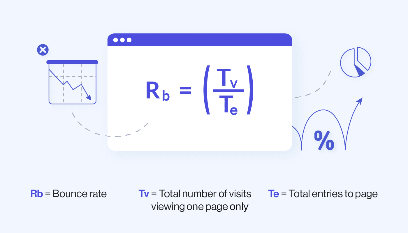
Site visitors don’t always find what they are looking for in it. The reason can be in irrelevant content, hard-to-read structure, or intricate design. As the result, the user leaves (most likely to your competitor.) Thus, bounce rate is a metric that shows the total number of users who visit the website but leave without converting.

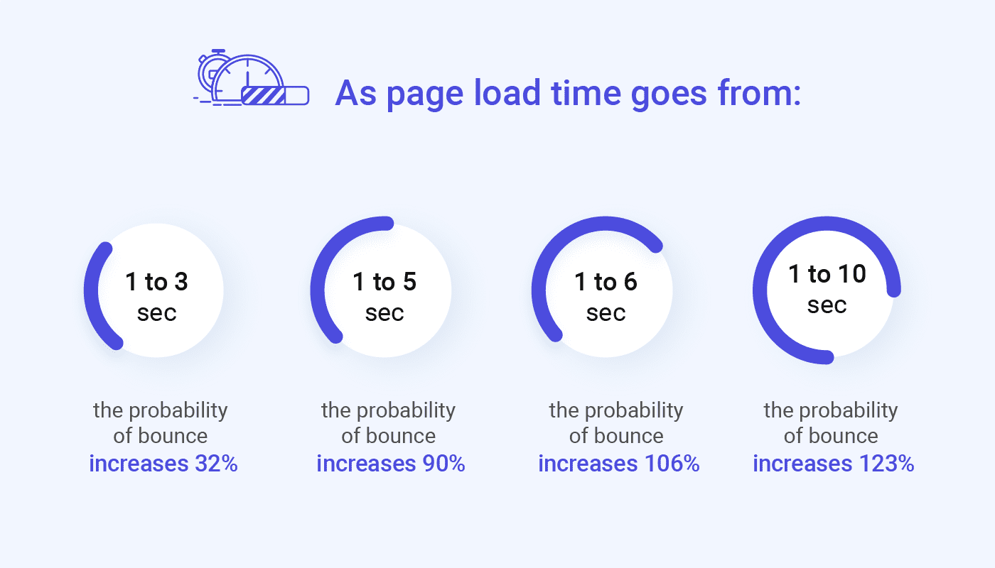
Many website owners, developers, and marketers overlook an essential parameter- a bounce rate in Google Analytics. A high bounce rate indicates that the web pages don’t meet the user’s expectations. The reason is probably in slow website loading, poor navigation, lack of optimization for mobile devices, etc. All of these factors make visitors leave your site quickly. A decrease in bounce rate will mean that your site is optimized for quality traffic and conversions. This article will analyze what reasons force users to leave your site quickly and how to reduce this indicator.

We’ve got 8 ways to reduce the website bounce rate. But first, let’s figure out what is a website bounce rate?

What is a website bounce rate?

Web page bounce rate is a single-page view session on your site. A bounce in Google Analytics is a session that activates only one request to Google Analytics (for example, if a user opened one page of the site and left it without activating other requests).

The bounce rate is calculated by dividing the number of single pageview sessions by the total number of visits, which is a fraction of the total number of sessions.

What is website bounce rate?

Web page bounce rate is one of the most controversial metrics when it comes to measuring online marketing results. It’s usually analyzed to get an idea of ​​the overall user experience.

Google defines bounce rate as “a session with one-page view on a site.” While the definition seems straightforward, the reasons for failure can be pretty complex. Sometimes it can be a bad user experience, and in some cases, the opposite situation can be observed, and a high bounce rate, on the contrary, indicates a great UX.

We are talking about situations when a user needs, for example, a dish recipe. By clicking on the search results link, they immediately see what they need and leave the site. That is, all the necessary information is available; no additional effort is required to find it. This speaks to a great user experience despite a high bounce rate.

However, if you are sure that a high web page bounce rate is evidence of some kind of flaw, it has to be corrected. Therefore, we decided to collect for you some helpful advice that you can use.

8 steps to reduce website bounce rate:

1) Pay attention to page load speed

According to Google, if a site takes more than three seconds to load, 53% of users will leave. The content of the page doesn’t matter if users don’t see it right away.

Download page speed is critical on mobile devices too. So, in 2018, it became one of the ranking factors in Google. The company also said that mobile pages that dropped from 1 second to 10 seconds had a web page bounce rate of 123%.

.

Also, keep in mind that low download speeds annoy users. Pay attention to the web page loading speed.

Pay attention to page load speed

This is a graphic of the bounce rate increase versus the page speed decrease.

P.S. You can check the speed of your site using the PageSpeed ​​Insights tool.

2) Simplify your site search (or add one if you haven’t already)

Many resources are abandoning the site search function, thereby making life difficult for their visitors. If a user is looking for something specific and doesn’t see it immediately after entering the site, then it’s essential that he can use the search box. Otherwise, it will leave the site.

Research results have shown that 90% of users don’t go beyond the site’s first page when searching. Therefore, you shouldn’t hide the corresponding line behind a pile of visual elements. In addition, users who actively search a site are more likely to spend more time on it.

Consider the search if your site has a lot of pages and items. Your website’s guests shouldn’t click on everything searching for the information they need; they value their time and want comfort.

3) Pay attention to design

Good web design is intuitive and increases user credibility. Users are unlikely to waste their time on a site with difficult navigation or one that looks suspicious. Research by Social Triggers shows that users are not interested in content on poorly designed sites. Thus, 94% of respondents refused to visit an unattractive site. And only 6% of the study participants were confused by the quality of the content provided.

Compare these two e-commerce sites:

Pay attention to design

The first shows the user everything at once. Site owners care little about user experience. Even if you know exactly what you are looking for, you will unlikely to quickly find the product you are looking for on the first site. The second, in turn, looks much more attractive.

Still think that design is not such an essential part of the design? Then read our article What is the value of design for your business and see the opposite!

Make your design clear and ready to interact with users on any device. Technical issues directly affect the loading speed and the correct display of information on the pages, so you definitely won’t give up on adapting the site for different devices.

4) Simplify navigation

Navigation should be simple, straightforward, and not require any effort from the user. According to research by Nielsen, hamburger menus and hidden navigation significantly impair user experience. So, on desktops, users preferred the hidden menu only in 27% of cases. Combo boxes and visible menus were selected 50% and 48% of the time, respectively.

Simplify navigation
Simplify navigation

Hidden navigation was used 57% of the time, and combo boxes 86% in mobile app design. The study results showed that users in principle tend to choose site navigation (if any) over search.

Here are some tips to follow designing a navigation block:

  • Give preference to a tree-like menu structure.
  • The number of nesting levels should be no more than two or three.
  • It is necessary to show the user which menu item he is at the moment.
  • If there are multiple levels of nesting, use breadcrumbs.
  • If you have an extensive catalog, you can use the drop-down menu items. They will allow you to get rid of long canvases of text that are difficult to navigate.

5) Remember about readability

The content on the page should be formatted and easy to read. Users don’t want to read indigestible and poorly structured articles. Break up large amounts of text into paragraphs, add videos, images, and bulleted lists. A significant number of information always increases the web page bounce rate.

Another important aspect is the text readability index. Site owners should pay attention to it, as readability is one of the main factors in Google ranking. In addition, research data shows that only 16% of website visitors read texts from start to finish, while 79% prefer to skim through them. That is why it is important to make sure that they can assimilate as much information as possible.

Usually, the index is calculated based on several parameters, such as the length of sentences, words, the specific number of the most frequent (or rare) words, etc. The most popular formula for calculating is the “Flash Readability Index”. It was specially designed for the English language. As follows:

The FRE Index is calculated as follows:

use FRE Index during readability
Use FRE Index during readability

100: easy to read. The average sentence length is 12 words or less. There are no words with more than two syllables.

65: simple language. The average sentence length is 15 to 20 words. On average, there are two syllables in words.30: A little hard to read. Sentences contain up to 25 words. Lots of two-syllable words.

0: Very difficult to read. On average, a sentence has 37 words. The word has more than two syllables on average.

Remember the main thing!

Offer personalized and educational content to help grab user attention and build loyalty to your brand design. They will explore exciting content on the site, subscribe to your blog, and feel like you wrote this story for them.

6) Use different types of content

Everything is pretty obvious – it is difficult for a modern user to focus their attention on one thing for an extended period. Scientists in South Korea have even come up with an appropriate term for this phenomenon – digital dementia. In 2007, scientists noticed that more and more adolescents suffer from memory loss, attention disorders, and low self-control levels. Research has shown that these patients experience changes in their brains similar to those of a traumatic brain injury. The reason was the widespread use of smartphones and the growing level of “digitalization” of the world.

As we noted in the previous paragraph, only 16% of users view content on sites in full. Therefore, it is extremely important to diversify it to interest users. In addition, it can have a positive effect on the position of the site in the search. Thus, a video on a website increases the chance of a resource getting to the first search page 53 times.

  • Be extremely careful in posting videos. Otherwise, you risk making it worse. No autoruns or a healthy window that follows the visitor. It is better to create a special section on the site with useful content that will delay the user for tens of minutes or even hours.

7) Take care of links

Broken links impair the user experience with the site and increase the webpage bounce rate. And they are just as annoying as pop-ups. You can check if there are broken links on the site using:

You need to use internal links to increase the duration of a user’s stay on the site. In addition, their presence makes it easier to navigate.

Reduce website bounce rate taking care of links

It is also essential to make sure that links open on separate tabs. This will allow users to open several pages at once, spending more time on the site.

8) Apply CTA buttons correctly

If there is a call to action on the page, it should be clear and visible. Visitors should notice it in the first seconds of being on the site. Besides, CTA buttons need to be attractively styled. According to experts, the best colors for such elements are green and orange, although it all depends on the site’s design.

In 2006, Jacob Nielsen, founder of the Nielsen Norman Group, studied how users browse websites. It turned out that the most common pattern of a user’s eye movement is the F-pattern. On a heatmap, it looks like this:

F-pattern CTA buttons

This is one of the first examples of the F-pattern demonstrated in Nielsen’s research in the early 2000s.

According to experts, these studies have lost their relevance over time since they do not consider mobile users’ behavior. However, in 2017, Nielsen representatives proved the applicability of this information, including for mobile users. In addition to the F-pattern, experts also distinguish the Z-pattern:

CTA Z-pattern on a website

and Gutenberg Diagram:

Apply Gutenberg Diagram during web page bounce rate

Conclusion

Of course, we have listed far from all the methods specialists use to reduce website bounce rate. If you notice a high bounce rate on your website, don’t rush to sound the alarm. The first thing to do is check the benchmarks. The bounce rate for one-page and blogs can go up to 90%, and for large e-commerce projects, it shouldn’t exceed 40%.

If the indicator still exceeds the norm, check if you correctly define the site’s primary goals. For an online store, the very fact of purchase is essential. To nudge the user towards it, you need to guide the user to product categories and their descriptions. If your main goal is to read a blog post, focus on scrolling the content and not getting tied to the number of pages viewed.

There are several ways to optimize the web page bounce rate, for example, by reducing the load time of the site, improving the UX, creating a responsive version. Be sure to check if your traffic is targeted. And if you still doubt that you can understand the reason for the high bounce rate from the site, you should resort to a UX audit. Still not sure what it is? Then rather read our article Everything About UX Audit and how businesses can benefit from it and order a quality website audit. To see our expertise, you are welcome to our projects at Dribbble and Behance, as well as you can take a look at our services and what we can provide you in your work.

Rate this article

20 ratings
Average: 4.9 out of 5

If you like what we write, we recommend subscribing to our mailing list to always be aware of new publications.

Do you have any questions? We tried to answer most of them!