Meet 6 Best Practices on Improving Your Website Design

12minutes read
how to improve website design

Web design is intended to provide high consumer characteristics and aesthetic qualities. How long the visitor will be on the site depends on how understandable, adaptive, and attractive it will be. It usually takes less than 15 seconds for a user to figure out if they have opened the right site. Accordingly, web design and site usability have a direct impact on conversion rates.

Very rarely we get to do something perfectly the first time. This rule is also quite true for technologies- it’s never too late to improve your website design. There is always something to improve and strive to. Let’s take a look at your site from the outside and together think about what else you can do to get more sales and traffic and increase your website’s conversion.

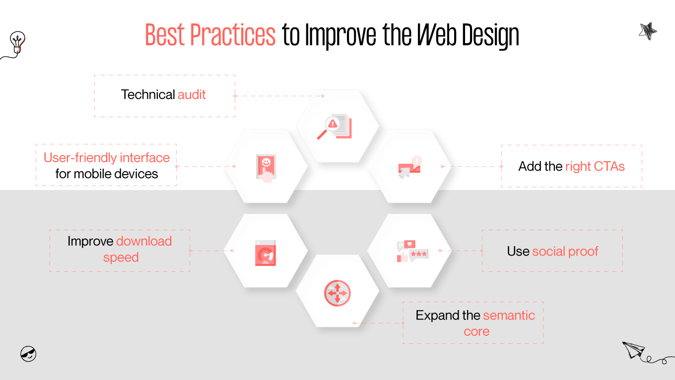
To make this task easier for you, we’ll show you ten website elements you can add to make your online resource more professional and better. We assure you – at least one of the items on this list will be relevant for almost any site on the Internet.

What is website improvement?

Website improvements are work on improving and developing an Internet resource. They are required almost always, even if at first it seems that they are not.

Surely you regularly add content to the site, answer questions and comments from visitors, and just make sure that everything stays in place. However, this is not enough: maintaining a site is not the same as improving it.

Over time, any resource becomes obsolete, new trends in programming appear and search engine algorithms change. The site must adapt to all changes.

Why improve your website design?

If you want the site to be in the TOP, you can’t do without improvements! It is a mistake to think that a good site will climb to the top of the search results by itself and remain there forever. Promotion is an ongoing process that requires development and support.

To make it more straightforward, we will give specific examples. You definitely can’t do without improving website design when:

  • The site unexpectedly dropped in the SERP;
  • Google has introduced new algorithms and urgently needs to adapt to them;
  • A filter has been applied to the site;
  • The company has rebranded;
  • There have been functional changes in the company (the payment system has changed or the company has switched to a different audience);
  • There was a large number of site failures;
  • Found a lot of bugs in the code;
  • The number of mobile users has grown – urgently create a version with the mobile design!

Like a person, a web page must change all the time to live and flourish.

Best six practices to improve your website design

In 2021, search engines will continue to improve their algorithms, considering increasing factors when ranking results in SERPs (Search engine results page).

tips to improve the web design
how to improve the web design?

We decided to compile a list for you of the six most common tips on how to improve your website design:

1) Technical audit

A technical site audit is a set of measures to check the site for various internal errors. This set of works allows you to identify errors that negatively affect the functional operation of the site and can also impede the promotion of the resource in search engines. Timely detection and elimination of technical problems are thereby good website promotion, as analysis for its usability and good web design improvement.

The resource analysis is carried out on such points as:

  • checking duplicates and technical pages;
  • restricting the use of canonical URLs;
  • checking 404 error pages and redirects;
  • analysis of the quality of texts on the pages (compliance with the semantic core, no over spam);
  • image optimization check (ALT attribute);
  • and many other components that affect the quality of the site.

Some things are checked only before the site’s launch, and some require regular monitoring. A specialist’s checklist can have more than a hundred items, and that’s just for SEO. And it is always better to turn to professionals than to check it yourself based on some document found on the Internet.

You can get to know more about the audit in our article Everything About UX Audit And How Businesses Can Benefit From It.

2. User-friendly interface for mobile devices

If earlier it was only desirable to have a website design responsive to mobile phones, now it is mandatory. On April 21, Google updated its site ranking algorithm. From now on, a site that has a mobile-friendly design will rank higher.

Judge for yourself, if your site has tiny links and confusing navigation, will people who logged in from a cell phone want to stay on it? That’s just it. Even if you just set compression and zoom, it won’t make your website more pleasant.

If you are not sure if your site displays well enough on mobile, you can use special tools to test its usability on different screen sizes. Look at Gapsy's responsive design for the Remote.job project:

user-friendly interface for mobile
remote.job gapsy's project

If you want to know more about what adaptive design is, read our article What is Responsive Website Design and How it Works?

3. Improving download speed

Page speed has become one of the ranking factors. If your website’s pages load slowly, it negatively affects everything – bounce rate, conversion rate, and, more recently, even rankings.

The need to wait too long for the pages to load is one of the most unpleasant experiences for the user, especially when even the mobile Internet is available reasonably. According to surveys, up to 3-4 seconds is the maximum loading time, which people find comfortable. And even a two-second delay can increase the bounce rate by 2%.

You can improve this indicator by optimizing images, code, and, if necessary, the site database. All this together can provide a tremendous increase in site speed.

4. Expanding the semantic core

The semantic core is collecting keywords, search terms that relate to your business, service, and product. Potential customers use them to find the information they need or make a purchase, so semantics is used to optimize individual pages and the site as a whole and in search engine optimization and contextual advertising.

semantic core explanation
what is a semantic core?

In many niches, new topics regularly appear on which you can write articles or for which you can create landing pages – events, changes in the market, exciting and controversial issues. The same is true for trending products, the demand for which can grow sharply, and if you notice this promptly, you can get a good profit.

Therefore, one of the proven ways to improve the website’s position is to make it more informative for users and attract more traffic to update and update the semantic core. And an even better effect can be achieved if you do this work regularly, for example, with an interval of several months.

5. Use social proof

Social proof or informational social influence is a psychological phenomenon that occurs when some people cannot determine their preferred behavior under challenging situations. Assuming that others are more familiar with the situation, such people consider their behavior to be preferable. This phenomenon is often used to manipulate the behavior of others deliberately.

Reviews are also social proof. It also includes:

  • snippets of ratings
  • number of pages and video views
  • number and “quality” of clients in the portfolio
  • the number of subscribers of communities in social networks
  • number of subscribers to the newsletter

If you already have good results that anyone you come across can boast of – go ahead. Feel free to show them.

6. Add the right CTA button

There are 3 key elements on the site, without which it will be very difficult or even impossible to make sales. This is a headline, a description (benefits and benefits, not just dry characteristics), and a call to action.

A call to action is the final step that should stimulate the visitor to become a customer. But for it to successfully fulfill its task, it must be correct. There are the following rules for creating a call to action:

  • Use a verb and additionally attach an incentive to it – “order website development and get a design for free,” “subscribe and get a book of 100 ideas for your business for free”, etc. Buttons “more information” “read more” are not a call to action.
  • Make the CTA button bright and visible. Any designer will select the optimal size and, most importantly, the button’s color for you. It should be immediately apparent and at the same time not fall out of the overall concept of the page.

There is a so-called “10-foot test”. It refers not only to the call-to-action button but also to the overall look of the page. Move 3 meters away from the monitor and assess whether it is possible to see all the page’s key elements from this distance. Here's how Gapsy implemented CTAs into the Adsellr e-commerce platform:

cta buttons gapsy's design
adsellr gapsy's project

Conclusion

Whichever method you choose, remember to use common sense and trust your own experience. A specific purpose must justify each technique. There are no perfect solutions for everyone, but there are those that are right for your project.

The essence of all the improvements we have listed in this article is making the site more valuable and useful for visitors. The modern user has become more selective, and if he doesn’t like something, he simply closes the tab. And the distance between you and the closest competitor is measured by a few clicks.

Our Gapsy studio knows all web design trends and is ready to improve your web design and create a new one with ease and professionalism. Convince yourself of our professionalism by our projects at Dribbble and Behance and look at our services we can provide for you.

Rate this article

20 ratings
Average: 4.9 out of 5

If you like what we write, we recommend subscribing to our mailing list to always be aware of new publications.

Do you have any questions? We tried to answer most of them!