Modals: Enhance or Hinder UX in Web Design?

    12minutes read
    modals-in-web-design

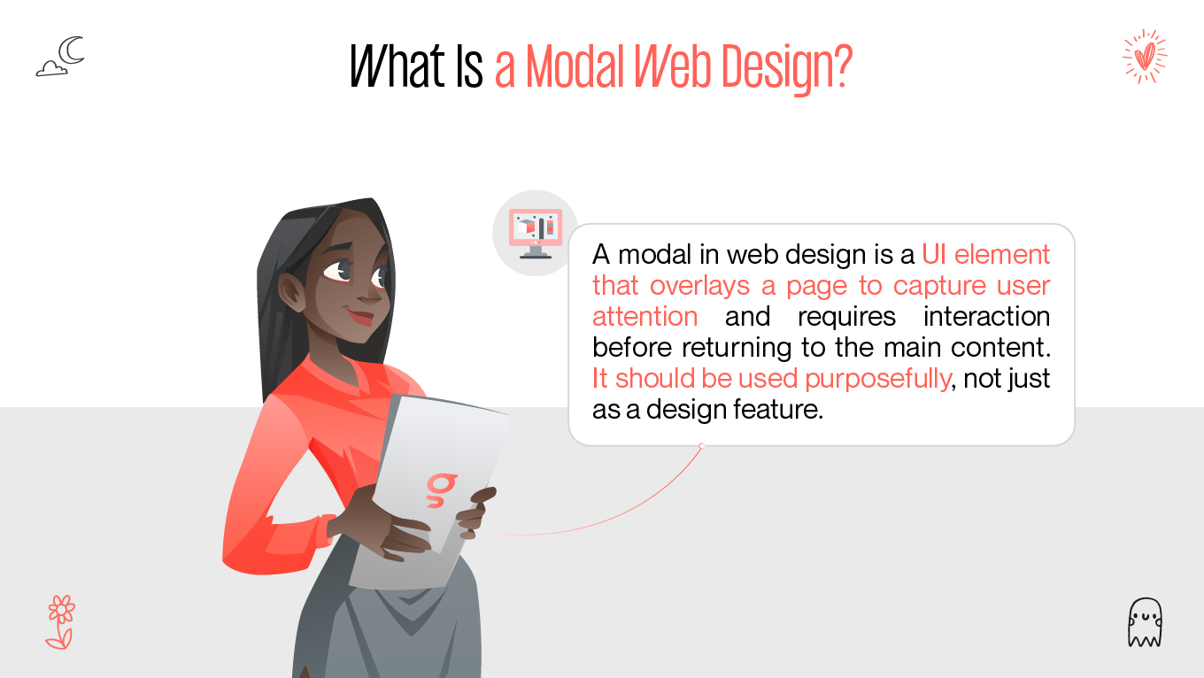
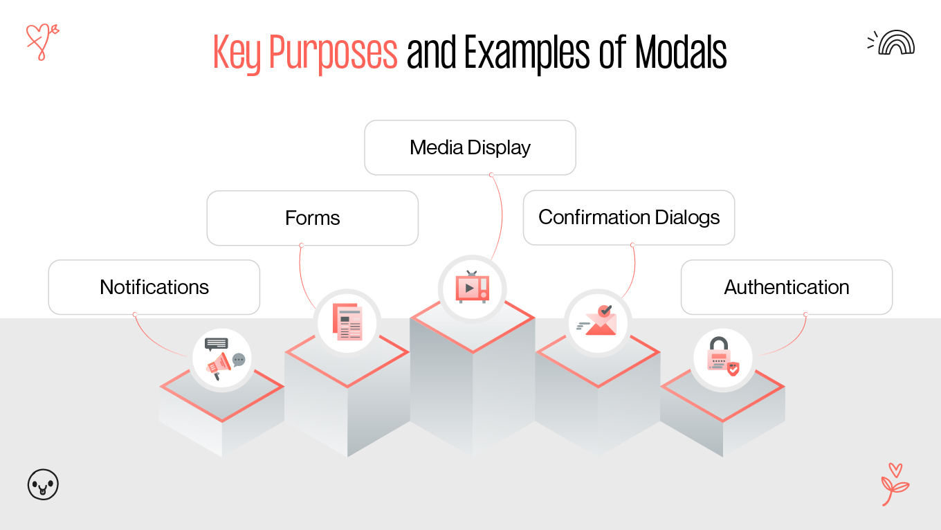
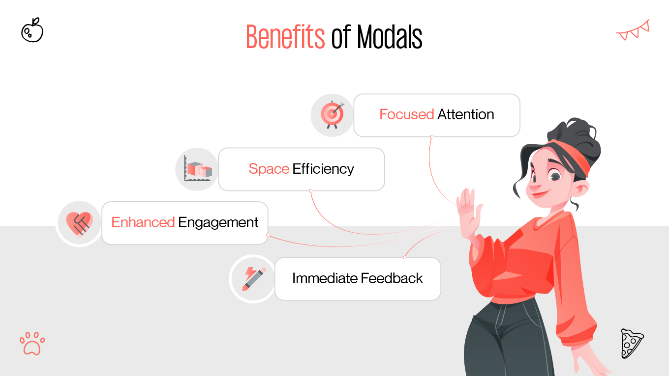
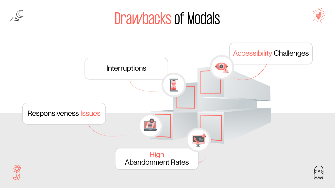
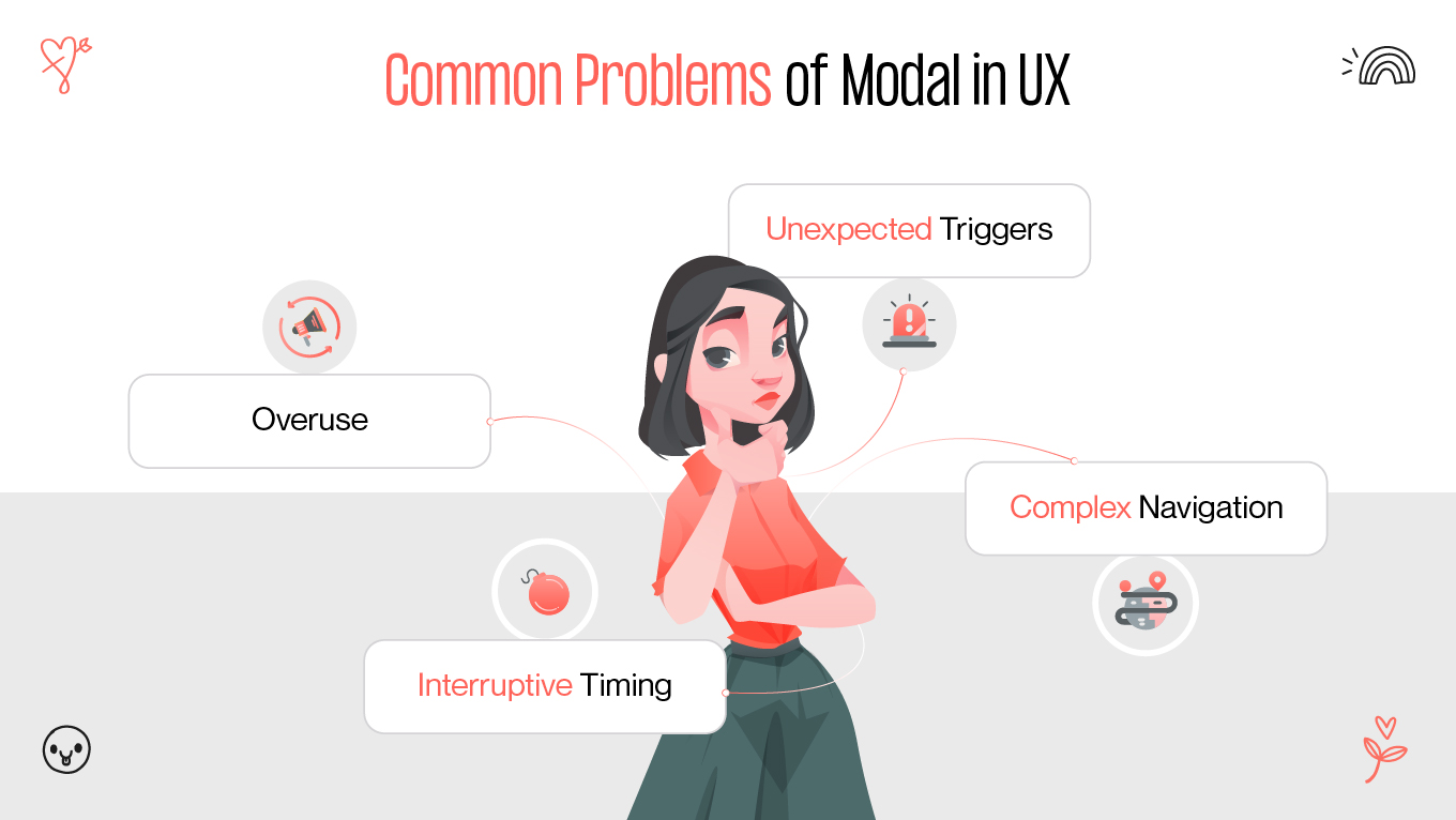
    Modals are a ubiquitous feature in web design, but their impact on user experience (UX) remains a topic of debate. Some designers and developers laud modals for their ability to enhance usability, while others criticize them for interrupting user flow and causing frustration. This article provides a comprehensive exploration of modals, examining their purpose, advantages, drawbacks, and best practices to ensure they contribute positively to web design.

    What Are Modals, and Why Are They Used?

    What Is a Modal Web Design?

    A modal, in the context of web design, is a type of user interface (UI) element that appears as an overlay on top of a website’s primary content. It is typically used to draw the user's attention to specific content or actions and requires interaction before users can return to the underlying page. Understanding what is modal in web design is crucial, as it helps web designers implement them purposefully rather than as mere design embellishments.

    What Is a Modal Web Design?
    What Is a Modal Web Design?

    Key Purposes and Examples of Modals

    Key Purposes and Examples of Modals
    Key Purposes and Examples of Modals

    Modals serve several purposes in web design, including but not limited to:

    • Notifications: Displaying critical updates or alerts that require immediate attention.
    • Forms: Collecting user input through sign-up forms, surveys, or feedback tools.
    • Media Display: Showcasing images, videos, or galleries in an isolated environment for better focus.
    • Confirmation Dialogs: Prompting users to confirm actions such as deletions, subscriptions, or purchases.
    • Authentication: Facilitating user login or sign-up without redirecting to a separate page.

    Website Modal Examples:

    • A subscription pop-up offering a discount for first-time buyers.
    • A login form that overlays the homepage content.
    • An image light box feature in a photo gallery on an e-commerce website.

    Pros and Cons of Modals

    Benefits of Modals

    Benefits of modals
    Benefits of modals
    1. Focused Attention: Modals isolate critical content or actions, ensuring users focus exclusively on the intended task.
    2. Space Efficiency: By overlaying the main content, modals eliminate the need for additional pages, conserving screen real estate.
    3. Enhanced Engagement: When used sparingly and contextually, modals can encourage users to take desired actions, such as subscribing or providing feedback.
    4. Immediate Feedback: Modals can quickly present information or actions in response to user input, streamlining interactions.

    Drawbacks of Modals

    Drawbacks of Modals
    Drawbacks of Modals
    1. Interruptions: Modals can disrupt the user's workflow, especially if triggered unexpectedly or frequently.
    2. Accessibility Challenges: Poorly designed modals can be difficult to navigate for users relying on screen readers or keyboard navigation.
    3. High Abandonment Rates: Overly intrusive or irrelevant modals are often dismissed by users without engagement.
    4. Responsiveness Issues: Non-responsive modals can render poorly on smaller screens, leading to frustrating experiences for mobile users.

    Transform Your Vision into Reality

    Craft stunning, user-centric digital experiences with Gapsy Studio. From strategy to execution, we bring your ideas to life with cutting-edge UI/UX design. 🚀
    Let’s Design Together →

    How Modals Impact User Interaction

    Common Problems of Modal in UX

    Common Problems of Modal in UX
    Common Problems of Modal in UX

    Modals, if not designed thoughtfully, can introduce several UX issues:

    • Unexpected Triggers: Modals that appear without clear context or purpose can confuse users.
    • Complex Navigation: Modals lacking obvious close buttons or exit options can create a feeling of being “stuck.”
    • Interruptive Timing: Poorly timed modals can disrupt the user’s journey, such as displaying a pop-up immediately after a page loads.
    • Overuse: Excessive reliance on modals can overwhelm users, leading to a negative perception of the website.

    Modal UX Challenges

    Evaluating UX modals design involves considering the context in which the modal appears. Does the modal provide value to the user? Does it align with their goals and expectations? Misuse of modals often results in them being perceived as more of a hindrance than a helpful tool.

    How to Make Modals User-Friendly

    Tips for Improving UX

    Tips for Improving UX
    Tips for Improving UX

    To ensure that modals contribute positively to the user experience, follow these guidelines:

    1. Use Modals Sparingly: Avoid overwhelming users with frequent or unnecessary modals. Only use them for high-priority actions or content.
    2. Provide Clear Exit Options: Every modal should have a visible and easily accessible close button. Additionally, allow users to exit modals by clicking outside the modal area or pressing the Escape key.
    3. Prioritize Accessibility: Design modals that are fully accessible to all users, including those relying on assistive technologies. Ensure they are keyboard-navigable and support screen readers.
    4. Optimize for Mobile: Ensure that modals are fully responsive and display correctly on devices of all sizes. A mobile-friendly modal should be easy to interact with using touch gestures.
    5. Test Modal Timing: Analyze user behavior to determine the optimal moments to display modals. Avoid interrupting tasks or appearing too soon after page load.
    6. Use Visual Hierarchy: Design modals with clear visual cues that guide users’ attention to the most important elements, such as call-to-action buttons.

    Modal Best Practices

    Modals Best Practices
    Modals Best Practices

    Adhering to modal best practices can help create a seamless and intuitive experience for users. Modals should:

    • Appear contextually relevant: Modals need to directly relate to the user’s current actions or intent on the page. For instance, a confirmation modal should only appear when a user initiates an action requiring confirmation, ensuring its relevance.
    • Avoid obstructing primary content unnecessarily: Modals should not block important content or prevent users from completing their primary tasks. For example, if a modal covers essential navigation elements without a valid reason, it can lead to frustration.
    • Include concise and actionable messaging: The content within modals must be clear and straight to the point. Avoid lengthy text blocks, and ensure any instructions or calls to action are easy to understand and act upon.
    • Ensure accessibility and visibility: All modals should include accessibility features such as ARIA labels and keyboard navigability. They must also be visually distinct from the background content, ensuring that users can easily identify and interact with them.
    • Design for responsiveness: Modals must adapt seamlessly to different screen sizes and orientations. On mobile devices, for instance, ensure modals do not occupy the entire screen unless absolutely necessary.
    • Include non-disruptive closing options: A modal should have a prominent close button and allow users to exit by clicking outside the modal or pressing the Escape key. This prevents users from feeling trapped or forced into interacting with the modal.

    Boost Conversions with a UX Audit

    Are usability issues costing you customers? Our UX audit uncovers hidden problems and optimizes your digital product for seamless user experiences.
    Get Your Free UX Audit →

    Alternatives to Modals

    Modals are not always the best solution for enhancing user interaction. While they have their benefits, they can sometimes disrupt the user’s workflow or feel intrusive. Here are other design patterns and solutions that can serve as alternatives to modals, ensuring smoother user experiences and more intuitive interfaces:

    Other Solutions for User Interaction

    Other Solutions for User Interaction
    Other Solutions for User Interaction

    If modals are not the best fit for your design goals, consider these alternatives:

    Inline Notifications

    Displaying messages directly within the main content area ensures users can stay focused on their tasks without interruption. Understanding when to use modals versus inline notifications is key to maintaining a seamless user experience. For example, a success message confirming a form submission can appear inline instead of as a modal, allowing users to continue their workflow seamlessly.

    Advantages: Inline notifications are non-intrusive and maintain the natural flow of user interaction.

    Use Case: E-commerce platforms use inline banners to notify users of successful cart updates without disrupting browsing.

    Dropdown Menus

    Dropdowns offer expandable options or additional information, helping users access details or functionalities without blocking the entire screen.

    Advantages: They are compact and allow for hierarchical organization of content.

    Use Case: Navigation menus on websites often use dropdowns to display subcategories or related links.

    Tooltips

    Tooltips provide subtle hover interactions to reveal supplementary details. These are especially useful for clarifying elements like icons, buttons, or technical terms.

    Advantages: Tooltips are lightweight and only appear when needed, ensuring minimal disruption.

    Use Case: A tooltip explaining form field requirements enhances usability without overwhelming users with on-screen text.

    Side Panels

    Slide-in panels offer functionality similar to modals but are less intrusive as they do not overlay the entire screen. They can be anchored to the side, leaving part of the main content visible.

    Advantages: Side panels provide additional space for content while allowing users to maintain context.

    Use Case: Email clients use side panels to display message details without navigating away from the inbox.

    Progressive Disclosure

    Gradually revealing information or options as users interact with specific elements reduces cognitive load. This approach ensures that users see only the most relevant details at each stage.

    Advantages: Progressive disclosure prioritizes simplicity while accommodating complex workflows.

    Use Case: Multi-step forms often hide subsequent fields until the user completes the current step, preventing information overload.

    These alternatives can provide many of the same benefits as modals while minimizing potential disruptions to the user’s experience. By choosing the appropriate interaction pattern, designers can ensure a smooth and intuitive journey tailored to user needs.

    Are Modals Really a UX Disaster?

    The debate over are modals bad UX doesn’t have a definitive answer. Modals are not inherently bad, but their effectiveness depends on their implementation. When designed thoughtfully, modals can enhance the user experience by simplifying complex interactions and drawing attention to important content. However, poorly designed modals can lead to frustration, confusion, and negative perceptions of a website.

    Future-Ready Web Development for Your Business?

    Build fast, scalable, and high-performing websites tailored to your goals. From sleek designs to seamless functionality, we bring your vision to life.
    Start Your Project Today →

    Conclusion

    In modal UX design and modal web development, the focus should always be on balance and user needs. By understanding what is a modal on a website and applying modal best practices, designers can leverage modals to support user goals. Whether you’re building a modal website or experimenting with modals web design, always prioritize usability and accessibility.

    Ultimately, modals are a powerful tool in a designer’s arsenal. By considering alternatives, focusing on user-centric design, and testing their impact, you can ensure that modals enhance rather than hinder the user experience. A well-executed modals ux strategy can elevate your web design and leave users with a positive impression.

    Rate this article

    20 ratings
    Average: 4.9 out of 5

    If you like what we write, we recommend subscribing to our mailing list to always be aware of new publications.